


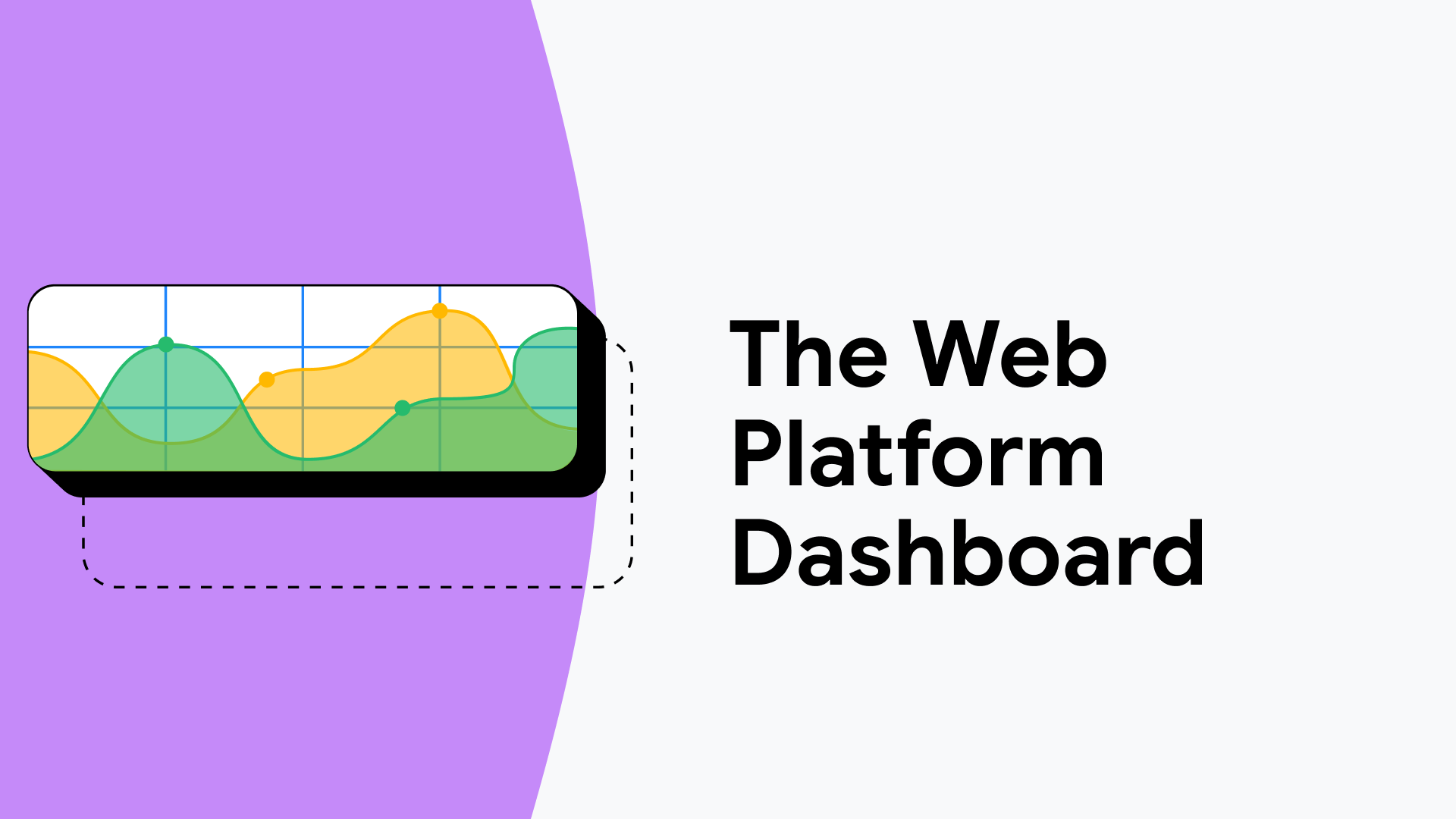
![How to Build an AI Assistant with Keith Moehring [MAICON 2025 Speaker Series]](https://www.marketingaiinstitute.com/hubfs/MAICON-Speaker_Series%20%281%29.png)
![[The AI Show Episode 156]: AI Answers - Data Privacy, AI Roadmaps, Regulated Industries, Selling AI to the C-Suite & Change Management](https://www.marketingaiinstitute.com/hubfs/ep%20156%20cover.png)
![[The AI Show Episode 155]: The New Jobs AI Will Create, Amazon CEO: AI Will Cut Jobs, Your Brain on ChatGPT, Possible OpenAI-Microsoft Breakup & Veo 3 IP Issues](https://www.marketingaiinstitute.com/hubfs/ep%20155%20cover.png)


![Rust VS Go VS TypeScript – which back end language is for you? With Tai Groot [Podcast #176]](https://cdn.hashnode.com/res/hashnode/image/upload/v1750974265013/73f79068-0087-4c39-8a8b-feea8cac873b.png?#)


.jpg?width=1920&height=1920&fit=bounds&quality=70&format=jpg&auto=webp#)


_Michael_Burrell_Alamy.jpg?width=1280&auto=webp&quality=80&disable=upscale#)


How to Create a Vertical Dotted Line with CSS
Creating a vertical dotted line down the center of a webpage can enhance the layout and guide users' eyes. If you’re wondering how to achieve this effect with CSS, you’ll be pleased to know that there are straightforward methods that don’t require images. In this article, we’ll detail a clean CSS approach to create a vertical dotted line that appears under any content boxes. Why Use CSS for Dotted Lines? While it’s possible to use repeating images to generate a dotted line, CSS offers more flexibility, allowing adjustments to color, spacing, and responsiveness without the need for additional image files. This method not only streamlines your code but also optimizes your website's performance by reducing HTTP requests, resulting in faster loading times. Creating the Dotted Line with CSS There are multiple ways to create a vertical dotted line in CSS. Below, we will explore two efficient methods: using the border property and utilizing a linear-gradient background. Method 1: Using the Border Property This is the simplest way to add a vertical dotted line. We will leverage a full-height div with a border on one side. HTML Structure Your Content Here This is where your other content goes, and it will overlap with the vertical line. CSS Styling body { margin: 0; padding: 0; height: 100vh; } .container { display: flex; justify-content: center; align-items: center; position: relative; } .vertical-line { border-left: 2px dotted black; height: 100%; position: absolute; left: 50%; transform: translateX(-50%); } .content { padding: 20px; background-color: white; z-index: 1; /* Ensures the content is above the line */ } In this setup, we create a container div that houses both the vertical line and other content. The line is positioned absolutely in the center, utilizing transform: translateX(-50%); to perfectly align it. Method 2: Using a Linear Gradient For even more customization, particularly in styling the dotted line's appearance, we can use a linear-gradient as a background image. Updated HTML Structure No changes are needed here; you can continue with the same HTML as above. Updated CSS Styling .vertical-line { width: 2px; /* Width of the line */ height: 100%; background: linear-gradient( to bottom, transparent 9%, black 9%, black 11%, transparent 11% ); position: absolute; left: 50%; transform: translateX(-50%); } In this method, we create the dotted effect by transitioning between transparent and black colors in the linear-gradient. Adjust the percentages to get your desired dot size and spacing. Responsive Design Considerations When creating visual elements like a vertical line, it’s essential to ensure that they remain visually appealing across different screen sizes. The above examples use relative measurements, making it easy to adapt the design as users resize their browsers. Testing in Different Viewports Make sure to test your design on various devices, as elements may shift slightly based on screen resolutions and sizes. Tools like Chrome Developer Tools can help you simulate different devices. Frequently Asked Questions (FAQ) Can I change the color of the dotted line? Yes! Simply change the color value in the border or gradient to suit your design preferences. How do I make the line thicker or thinner? Adjust the pixel value in the border-left property or the width of the .vertical-line class. Will this method work across all browsers? Yes, the CSS properties used are widely supported across modern browsers. However, it’s always best to test to confirm. In conclusion, creating a vertical dotted line using CSS is both easy and highly customizable. Whether you opt for the border method or the linear-gradient approach, these techniques allow you to maintain a clean design and optimize performance effectively.

Creating a vertical dotted line down the center of a webpage can enhance the layout and guide users' eyes. If you’re wondering how to achieve this effect with CSS, you’ll be pleased to know that there are straightforward methods that don’t require images. In this article, we’ll detail a clean CSS approach to create a vertical dotted line that appears under any content boxes.
Why Use CSS for Dotted Lines?
While it’s possible to use repeating images to generate a dotted line, CSS offers more flexibility, allowing adjustments to color, spacing, and responsiveness without the need for additional image files. This method not only streamlines your code but also optimizes your website's performance by reducing HTTP requests, resulting in faster loading times.
Creating the Dotted Line with CSS
There are multiple ways to create a vertical dotted line in CSS. Below, we will explore two efficient methods: using the border property and utilizing a linear-gradient background.
Method 1: Using the Border Property
This is the simplest way to add a vertical dotted line. We will leverage a full-height div with a border on one side.
HTML Structure
        Your Content Here
        This is where your other content goes, and it will overlap with the vertical line.
CSS Styling
body {
    margin: 0;
    padding: 0;
    height: 100vh;
}
.container {
    display: flex;
    justify-content: center;
    align-items: center;
    position: relative;
}
.vertical-line {
    border-left: 2px dotted black;
    height: 100%;
    position: absolute;
    left: 50%;
    transform: translateX(-50%);
}
.content {
    padding: 20px;
    background-color: white;
    z-index: 1; /* Ensures the content is above the line */
}
In this setup, we create a container div that houses both the vertical line and other content. The line is positioned absolutely in the center, utilizing transform: translateX(-50%); to perfectly align it.
Method 2: Using a Linear Gradient
For even more customization, particularly in styling the dotted line's appearance, we can use a linear-gradient as a background image.
Updated HTML Structure
No changes are needed here; you can continue with the same HTML as above.
Updated CSS Styling
.vertical-line {
    width: 2px; /* Width of the line */
    height: 100%;
    background: linear-gradient(
        to bottom,
        transparent 9%,
        black 9%,
        black 11%,
        transparent 11%
    );
    position: absolute;
    left: 50%;
    transform: translateX(-50%);
}
In this method, we create the dotted effect by transitioning between transparent and black colors in the linear-gradient. Adjust the percentages to get your desired dot size and spacing.
Responsive Design Considerations
When creating visual elements like a vertical line, it’s essential to ensure that they remain visually appealing across different screen sizes. The above examples use relative measurements, making it easy to adapt the design as users resize their browsers.
Testing in Different Viewports
Make sure to test your design on various devices, as elements may shift slightly based on screen resolutions and sizes. Tools like Chrome Developer Tools can help you simulate different devices.
Frequently Asked Questions (FAQ)
Can I change the color of the dotted line?
Yes! Simply change the color value in the border or gradient to suit your design preferences.
How do I make the line thicker or thinner?
Adjust the pixel value in the border-left property or the width of the .vertical-line class.
Will this method work across all browsers?
Yes, the CSS properties used are widely supported across modern browsers. However, it’s always best to test to confirm.
In conclusion, creating a vertical dotted line using CSS is both easy and highly customizable. Whether you opt for the border method or the linear-gradient approach, these techniques allow you to maintain a clean design and optimize performance effectively.