


![[The AI Show Episode 146]: Rise of “AI-First” Companies, AI Job Disruption, GPT-4o Update Gets Rolled Back, How Big Consulting Firms Use AI, and Meta AI App](https://www.marketingaiinstitute.com/hubfs/ep%20146%20cover.png)


![Ditching a Microsoft Job to Enter Startup Hell with Lonewolf Engineer Sam Crombie [Podcast #171]](https://cdn.hashnode.com/res/hashnode/image/upload/v1746753508177/0cd57f66-fdb0-4972-b285-1443a7db39fc.png?#)


.jpg?width=1920&height=1920&fit=bounds&quality=70&format=jpg&auto=webp#)


-Nintendo-Switch-2-Hands-On-Preview-Mario-Kart-World-Impressions-&-More!-00-10-30.png?width=1920&height=1920&fit=bounds&quality=70&format=jpg&auto=webp#)


-xl.jpg)


![New iPad 11 (A16) On Sale for Just $277.78! [Lowest Price Ever]](https://www.iclarified.com/images/news/97273/97273/97273-640.jpg)

![Apple Foldable iPhone to Feature New Display Tech, 19% Thinner Panel [Rumor]](https://www.iclarified.com/images/news/97271/97271/97271-640.jpg)


![[Weekly funding roundup May 3-9] VC inflow into Indian startups touches new high](https://images.yourstory.com/cs/2/220356402d6d11e9aa979329348d4c3e/WeeklyFundingRoundupNewLogo1-1739546168054.jpg)


Design system annotations, part 2: Advanced methods of annotating components
How to build custom annotations for your design system components or use Figma’s Code Connect to help capture important accessibility details before development. The post Design system annotations, part 2: Advanced methods of annotating components appeared first on The GitHub Blog.

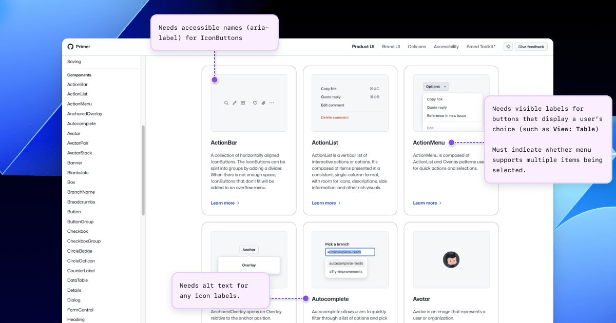
In part one of our design system annotation series, we discussed the ways in which accessibility can get left out of design system components from one instance to another. Our solution? Using a set of “Preset annotations” for each component with Primer. This allows designers to include specific pre-set details that aren’t already built into the component and visually communicated in the design itself.
That being said, Preset annotations are unique to each design system — and while ours may be a helpful reference for how to build them — they’re not something other organizations can utilize if you’re not also using the Primer design system.
Luckily, you can build your own. Here’s how.
How to make Preset annotations for your design system
Start by assessing components to understand which ones would need Preset annotations—not all of them will. Prioritize components that would benefit most from having a Preset annotation, and build that key information into each one. Next, determine what properties should be included. Only include key information that isn’t conveyed visually, isn’t in the component properties, and isn’t already baked into a coded component.
Prioritizing components
When a design system has 60+ components, knowing where to start can be a challenge. Which components need these annotations the most? Which ones would have the highest impact for both design teams and our users?
When we set out to create a new set of Preset annotations based on our proof of concept, we decided to use ten Primer components that would benefit the most. To help pick them, we used an internal tool called Primer Query that tracks all component implementations across the GitHub codebase as well as any audit issues connected to them. Here is a video breakdown of how it works, if you’re curious.
We then prioritized new Preset annotations based on the following criteria:
- Components that align to organization priorities (i.e. high value products and/or those that receive a lot of traffic).
- Components that appear frequently in accessibility audit issues.
- Components with React implementations (as our preferred development framework).
- Most frequently implemented components.
Mapping out the properties
For each component, we cross-referenced multiple sources to figure out what component properties and attributes would need to be added in each Preset annotation. The things we were looking for may only exist in one or two of those places, and thus are less likely to be accounted for all the way through the design and development lifecycle. The sources include:
Component documentation on Primer.style
Design system docs should contain usage guidance for designers and developers, and accessibility requirements should be a part of this guidance as well. Some of the guidance and requirements get built into the component’s Figma asset, while some only end up in the coded component.
Look for any accessibility requirements that are not built into either Figma or code. If it’s built in, putting the same info in the Preset annotation may be redundant or irrelevant.
Coded demos in Storybook
Our component sandbox helped us see how each component is built in React or Rails, as well as what the HTML output is. We looked for any code structure or accessibility attributes that are not included in the component documentation or the Figma asset itself—especially when they may vary from one implementation to another.
Component properties in the Figma asset library
Library assets provide a lot of flexibility through text layers, image fills, variants, and elaborate sets of component properties. We paid close attention to these options to understand what designers can and can’t change. Worthwhile additions to a Preset Annotation are accessibility attributes, requirements, and usage guidance in other sources that aren’t built into the Figma component.
Other potential sources
- Experiences from team members: The designers, developers, and accessibility specialists you work with may have insight into things that the docs and design tools may have missed. If your team and design system have been around for a while, their insights may be more valuable than those you’ll find in the docs, component demos, or asset libraries. Take some time to ask which components have had challenging bugs and which get intentionally broken when implemented.
- Findings from recent audits: Design system components themselves may have unresolved audit issues and remediation recommendations. If that’s the case, those issues are likely present in Storybook demos and may be unaccounted for in the component documentation. Design system audit issues may have details that both help create a Preset annotation and offer insights about what should not be carried over from existing resources.
What we learned from creating Preset annotations
Preset annotations may not be for every team or organization. However, they are especially well suited for younger design systems and those that aren’t well adopted.
Mature design systems like Primer have frequent updates. This means that without close monitoring, the design system components themselves may fall out of sync with how a Preset annotation is built. This can end up causing confusion and rework after development starts, so it may be wise to make sure there’s some capacity to maintain these annotations after they’ve been created.
For newer teams at GitHub, new members of existing teams, and team members who were less familiar with the design system, the built-in guidance and links to documentation and component demos proved very useful. Those who are more experienced are also able to fine-tune the Presets and how they’re used.
If you don’t already have extensive experience with the design system components (or peers to help build them), it can take a lot of time to assess and map out the properties needed to build a Preset. It can also be challenging to name a component property succinctly enough that it doesn’t get truncated in Figma’s properties panel. If the context is not self-evident, some training or additional documentation may help.
It’s not always clear that you need a Preset annotation
There may be enough overlap between the Preset annotation for a component and types of annotations that aren’t specific to the design system.
For example, the GitHub Annotation Toolkit has components to annotate basic
