


![[The AI Show Episode 146]: Rise of “AI-First” Companies, AI Job Disruption, GPT-4o Update Gets Rolled Back, How Big Consulting Firms Use AI, and Meta AI App](https://www.marketingaiinstitute.com/hubfs/ep%20146%20cover.png)


![Ditching a Microsoft Job to Enter Startup Hell with Lonewolf Engineer Sam Crombie [Podcast #171]](https://cdn.hashnode.com/res/hashnode/image/upload/v1746753508177/0cd57f66-fdb0-4972-b285-1443a7db39fc.png?#)


.jpg?width=1920&height=1920&fit=bounds&quality=70&format=jpg&auto=webp#)


-Nintendo-Switch-2-Hands-On-Preview-Mario-Kart-World-Impressions-&-More!-00-10-30.png?width=1920&height=1920&fit=bounds&quality=70&format=jpg&auto=webp#)


-xl.jpg)


![New iPad 11 (A16) On Sale for Just $277.78! [Lowest Price Ever]](https://www.iclarified.com/images/news/97273/97273/97273-640.jpg)

![Apple Foldable iPhone to Feature New Display Tech, 19% Thinner Panel [Rumor]](https://www.iclarified.com/images/news/97271/97271/97271-640.jpg)


![[Weekly funding roundup May 3-9] VC inflow into Indian startups touches new high](https://images.yourstory.com/cs/2/220356402d6d11e9aa979329348d4c3e/WeeklyFundingRoundupNewLogo1-1739546168054.jpg)


Design system annotations, part 1: How accessibility gets left out of components
The Accessibility Design team created a set of annotations to bridge the gaps that design systems alone can’t fix and proactively addresses accessibility issues within Primer components. The post Design system annotations, part 1: How accessibility gets left out of components appeared first on The GitHub Blog.

When it comes to design systems, every organization tends to be at a different place in their accessibility journey. Some have put a great deal of work into making their design system accessible while others have a long way to go before getting there. To help on this journey, many organizations rely on accessibility annotations to make sure there are no access barriers when a design is ready to be built.
However, it’s a common misconception (especially for organizations with mature design systems) that accessible components will result in accessible designs. While design systems are fantastic for scaling standards and consistency, they can’t prevent every issue with our designs or how we build them. Access barriers can still slip through the cracks and make it into production.
This is the root of the problem our Accessibility Design team set out to solve.
In this two-part series, we’ll show you exactly how accessible design system components can produce inaccessible designs. Then we’ll demonstrate our solution: integrating annotations with our Primer components. This allows us to spend less time annotating, increases design system adoption, and reaches teams who may not have accessibility support. And in our next post, we’ll walk you through how you can do the same for your own components.
Let’s dig in.
What are annotations and their benefits?
Annotations are notes included in design projects that help make the unseen explicit by conveying design intent that isn’t shown visually. They improve the usability of digital experiences by providing a holistic picture for developers of how an experience should function. Integrating annotations into our design process helps our teams work better together by closing communication gaps and preventing quality issues, accessibility audit issues, and expensive re-work.
Some of the questions annotations help us answer include:
- How is assistive technology meant to navigate a page from one element to another?
- What’s the alternative text for informative images and buttons without labels?
- How does content shift depending on viewport size, screen orientation, or zoom level?
- Which virtual keyboard should be used for a form input on mobile?
- How should focus be managed for complex interactions?
Our answers to questions like this—or the lack thereof—can make or break the experience of the web for a lot of people, especially users with disabilities. Some annotation tools are built specifically to help with this by guiding designers to include key details about web standards, platform functionality, and accessibility (a11y).
Most public annotation kits are well suited for teams who are creating new design system components, teams who aren’t already using a design system, or teams who don’t have specialized accessibility knowledge. They usually help annotate things like:
- Controls such as buttons and links
- Structural elements such as headings and landmarks
- Decorative images and informative descriptions
- Forms and other elements that require labels and semantic roles
- Focus order for assistive technology and keyboard navigation
GitHub’s annotation’s toolkit
One of our top priorities is to meet our colleagues where they’re at. We wanted all our designers to be able to use annotations out of the box because we believe they shouldn’t need to be a certified accessibility specialist in order to get things built in an accessible way.

To this end, last year we began creating an internal Figma library—the GitHub Annotation Toolkit (which we aim to release to the public soon). Our toolkit builds on the legacy of the former Inclusive Design team at CVS Health. Their two open source annotation kits help make documentation that’s easy to create and consume, and are among the most widely used annotation libraries in the Figma Community.
While they add clarity, annotations can also add overhead. If teams are only relying on specialists to interpret designs and technical specifications for developers, the hand-off process can take longer than it needs to. To create our annotation toolkit, we rebuilt its predecessor from the ground up to avoid that overhead, making extensive improvements and adding inline documentation to make it more intuitive and helpful for all of our designers—not just accessibility specialists.
Design systems can also help reduce that overhead. When you audit your design systems for accessibility, there’s less need for specialist attention on every product feature, since you’re using annotations to add technical semantics and specialist knowledge into every component. This means that designers and developers only need to adhere to the usage guidelines consistently, right?
The problems with annotations and design system components
Unfortunately, it’s not that simple.
Accessibility is not binary
While design systems can help drive more accessible design at scale, they are constantly evolving and the work on them is never done. The accessibility of any component isn’t binary. Some may have a few severe issues that create access barriers, such as being inoperable with a keyboard or missing alt text. Others may have a few trivial issues, such as generic control labels.
Most of the time, it will be a misnomer to claim that your design system is “fully accessible.” There’s always more work to do—it’s just a question of how much. The Web Content Accessibility Guidelines (WCAG) are a great starting point, but their “Success Criteria” isn’t tailored for the unique context that is your website or product or audience.
While the WCAG should be used as a foundation to build from, it’s important to understand that it can’t capture every nuance of disabled users’ needs because your users’ needs are not every user’s needs. It would be very easy to believe that your design system is “fully accessible” if you never look past WCAG to talk to your users. If Primer has accessible components, it’s because we feel that direct participation and input from daily assistive technology users is the most important aspect of our work. Testing plans with real users—with and without disabilities—is where you really find what matters most.
Accessible components do not guarantee accessible designs
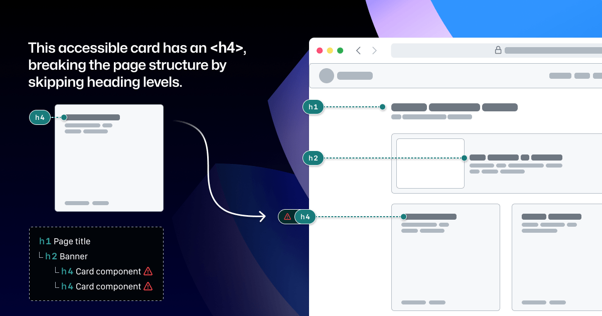
Arranging a series of accessible components on a page does not automatically create an accurate and informative heading hierarchy. There’s a good chance that without additional documentation, the heading structure won’t make sense visually—nor as a medium for navigating with assistive technology.
It’s great when accessible components are flexible and responsive, but what about when they’re placed in a layout that the component guidance doesn’t account for? Do they adapt to different zoom levels, viewport sizes, and screen orientations? Do they lose any functionality or context when any of those things change?
Component usage is contextual. You can add an image or icon to your design, but the design system docs can’t write descriptive text for you. You can use the same image in multiple places, but the image description may need to change depending on context.
Similarly, forms built using the same input components may do different things and require different error validation messages. It’s no wonder that adopting design system components doesn’t get rid of all audit issues.
Design system components in Figma don’t include all the details
Annotation kits don’t include components for specific design systems because almost every organization is using their own. When annotation kits are adopted, teams often add ways to label their design system components.
This labeling lets developers know they can use something that’s already been built, and that they don’t need to build something from scratch. It also helps identify any design system components that get ‘detached’ in Figma. And it reduces the number of things that need to be annotated.
Let’s look at an example:

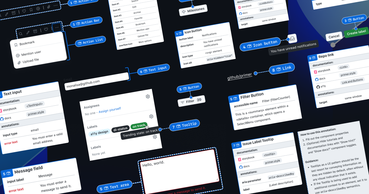
If we’re using this Primer Button component from the Primer Web Figma library, there are a few important things that we won’t know just by looking at the design or the component properties:
- Functional differences when components are implemented. Is this a link that just looks visually like a button? If so, a developer would use the
. - Accessible labels for folks using assistive technology. The icon may need alt text. In some cases, the button text might need some visually-hidden text to differentiate it from similar buttons. How would we know what that text is? Without annotations, the Figma component doesn’t have a place to display this.
- Whether user data is submitted. When a design doesn’t include an obvious form with input fields, how do we convey that the button needs specific attributes to submit data?
It’s risky to leave questions like this unanswered, hoping someone notices and guesses the correct answer.
A solution that streamlines the annotation process while minimizing risk
When creating new components, a set of detailed annotations can be a huge factor in how robust and accessible they are. Once the component is built, design teams can start to add instances of that component in their designs. When those designs are ready to be annotated, those new components shouldn’t need to be annotated again. In most cases, it would be redundant and unnecessary—but not in every case.
There are some important details in many Primer components that may change from one instance to another. If we use the CVS Health annotation kit out of the box, we should be able to capture those variations, but we wouldn’t be able to avoid those redundant and unnecessary annotations. As we built our own annotation toolkit, we built a set of annotations for each Primer component to do both of those things at once.

This accordion component has been thoroughly annotated so that an engineer has everything they need to build it the first time. These include heading levels, semantics for
However, there are two important things we need to annotate, as they can change from one instance to another:
- The optional title at the top.
- The heading level of each item within the accordion.
If we don’t specify these things, we’re leaving it to chance that the page’s heading structure will break or that the experience will be confusing for people to understand and navigate the page. The risks may be low for a single button or basic accordion, but they grow with pattern complexity, component nesting, interaction states, duplicated instances, and so on.

Instead of annotating what’s already built into the component or leaving these details to chance, we can add two quick annotations. One Stamp to point to the component, and one Details annotation where we fill in some blanks to make the heading levels clear.
Because the prompts for specific component details are pre-set in the annotation, we call them Preset annotations.
Introducing our Primer A11y Preset annotations
With this proof of concept, we selected ten frequently used Primer components for the same treatment and built a new set of Preset annotations to document these easily missed accessibility details—our Primer A11y Presets.
Those Primer components tend to contribute to more accessibility audit issues when key details are missing on implementation. Issues for these components relate to things like lack of proper labels, error validation messages, or missing HTML or ARIA attributes.
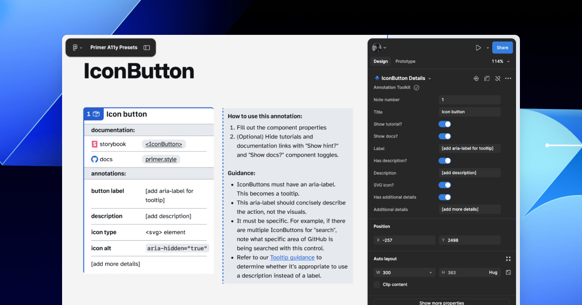
Each of our Preset annotations is linked to component docs and Storybook demos. This will hopefully help developers get straight to the technical info they need without designers having to find and add links manually. We also included guidance for how to fill out each Preset, as well as how to use the component in an accessible way. This helps designers get support inline without leaving their Figma canvas.
Want to create your own? Check out Design system annotations, part 2
Button components in Google’s Material Design and Shopify’s Polaris, IBM’s Carbon, or our Primer design system are all very different from one another. Because Preset annotations are based on specific components, they only work if you’re also using the design system they’re made for.
In part 2 of this series, we’ll walk you through how you can build your own set of Preset annotations for your design system, as well as some different ways to document important accessibility details before development starts.
You may also like:
If you’re more of a visual learner, you can watch Alexis Lucio explore Preset annotations during GitHub’s Dev Community Event to kick off Figma’s Config 2024.
The post Design system annotations, part 1: How accessibility gets left out of components appeared first on The GitHub Blog.


