


![[The AI Show Episode 146]: Rise of “AI-First” Companies, AI Job Disruption, GPT-4o Update Gets Rolled Back, How Big Consulting Firms Use AI, and Meta AI App](https://www.marketingaiinstitute.com/hubfs/ep%20146%20cover.png)


![Ditching a Microsoft Job to Enter Startup Hell with Lonewolf Engineer Sam Crombie [Podcast #171]](https://cdn.hashnode.com/res/hashnode/image/upload/v1746753508177/0cd57f66-fdb0-4972-b285-1443a7db39fc.png?#)


.jpg?width=1920&height=1920&fit=bounds&quality=70&format=jpg&auto=webp#)


-Nintendo-Switch-2-Hands-On-Preview-Mario-Kart-World-Impressions-&-More!-00-10-30.png?width=1920&height=1920&fit=bounds&quality=70&format=jpg&auto=webp#)


-xl.jpg)


![New iPad 11 (A16) On Sale for Just $277.78! [Lowest Price Ever]](https://www.iclarified.com/images/news/97273/97273/97273-640.jpg)

![Apple Foldable iPhone to Feature New Display Tech, 19% Thinner Panel [Rumor]](https://www.iclarified.com/images/news/97271/97271/97271-640.jpg)


![[Weekly funding roundup May 3-9] VC inflow into Indian startups touches new high](https://images.yourstory.com/cs/2/220356402d6d11e9aa979329348d4c3e/WeeklyFundingRoundupNewLogo1-1739546168054.jpg)


Top 10 AI Tools for Embedded Analytics and Reporting (May 2025)
Embedded analytics refers to integrating interactive dashboards, reports, and AI-driven data insights directly into applications or workflows. This approach lets users access analytics in context without switching to a separate BI tool. It’s a rapidly growing market – valued around $20 billion in 2024 and projected to reach $75 billion by 2032 (18% CAGR). Organizations […] The post Top 10 AI Tools for Embedded Analytics and Reporting (May 2025) appeared first on Unite.AI.

Embedded analytics refers to integrating interactive dashboards, reports, and AI-driven data insights directly into applications or workflows. This approach lets users access analytics in context without switching to a separate BI tool. It’s a rapidly growing market – valued around $20 billion in 2024 and projected to reach $75 billion by 2032 (18% CAGR).
Organizations are embracing embedded analytics to empower end-users with real-time information. These trends are fueled by demand for self-service data access and AI features like natural language queries and automated insights, which make analytics more accessible.
Below we review top tools that provide AI-powered embedded analytics and reporting. Each tool includes an overview, key pros and cons, and a breakdown of pricing tiers.
AI Tools for Embedded Analytics and Reporting (Comparison Table)
| AI Tool | Best For | Price | Features |
|---|---|---|---|
| Explo | Turnkey, white-label SaaS dashboards | Free internal · embed from $795/mo | No-code builder, Explo AI NLQ, SOC 2/HIPAA |
| ThoughtSpot | Google-style NL search for data in apps | Dev trial free · usage-based quote | SpotIQ AI insights, search & Liveboards embed |
| Tableau Embedded | Pixel-perfect visuals & broad connectors | $12–70/user/mo | Pulse AI summaries, drag-drop viz, JS API |
| Power BI Embedded | Azure-centric, cost-efficient scaling | A1 capacity from ~$735/mo | NL Q&A, AutoML visuals, REST/JS SDK |
| Looker | Governed metrics & Google Cloud synergy | Custom (≈$120k+/yr) | LookML model, secure embed SDK, BigQuery native |
| Sisense | OEMs needing deep white-label control | Starter ≈$10k/yr · Cloud ≈$21k/yr | ElastiCube in-chip, NLQ, full REST/JS APIs |
| Qlik | Associative, real-time data exploration | $200–2,750/mo (capacity-based) | Associative engine, Insight Advisor AI, Nebula.js |
| Domo Everywhere | Cloud BI with built-in ETL & sharing | From ~$3k/mo (quote) | 500+ connectors, alerts, credit-based scaling |
| Yellowfin BI | Data storytelling & flexible OEM pricing | Custom (≈$15k+/yr) | Stories, Signals AI alerts, multi-tenant |
| Mode Analytics | SQL/Python notebooks to embedded reports | Free · Pro ≈$6k/yr | Notebooks, API embed, Visual Explorer |
1. Explo

(Source: Explo)
Explo is an embedded analytics platform designed for product and engineering teams to quickly add customer-facing dashboards and reports to their apps. It offers a no-code interface for creating interactive charts and supports white-labeled embedding, so the analytics blend into your product’s UI.
Explo focuses on self-service: end-users can explore data and even build ad hoc reports without needing developer intervention. A standout feature is Explo AI, a generative AI capability that lets users ask free-form questions and get back relevant charts automatically.
This makes data exploration as easy as typing a query in natural language. Explo integrates with many databases and is built to scale from startup use cases to enterprise deployments (it’s SOC II, GDPR, and HIPAA compliant for security).
Pros and Cons
- Drag-and-drop dashboards—embed in minutes
- Generative AI (Explo AI) for NLQ insights
- Full white-label + SOC 2 / HIPAA compliance
- Young platform; smaller community
- Costs rise with large end-user counts
- Cloud-only; no on-prem deployment
Pricing: (Monthly subscriptions – USD)
- Launch – Free: Internal BI use only; unlimited internal users/dashboards.
- Growth – from $795/month: For embedding in apps; includes 3 embedded dashboards, 25 customer accounts.
- Pro – from $2,195/month: Advanced embedding; unlimited dashboards, full white-label, scales with usage.
- Enterprise – Custom: Custom pricing for large scale deployments; includes priority support, SSO, custom features.
2. ThoughtSpot

ThoughtSpot is an AI-driven analytics platform renowned for its search-based interface. With ThoughtSpot’s embedded analytics, users can type natural language queries (or use voice) to explore data and instantly get visual answers.
This makes analytics accessible to non-technical users – essentially a Google-like experience for your business data. ThoughtSpot’s in-memory engine handles large data volumes, and its AI engine (SpotIQ) automatically finds insights and anomalies.
For embedding, ThoughtSpot provides low-code components and robust REST APIs/SDKs to integrate interactive Liveboards (dashboards) or even just the search bar into applications. It’s popular for customer-facing analytics in apps where end-users need ad-hoc querying ability.
Businesses in retail, finance, and healthcare use ThoughtSpot to let frontline employees and customers ask data questions on the fly. The platform emphasizes ease-of-use and fast deployment, though it also offers enterprise features like row-level security and scalability across cloud data warehouses.
Pros and Cons
- Google-style NL search for data
- SpotIQ AI auto-surfaces trends
- Embeds dashboards, charts, or just the search bar
- Enterprise-grade pricing for SMBs
- Limited advanced data modeling
- Setup needs schema indexing expertise
Pricing: (Tiered, with consumption-based licensing – USD)
- Essentials – $1,250/month (billed annually): For larger deployments; increased data capacity and features.
- ThoughtSpot Pro: Custom quote. Full embedding capabilities for customer-facing apps (up to ~500 million data rows).
- ThoughtSpot Enterprise: Custom quote. Unlimited data scale and enterprise SLA. Includes multi-tenant support, advanced security, etc.
3. Tableau Embedded Analytics

Tableau (part of Salesforce) is a leading BI platform known for its powerful visualization and dashboarding capabilities. Tableau Embedded Analytics allows organizations to integrate Tableau’s interactive charts and reports into their own applications or websites.
Developers can embed Tableau dashboards via iFrames or using the JavaScript API, enabling rich data visuals and filtering in-app. Tableau’s strength lies in its breadth of out-of-the-box visuals, drag-and-drop ease for creating dashboards, and a large user community.
It also has introduced AI features – for example, in 2024 Salesforce announced Tableau Pulse, which uses generative AI to deliver automated insights and natural language summaries to users. This augments embedded dashboards with proactive explanations.
Tableau works with a wide range of data sources and offers live or in-memory data connectivity, ensuring that embedded content can display up-to-date info. It’s well-suited for both internal embedded use (e.g. within an enterprise portal) and external customer-facing analytics, though licensing cost and infrastructure must be planned accordingly.
Pros and Cons
- Market-leading visual library
- New “Pulse” AI summaries & NLQ
- Broad data connectors + massive community
- License cost balloons at scale
- Requires Tableau Server/Cloud infrastructure
- Styling customization via JS API only
Pricing: (Subscription per user, with role-based tiers – USD)
- Creator – $70 per user/month: Full authoring license (data prep, dashboard creation). Needed for developers building embedded dashboards.
- Explorer – $35 per user/month: For users who explore and edit limited content. Suitable for internal power users interacting with embedded reports.
- Viewer – $12 per user/month: Read-only access to view dashboards. For end viewers of embedded analytics.
4. Microsoft Power BI Embedded
Microsoft Power BI is a widely-used BI suite, and Power BI Embedded refers to the Azure service and APIs that let you embed Power BI visuals into custom applications. This is attractive for developers building customer-facing analytics, as it combines Power BI’s robust features (interactive reports, AI visuals, natural language Q&A, etc.) with flexible embedding options.
You can embed full reports or individual tiles, control them via REST API, and apply row-level security for multi-tenant scenarios. Power BI’s strengths include tight integration with the Microsoft ecosystem (Azure, Office 365), strong data modeling (via Power BI Desktop), and growing AI capabilities (e.g. the Q&A visual that allows users to ask questions in plain English).
Pros and Cons
- Rich BI + AI visuals (NL Q&A, AutoML)
- Azure capacity pricing scales to any user base
- Deep Microsoft ecosystem integration
- Initial setup can be complex (capacities, RLS)
- Devs need Power BI Pro licenses
- Some portal features absent in embeds
Pricing: (Azure capacity-based or per-user – USD)
- Power BI Pro – $14/user/month: Enables creating and sharing reports. Required for developers and any internal users of embedded content.
- Power BI Premium Per User – $24/user/month: Enhanced features (AI, larger datasets) on a per-user basis. Useful if a small number of users need premium capabilities instead of a full capacity.
- Power BI Embedded (A SKUs) – From ~$735/month for A1 capacity (3 GB RAM, 1 v-core). Scales up to ~$23,500/month for A6 (100 GB, 32 cores) for high-end needs. Billed hourly via Azure, with scale-out options.
5. Looker (Google Cloud BI)

Looker is a modern analytics platform now part of Google Cloud. It is known for its unique data modeling layer, LookML, which lets data teams define business metrics and logic centrally.
For embedded analytics, Looker provides a robust solution: you can embed interactive dashboards or exploratory data tables in applications, leveraging the same Looker backend. One of Looker’s core strengths is consistency – because of LookML, all users (and embedded views) use trusted data definitions, avoiding mismatched metrics.
Looker also excels at integrations: it connects natively to cloud databases (BigQuery, Snowflake, etc.), and because it’s in the Google ecosystem, it integrates with Google Cloud services (permissions, AI/ML via BigQuery, etc.).
Pros and Cons
- LookML enforces single source of truth
- Secure embed SDK + full theming
- Tight BigQuery & Google AI integration
- Premium six-figure pricing common
- Steep LookML learning curve
- Visuals less flashy than Tableau/Power BI
Pricing: (Custom quotes via sales; example figures)
6. Sisense

Sisense is a full-stack BI and analytics platform with a strong focus on embedded analytics use cases. It enables companies to infuse analytics into their products via flexible APIs or web components, and even allows building custom analytic apps.
Sisense is known for its ElastiCube in-chip memory technology, which can mash up data from multiple sources and deliver fast performance for dashboards. In recent years, Sisense has incorporated AI features (e.g. NLQ, automated insights) to stay competitive.
A key advantage of Sisense is its ability to be fully white-labeled and its OEM-friendly licensing, which is why many SaaS providers choose it to power their in-app analytics. It offers both cloud and on-premises deployment options, catering to different security requirements.
Sisense also provides a range of customization options: you can embed entire dashboards or individual widgets, and use their JavaScript library to deeply customize look and feel. It’s suited for organizations that need an end-to-end solution – from data preparation to visualization – specifically tailored for embedding in external applications.
Pros and Cons
- ElastiCube fuses data fast in-memory
- White-label OEM-friendly APIs
- AI alerts & NLQ for end-users
- UI learning curve for new users
- Quote-based pricing can be steep
- Advanced setup often needs dev resources
Pricing: (Annual license, quote-based – USD)
- Starter (Self-Hosted) – Starts around $10,000/year for a small deployment (few users, basic features). This would typically be an on-prem license for internal BI or limited OEM use.
- Cloud (SaaS) Starter – ~$21,000/year for ~5 users on Sisense Cloud (cloud hosting carries ~2× premium over self-host).
- Growth/Enterprise OEM – Costs scale significantly with usage; mid-range deployments often range $50K-$100K+ per year. Large enterprise deals can reach several hundred thousand or more if there are very high numbers of end-users.
7. Qlik Embedded Analytics

Qlik is a long-time leader in BI, offering Qlik Sense as its modern analytics platform. Qlik’s embedded analytics capabilities allow you to integrate its associative data engine and rich visuals into other applications.
Qlik’s differentiator is its Associative Engine: users can freely explore data associations (making selections across any fields) and the engine instantly updates all charts to reflect those selections, revealing hidden insights.
In an embedded scenario, this means end-users can get powerful interactive exploration, not just static filtered views. Qlik provides APIs (Capability API, Nebula.js library, etc.) to embed charts or even build fully custom analytics experiences on top of its engine. It also supports standard embed via iframes or mashups.
Qlik has incorporated AI as well – the Insight Advisor can generate insights or chart suggestions automatically. For developers, Qlik’s platform is quite robust: you can script data transformations in its load script, use its security rules for multi-tenant setups, and even embed Qlik into mobile apps.
Pros and Cons
- Associative engine enables free exploration
- Fast in-memory performance for big data
- Robust APIs + Insight Advisor AI
- Unique scripting → higher learning curve
- Enterprise-level pricing
- UI can feel dated without theming
Pricing: (USD)
- Starter – $200 / month (billed annually): Includes 10 users + 25 GB “data for analysis.” No extra data add-ons available.
- Standard – $825 / month: Starts with 25 GB; buy more capacity in 25 GB blocks. Unlimited user access.
- Premium – $2,750 / month: Starts with 50 GB, adds AI/ML, public/anonymous access, larger app sizes (10 GB).
- Enterprise – Custom quote: Begins at 250 GB; supports larger app sizes (up to 40 GB), multi-region tenants, expanded AI/automation quotas.
8. Domo

Domo is a cloud-first business intelligence platform, and Domo Everywhere is its embedded analytics solution aimed at sharing Domo’s dashboards outside the core Domo environment. With Domo Everywhere, companies can distribute interactive dashboards to customers or partners via embed codes or public links, while still managing everything from the central Domo instance.
Domo is known for its end-to-end capabilities in the cloud – from data integration (500+ connectors, built-in ETL called Magic ETL) to data visualization and even a built-in data science layer.
For embedding, Domo emphasizes ease of use: non-technical users can create dashboards in Domo’s drag-and-drop interface, then simply embed them with minimal coding. It also offers robust governance so you can control what external viewers see.
Pros and Cons
- End-to-end cloud BI with 500+ connectors
- Simple drag-and-embed workflow
- Real-time alerts & collaboration tools
- Credit-based pricing tricky to budget
- Cloud-only; no on-prem option
- Deeper custom UI needs dev work
Pricing: (Subscription, contact Domo for quote – USD)
- Basic Embedded Package – roughly $3,000 per month for a limited-user, limited-data scenario. This might include a handful of dashboards and a moderate number of external viewers.
- Mid-size Deployment – approximately $20k–$50k per year for mid-sized businesses. This would cover more users and data; e.g., a few hundred external users with regular usage.
- Enterprise – $100k+/year for large-scale deployments. Enterprises with thousands of external users or very high data volumes can expect costs in six figures. (Domo often structures enterprise deals as unlimited-user but metered by data/query credits.)
9. Yellowfin BI

Yellowfin is a BI platform that has carved a niche in embedded analytics and data storytelling. It offers a cohesive solution with modules for dashboards, data discovery, automated signals (alerts on changes), and even a unique Story feature for narrative reporting.
For embedding, Yellowfin Embedded Analytics provides OEM partners a flexible licensing model and technical capabilities to integrate Yellowfin content into their applications. Yellowfin’s strength lies in its balanced focus: it’s powerful enough for enterprise BI but also streamlined for embedding, with features like multi-tenant support and white-labeling.
It also has NLP query (natural language querying) and AI-driven insights, aligning with modern trends. A notable feature is Yellowfin’s data storytelling – you can create slide-show style narratives with charts and text, which can be embedded to give end-users contextual analysis, not just raw dashboards.
Yellowfin is often praised for its collaborative features (annotations, discussion threads on charts) which can be beneficial in an embedded context where you want users to engage with the analytics.
Pros and Cons
- Built-in Stories & Signals for narratives
- OEM pricing adaptable (fixed or revenue-share)
- Multi-tenant + full white-label support
- Lower brand recognition vs. “big three”
- Some UI elements feel legacy
- Advanced features require training
Pricing: (Custom – Yellowfin offers flexible models)
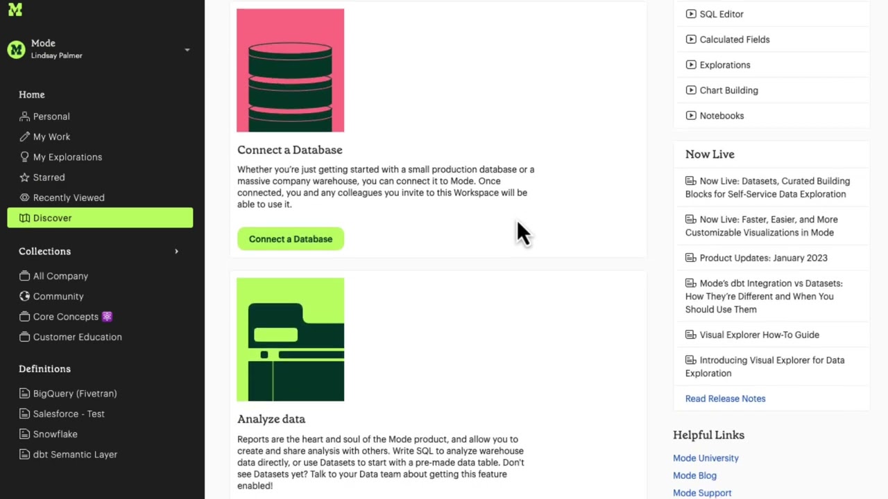
10. Mode

Mode is a platform geared towards advanced analysts and data scientists, combining BI with notebooks. It’s now part of ThoughtSpot (acquired in 2023) but still offered as a standalone solution.
Mode’s appeal in an embedded context is its flexibility: analysts can use SQL, Python, and R in one environment to craft analyses, then publish interactive visualizations or dashboards that can be embedded into web apps. This means if your application’s analytics require heavy custom analysis or statistical work, Mode is well-suited.
It has a modern HTML5 dashboarding system and recently introduced “Visual Explorer” for drag-and-drop charting, plus AI assist features for query suggestions. Companies often use Mode to build rich, bespoke analytics for their customers – for example, a software company might use Mode to develop a complex report, and then embed that report in their product for each customer with the data filtered appropriately.
Mode supports white-label embedding, and you can control it via their API (to provision users, run queries, etc.). It’s popular with data teams due to the seamless workflow from coding to sharing insights.
Pros and Cons
- Unified SQL, Python, R notebooks → dashboards
- Strong API for automated embedding
- Generous free tier for prototyping
- Analyst skills (SQL/Python) required
- Fewer NLQ/AI features for end-users
- Visualization options less extensive than Tableau
Pricing: (USD)
- Studio (Free) – $0 forever for up to 3 users. This includes core SQL/Python/R analytics, private data connections, 10MB query limit, etc. Good for initial development and testing of embedded ideas.
- Pro (Business) – Starts around ~$6,000/year (estimated). Mode doesn’t list fixed prices, but third-party sources indicate pro plans in the mid four-figure range annually for small teams.
- Enterprise – Custom pricing, typically five-figure annually up to ~$50k for large orgs. Includes all Pro features plus enterprise security (SSO, advanced permissions), custom compute for heavy workloads, and premium support.
How to Choose the Right Embedded Analytics Tool
Selecting an embedded analytics solution requires balancing your company’s needs with each tool’s strengths. Start with your use case and audience: Consider who will be using the analytics and their technical level. If you’re embedding dashboards for non-technical business users or customers, a tool with an easy UI could be important. Conversely, if your application demands highly custom analyses or you have a strong data science team, a more flexible code-first tool might be better.
Also evaluate whether you need a fully managed solution (more plug-and-play, e.g. Explo or Domo) or are willing to manage more infrastructure for a potentially more powerful platform (e.g. self-hosting Qlik or Sisense for complete control). The size of your company (and engineering resources) will influence this trade-off – startups often lean towards turnkey cloud services, while larger enterprises might integrate a platform into their existing tech stack.
Integration and scalability are critical factors. Look at how well the tool will integrate with your current systems and future architecture. Finally, weigh pricing and total cost of ownership against your budget and revenue model. Embedded analytics tools vary from per-user pricing to usage-based and fixed OEM licenses. Map out a rough projection of costs for 1 year and 3 years as your user count grows.
FAQs (Embedded Analytics and Reporting)
1. What are the main differences between Tableau and Power BI?
Tableau focuses on advanced visual design, cross-platform deployment (on-prem or any cloud), and a large viz library, but it costs more per user. Power BI is cheaper, tightly integrated with Microsoft 365/Azure, and great for Excel users, though some features require an Azure capacity and Windows-centric stack.
2. How does Sisense handle large datasets compared to other tools?
Sisense’s proprietary ElastiCube “in-chip” engine compresses data in memory, letting a single node serve millions of rows while maintaining fast query response; benchmarks show 500 GB cubes on 128 GB RAM. Competing BI tools often rely on external warehouses or slower in-memory engines for similar workloads.
3. Which embedded analytics tool offers the best customization options?
Sisense and Qlik are stand-outs: both expose full REST/JavaScript APIs, support deep white-labeling, and let dev teams build bespoke visual components or mashups—ideal when you need analytics to look and feel 100 % native in your app.
4. Are there any free alternatives to Tableau and Sisense?
Yes—open-source BI platforms like Apache Superset, Metabase, Redash, and Google’s free Looker Studio deliver dashboarding and basic embedded options at zero cost (self-hosted or SaaS tiers), making them good entry-level substitutes for smaller teams or tight budgets.
The post Top 10 AI Tools for Embedded Analytics and Reporting (May 2025) appeared first on Unite.AI.


