


![How to Build an AI Assistant with Keith Moehring [MAICON 2025 Speaker Series]](https://www.marketingaiinstitute.com/hubfs/MAICON-Speaker_Series%20%281%29.png)
![[The AI Show Episode 156]: AI Answers - Data Privacy, AI Roadmaps, Regulated Industries, Selling AI to the C-Suite & Change Management](https://www.marketingaiinstitute.com/hubfs/ep%20156%20cover.png)
![[The AI Show Episode 155]: The New Jobs AI Will Create, Amazon CEO: AI Will Cut Jobs, Your Brain on ChatGPT, Possible OpenAI-Microsoft Breakup & Veo 3 IP Issues](https://www.marketingaiinstitute.com/hubfs/ep%20155%20cover.png)


![Rust VS Go VS TypeScript – which back end language is for you? With Tai Groot [Podcast #176]](https://cdn.hashnode.com/res/hashnode/image/upload/v1750974265013/73f79068-0087-4c39-8a8b-feea8cac873b.png?#)


.jpg?width=1920&height=1920&fit=bounds&quality=70&format=jpg&auto=webp#)


How to Use Local Notifications in Flutter – A Tutorial for Beginners
Mobile applications often need to communicate important information to users, even when the app isn't actively running. Local notifications are an excellent way to achieve this, allowing you to display messages, reminders, or alerts directly on the u...

Mobile applications often need to communicate important information to users, even when the app isn't actively running. Local notifications are an excellent way to achieve this, allowing you to display messages, reminders, or alerts directly on the user's device. This article will explore how to implement local notifications in a Flutter application using the powerful awesome_notifications package.
We'll discuss why you'd want to use local notifications, their importance in applications, and then provide a step-by-step guide on creating, scheduling, and canceling them. We'll also walk through setting up a Flutter project and installing the necessary dependencies, with in-depth explanations of each code block.
Table of Contents
Why Use Local Notifications?
Local notifications play a vital role in enhancing user engagement and providing a seamless user experience. Here are some key reasons for incorporating local notifications in your Flutter application:
Improved User Engagement: Notifications help keep users engaged with your app by providing timely and relevant information, updates, or reminders. For instance, a fitness app might send a notification reminding a user to log their daily workout.
Retaining User Attention: In a crowded app landscape, notifications serve as a means to capture and retain user attention, ensuring they don't forget about your app. They act as gentle nudges to bring users back into the application.
Enhanced User Experience: Local notifications can enhance the overall user experience by providing real-time updates, alerts, or personalized messages without requiring the user to open the app. Think of a weather app sending an alert about an incoming storm.
Task Reminders: Applications often need to remind users about specific tasks, events, or deadlines. Local notifications are an effective way to alert users about such events, like a to-do list app reminding you of an overdue task.
Prerequisites
Before we begin, ensure you have the following installed on your system:
Flutter SDK: Make sure you have Flutter installed and configured correctly. You can follow the official Flutter installation guide for your operating system.
Dart SDK: Dart comes bundled with Flutter, so if you have Flutter installed, you're good to go.
An IDE: Visual Studio Code or Android Studio with the Flutter and Dart plugins are highly recommended for a smooth development experience.
It’ll also be helpful to have basic familiarity with Flutter widgets, state management (especially StatefulWidget), and asynchronous programming (async/await).
Project Example
In this project, we're going to build a Flutter application for iOS and Android that incorporates local notifications. You'll learn how to schedule, cancel, and reduce the notification count on iOS, as well as how to trigger actions when a notification is opened.
Set Up the Flutter Project
Let's start by creating a Flutter project. Open your terminal or command prompt and run the following commands:
flutter create app_notifications
cd app_notifications
flutter create app_notifications: This command creates a new Flutter project namedapp_notifications.cd app_notifications: This command navigates you into the newly created project directory.
Configure Project Dependencies
Now, we need to add the necessary packages to our project. Open the pubspec.yaml file located at the root of your project and add the following dependencies under the dependencies section:
dependencies:
  flutter:
    sdk: flutter
  flutter_launcher_icons: ^0.13.1
  awesome_notifications: ^0.9.2
  cool_alert: ^2.0.1
  awesome_notifications_core: ^0.9.1
Explanation of dependencies:
flutter_launcher_icons: This package allows you to easily update your Flutter app's launcher icon for both Android and iOS. It's a handy utility for branding your application.awesome_notifications: This is the primary package we'll be using for handling local notifications. It provides a comprehensive set of features for creating, scheduling, and managing notifications.cool_alert: This package provides beautiful and customizable alert dialogs, which we'll use for user feedback in our application.awesome_notifications_core: This package contains the core functionalities ofawesome_notificationsand is often a dependency of the mainawesome_notificationspackage itself. Including it explicitly ensures all necessary components are available.
Next, still in your pubspec.yaml file, configure flutter_launcher_icons by adding the following code below the dev_dependencies section:
flutter_icons:
  android: "launcher_icon"
  ios: true
  remove_alpha_ios: true
  image_path: "assets/imgs/icon.png"
  adaptive_icon_background: "#6C63FF"
  adaptive_icon_foreground: "assets/imgs/icon.png"
What’s going on in the flutter_icons configuration:
android: "launcher_icon": Specifies that the Android launcher icon should be generated.ios: true: Enables icon generation for iOS.remove_alpha_ios: true: Removes the alpha channel from iOS icons, which is often a requirement for App Store submission.image_path: "assets/imgs/icon.png": Points to the source image file for your app icon. We'll create this path in the next step.adaptive_icon_background: "#6C63FF": Sets the background color for Android adaptive icons. This color (#6C63FF) is a shade of purple, which we'll also define as ourprimaryColor.adaptive_icon_foreground: "assets/imgs/icon.png": Sets the foreground image for Android adaptive icons.
Add Project Assets
Applications often need static assets like images. Add the following to your pubspec.yaml file to declare your asset folder:
assets:
    - assets/imgs/
This tells Flutter where to find your image assets. Now, create a folder named assets at the root of your project, and inside it, create another folder named imgs. Place your image files (icon.png, cancel.png, eco.png, eco_large.png, network.png, res_notification_icon.png, rocket.png, stats.png) into this imgs folder.
After modifying pubspec.yaml and adding your assets, run the following commands in your terminal to apply the changes and generate the launcher icons:
flutter pub get
flutter pub run flutter_launcher_icons
flutter pub get: This command fetches all the newly added dependencies and updates your project.flutter pub run flutter_launcher_icons: This command executes theflutter_launcher_iconspackage to generate your app icons based on the configuration you provided.
Define App Constants
It's good practice to centralize frequently used strings and keys. Inside your lib directory, create a folder named constants. Inside this folder, create a file named app_strings.dart and add the following code:
class AppStrings {
  static const String BASIC_CHANNEL_KEY = 'basic_channel';
  static const String BASIC_CHANNEL_NAME = 'Basic Notifications';
  static const String BASIC_CHANNEL_DESCRIPTION = 'This channel is for basic notification';

  static const String SCHEDULE_CHANNEL_KEY = 'schedule_channel';
  static const String SCHEDULE_CHANNEL_NAME = 'Schedule Notifications';
  static const String SCHEDULE_CHANNEL_DESCRIPTION = 'This channel is for schedule notification';

  static const String DEFAULT_ICON = 'asset://assets/imgs/icon.png';

  static const String SCHEDULED_NOTIFICATION_BUTTON1_KEY = 'button_one';
  static const String SCHEDULED_NOTIFICATION_BUTTON2_KEY = 'button_two';
}
What’s going on in AppStrings:
This file contains string constants that will be used throughout the application. These constants provide a single source of truth for values like:
Notification Channel Keys, Names, and Descriptions: These are essential for categorizing and managing notifications on Android. Each notification must belong to a channel.
DEFAULT_ICON: A reference to our default notification icon.SCHEDULED_NOTIFICATION_BUTTON1_KEYandSCHEDULED_NOTIFICATION_BUTTON2_KEY: These keys will be used to identify actions triggered by buttons within scheduled notifications.
Define App Colors
For consistent theming, define your application's color palette in one place. Inside the constants folder, create a file named colors.dart and add the following code:
import 'dart:ui';

class AppColor {
  static const primaryColor = Color(0XFF6C63FF);
  static const secondaryColor = Color(0XFFF96685);
}
This file defines color constants that you can use for consistent theming in your application. primaryColor and secondaryColor will be used across various UI elements to maintain a cohesive design.
Implement Notification Utilities
This is where the core logic for handling notifications resides. Create a folder inside lib called utilities. Inside this folder, create a file named notification_util.dart and add the following code:
import 'dart:io';
import 'package:app_notifications/utilities/create_uid.dart';
import 'package:awesome_notifications/awesome_notifications.dart';
import 'package:flutter/material.dart';
import '../constants/app_strings.dart';
import '../constants/colors.dart';
import '../main.dart';
import '../pages/stats_page.dart';
class NotificationUtil {
final AwesomeNotifications awesomeNotifications;
NotificationUtil({required this.awesomeNotifications});
/// Creates a basic notification that appears immediately.
Future<void> createBasicNotification({
required int id,
required String channelKey,
required String title,
required String body,
String bigPicture = AppStrings.DEFAULT_ICON,
NotificationLayout layout = NotificationLayout.BigPicture,
}) async {
awesomeNotifications.createNotification(
content: NotificationContent(
id: id,
channelKey: channelKey,
title: title,
body: body,
bigPicture: bigPicture,
notificationLayout: layout,
),
);
}
/// Creates a scheduled notification that will appear at a specific time and can repeat.
Future<void> createScheduledNotification({
required int id,
required String channelKey,
required String title,
required String body,
String bigPicture = AppStrings.DEFAULT_ICON,
NotificationLayout layout = NotificationLayout.BigPicture,
required NotificationCalendar notificationCalendar,
}) async {
awesomeNotifications.createNotification(
content: NotificationContent(
id: id,
channelKey: channelKey,
title: title,
body: body,
bigPicture: bigPicture,
notificationLayout: layout,
),
actionButtons: [
NotificationActionButton(
key: AppStrings.SCHEDULED_NOTIFICATION_BUTTON1_KEY,
label: 'Mark Done',
),
NotificationActionButton(
key: AppStrings.SCHEDULED_NOTIFICATION_BUTTON2_KEY,
label: 'Clear',
),
],
schedule: NotificationCalendar(
weekday: notificationCalendar.weekday,
hour: notificationCalendar.hour,
minute: notificationCalendar.minute,
repeats: true, // This notification will repeat every week on the specified day and time.
),
);
}
/// Cancels all currently scheduled notifications.
void cancelAllScheduledNotifications({required BuildContext context}){
awesomeNotifications.cancelAllSchedules().then((value) => {
ScaffoldMessenger.of(context).showSnackBar(
const SnackBar(
content: Text('Cancelled all scheduled notifications'),
backgroundColor: AppColor.primaryColor,
),
)
});
}
/// Requests permission from the user to send notifications. This is crucial for Android 13+ and iOS.
void requestPermissionToSendNotifications({required BuildContext context}) {
AwesomeNotifications().requestPermissionToSendNotifications().then((value) {
// After requesting permission, pop the dialog that prompted the user.
Navigator.of(context).pop();
});
}
/// Static methods for handling notification lifecycle events.
/// These methods are marked with `@pragma("vm:entry-point")` to ensure they are accessible
/// even when the application is running in the background or killed.
/// Use this method to detect when a new notification or a schedule is created.
@pragma("vm:entry-point")
static Future<void> onNotificationCreatedMethod(
ReceivedNotification receivedNotification, BuildContext context) async {
// Show a SnackBar to indicate that a notification has been created.
ScaffoldMessenger.of(context).showSnackBar(
SnackBar(
content: Text(
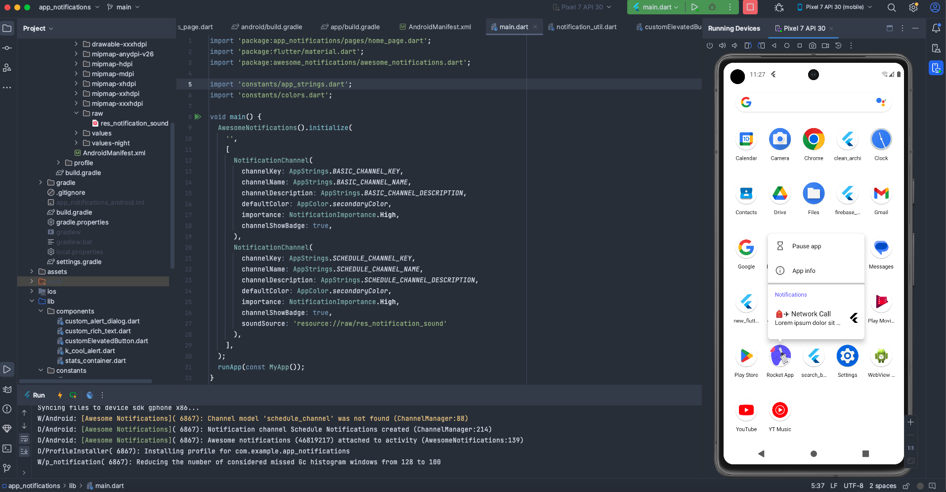
'Notification created ${receivedNotification.channelKey}',
),
backgroundColor: AppColor.primaryColor,
),
);
}
/// Use this method to detect every time that a new notification is displayed.
@pragma("vm:entry-point")
static Future<void> onNotificationDisplayedMethod(
ReceivedNotification receivedNotification) async {
// Your code to handle a notification being displayed can go here.
// For example, you might log the event or update a UI element.
}
/// Use this method to detect if the user dismissed a notification.
@pragma("vm:entry-point")
static Future<void> onDismissActionReceivedMethod(
ReceivedAction receivedAction) async {
// Your code to handle a notification being dismissed can go here.
// This is useful for tracking user interaction or cleaning up resources.
}
/// Use this method to detect when the user taps on a notification or an action button within it.
@pragma("vm:entry-point")
static Future<void> onActionReceivedMethod(
ReceivedAction receivedAction) async {
// Reducing icon badge count on iOS when a basic notification is tapped/acted upon.
// This is important for maintaining accurate badge counts.
if (receivedAction.channelKey == AppStrings.BASIC_CHANNEL_KEY &&
Platform.isIOS) {
AwesomeNotifications().getGlobalBadgeCounter().then((value) {
AwesomeNotifications().setGlobalBadgeCounter(value - 1);
});
}
// Navigating to the StatsPage when any notification action is received.
// The `navigatorKey` from `MyApp` is used to navigate from anywhere in the app.
MyApp.navigatorKey.currentState?.pushAndRemoveUntil(
MaterialPageRoute(
builder: (context) => const StatsPage(),
),
(route) => route.isFirst);
}
}
What’s going on in NotificationUtil:
This class is the heart of our notification logic. It encapsulates methods for:
createBasicNotification: This function creates a simple, immediate notification. It takes anid,channelKey,title, andbody. ThebigPictureandlayoutparameters allow for rich notification content.createScheduledNotification: This powerful function allows you to schedule notifications to appear at a specific date and time. It includesactionButtons(like "Mark Done" or "Clear") that users can interact with directly from the notification, and aNotificationCalendarfor precise scheduling withrepeats: trueto make it a weekly recurring notification.cancelAllScheduledNotifications: A utility to cancel all notifications that have been scheduled. It also displays aSnackBarfor user feedback.requestPermissionToSendNotifications: This method handles the crucial step of asking the user for permission to send notifications. This is a system-level prompt on both Android (especially Android 13+) and iOS.Listener Methods (
onNotificationCreatedMethod,onNotificationDisplayedMethod,onDismissActionReceivedMethod,onActionReceivedMethod): Thesestaticmethods are callbacks thatawesome_notificationsinvokes at different stages of a notification's lifecycle. They are marked with@pragma("vm:entry-point")to ensure they can execute even when the app is in the background or completely closed.onNotificationCreatedMethod: Triggered when a new notification is created.onNotificationDisplayedMethod: Triggered when a notification is actually displayed to the user.onDismissActionReceivedMethod: Triggered when a user dismisses a notification.onActionReceivedMethod: This is a very important one. It's triggered when the user taps on the notification itself or any of its action buttons. In our implementation, it handles:iOS Badge Count Reduction: For basic notifications on iOS, it decrements the app icon's badge counter, providing a more accurate unread count.
Navigation: It navigates the user to the
StatsPageregardless of which notification action was received. This demonstrates how you can direct users to specific parts of your app based on their notification interaction.
Generate Unique IDs
Every notification needs a unique identifier. Inside the utilities folder, create a file named create_uid.dart and add the following code:
int createUniqueId() {
  return DateTime.now().millisecondsSinceEpoch.remainder(100000);
}
createUniqueId is a simple function that generates a unique integer ID by taking the current timestamp in milliseconds and getting its remainder when divided by 100000. This ensures a reasonably unique ID for each notification without creating excessively large numbers.
Create Reusable UI Components
To maintain a clean and modular codebase, we'll create several reusable UI components. Create a folder named components inside lib. Inside this folder, create the following files: custom_alert_dialog.dart, custom_rich_text.dart, custom_elevated_button.dart, stats_container.dart, and k_cool_alert.dart.
custom_alert_dialog.dart:
import 'dart:io';
import 'package:flutter/cupertino.dart';
import 'package:flutter/material.dart';
import '../constants/colors.dart';

Future<void> customAlertDialog({
  required String title,
  required String content,
  required BuildContext context,
  required Function action,
  required String button1Title,
  required String button2Title,
}) {
  return showDialog(
    context: context,
    builder: (context) =>
        // FOR iOS
        Platform.isIOS
            ? CupertinoAlertDialog(
                title: Text(
                  title,
                  style: const TextStyle(
                    fontWeight: FontWeight.w700,
                    color: Colors.black,
                    fontSize: 16,
                  ),
                ),
                content: Text(content),
                actions: [
                  Padding(
                    padding: const EdgeInsets.all(8.0),
                    child: ElevatedButton(
                      style: ElevatedButton.styleFrom(
                        padding: const EdgeInsets.symmetric(horizontal: 5),
                        backgroundColor: AppColor.secondaryColor,
                        shape: RoundedRectangleBorder(
                          borderRadius: BorderRadius.circular(10),
                        ),
                      ),
                      onPressed: () => action(),
                      child: Text(
                        button1Title,
                        style: const TextStyle(
                          color: Colors.white,
                          fontWeight: FontWeight.normal,
                        ),
                      ),
                    ),
                  ),
                  Padding(
                    padding: const EdgeInsets.all(8.0),
                    child: ElevatedButton(
                      style: ElevatedButton.styleFrom(
                        padding: const EdgeInsets.symmetric(horizontal: 5),
                        backgroundColor: AppColor.secondaryColor,
                        shape: RoundedRectangleBorder(
                          borderRadius: BorderRadius.circular(10),
                        ),
                      ),
                      onPressed: () => Navigator.of(context).pop(),
                      child: Text(
                        button2Title,
                        style: const TextStyle(
                          color: Colors.white,
                          fontWeight: FontWeight.normal,
                        ),
                      ),
                    ),
                  ),
                ],
              )
            // FOR Android
            : AlertDialog(
                title: Text(
                  title,
                  style: const TextStyle(
                    fontWeight: FontWeight.w700,
                    color: Colors.black,
                    fontSize: 16,
                  ),
                ),
                content: Text(content),
                actions: [
                  ElevatedButton(
                    style: ElevatedButton.styleFrom(
                      backgroundColor: AppColor.secondaryColor,
                      padding: const EdgeInsets.symmetric(horizontal: 5),
                      shape: RoundedRectangleBorder(
                        borderRadius: BorderRadius.circular(10),
                      ),
                    ),
                    onPressed: () => action(),
                    child: Text(
                      button1Title,
                      style: const TextStyle(
                        color: Colors.white,
                        fontWeight: FontWeight.normal,
                      ),
                    ),
                  ),
                  ElevatedButton(
                    style: ElevatedButton.styleFrom(
                      backgroundColor: AppColor.secondaryColor,
                      padding: const EdgeInsets.symmetric(horizontal: 5),
                      shape: RoundedRectangleBorder(
                        borderRadius: BorderRadius.circular(10),
                      ),
                    ),
                    onPressed: () => Navigator.of(context).pop(),
                    child: Text(
                      button2Title,
                      style: const TextStyle(
                        color: Colors.white,
                        fontWeight: FontWeight.normal,
                      ),
                    ),
                  ),
                ],
              ),
  );
}
The customAlertDialog function provides a customizable alert dialog that adapts its appearance based on the platform. It uses CupertinoAlertDialog for iOS to provide a native look and feel, and AlertDialog for Android.
This ensures a consistent user experience across different devices. It takes a title, content, context, an action function for the primary button, and titles for both buttons.
custom_rich_text.dart:
import 'package:flutter/material.dart';

class CustomRichText extends StatelessWidget {
  const CustomRichText({
    Key? key,
    required this.title,
    required this.content,
  }) : super(key: key);

  final String title;
  final String content;

  @override
  Widget build(BuildContext context) {
    return RichText(
      text: TextSpan(
        text: title,
        style: TextStyle(
          color: Colors.grey.shade800,
          fontWeight: FontWeight.w800,
        ),
        children: [
          TextSpan(
            text: content,
            style: const TextStyle(
              color: Colors.grey,
            ),
          ),
        ],
      ),
    );
  }
}
The CustomRichText widget is a simple RichText component designed to display a title and content with different text styles. The title is bold and dark grey, while the content is a lighter grey, making it ideal for displaying labels and their corresponding values.
custom_elevated_button.dart:
import 'package:flutter/material.dart';
import '../constants/colors.dart';

class CustomElevatedButton extends StatelessWidget {
  const CustomElevatedButton({
    Key? key,
    required this.function,
    required this.title,
    required this.icon,
  }) : super(key: key);

  final Function function;
  final IconData icon;
  final String title;

  @override
  Widget build(BuildContext context) {
    return ElevatedButton.icon(
      style: ElevatedButton.styleFrom(
        backgroundColor: AppColor.secondaryColor,
      ),
      onPressed: () => function(),
      icon: Icon(
        icon,
        color: Colors.white,
      ),
      label: Text(
        title,
        style: const TextStyle(
          color: Colors.white,
        ),
      ),
    );
  }
}
The CustomElevatedButton widget is a reusable ElevatedButton with an icon and a text label. It takes a function to execute when pressed, an icon, and a title. It uses our secondaryColor for its background, ensuring a consistent look and feel for primary actions.
k_cool_alert.dart:
import 'package:cool_alert/cool_alert.dart';
import 'package:flutter/material.dart';
import '../constants/colors.dart';

Future kCoolAlert({
  required String message,
  required BuildContext context,
  required CoolAlertType alert,
  bool barrierDismissible = true,
  String confirmBtnText = 'Ok',
}) {
  return CoolAlert.show(
    backgroundColor: AppColor.primaryColor,
    confirmBtnColor: AppColor.secondaryColor,
    context: context,
    type: alert,
    text: message,
    barrierDismissible: barrierDismissible,
    confirmBtnText: confirmBtnText,
  );
}
The kCoolAlert function leverages the cool_alert package to display aesthetically pleasing alert dialogs. It allows you to specify the message, context, alert type (for example, success, error, warning), whether it's barrierDismissible, and the confirmBtnText. It uses our primaryColor and secondaryColor for styling.
stats_container.dart:
import 'package:flutter/material.dart';
import '../constants/colors.dart';

class StatsContainer extends StatelessWidget {
  StatsContainer({
    Key? key,
    required this.icon,
    required this.stat,
    this.iconColor = Colors.orange,
  }) : super(key: key);

  Color iconColor;
  final IconData icon;
  final String stat;

  @override
  Widget build(BuildContext context) {
    return Container(
      height: 40,
      width: 110,
      decoration: BoxDecoration(
        borderRadius: BorderRadius.circular(20),
        color: AppColor.secondaryColor,
      ),
      child: Center(
        child: Wrap(
          crossAxisAlignment: WrapCrossAlignment.center,
          spacing: 6,
          children: [
            Icon(
              icon,
              color: iconColor,
            ),
            Text(
              stat,
              style: const TextStyle(
                color: Colors.white,
                fontSize: 18,
                fontWeight: FontWeight.w700,
              ),
            )
          ],
        ),
      ),
    );
  }
}
The StatsContainer widget is a simple container designed to display an icon and a numeric statistic. It features a rounded background using AppColor.secondaryColor and provides a visually appealing way to present key metrics, as we'll see on the StatsPage.
Build Application Pages
Now, let's create the main screens of our application. Create a new folder inside lib called pages. Inside this folder, create two files: home_page.dart and stats_page.dart.
home_page.dart:
import 'package:app_notifications/pages/stats_page.dart';
import 'package:awesome_notifications/awesome_notifications.dart';
import 'package:flutter/cupertino.dart';
import 'package:flutter/material.dart';
import '../components/custom_elevated_button.dart';
import '../components/custom_alert_dialog.dart';
import '../components/custom_rich_text.dart';
import '../constants/app_strings.dart';
import '../constants/colors.dart';
import '../utilities/create_uid.dart';
import '../utilities/notification_util.dart';
class HomePage extends StatefulWidget {
const HomePage({Key? key}) : super(key: key);
@override
State createState() => _HomePageState();
}
class _HomePageState extends State<HomePage> {
String selectedNotificationDay = '';
int selectedDayOfTheWeek = 0;
TimeOfDay selectedTime = TimeOfDay.now();
bool isTimeSelected = false;
late NotificationUtil notificationUtil;
// list of notification days
final List<String> notificationDays = [
'Mon',
'Tue',
'Wed',
'Thur',
'Fri',
'Sat',
'Sun',
];
// Function to create a basic notification
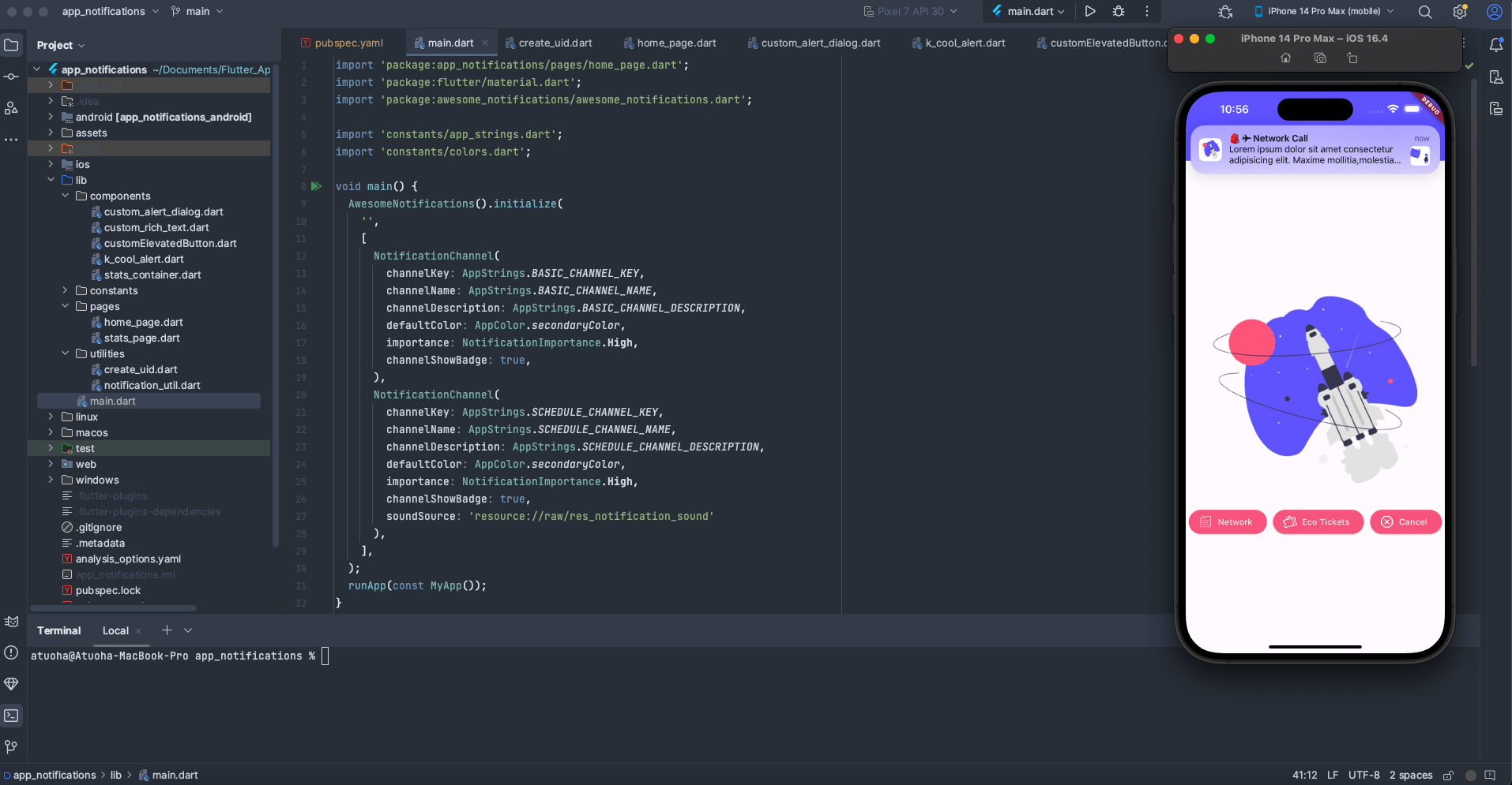
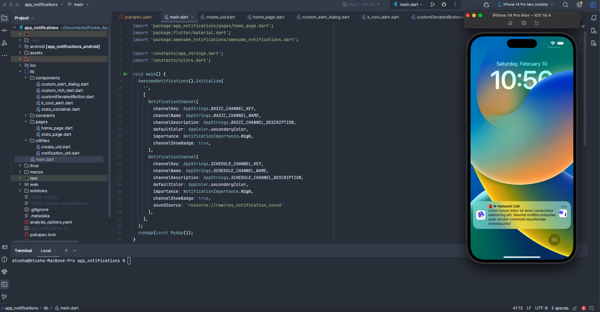
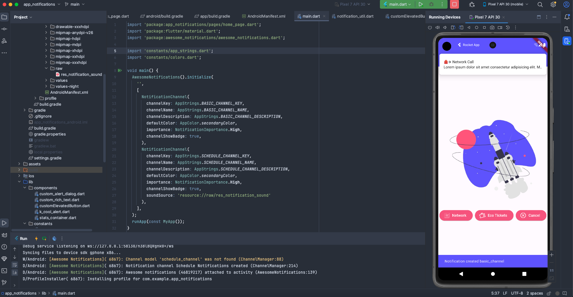
void createBasicNotification() {
notificationUtil.createBasicNotification(
id: createUniqueId(), // Get a unique ID for this notification
channelKey: AppStrings.BASIC_CHANNEL_KEY,
title: '${Emojis.clothing_backpack + Emojis.transport_air_airplane} Network Call',
body:
'Lorem ipsum dolor sit amet consectetur adipisicing elit. Maxime mollitia,molestiae quas vel sint commodi repudiandae consequuntur',
bigPicture: 'asset://assets/imgs/eco_large.png', // Display a large image
);
}
// Function to trigger cancellation of all scheduled notifications
void triggerCancelNotification() {
notificationUtil.cancelAllScheduledNotifications(context: context);
}
// Function to initiate the scheduling process by showing a day selection dialog
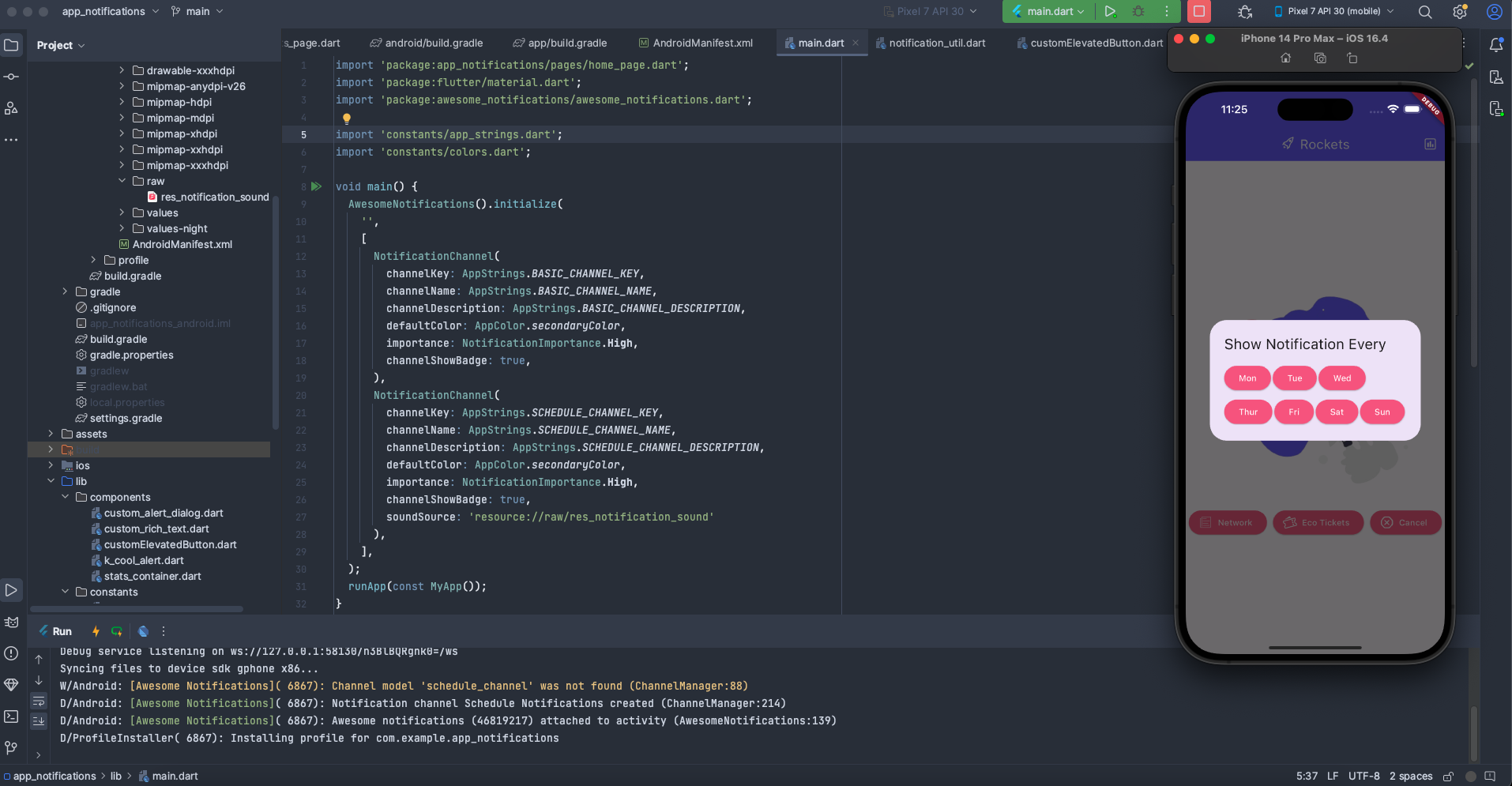
void triggerScheduleNotification() {
showDialog(
context: context,
builder: (context) => AlertDialog(
title: const Text('Show Notification Every'),
content: Wrap(
spacing: 3.0,
runSpacing: 8.0,
children: notificationDays
.asMap()
.entries
.map(
(day) => ElevatedButton(
style: ElevatedButton.styleFrom(
backgroundColor: AppColor.secondaryColor),
onPressed: () {
int index = day.key;
setState(() {
selectedNotificationDay = day.value;
selectedDayOfTheWeek = index + 1; // Weekday is 1-indexed (Sunday is 1, Monday is 2, etc.)
});
Navigator.of(context).pop(); // Close day selection dialog
pickTime(); // Then, prompt for time selection
},
child: Text(
day.value,
style: const TextStyle(
color: Colors.white,
),
),
),
)
.toList(),
),
),
);
}
// Function to create the actual scheduled notification after day and time are selected
void createScheduleNotification() {
notificationUtil.createScheduledNotification(
id: createUniqueId(),
channelKey: AppStrings.SCHEDULE_CHANNEL_KEY,
title: '${Emojis.time_alarm_clock} Check your rocket!',
body:
'Lorem ipsum dolor sit amet consectetur adipisicing elit. Maxime mollitia,molestiae quas vel sint commodi repudiandae consequuntur',
layout: NotificationLayout.Default,
notificationCalendar: NotificationCalendar(
hour: selectedTime.hour,
minute: selectedTime.minute,
weekday: selectedDayOfTheWeek, // Use the selected day of the week
),
);
}
// Function to show a time picker dialog
Future pickTime() async {
TimeOfDay? pickedTime = await showTimePicker(
context: context,
initialTime: TimeOfDay.now(),
);
if (pickedTime != null) {
setState(() {
selectedTime = pickedTime;
isTimeSelected = true;
});
createScheduleNotification(); // Once time is picked, create the notification
}
return null;
}
// Function to request notification permissions
void requestPermission() {
notificationUtil.requestPermissionToSendNotifications(context: context);
}
@override
void initState() {
super.initState();
// Check notification permission and prompt if not allowed
AwesomeNotifications().isNotificationAllowed().then((isAllowed) {
if (!isAllowed) {
customAlertDialog(
title: 'Allow notifications',
content: 'Rocket App needs access to notifications to send you timely updates and reminders.',
context: context,
action: requestPermission,
button1Title: 'Allow',
button2Title: 'Don\'t Allow',
);
}
});
// Initialize NotificationUtil with an instance of AwesomeNotifications
notificationUtil = NotificationUtil(
awesomeNotifications: AwesomeNotifications(),
);
// Set up listeners for various notification events
AwesomeNotifications().setListeners(
onNotificationCreatedMethod: (notification) async =>
NotificationUtil.onNotificationCreatedMethod(notification, context),
onActionReceivedMethod: NotificationUtil.onActionReceivedMethod,
onDismissActionReceivedMethod: (ReceivedAction receivedAction) =>
NotificationUtil.onDismissActionReceivedMethod(receivedAction),
onNotificationDisplayedMethod: (ReceivedNotification receivedNotification) =>
NotificationUtil.onNotificationDisplayedMethod(receivedNotification),
);
}
@override
void dispose() {
// Dispose of AwesomeNotifications resources when the widget is removed
AwesomeNotifications().dispose();
super.dispose();
}
@override
Widget build(BuildContext context) {
return Scaffold(
appBar: AppBar(
backgroundColor: AppColor.primaryColor,
title: const Wrap(
spacing: 8,
children: [
Icon(
CupertinoIcons.rocket,
color: Colors.white,
),
Text(
'Rockets',
style: TextStyle(
color: Colors.white,
),
),
],
),
actions: [
IconButton(
onPressed: () => Navigator.of(context).push(
MaterialPageRoute(
builder: (context) => const StatsPage(),
),
),
icon: const Icon(
CupertinoIcons.chart_bar_square,
color: Colors.white,
),
)
],
),
body: Column(
mainAxisAlignment: MainAxisAlignment.center,
children: [
// Display selected day and time if a schedule is picked
if (isTimeSelected) ...[
CustomRichText(
title: 'Selected Day: ',
content: selectedNotificationDay,
),
const SizedBox(height: 10),
CustomRichText(
title: 'Selected Time: ',
content: selectedTime.format(context),
),
const SizedBox(height: 10),
],
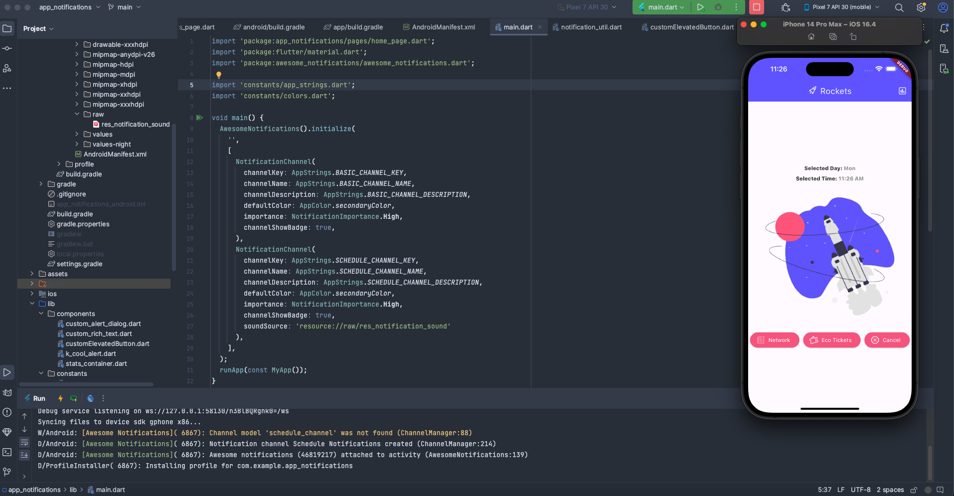
Image.asset('assets/imgs/rocket.png'),
const SizedBox(height: 20),
// Buttons for various notification actions
CustomElevatedButton(
function: createBasicNotification,
title: 'Show Basic Notification',
icon: Icons.notifications,
),
const SizedBox(height: 20),
CustomElevatedButton(
function: triggerScheduleNotification,
title: 'Schedule Notification',
icon: Icons.schedule,
),
const SizedBox(height: 20),
CustomElevatedButton(
function: triggerCancelNotification,
title: 'Cancel All Scheduled Notifications',
icon: Icons.cancel,
),
],
),
);
}
}
The HomePage is the main interactive screen of our application.
State Variables: manages the
selectedNotificationDay,selectedDayOfTheWeek,selectedTime, andisTimeSelectedto handle the scheduling process.notificationDaysList: A simple list of strings representing days of the week, used for the schedule selection dialog.createBasicNotification(): This function is triggered by a button press and callsnotificationUtil.createBasicNotificationto display an immediate notification with an image.triggerCancelNotification(): CallsnotificationUtil.cancelAllScheduledNotificationsto clear any pending scheduled notifications.triggerScheduleNotification(): This function first presents anAlertDialogwhere the user can select a day of the week for the scheduled notification. Once a day is selected, it callspickTime().createScheduleNotification(): After the user selects both a day and time, this function is called to create the recurring scheduled notification usingnotificationUtil.createScheduledNotification.pickTime(): Uses Flutter'sshowTimePickerto allow the user to select a specific time for the scheduled notification.requestPermission(): A simple wrapper to callnotificationUtil.requestPermissionToSendNotifications.initState(): This crucial method is called once when the widget is inserted into the widget tree.It first checks if notification permissions are granted using
AwesomeNotifications().isNotificationAllowed(). If not, it displays acustomAlertDialogprompting the user for permission.It initializes
notificationUtilto interact with our notification helper class.Crucially, it sets up the
awesome_notificationslisteners (setListeners). These listeners connect the global static methods inNotificationUtilto the various notification events (creation, display, dismissal, and action received). This ensures our app can react to notification interactions even when it's not actively in the foreground.
dispose(): This method is called when the widget is removed from the widget tree. It callsAwesomeNotifications().dispose()to release any resources held by the notification package, which is good practice.build()Method: This describes the UI of the home page, including the app bar, arocket.pngimage, and threeCustomElevatedButtonwidgets that trigger the different notification functionalities. It also conditionally displays the selected day and time if a scheduled notification has been initiated.
stats_page.dart:
import 'package:flutter/material.dart';
import '../components/stats_container.dart';
import '../constants/colors.dart';

class StatsPage extends StatelessWidget {
  const StatsPage({Key? key}) : super(key: key);

  @override
  Widget build(BuildContext context) {
    return Scaffold(
      appBar: AppBar(
        backgroundColor: AppColor.primaryColor,
        title: const Wrap(
          spacing: 8,
          children: [
            Icon(
              Icons.analytics,
              color: Colors.white,
            ),
            Text(
              'Stats',
              style: TextStyle(
                color: Colors.white,
              ),
            ),
          ],
        ),
      ),
      body: Center(
        child: Padding(
          padding: const EdgeInsets.symmetric(horizontal: 20),
          child: Column(
            mainAxisAlignment: MainAxisAlignment.center,
            children: [
              const StatsContainer(
                icon: Icons.notifications,
                stat: '10', // Dummy data for demonstration
              ),
              const SizedBox(height: 20),
              const StatsContainer(
                icon: Icons.schedule,
                stat: '5', // Dummy data for demonstration
              ),
              const SizedBox(height: 20),
              const StatsContainer(
                icon: Icons.cancel,
                stat: '2', // Dummy data for demonstration
              ),
            ],
          ),
        ),
      ),
    );
  }
}
The StatsPage is a simple screen designed to display some hypothetical statistics related to notifications.
It features an
AppBarwith a title and an analytics icon.The
bodyconsists of aCenterwidget containing aColumnof threeStatsContainerwidgets.Each
StatsContainerdisplays a dummy number for "notifications," "scheduled notifications," and "canceled notifications." This page serves as a placeholder to demonstrate navigation after a notification action, and in a real application, these numbers would be dynamic.
Initialize and Run the Application
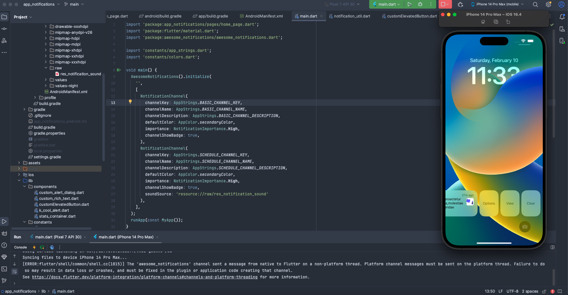
Finally, let's set up the main entry point of our Flutter application. Open main.dart and replace its content with the following code:
import 'package:awesome_notifications/awesome_notifications.dart';
import 'package:flutter/material.dart';
import 'pages/home_page.dart';
import 'constants/app_strings.dart'; // Import AppStrings for channel keys
import 'constants/colors.dart'; // Import AppColor for default channel color

void main() async {
  WidgetsFlutterBinding.ensureInitialized(); // Ensure Flutter binding is initialized

  // Initialize Awesome Notifications with notification channels
  AwesomeNotifications().initialize(
    'resource://drawable/app_icon', // The icon to display for notifications.
                                     // For Android, this usually points to a drawable resource.
                                     // 'resource://drawable/res_notification_icon' is another common path.
                                     // If your icon isn't showing, try experimenting with this path.
    [
     // Notification channel for basic notifications
      NotificationChannel(
        key: AppStrings.BASIC_CHANNEL_KEY,
        name: AppStrings.BASIC_CHANNEL_NAME,
        channelDescription: AppStrings.BASIC_CHANNEL_DESCRIPTION,
        defaultColor: AppColor.primaryColor, // Default color for notifications in this channel
        importance: NotificationImportance.High, // High importance notifications make sound and appear on screen
        defaultRingtoneType: DefaultRingtoneType.Notification, // Use the default notification sound
      ),

      // Notification channel for scheduled notifications
      NotificationChannel(
        key: AppStrings.SCHEDULE_CHANNEL_KEY,
        name: AppStrings.SCHEDULE_CHANNEL_NAME,
        channelDescription: AppStrings.SCHEDULE_CHANNEL_DESCRIPTION,
        defaultColor: AppColor.primaryColor,
        importance: NotificationImportance.High,
        defaultRingtoneType: DefaultRingtoneType.Notification,
      ),
    ],
    // Optional: set this to true if you want to debug Awesome Notifications
    debug: false,
  );

  runApp(MyApp());
}

class MyApp extends StatelessWidget {
  // GlobalKey is used to access the NavigatorState from anywhere in the application
  // This is crucial for navigating from background notification actions.
  static GlobalKey navigatorKey = GlobalKey();

  @override
  Widget build(BuildContext context) {
    return MaterialApp(
      navigatorKey: navigatorKey, // Assign the global key to the MaterialApp
      title: 'Rockets',
      theme: ThemeData(
        primarySwatch: MaterialColor(
          AppColor.primaryColor.value, // Convert Color to MaterialColor for primary swatch
          <int, Color>{
            50: AppColor.primaryColor.withOpacity(0.1),
            100: AppColor.primaryColor.withOpacity(0.2),
            200: AppColor.primaryColor.withOpacity(0.3),
            300: AppColor.primaryColor.withOpacity(0.4),
            400: AppColor.primaryColor.withOpacity(0.5),
            500: AppColor.primaryColor.withOpacity(0.6),
            600: AppColor.primaryColor.withOpacity(0.7),
            700: AppColor.primaryColor.withOpacity(0.8),
            800: AppColor.primaryColor.withOpacity(0.9),
            900: AppColor.primaryColor.withOpacity(1.0),
          },
        ),
      ),
      home: const HomePage(),
    );
  }
}
The main.dart file is the entry point of your Flutter application.
main()Function:WidgetsFlutterBinding.ensureInitialized();: This line is vital to ensure that the Flutter widget binding is initialized beforeAwesomeNotifications().initialize()is called. This prevents potential errors, especially when dealing with platform channels.AwesomeNotifications().initialize(...): This is whereawesome_notificationsis set up.The first argument (
'resource://drawable/app_icon') specifies the default icon for notifications. This path points to a drawable resource on Android.The second argument is a list of
NotificationChannelobjects. Notification channels are mandatory for Android 8.0 (API level 26) and above. They allow users to control notification settings (sound, vibration, importance) on a per-channel basis. We define two channels: one for basic notifications and another for scheduled notifications, each with itskey,name,channelDescription,defaultColor,importance, anddefaultRingtoneType.debug: false: Set totrueduring development to see more detailed logs fromawesome_notifications.
MyAppClass:static GlobalKey: This is a crucial line. AnavigatorKey = GlobalKey (); GlobalKeyassigned toMaterialApp'snavigatorKeyallows us to access theNavigatorStatefrom anywhere in the application, even from static methods likeNotificationUtil.onActionReceivedMethod. This enables us to perform navigation (for example, toStatsPage) when a notification is tapped, regardless of the current screen.The
MaterialAppwidget sets up the basic structure of our app, including the title, theme (using ourAppColor.primaryColor), and setsHomePageas the initial screen. ThenavigatorKeyis assigned here so it can be accessed globally.
Save all files and run the application from your terminal:
flutter run
This command will launch the application on your connected device or emulator, and you can start triggering basic and scheduled notifications!
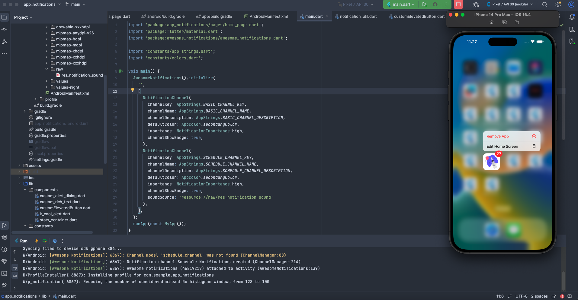
Some screenshots:


To explore more examples and get detailed information about the awesome_notifications package, you can refer to the official documentation and GitHub repository:
Official Documentation: awesome_notifications on pub.dev: This is the official package page on pub.dev. You can find documentation, examples, and version history here.
GitHub Repository: awesome_notifications on GitHub: Visit the GitHub repository to access the source code, issues, discussions, and more. It's a great resource to explore the inner workings of the package.
Reading through the documentation and checking out the official repository can provide additional insights, usage scenarios, and updates related to the awesome_notifications package. It's always beneficial to refer to the official sources for the latest and most comprehensive information.
Conclusion
Implementing local notifications in a Flutter application is essential for providing users with timely information and reminders. The awesome_notifications package simplifies the process of creating, scheduling, and handling notifications significantly.
By following the detailed steps outlined in this article, and understanding the purpose of each code segment, you can effectively enhance user engagement and provide a better overall experience for your Flutter application users.