


![How to Build an AI Assistant with Keith Moehring [MAICON 2025 Speaker Series]](https://www.marketingaiinstitute.com/hubfs/MAICON-Speaker_Series%20%281%29.png)
![[The AI Show Episode 156]: AI Answers - Data Privacy, AI Roadmaps, Regulated Industries, Selling AI to the C-Suite & Change Management](https://www.marketingaiinstitute.com/hubfs/ep%20156%20cover.png)
![[The AI Show Episode 155]: The New Jobs AI Will Create, Amazon CEO: AI Will Cut Jobs, Your Brain on ChatGPT, Possible OpenAI-Microsoft Breakup & Veo 3 IP Issues](https://www.marketingaiinstitute.com/hubfs/ep%20155%20cover.png)


![Rust VS Go VS TypeScript – which back end language is for you? With Tai Groot [Podcast #176]](https://cdn.hashnode.com/res/hashnode/image/upload/v1750974265013/73f79068-0087-4c39-8a8b-feea8cac873b.png?#)


.jpg?width=1920&height=1920&fit=bounds&quality=70&format=jpg&auto=webp#)


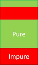
SEO: Too Much Contrast? SEO Doesn't Always Care
This is Post 2 from my “Accessible Links & SEO” series — based on the paper I presented at SIU 2025. If you missed Part 1 (about unique links being punished by bots), you might want to check it out. Now let’s talk contrast — and what happens when you're just… too accessible? Quick Setup We know accessibility matters. We know WCAG 2.0 suggests a minimum contrast ratio of 4.5:1 for readable links. So naturally, I expected better contrast to mean better SEO ranking. I built a labeled dataset using real-world shopping websites, gathered link features like contrast ratio (contrast_ratio), and paired them with SERP positions from both Google and Bing. Then this happened: Higher contrast didn’t improve ranking. Sometimes, it even correlated negatively. Let me rephrase that: I had links with perfect, 12:1 contrast. And they ranked lower than links with 6:1. Data Snapshot: Feature: contrast_ratio Average contrast (ranked): 12.04 Average contrast (not ranked): 12.43 So the higher contrast group actually performed worse in visibility terms. It wasn’t huge — but it was consistent across both search engines. What gives? Here are two thoughts: Accessibility isn’t the only game in town. Search engines likely weigh link context, site architecture, crawlability, internal references, etc. High contrast alone isn’t enough to signal value. Overengineering for bots ≠ better visibility. You might pass every Lighthouse audit, and still get ghosted by Google. Bonus Visual: Here’s the ranking distribution against contrast ratio: (This is where you could insert a simple contrast histogram or scatter plot — let me know if you want one generated.)

This is Post 2 from my “Accessible Links & SEO” series — based on the paper I presented at SIU 2025.
If you missed Part 1 (about unique links being punished by bots), you might want to check it out.
Now let’s talk contrast — and what happens when you're just… too accessible?
Quick Setup
We know accessibility matters.
We know WCAG 2.0 suggests a minimum contrast ratio of 4.5:1 for readable links.
So naturally, I expected better contrast to mean better SEO ranking.
I built a labeled dataset using real-world shopping websites, gathered link features like contrast ratio (contrast_ratio), and paired them with SERP positions from both Google and Bing.
Then this happened:
Higher contrast didn’t improve ranking.
Sometimes, it even correlated negatively.
Let me rephrase that:
I had links with perfect, 12:1 contrast.
And they ranked lower than links with 6:1.
Data Snapshot:
Feature: contrast_ratio
Average contrast (ranked): 12.04
Average contrast (not ranked): 12.43
So the higher contrast group actually performed worse in visibility terms.
It wasn’t huge — but it was consistent across both search engines.
What gives?
Here are two thoughts:
Accessibility isn’t the only game in town.
Search engines likely weigh link context, site architecture, crawlability, internal references, etc.
High contrast alone isn’t enough to signal value.Overengineering for bots ≠ better visibility.
You might pass every Lighthouse audit, and still get ghosted by Google.
Bonus Visual:
Here’s the ranking distribution against contrast ratio:
(This is where you could insert a simple contrast histogram or scatter plot — let me know if you want one generated.)