


![How to Build an AI Assistant with Keith Moehring [MAICON 2025 Speaker Series]](https://www.marketingaiinstitute.com/hubfs/MAICON-Speaker_Series%20%281%29.png)


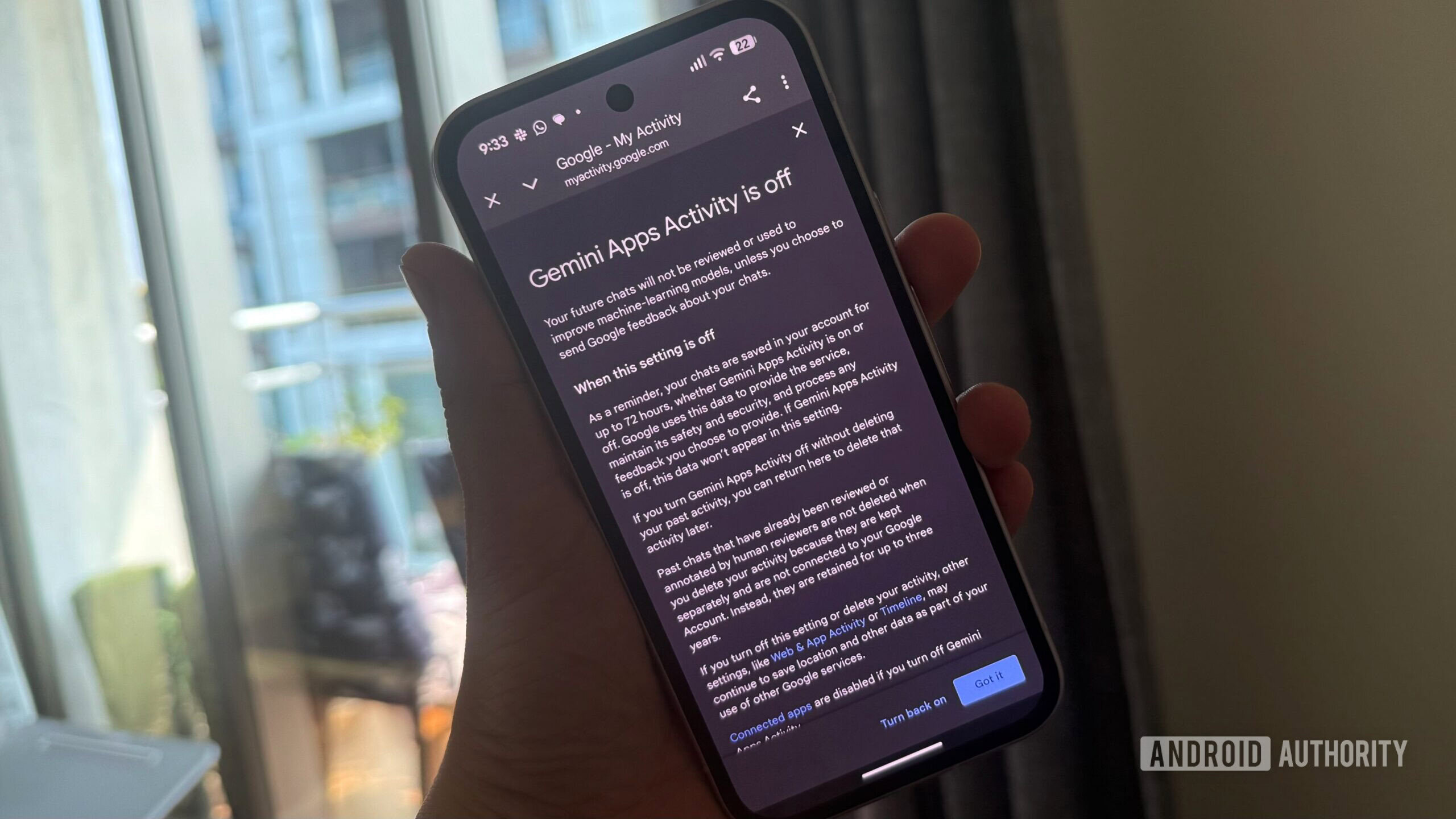
![[The AI Show Episode 156]: AI Answers - Data Privacy, AI Roadmaps, Regulated Industries, Selling AI to the C-Suite & Change Management](https://www.marketingaiinstitute.com/hubfs/ep%20156%20cover.png)
![[The AI Show Episode 155]: The New Jobs AI Will Create, Amazon CEO: AI Will Cut Jobs, Your Brain on ChatGPT, Possible OpenAI-Microsoft Breakup & Veo 3 IP Issues](https://www.marketingaiinstitute.com/hubfs/ep%20155%20cover.png)


_incamerastock_Alamy.jpg?width=1280&auto=webp&quality=80&disable=upscale#)
_Brain_light_Alamy.jpg?width=1280&auto=webp&quality=80&disable=upscale#)


![Some of our favorite Pixel Watch 3 accessories [Video]](https://i0.wp.com/9to5google.com/wp-content/uploads/sites/4/2024/10/Best-Pixel-Watch-3-accessories.jpg?resize=1200%2C628&quality=82&strip=all&ssl=1)
![How’s your Pixel holding up in the heat? [Poll]](https://i0.wp.com/9to5google.com/wp-content/uploads/sites/4/2024/08/google-pixel-9-pro-xl-31.jpg?resize=1200%2C628&quality=82&strip=all&ssl=1)
![Nothing Phone (3) has a 50MP ‘periscope’ telephoto lens – here are the first samples [Gallery]](https://i0.wp.com/9to5google.com/wp-content/uploads/sites/4/2025/06/nothing-phone-3-telephoto.jpg?resize=1200%2C628&quality=82&strip=all&ssl=1)


HarmonyOS Slider Component Guide
HarmonyOS Slider Component Guide This document introduces the Slider component in Huawei Developer documentation, covering overview, interfaces, attributes, events, and examples for developers using Slider in HarmonyOS applications. 1. Component Overview Purpose Used for quickly adjusting settings (e.g., volume, brightness). Supported Versions Introduced in API Version 7. Additional features added in subsequent updates. 2. Interfaces Slider(options?: SliderOptions) Creates a slider component, available in: ArkUI Cards (API version 9+) Atomic Services (API version 11+) SliderOptions Parameters Parameter Description Default Value value Current progress value. Supports two-way binding from API version 10. Matches min min Minimum value. Defaults to 0. 0 max Maximum value. Defaults to 100. min >= max resets to defaults. 100 step Step increment. Range: [0.01, max - min]. Defaults to 1. 1 style Slider style (SliderStyle.OutSet, SliderStyle.InSet, etc.). SliderStyle.OutSet direction Orientation (Axis.Horizontal or Axis.Vertical). Defaults to horizontal. Horizontal reverse Reverses the value range. Defaults to false. false 3. Attributes General Attributes Supports all common component attributes (except touch hotspot). Specific Attributes Attribute Description blockColor Slider color (varies by shape). trackColor Track background color (supports gradients from API version 12). selectedColor Color for the slid portion of the track. showSteps Shows step markers. showTips Enables tooltip with value feedback. trackThickness Track thickness (affects slider size). blockBorderColor Border color for specific slider shapes. blockBorderWidth Border width for specific slider shapes. stepColor Color for step markers. trackBorderRadius Radius for track corners. selectedBorderRadius Radius for the selected track area. blockSize Slider size (varies by shape). blockStyle Slider shape parameters. stepSize Size of step markers. minLabel Deprecated. Use min instead. maxLabel Deprecated. Use max instead. sliderInteractionMode Interaction mode (e.g., continuous/discrete). minResponsiveDistance Minimum drag distance to trigger events. contentModifier Customizes the content area (e.g., adding buttons). slideRange Sets the valid sliding range. 4. Events onChange Triggered when dragging or clicking the slider. Returns: Current value Event status (e.g., start, change, end). 5. Examples Basic Styles Demonstrates different styles (OutSet, InSet, NONE), orientations (horizontal/vertical), tooltips, step markers, and event handling. Styled Slider Customizes: Slider color Track gradient Tick marks Tooltip content Custom Slider Uses contentModifier to add custom controls (e.g., buttons) and displays real-time progress values. Let me know if you need further refinements!
HarmonyOS Slider Component Guide
This document introduces the Slider component in Huawei Developer documentation, covering overview, interfaces, attributes, events, and examples for developers using Slider in HarmonyOS applications.
1. Component Overview
Purpose
Used for quickly adjusting settings (e.g., volume, brightness).
Supported Versions
- Introduced in API Version 7.
- Additional features added in subsequent updates.
2. Interfaces
Slider(options?: SliderOptions)
Creates a slider component, available in:
- ArkUI Cards (API version 9+)
- Atomic Services (API version 11+)
SliderOptions Parameters
| Parameter | Description | Default Value |
|---|---|---|
value |
Current progress value. Supports two-way binding from API version 10. | Matches min
|
min |
Minimum value. Defaults to 0. |
0 |
max |
Maximum value. Defaults to 100. min >= max resets to defaults. |
100 |
step |
Step increment. Range: [0.01, max - min]. Defaults to 1. |
1 |
style |
Slider style (SliderStyle.OutSet, SliderStyle.InSet, etc.). |
SliderStyle.OutSet |
direction |
Orientation (Axis.Horizontal or Axis.Vertical). Defaults to horizontal. |
Horizontal |
reverse |
Reverses the value range. Defaults to false. |
false |
3. Attributes
General Attributes
Supports all common component attributes (except touch hotspot).
Specific Attributes
| Attribute | Description |
|---|---|
blockColor |
Slider color (varies by shape). |
trackColor |
Track background color (supports gradients from API version 12). |
selectedColor |
Color for the slid portion of the track. |
showSteps |
Shows step markers. |
showTips |
Enables tooltip with value feedback. |
trackThickness |
Track thickness (affects slider size). |
blockBorderColor |
Border color for specific slider shapes. |
blockBorderWidth |
Border width for specific slider shapes. |
stepColor |
Color for step markers. |
trackBorderRadius |
Radius for track corners. |
selectedBorderRadius |
Radius for the selected track area. |
blockSize |
Slider size (varies by shape). |
blockStyle |
Slider shape parameters. |
stepSize |
Size of step markers. |
minLabel |
Deprecated. Use min instead. |
maxLabel |
Deprecated. Use max instead. |
sliderInteractionMode |
Interaction mode (e.g., continuous/discrete). |
minResponsiveDistance |
Minimum drag distance to trigger events. |
contentModifier |
Customizes the content area (e.g., adding buttons). |
slideRange |
Sets the valid sliding range. |
4. Events
onChange
Triggered when dragging or clicking the slider. Returns:
- Current value
- Event status (e.g.,
start,change,end).
5. Examples
Basic Styles
Demonstrates different styles (OutSet, InSet, NONE), orientations (horizontal/vertical), tooltips, step markers, and event handling.
Styled Slider
Customizes:
- Slider color
- Track gradient
- Tick marks
- Tooltip content
Custom Slider
Uses contentModifier to add custom controls (e.g., buttons) and displays real-time progress values.
Let me know if you need further refinements!