


![[The AI Show Episode 154]: AI Answers: The Future of AI Agents at Work, Building an AI Roadmap, Choosing the Right Tools, & Responsible AI Use](https://www.marketingaiinstitute.com/hubfs/ep%20154%20cover.png)
![How to Create Your Own AI Toolkit with Taylor Radey [MAICON 2025 Speaker Series]](https://www.marketingaiinstitute.com/hubfs/MAICON-Speaker_Series-Taylor.png)
![[The AI Show Episode 153]: OpenAI Releases o3-Pro, Disney Sues Midjourney, Altman: “Gentle Singularity” Is Here, AI and Jobs & News Sites Getting Crushed by AI Search](https://www.marketingaiinstitute.com/hubfs/ep%20153%20cover.png)


![GrandChase tier list of the best characters available [June 2025]](https://media.pocketgamer.com/artwork/na-33057-1637756796/grandchase-ios-android-3rd-anniversary.jpg?#)


_Frank_Peters_Alamy.jpg?width=1280&auto=webp&quality=80&disable=upscale#)


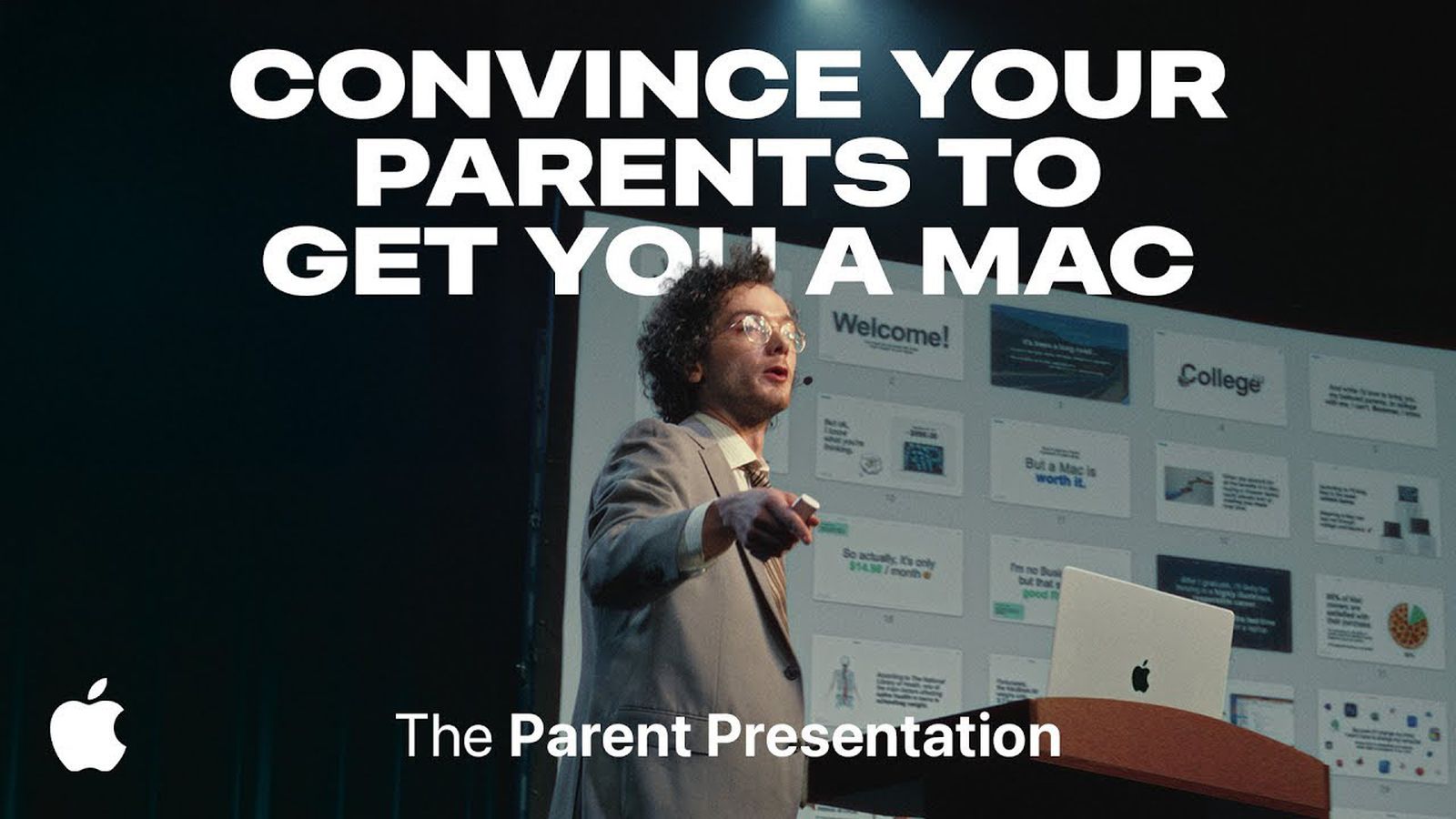
![Apple tells students ‘how to convince your parents to get you a Mac’ [Update: Removed]](https://i0.wp.com/9to5mac.com/wp-content/uploads/sites/6/2025/06/screenshot-2025-06-20-at-09.14.21.jpg?resize=1200%2C628&quality=82&strip=all&ssl=1)


![Apple Weighs Acquisition of AI Startup Perplexity in Internal Talks [Report]](https://www.iclarified.com/images/news/97674/97674/97674-640.jpg)
![Oakley and Meta Launch Smart Glasses for Athletes With AI, 3K Camera, More [Video]](https://www.iclarified.com/images/news/97665/97665/97665-640.jpg)

![How to Get Your Parents to Buy You a Mac, According to Apple [Video]](https://www.iclarified.com/images/news/97671/97671/97671-640.jpg)


![New accessibility settings announced for Steam Big Picture Mode and SteamOS [Beta]](https://www.ghacks.net/wp-content/uploads/2025/06/New-accessibility-settings-announced-for-Steam-Big-Picture-Mode-and-SteamOS.jpg)


✨ Why the Same Font Can Look So Different — and How to Fix It
Can you spot the difference between these two pieces of text? They look different, right? But surprisingly, they're both using the same font. I discovered this while working on my portfolio site and browsing for design inspiration. That’s when I stumbled upon Brittany Chiang’s portfolio. Looks amazing, right? I really liked the typography. So I inspected the font and was shocked to find that it was Inter — the same font I used on my site. That left me wondering: Why does this same font look so much better on her site than on mine? I tried tweaking font weights and letter spacing, but something still felt off. Then I noticed it — the letter "a" looked different.

Can you spot the difference between these two pieces of text?
They look different, right? But surprisingly, they're both using the same font.
I discovered this while working on my portfolio site and browsing for design inspiration. That’s when I stumbled upon Brittany Chiang’s portfolio.

Looks amazing, right?
I really liked the typography. So I inspected the font and was shocked to find that it was Inter — the same font I used on my site.

That left me wondering:
Why does this same font look so much better on her site than on mine?
I tried tweaking font weights and letter spacing, but something still felt off.
Then I noticed it — the letter "a" looked different.