


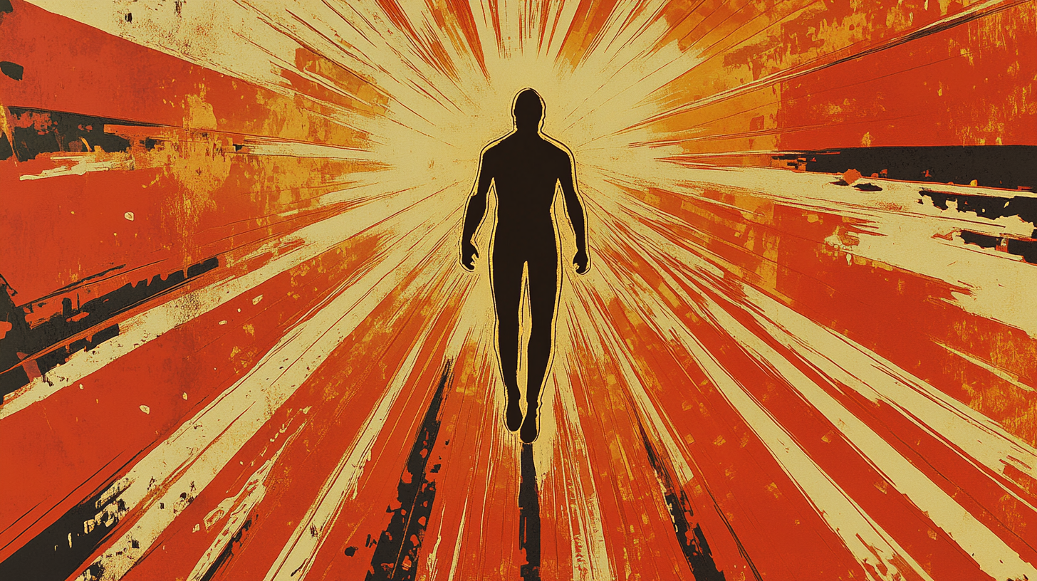
![How to Build an AI Assistant with Keith Moehring [MAICON 2025 Speaker Series]](https://www.marketingaiinstitute.com/hubfs/MAICON-Speaker_Series%20%281%29.png)


![[The AI Show Episode 156]: AI Answers - Data Privacy, AI Roadmaps, Regulated Industries, Selling AI to the C-Suite & Change Management](https://www.marketingaiinstitute.com/hubfs/ep%20156%20cover.png)
![[The AI Show Episode 155]: The New Jobs AI Will Create, Amazon CEO: AI Will Cut Jobs, Your Brain on ChatGPT, Possible OpenAI-Microsoft Breakup & Veo 3 IP Issues](https://www.marketingaiinstitute.com/hubfs/ep%20155%20cover.png)


_incamerastock_Alamy.jpg?width=1280&auto=webp&quality=80&disable=upscale#)
_Brain_light_Alamy.jpg?width=1280&auto=webp&quality=80&disable=upscale#)


![Senators reintroduce App Store bill to rein in ‘gatekeeper power in the app economy’ [U]](https://i0.wp.com/9to5mac.com/wp-content/uploads/sites/6/2025/06/app-store-senate.jpg?resize=1200%2C628&quality=82&strip=all&ssl=1)


How to Accurately Position Image Parts Using CSS and JavaScript?
In today’s web design landscape, positioning image parts correctly is essential, especially when working with separate assets like windows, doors, and roofs for a house render. This article will guide you through the best practices to achieve accurate positioning across all devices using CSS (specifically SCSS) and JavaScript. Understanding the Positioning Challenge When you want to combine different parts of an image, accurately positioning each element can be daunting. The challenge intensifies with varying screen sizes and resolutions. This article will cover two primary methods: CSS with flexbox/grid or creative absolute positioning, and a JavaScript solution for more dynamic applications. Using CSS for Image Positioning One of the most effective ways to position separate image components is through CSS. We can leverage position, flexbox, or grid for layout. Example: CSS Flexbox Approach Here, we will create a responsive layout using flexbox for our image components: .container { display: flex; justify-content: center; align-items: center; position: relative; width: 100%; max-width: 800px; // Set max width as per your design } .house-image { width: 100%; height: auto; } .window { position: absolute; top: 15%; left: 25%; // Adjust these values to position your windows } .door { position: absolute; bottom: 10%; left: 40%; // Adjust these values to position your door } .roof { position: absolute; top: 0; left: 20%; // Adjust these values to position your roof } Example: CSS Grid Approach For more complex layouts involving multiple components, CSS Grid can be a great alternative: div.grid-container { display: grid; grid-template-areas: 'roof roof' 'window door'; width: 100%; max-width: 800px; } .roof { grid-area: roof; } .window { grid-area: window; } .door { grid-area: door; } In this structure, you create a grid layout, and then assign the respective images to their designated grid areas. Adjusting the CSS ensures the design remains responsive and adapts to various screen sizes. Using JavaScript for Dynamic Positioning Sometimes, CSS alone isn’t enough, especially when the images need to adapt based on user interaction or dynamic content. Here’s how you can implement positioning through JavaScript: Example: JavaScript for Image Positioning You can manipulate the style property of HTML elements in real-time based on screen size or user input: function positionElements() { const windowElement = document.querySelector('.window'); const doorElement = document.querySelector('.door'); const roofElement = document.querySelector('.roof'); // Adjust positions based on the window size const screenWidth = window.innerWidth; const screenHeight = window.innerHeight; windowElement.style.top = `${screenHeight * 0.15}px`; windowElement.style.left = `${screenWidth * 0.25}px`; doorElement.style.bottom = `${screenHeight * 0.10}px`; doorElement.style.left = `${screenWidth * 0.40}px`; roofElement.style.top = `0px`; roofElement.style.left = `${screenWidth * 0.20}px`; } window.addEventListener('resize', positionElements); window.onload = positionElements; Testing for Responsiveness After implementing either method, ensure you test your layout across different devices. You can use developer tools in browsers to simulate various screen sizes and make adjustments as necessary. Frequently Asked Questions (FAQ) 1. What is the best way to position images? The best method often depends on your specific layout needs, but CSS flexbox/grid combined with media queries usually provides a solid foundation for responsiveness. 2. Can I use media queries to adjust positions? Yes, media queries can definitely help ensure your positioning adapts to changes in screen size effectively. 3. Is JavaScript necessary for image positioning? JavaScript is not always necessary, but it can enhance responsiveness and interactivity, especially in dynamic scenarios. 4. How do I ensure quality images? Always use high-resolution images and optimize them for web use to balance quality and loading speed. In conclusion, accurately positioning divided parts of an image using CSS (SCSS) or JavaScript involves understanding the layout design and utilizing the right techniques. Utilizing flexbox, grid layouts, and even JavaScript, you can create a responsive and well-positioned image that enhances your design's appeal across devices. Don’t forget to test thoroughly to ensure consistency in all user experiences.
In today’s web design landscape, positioning image parts correctly is essential, especially when working with separate assets like windows, doors, and roofs for a house render. This article will guide you through the best practices to achieve accurate positioning across all devices using CSS (specifically SCSS) and JavaScript.
Understanding the Positioning Challenge
When you want to combine different parts of an image, accurately positioning each element can be daunting. The challenge intensifies with varying screen sizes and resolutions. This article will cover two primary methods: CSS with flexbox/grid or creative absolute positioning, and a JavaScript solution for more dynamic applications.
Using CSS for Image Positioning
One of the most effective ways to position separate image components is through CSS. We can leverage position, flexbox, or grid for layout.
Example: CSS Flexbox Approach
Here, we will create a responsive layout using flexbox for our image components:
.container {
    display: flex;
    justify-content: center;
    align-items: center;
    position: relative;
    width: 100%;
    max-width: 800px; // Set max width as per your design
}

.house-image {
    width: 100%;
    height: auto;
}

.window {
    position: absolute;
    top: 15%;
    left: 25%; // Adjust these values to position your windows
}

.door {
    position: absolute;
    bottom: 10%;
    left: 40%; // Adjust these values to position your door
}

.roof {
    position: absolute;
    top: 0;
    left: 20%; // Adjust these values to position your roof
}
Example: CSS Grid Approach
For more complex layouts involving multiple components, CSS Grid can be a great alternative:
div.grid-container {
    display: grid;
    grid-template-areas:
        'roof roof'
        'window door';
    width: 100%;
    max-width: 800px;
}

.roof {
    grid-area: roof;
}

.window {
    grid-area: window;
}

.door {
    grid-area: door;
}
In this structure, you create a grid layout, and then assign the respective images to their designated grid areas. Adjusting the CSS ensures the design remains responsive and adapts to various screen sizes.
Using JavaScript for Dynamic Positioning
Sometimes, CSS alone isn’t enough, especially when the images need to adapt based on user interaction or dynamic content. Here’s how you can implement positioning through JavaScript:
Example: JavaScript for Image Positioning
You can manipulate the style property of HTML elements in real-time based on screen size or user input:


Testing for Responsiveness
After implementing either method, ensure you test your layout across different devices. You can use developer tools in browsers to simulate various screen sizes and make adjustments as necessary.
Frequently Asked Questions (FAQ)
1. What is the best way to position images?
The best method often depends on your specific layout needs, but CSS flexbox/grid combined with media queries usually provides a solid foundation for responsiveness.
2. Can I use media queries to adjust positions?
Yes, media queries can definitely help ensure your positioning adapts to changes in screen size effectively.
3. Is JavaScript necessary for image positioning?
JavaScript is not always necessary, but it can enhance responsiveness and interactivity, especially in dynamic scenarios.
4. How do I ensure quality images?
Always use high-resolution images and optimize them for web use to balance quality and loading speed.
In conclusion, accurately positioning divided parts of an image using CSS (SCSS) or JavaScript involves understanding the layout design and utilizing the right techniques. Utilizing flexbox, grid layouts, and even JavaScript, you can create a responsive and well-positioned image that enhances your design's appeal across devices. Don’t forget to test thoroughly to ensure consistency in all user experiences.