


![How to Build an AI Assistant with Keith Moehring [MAICON 2025 Speaker Series]](https://www.marketingaiinstitute.com/hubfs/MAICON-Speaker_Series%20%281%29.png)
![[The AI Show Episode 156]: AI Answers - Data Privacy, AI Roadmaps, Regulated Industries, Selling AI to the C-Suite & Change Management](https://www.marketingaiinstitute.com/hubfs/ep%20156%20cover.png)
![[The AI Show Episode 155]: The New Jobs AI Will Create, Amazon CEO: AI Will Cut Jobs, Your Brain on ChatGPT, Possible OpenAI-Microsoft Breakup & Veo 3 IP Issues](https://www.marketingaiinstitute.com/hubfs/ep%20155%20cover.png)


_incamerastock_Alamy.jpg?width=1280&auto=webp&quality=80&disable=upscale#)
_Brain_light_Alamy.jpg?width=1280&auto=webp&quality=80&disable=upscale#)


![Senators reintroduce App Store bill to rein in ‘gatekeeper power in the app economy’ [U]](https://i0.wp.com/9to5mac.com/wp-content/uploads/sites/6/2025/06/app-store-senate.jpg?resize=1200%2C628&quality=82&strip=all&ssl=1)


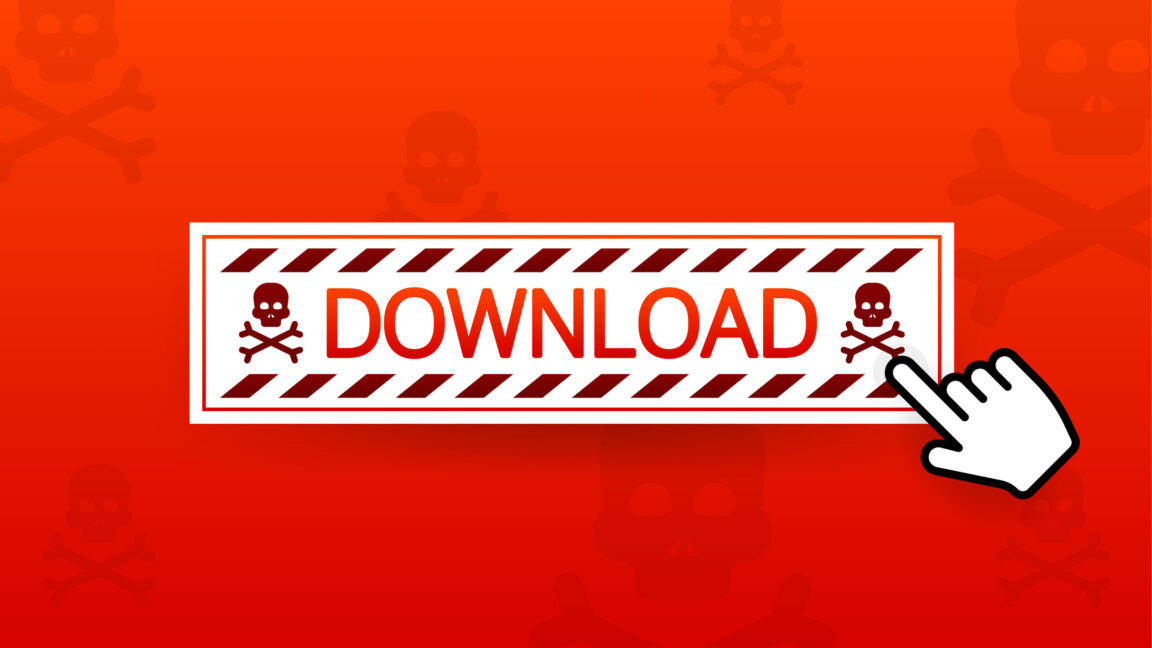
The Evolution of the Phrase “Click Here”: From Web Staple to Obsolete
The phrase “Click here” was once a cornerstone of internet navigation. It was ubiquitous across websites, often used as a direct instruction to users: simply click a link, button, or piece of text, and something new would unfold—whether it was a download, a page redirect, or a pop-up. In the early days of the internet, this phrase was essential, helping users navigate a relatively new and confusing online landscape. But today, “Click here” is seen as a relic, a remnant of simpler times that no longer meets the standards of modern web design and user expectations. In this article, we will examine how “Click here” came to prominence, why it has lost its relevance, and the evolution of web design that has led to the adoption of more sophisticated, user-centered alternatives. The Early Days of the Web: Simplicity Was Key When the World Wide Web was first introduced, it was a relatively simple space. Websites were mostly text-based, with few images, buttons, or interactive elements. People were still learning how to interact with websites, and clarity was paramount. Early websites were often designed with one thing in mind: getting users to the content they were looking for as quickly as possible. The phrase “Click here” became an easy, no-nonsense way to guide users. With limited design elements at the time, text links were the primary way of directing people to different pages or resources. In that context, it made sense to include a simple instruction—“Click here.” Users understood the action immediately, and developers could easily implement this phrase to make it clear what users should do next. The Rise of the Web and the “Click Here” Phenomenon As the internet grew in the late 1990s and early 2000s, websites became more complex. More interactive elements, including buttons, images, and forms, began to populate websites. However, the principle behind web design remained simple: users had to be told where to click to take an action. At this point, “Click here” was still one of the most effective ways to direct attention to links, and it spread rapidly across all kinds of websites. In the early 2000s, it was common to see the phrase used in abundance. Whether you were downloading a file, opening a link, or navigating through a website’s pages, “Click here” was nearly universal. Even today, it’s not uncommon to see old websites or outdated marketing campaigns that continue to rely on this simple phrase. The Downfall of “Click Here”: Why It’s No Longer Effective Despite its dominance in early web design, “Click here” has largely fallen out of favor. Several factors have contributed to its decline, primarily stemming from the evolving landscape of web design, user behavior, and technological advancements. Lack of Clarity and Context One of the most significant problems with “Click here” is that it lacks context. The phrase doesn’t tell the user what will happen if they click, nor does it offer any incentive or value proposition. For modern users, who are accustomed to a high level of sophistication in digital design, a vague instruction like “Click here” simply isn’t enough. For example, instead of a generic “Click here” link, a more effective CTA might say “Download your free eBook on SEO today” or “Get your free trial now”. This provides both the action and the expected result. Users are much more likely to engage with clear and informative CTAs that help them understand exactly what they will gain by taking action. Impact on SEO (Search Engine Optimization) Search engines, particularly Google, have become much more advanced over the years. They prioritize relevance, quality content, and user experience. The anchor text used in hyperlinks plays an essential role in SEO because it informs search engines about the content of the page being linked to. When websites use “Click here” as anchor text, it does nothing to tell search engines what the link is about. It is essentially meaningless in terms of SEO value. For example, “Click here” gives no context to the linked content, whereas anchor text like “Read about the latest digital marketing strategies” or “Discover our product catalog” is far more informative, benefiting both the user and the website’s SEO performance. The Shift to Mobile-Friendly Design As mobile internet usage has soared, website design has had to adapt. “Click here” is a phrase that simply doesn’t work well in the context of mobile-friendly design. The small screens and touch interfaces require streamlined, clear, and concise calls to action (CTAs). On a desktop, there’s more room for long, explanatory text, but on mobile devices, simplicity is key. A generic “Click here” consumes valuable space without delivering any meaningful value. Furthermore, mobile users are more likely to appreciate action-oriented CTAs that tell them exactly what they’ll get, such as “Shop Now” or “Learn More”. These clear, actionable phrases are more effective in the small, fast-paced mobile browsi
The phrase “Click here” was once a cornerstone of internet navigation. It was ubiquitous across websites, often used as a direct instruction to users: simply click a link, button, or piece of text, and something new would unfold—whether it was a download, a page redirect, or a pop-up. In the early days of the internet, this phrase was essential, helping users navigate a relatively new and confusing online landscape. But today, “Click here” is seen as a relic, a remnant of simpler times that no longer meets the standards of modern web design and user expectations.
In this article, we will examine how “Click here” came to prominence, why it has lost its relevance, and the evolution of web design that has led to the adoption of more sophisticated, user-centered alternatives.
The Early Days of the Web: Simplicity Was Key
When the World Wide Web was first introduced, it was a relatively simple space. Websites were mostly text-based, with few images, buttons, or interactive elements. People were still learning how to interact with websites, and clarity was paramount. Early websites were often designed with one thing in mind: getting users to the content they were looking for as quickly as possible.
The phrase “Click here” became an easy, no-nonsense way to guide users. With limited design elements at the time, text links were the primary way of directing people to different pages or resources. In that context, it made sense to include a simple instruction—“Click here.” Users understood the action immediately, and developers could easily implement this phrase to make it clear what users should do next.
The Rise of the Web and the “Click Here” Phenomenon
As the internet grew in the late 1990s and early 2000s, websites became more complex. More interactive elements, including buttons, images, and forms, began to populate websites. However, the principle behind web design remained simple: users had to be told where to click to take an action. At this point, “Click here” was still one of the most effective ways to direct attention to links, and it spread rapidly across all kinds of websites.
In the early 2000s, it was common to see the phrase used in abundance. Whether you were downloading a file, opening a link, or navigating through a website’s pages, “Click here” was nearly universal. Even today, it’s not uncommon to see old websites or outdated marketing campaigns that continue to rely on this simple phrase.
The Downfall of “Click Here”: Why It’s No Longer Effective
Despite its dominance in early web design, “Click here” has largely fallen out of favor. Several factors have contributed to its decline, primarily stemming from the evolving landscape of web design, user behavior, and technological advancements.
- Lack of Clarity and Context One of the most significant problems with “Click here” is that it lacks context. The phrase doesn’t tell the user what will happen if they click, nor does it offer any incentive or value proposition. For modern users, who are accustomed to a high level of sophistication in digital design, a vague instruction like “Click here” simply isn’t enough.
For example, instead of a generic “Click here” link, a more effective CTA might say “Download your free eBook on SEO today” or “Get your free trial now”. This provides both the action and the expected result. Users are much more likely to engage with clear and informative CTAs that help them understand exactly what they will gain by taking action.
- Impact on SEO (Search Engine Optimization) Search engines, particularly Google, have become much more advanced over the years. They prioritize relevance, quality content, and user experience. The anchor text used in hyperlinks plays an essential role in SEO because it informs search engines about the content of the page being linked to.
When websites use “Click here” as anchor text, it does nothing to tell search engines what the link is about. It is essentially meaningless in terms of SEO value. For example, “Click here” gives no context to the linked content, whereas anchor text like “Read about the latest digital marketing strategies” or “Discover our product catalog” is far more informative, benefiting both the user and the website’s SEO performance.
- The Shift to Mobile-Friendly Design As mobile internet usage has soared, website design has had to adapt. “Click here” is a phrase that simply doesn’t work well in the context of mobile-friendly design. The small screens and touch interfaces require streamlined, clear, and concise calls to action (CTAs).
On a desktop, there’s more room for long, explanatory text, but on mobile devices, simplicity is key. A generic “Click here” consumes valuable space without delivering any meaningful value. Furthermore, mobile users are more likely to appreciate action-oriented CTAs that tell them exactly what they’ll get, such as “Shop Now” or “Learn More”. These clear, actionable phrases are more effective in the small, fast-paced mobile browsing environment.
- The User Experience Revolution The field of User Experience (UX) has grown tremendously over the last decade. Today’s websites are designed to be as intuitive, engaging, and user-centered as possible. The focus has shifted from providing users with simple instructions to offering them seamless, rewarding experiences.
“Click here” simply doesn’t align with modern UX principles. It’s impersonal and lacks any kind of value proposition or urgency. Modern CTAs are more engaging and purposeful. For example, “Get started with a free 30-day trial”, “Join the community of 10,000+ happy customers”, or “Sign up for exclusive updates” all tell the user exactly what to expect, what benefit they’ll receive, and why they should take action.
In addition, personalization has become a key UX trend. Websites now tailor their CTAs to individual users based on their preferences, browsing history, or behavior. This type of personalized messaging is far more engaging than a generic “Click here”, which feels disconnected and irrelevant.
Modern Alternatives to “Click Here”
As “Click here” fades into the background, modern web design has adopted more user-friendly, action-oriented language. These new approaches are focused on providing context, value, and clarity, making them more effective at driving engagement. Below are some modern alternatives:
- Action-Oriented Language Today’s CTAs focus on the action the user will take and the benefit they’ll receive. Instead of “Click here”, use phrases like:
“Download the Free eBook”
“Start your free trial”
“Get started today”
These phrases clearly explain what the user will be doing and what they’ll gain from it.
- Descriptive CTAs Providing context is crucial. A well-crafted CTA lets the user know exactly what to expect when they click. For example:
“Read the full article on marketing tips”
“Explore our new product line”
These descriptions add clarity, allowing the user to make an informed decision.
- Urgency and Exclusivity Another effective approach is to create a sense of urgency or exclusivity, which motivates users to act quickly. For example:
“Limited time offer—Sign up now”
“Hurry, only 5 spots left”
“Offer expires in 24 hours—Don’t miss out”
By using urgency, you prompt users to take action without hesitation.
- Personalized CTAs As personalization continues to be a major trend in digital marketing, tailoring CTAs to individual users can significantly improve conversion rates. Some examples of personalized CTAs include:
“Welcome back, [Name]! Continue your shopping”
“Pick up where you left off”
“You might also like these products”
These personalized messages create a sense of relevance and connection, encouraging users to engage further.
Conclusion: The End of “Click Here”
The phrase “Click here” has had its moment in the sun, but it’s no longer a best practice in modern web design. As technology and user expectations have evolved, the need for more descriptive, engaging, and action-oriented CTAs has become clear. By using precise, informative language, businesses can improve user experience, drive higher engagement, and ultimately achieve better conversion rates.
While “Click here” served its purpose during the early days of the internet, it’s time to embrace more effective methods that speak directly to the needs and expectations of today’s web users.
Click Here
Click Here
Click Here
Click Here
Click Here
Click Here
Click Here
Click Here
Click Here
Click Here
Click Here
Click Here
Click Here
Click Here
Click Here
Click Here
Click Here
Click Here
Click Here
Click Here
Click Here
Click Here
Click Here
Click Here
Click Here
Click Here
Click Here
Click Here
Click Here
Click Here
Click Here
Click Here
Click Here
Click Here
Click Here
Click Here
Click Here
Click Here
Click Here
Click Here
Click Here
Click Here
Click Here
Click Here
Click Here
Click Here
Click Here
Click Here
Click Here
Click Here
Click Here
Click Here
Click Here
Click Here
Click Here
Click Here
Click Here
Click Here
Click Here
Click Here
Click Here
Click Here
Click Here
Click Here
Click Here
Click Here
Click Here
Click Here
Click Here
Click Here
Click Here
Click Here
Click Here
Click Here
Click Here
Click Here
Click Here
Click Here
Click Here
Click Here
Click Here
Click Here
Click Here
Click Here
Click Here
Click Here
Click Here
Click Here
Click Here
Click Here
Click Here
Click Here
Click Here
Click Here
Click Here
Click Here
Click Here
Click Here
Click Here
Click Here
Click Here
Click Here
Click Here
Click Here
Click Here
Click Here
Click Here
Click Here
Click Here
Click Here
Click Here
Click Here
Click Here
Click Here
Click Here
Click Here
Click Here
Click Here
Click Here
Click Here
Click Here
Click Here
Click Here
Click Here
Click Here
Click Here
Click Here
Click Here
Click Here
Click Here
Click Here
Click Here
Click Here
Click Here
Click Here
Click Here
Click Here
Click Here
Click Here
Click Here
Click Here
Click Here
Click Here
Click Here
Click Here
Click Here
Click Here
Click Here
Click Here
Click Here
Click Here
Click Here
Click Here
Click Here
Click Here
Click Here
Click Here
Click Here
Click Here
Click Here
Click Here
Click Here
Click Here
Click Here
Click Here
Click Here
Click Here
Click Here
Click Here
Click Here
Click Here
Click Here
Click Here
Click Here
Click Here
Click Here
Click Here
Click Here
Click Here
Click Here
Click Here
Click Here
Click Here
Click Here
Click Here
Click Here
Click Here
Click Here
Click Here
Click Here
Click Here
Click Here
Click Here
Click Here
Click Here
Click Here
Click Here
Click Here
Click Here
Click Here
Click Here
Click Here
Click Here