


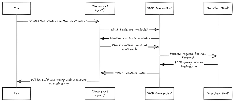
![[The AI Show Episode 143]: ChatGPT Revenue Surge, New AGI Timelines, Amazon’s AI Agent, Claude for Education, Model Context Protocol & LLMs Pass the Turing Test](https://www.marketingaiinstitute.com/hubfs/ep%20143%20cover.png)


![From Accountant to Data Engineer with Alyson La [Podcast #168]](https://cdn.hashnode.com/res/hashnode/image/upload/v1744420903260/fae4b593-d653-41eb-b70b-031591aa2f35.png?#)


.png?#)


![Apple Watch SE 2 On Sale for Just $169.97 [Deal]](https://www.iclarified.com/images/news/96996/96996/96996-640.jpg)

![Apple Posts Full First Episode of 'Your Friends & Neighbors' on YouTube [Video]](https://www.iclarified.com/images/news/96990/96990/96990-640.jpg)


The Art of Writing Reusable React Components with TypeScript (2025 Edition)
In 2025, React 19 and the latest TypeScript 5.x releases have refined how we craft applications — especially when it comes to building reusable, scalable components. Reusable components aren't just about DRY (Don't Repeat Yourself); they're about architecture, type safety, performance, and developer experience. In this guide, we'll dive deep into how senior frontend engineers approach reusable React components today, leveraging the newest patterns. Why Focus on Reusability? Before we dive into code, here’s why reusable components are critical: Scalability: Future teams can build faster without reinventing the wheel. Consistency: Enforces design systems, UX patterns, and coding standards. Maintainability: Easier to debug, enhance, and refactor across large codebases. Performance: Reusable components tend to get more optimization love. What's New in React 19 and TypeScript (2025)? ✨ React 19 Updates: New Hook (for resource loading like suspense + fetch) React Compiler (formerly React Forget): Auto-memoizes components for free Actions API (built-in server actions natively, cleaner forms) Document Metadata API (first-class SEO/head management) ✨ TypeScript 5.x+ Updates: Variadic Tuple Types (better prop typing for complex components) Satisfies Operator (guaranteed type narrowing) Const Type Parameters (preserve literal types without widening) New using keyword (for scoped resource management) How to Write Reusable Components Let’s break this down practically: ⸻ 1. Define Clear Component Boundaries Before writing a reusable component, ask yourself: What is this component responsible for? Keep it small and focused. A component should do one thing and do it well. Follow the principle: smart containers, dumb components. Example: Don't mix a Button and an API call inside the same component. ⸻ 2. Use Generics for Flexibility In TypeScript 5.4+, generics are more powerful and easier to infer. Make your components flexible using generics rather than hardcoding types. type ListProps = { items: T[]; renderItem: (item: T) => React.ReactNode; }; function List({ items, renderItem }: ListProps) { return {items.map(renderItem)}; } Now List can handle any data type safely! ⸻ 3. Strong Prop Typing with satisfies (New!) TypeScript’s satisfies operator (TS 5.x) allows extra type safety without losing flexibility. const props = { label: "Submit", onClick: () => {}, } satisfies ButtonProps; ✅ Catches missing/invalid props at compile-time. ⸻ 4. Prioritize Composition Over Configuration Instead of 10+ props to control variations, compose components. Good: Title Content Actions Bad: Small pieces > Big props explosion. ⸻ 5. Default to Accessibility (a11y) Make your component accessible by default. Use semantic HTML (button, nav, section, etc.) Provide aria-* attributes when necessary. Label controls properly. Support keyboard navigation. Good UI = Good UX = Good a11y. ⸻ 6. Use Modern Patterns (React 19 Era) React 19 introduces new patterns: useOptimistic hook for faster UI actions and forms improvements Server Components (RSC) are more stable

In 2025, React 19 and the latest TypeScript 5.x releases have refined how we craft applications — especially when it comes to building reusable, scalable components.
Reusable components aren't just about DRY (Don't Repeat Yourself); they're about architecture, type safety, performance, and developer experience. In this guide, we'll dive deep into how senior frontend engineers approach reusable React components today, leveraging the newest patterns.
Why Focus on Reusability?
Before we dive into code, here’s why reusable components are critical:
- Scalability: Future teams can build faster without reinventing the wheel.
- Consistency: Enforces design systems, UX patterns, and coding standards.
- Maintainability: Easier to debug, enhance, and refactor across large codebases.
- Performance: Reusable components tend to get more optimization love.
What's New in React 19 and TypeScript (2025)?
✨ React 19 Updates:
-
New
Hook (for resource loading like suspense + fetch) - React Compiler (formerly React Forget): Auto-memoizes components for free
- Actions API (built-in server actions natively, cleaner forms)
- Document Metadata API (first-class SEO/head management)
✨ TypeScript 5.x+ Updates:
- Variadic Tuple Types (better prop typing for complex components)
- Satisfies Operator (guaranteed type narrowing)
- Const Type Parameters (preserve literal types without widening)
-
New
usingkeyword (for scoped resource management)
How to Write Reusable Components
Let’s break this down practically:
⸻
1. Define Clear Component Boundaries
Before writing a reusable component, ask yourself: What is this component responsible for?
- Keep it small and focused.
- A component should do one thing and do it well.
- Follow the principle: smart containers, dumb components.
Example: Don't mix a Button and an API call inside the same component.
⸻
2. Use Generics for Flexibility
In TypeScript 5.4+, generics are more powerful and easier to infer.
Make your components flexible using generics rather than hardcoding types.
type ListProps<T> = {
  items: T[];
  renderItem: (item: T) => React.ReactNode;
};

function List<T>({ items, renderItem }: ListProps<T>) {
  return <ul>{items.map(renderItem)}ul>;
}
Now List can handle any data type safely!
⸻
3. Strong Prop Typing with satisfies (New!)
TypeScript’s satisfies operator (TS 5.x) allows extra type safety without losing flexibility.
const props = {
  label: "Submit",
  onClick: () => {},
} satisfies ButtonProps;
✅ Catches missing/invalid props at compile-time.
⸻
4. Prioritize Composition Over Configuration
Instead of 10+ props to control variations, compose components.
Good:
<Card>
  <CardHeader>TitleCardHeader>
  <CardBody>ContentCardBody>
  <CardFooter>ActionsCardFooter>
Card>
Bad:
<Card title="Title" body="Content" footer="Actions" footerPosition="right" bordered shadow variant="primary" ... />
Small pieces > Big props explosion.
⸻
5. Default to Accessibility (a11y)
Make your component accessible by default.
- Use semantic HTML (
button,nav,section, etc.) - Provide
aria-*attributes when necessary. - Label controls properly.
- Support keyboard navigation.
Good UI = Good UX = Good a11y.
⸻
6. Use Modern Patterns (React 19 Era)
React 19 introduces new patterns:
-
useOptimistichook for faster UI -
actionsandformsimprovements - Server Components (RSC) are more stable