


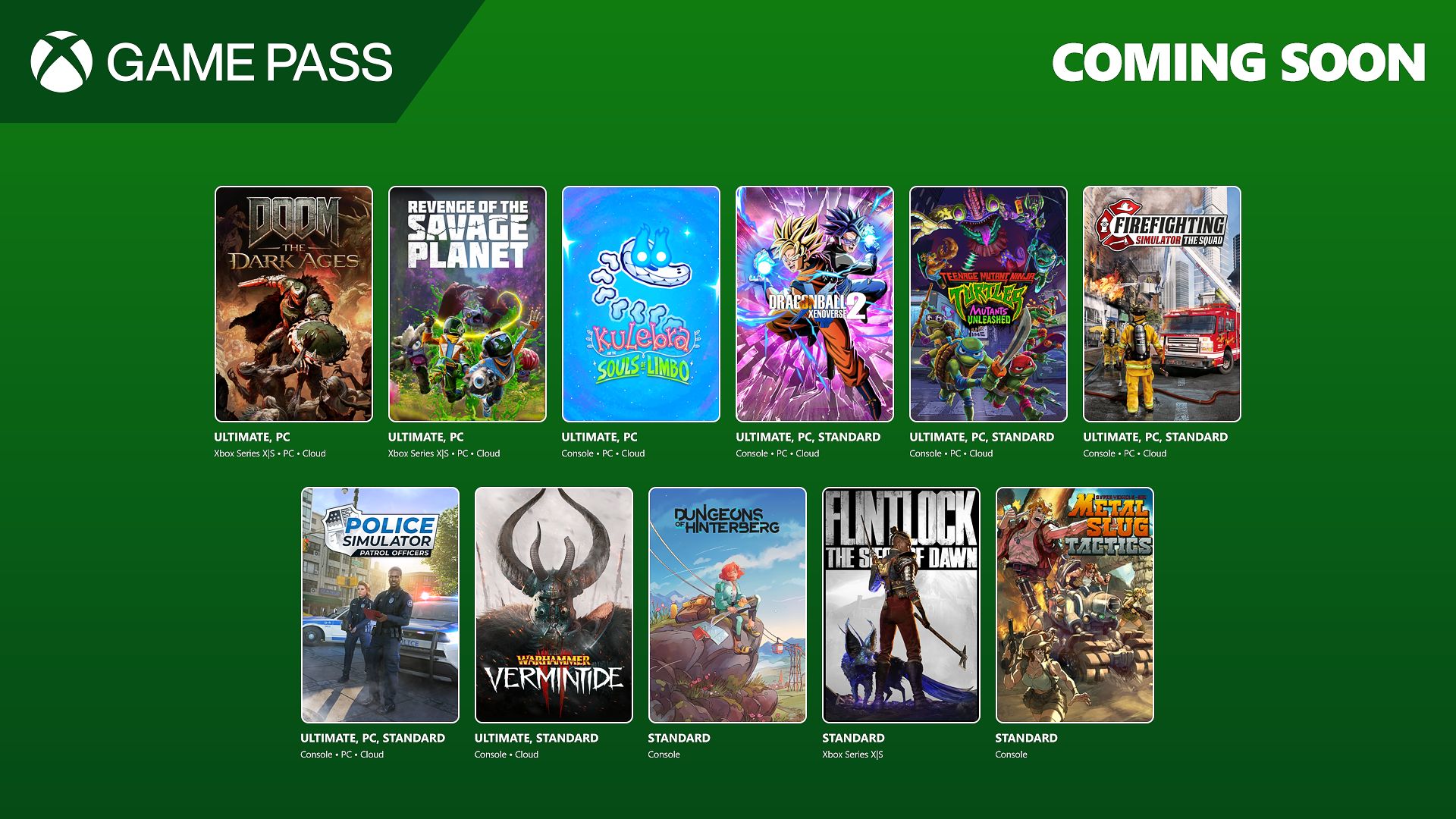
![[The AI Show Episode 146]: Rise of “AI-First” Companies, AI Job Disruption, GPT-4o Update Gets Rolled Back, How Big Consulting Firms Use AI, and Meta AI App](https://www.marketingaiinstitute.com/hubfs/ep%20146%20cover.png)


.jpg?#)


_Wavebreakmedia_Ltd_IFE-240611_Alamy.jpg?width=1280&auto=webp&quality=80&disable=upscale#)

_Alexey_Kotelnikov_Alamy.jpg?width=1280&auto=webp&quality=80&disable=upscale#)
_Brian_Jackson_Alamy.jpg?width=1280&auto=webp&quality=80&disable=upscale#)


![Netflix Unveils Redesigned TV Interface With Smarter Recommendations [Video]](https://www.iclarified.com/images/news/97249/97249/97249-640.jpg)


![Apple Seeds visionOS 2.5 RC to Developers [Download]](https://www.iclarified.com/images/news/97240/97240/97240-640.jpg)


Layering SVG Filters for Complex Visual Effects
SVG filters can be combined to build stunning, layered compositions — all using native filter primitives. Whether you're designing glowing UIs, abstract art, or interactive visuals, layering gives you the flexibility to create depth and motion without leaving your code editor. Step 1: Understanding Filter Layering To layer filters, you combine multiple primitives and chain their results using the result attribute. Here's a basic example that combines blur, color, and light: This applies a blur, shifts it slightly, and merges it with the original graphic to create a glow-like depth. Step 2: Apply the Filter to an Element You can use this on HTML elements via CSS, or inline within an SVG: Layered FX .layered-box { background: #0ea5e9; color: white; padding: 2rem 3rem; font-size: 1.5rem; display: inline-block; filter: url(#layered-effect); } Try adjusting the dx, dy, and stdDeviation values to get different looks — like shadow glows, neon strokes, or glassy overlays. Step 3: Add Interaction or Motion Want a hover effect that intensifies the blur? Use a second filter or animate the values with CSS or JavaScript: .layered-box:hover { filter: url(#layered-effect); transform: scale(1.05); transition: all 0.3s ease; } SVG filters layer beautifully on top of motion and scale effects. ✅ Pros and ❌ Cons of Filter Layering ✅ Pros:

SVG filters can be combined to build stunning, layered compositions — all using native filter primitives. Whether you're designing glowing UIs, abstract art, or interactive visuals, layering gives you the flexibility to create depth and motion without leaving your code editor.
Step 1: Understanding Filter Layering
To layer filters, you combine multiple primitives and chain their results using the result attribute. Here's a basic example that combines blur, color, and light:
This applies a blur, shifts it slightly, and merges it with the original graphic to create a glow-like depth.
Step 2: Apply the Filter to an Element
You can use this on HTML elements via CSS, or inline within an SVG:
Layered FX
Try adjusting the dx, dy, and stdDeviation values to get different looks — like shadow glows, neon strokes, or glassy overlays.
Step 3: Add Interaction or Motion
Want a hover effect that intensifies the blur? Use a second filter or animate the values with CSS or JavaScript:
.layered-box:hover {
  filter: url(#layered-effect);
  transform: scale(1.05);
  transition: all 0.3s ease;
}
SVG filters layer beautifully on top of motion and scale effects.
✅ Pros and ❌ Cons of Filter Layering
✅ Pros:
![[Research] Starting Web App in 2025: Vibe-coding, AI Agents….](https://media2.dev.to/dynamic/image/width%3D1000,height%3D500,fit%3Dcover,gravity%3Dauto,format%3Dauto/https:%2F%2Fdev-to-uploads.s3.amazonaws.com%2Fuploads%2Farticles%2Fby8z0auultdpyfrx5tx8.png)