


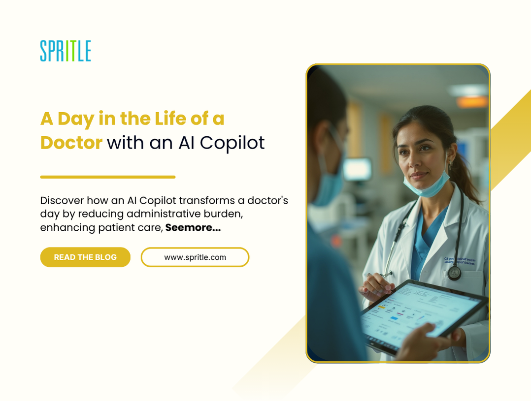


![How to Build an AI Assistant with Keith Moehring [MAICON 2025 Speaker Series]](https://www.marketingaiinstitute.com/hubfs/MAICON-Speaker_Series%20%281%29.png)
![[The AI Show Episode 156]: AI Answers - Data Privacy, AI Roadmaps, Regulated Industries, Selling AI to the C-Suite & Change Management](https://www.marketingaiinstitute.com/hubfs/ep%20156%20cover.png)
![[The AI Show Episode 155]: The New Jobs AI Will Create, Amazon CEO: AI Will Cut Jobs, Your Brain on ChatGPT, Possible OpenAI-Microsoft Breakup & Veo 3 IP Issues](https://www.marketingaiinstitute.com/hubfs/ep%20155%20cover.png)


.jpg?width=1920&height=1920&fit=bounds&quality=70&format=jpg&auto=webp#)


_Michael_Burrell_Alamy.jpg?width=1280&auto=webp&quality=80&disable=upscale#)


Implementing Responsive Tab Bar in HarmonyOS Next
Implementing Responsive Tab Bar in HarmonyOS Next 1. Window Breakpoint Detection ```typescript // Update breakpoint based on current window dimensions private updateBreakpoint(windowWidth: number): void { try { // Convert px to vp (virtual pixels) const windowWidthVp = windowWidth / display.getDefaultDisplaySync().densityPixels; console.log('Calculated windowWidthVp', windowWidthVp); let newBp: string = ''; // Determine breakpoint based on width if (windowWidthVp < 600) { newBp = 'sm'; // Small screens (phones) } else if (windowWidthVp < 840) { newBp = 'md'; // Medium screens (tablets) } else { newBp = 'lg'; // Large screens (desktops/large tablets) } // Update global breakpoint state if changed if (this.curBp !== newBp) { this.curBp = newBp; AppStorage.setOrCreate('currentBreakpoint', this.curBp); } } catch (err) { console.error("Display sync failed: " + err.code); } } ``` 2. Breakpoint Utility Class ```typescript interface BreakPointTypeOption { sm?: T; // Small screen configuration md?: T; // Medium screen configuration lg?: T; // Large screen configuration } /** * Media Query Utility * Core of responsive design implementation */ export class BreakPointType { options: BreakPointTypeOption; constructor(option: BreakPointTypeOption) { this.options = option; } // Get value for current breakpoint getValue(currentBreakPoint: string): T { return this.options[currentBreakPoint] as T; } } ``` 3. Responsive Tab Bar Implementation ```typescript Tabs({ // Position tab bar based on device size: // - Phones (sm/md): Bottom (BarPosition.End) // - Tablets (lg): Left side (BarPosition.Start) barPosition: new BreakPointType({ sm: BarPosition.End, md: BarPosition.End, lg: BarPosition.Start }).getValue(this.currentBreakpoint), index: 0, controller: this.controller }) { ForEach(tabbarList, (item: TabbarItem, index) => { TabContent() { // Conditional content rendering if (Utils.isSoutiXiaApp()) { this.questionsTabContent(index); // Specialized content } else { this.defaultTabContent(index); // Default content } }.tabBar(this.TabBuilder(index)) // Custom tab builder }) } .scrollable(false) .backgroundColor($r('app.color.mainBgColor')) // Responsive layout properties: .vertical( new BreakPointType({ sm: false, md: false, lg: true // Vertical only on large screens }).getValue(this.currentBreakpoint) ) .barWidth( new BreakPointType({ sm: '100%', md: '100%', lg: Utils.getVp(94) // Fixed width on tablets }).getValue(this.currentBreakpoint) ) .barHeight( new BreakPointType({ sm: Utils.getVp(94), // Fixed height on phones md: Utils.getVp(94), lg: '100%' // Full height on tablets }).getValue(this.currentBreakpoint) ) ``` Responsive Behavior Summary | Property | Phones (sm/md) | Tablets (lg) | |----------------|----------------------------|----------------------------| | Position | Bottom (BarPosition.End) | Left (BarPosition.Start) | | Orientation| Horizontal (vertical=false)| Vertical (vertical=true) | | Width | 100% (full width) | 94vp (fixed width) | | Height | 94vp (fixed height) | 100% (full height) | Key Implementation Details Adaptive Positioning: Mobile devices: Tab bar at bottom for thumb accessibility Tablets: Tab bar on left for efficient screen space usage Orientation Control: Horizontal layout for phones (limited width) Vertical layout for tablets (utilizes available height) Dimension Management: Fixed height (94vp) on phones for consistent UI Full height on tablets to maximize content area Responsive width adjustments based on device Content Flexibility: Conditional rendering for different app versions Custom tab builder for specialized UI elements Consistent background color across devices Utility Integration: Uses Utils.getVp() for responsive unit conversion Leverages BreakPointType for clean conditional logic Accesses global breakpoint state via currentBreakpoint This implementation provides a complete responsive tab bar solution that automatically adapts to different device sizes, optimizing the user experience across phones and tablets in HarmonyOS Next applications.

Implementing Responsive Tab Bar in HarmonyOS Next
1. Window Breakpoint Detection
```typescript
// Update breakpoint based on current window dimensions
private updateBreakpoint(windowWidth: number): void {
  try {
    // Convert px to vp (virtual pixels)
    const windowWidthVp = windowWidth / display.getDefaultDisplaySync().densityPixels;

    console.log('Calculated windowWidthVp', windowWidthVp);
    let newBp: string = '';

    // Determine breakpoint based on width
    if (windowWidthVp < 600) {
      newBp = 'sm'; // Small screens (phones)
    } else if (windowWidthVp < 840) {
      newBp = 'md'; // Medium screens (tablets)
    } else {
      newBp = 'lg'; // Large screens (desktops/large tablets)
    }

    // Update global breakpoint state if changed
    if (this.curBp !== newBp) {
      this.curBp = newBp;
      AppStorage.setOrCreate('currentBreakpoint', this.curBp);
    }
  } catch (err) {
    console.error("Display sync failed: " + err.code);
  }
}
```
2. Breakpoint Utility Class
```typescript
interface BreakPointTypeOption {
  sm?: T; // Small screen configuration
  md?: T; // Medium screen configuration
  lg?: T; // Large screen configuration
}

/**
 * Media Query Utility
 * Core of responsive design implementation
 */
export class BreakPointType {
  options: BreakPointTypeOption;

  constructor(option: BreakPointTypeOption) {
    this.options = option;
  }

  // Get value for current breakpoint
  getValue(currentBreakPoint: string): T {
    return this.options[currentBreakPoint] as T;
  }
}
```
3. Responsive Tab Bar Implementation
```typescript
Tabs({
  // Position tab bar based on device size:
  // - Phones (sm/md): Bottom (BarPosition.End)
  // - Tablets (lg): Left side (BarPosition.Start)
  barPosition: new BreakPointType({
    sm: BarPosition.End,
    md: BarPosition.End,
    lg: BarPosition.Start
  }).getValue(this.currentBreakpoint),

  index: 0,
  controller: this.controller
}) {
  ForEach(tabbarList, (item: TabbarItem, index) => {
    TabContent() {
      // Conditional content rendering
      if (Utils.isSoutiXiaApp()) {
        this.questionsTabContent(index); // Specialized content
      } else {
        this.defaultTabContent(index);   // Default content
      }
    }.tabBar(this.TabBuilder(index)) // Custom tab builder
  })
}
.scrollable(false)
.backgroundColor($r('app.color.mainBgColor'))

// Responsive layout properties:
.vertical(
  new BreakPointType({
    sm: false,
    md: false,
    lg: true  // Vertical only on large screens
  }).getValue(this.currentBreakpoint)
)
.barWidth(
  new BreakPointType({
    sm: '100%',
    md: '100%',
    lg: Utils.getVp(94) // Fixed width on tablets
  }).getValue(this.currentBreakpoint)
)
.barHeight(
  new BreakPointType({
    sm: Utils.getVp(94), // Fixed height on phones
    md: Utils.getVp(94),
    lg: '100%'           // Full height on tablets
  }).getValue(this.currentBreakpoint)
)
```
Responsive Behavior Summary
| Property       | Phones (sm/md)             | Tablets (lg)               |

|----------------|----------------------------|----------------------------|

| Position   | Bottom (BarPosition.End)   | Left (BarPosition.Start)   |

| Orientation| Horizontal (vertical=false)| Vertical (vertical=true)   |

| Width      | 100% (full width)          | 94vp (fixed width)         |

| Height     | 94vp (fixed height)        | 100% (full height)         |
Key Implementation Details
-
Adaptive Positioning:
- Mobile devices: Tab bar at bottom for thumb accessibility
- Tablets: Tab bar on left for efficient screen space usage
-
Orientation Control:
- Horizontal layout for phones (limited width)
- Vertical layout for tablets (utilizes available height)
-
Dimension Management:
- Fixed height (94vp) on phones for consistent UI
- Full height on tablets to maximize content area
- Responsive width adjustments based on device
-
Content Flexibility:
- Conditional rendering for different app versions
- Custom tab builder for specialized UI elements
- Consistent background color across devices
-
Utility Integration:
- Uses
Utils.getVp()for responsive unit conversion - Leverages
BreakPointTypefor clean conditional logic - Accesses global breakpoint state via
currentBreakpoint
- Uses
This implementation provides a complete responsive tab bar solution that automatically adapts to different device sizes, optimizing the user experience across phones and tablets in HarmonyOS Next applications.


