


![[The AI Show Episode 146]: Rise of “AI-First” Companies, AI Job Disruption, GPT-4o Update Gets Rolled Back, How Big Consulting Firms Use AI, and Meta AI App](https://www.marketingaiinstitute.com/hubfs/ep%20146%20cover.png)


![Ditching a Microsoft Job to Enter Startup Purgatory with Lonewolf Engineer Sam Crombie [Podcast #171]](https://cdn.hashnode.com/res/hashnode/image/upload/v1746753508177/0cd57f66-fdb0-4972-b285-1443a7db39fc.png?#)


.jpg?width=1920&height=1920&fit=bounds&quality=70&format=jpg&auto=webp#)


![[Exclusive] Infinix GT DynaVue: a Prototype that could change everything!](https://www.gizchina.com/wp-content/uploads/images/2025/05/Screen-Shot-2025-05-10-at-16.07.40-PM-copy.png)


-xl.jpg)


![New iPad 11 (A16) On Sale for Just $277.78! [Lowest Price Ever]](https://www.iclarified.com/images/news/97273/97273/97273-640.jpg)

![Apple Foldable iPhone to Feature New Display Tech, 19% Thinner Panel [Rumor]](https://www.iclarified.com/images/news/97271/97271/97271-640.jpg)


How to Create a Choropleth Map in Python Using Altair?
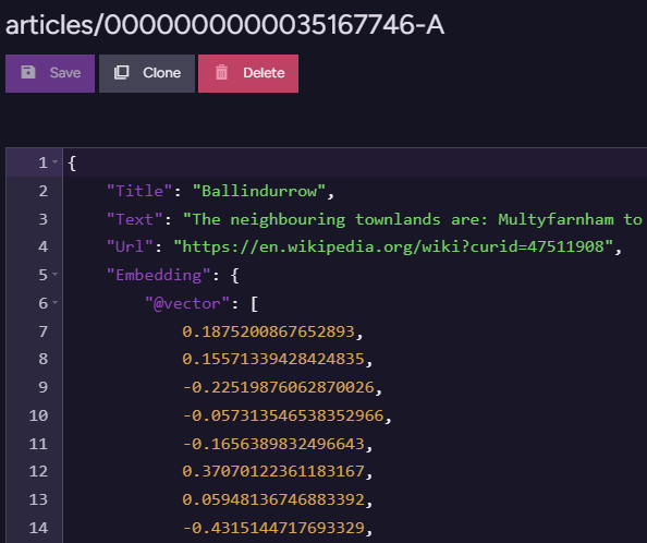
Creating a choropleth map in Python can be a powerful way to visualize geographical data. If you are downloading datasets for UK areas from different sources and using Altair to display this data, you may encounter issues or need clarification on how to correctly implement your code. In this article, we will explore how to create a choropleth map using the UK geographical data sourced from a GeoJSON file. We'll address common coding mistakes and provide detailed steps to ensure you're on the right track. Understanding Choropleth Maps A choropleth map is a visual representation of data in the form of a map where areas are shaded in relation to a variable. For instance, if you're visualizing population density across UK areas, different shades can reflect varying population densities. Altair is an excellent library for this type of visualization due to its declarative syntax, making it intuitive for users. The Code Breakdown You’ve provided the following code snippet, which is the starting point for creating your choropleth map: _map = alt.Chart(geo_uk, title='UK Map').mark_geoshape().encode().properties(width=500,height=300) Key Components of the Code alt.Chart(): Initializes a chart using your geographical data across UK areas. mark_geoshape(): This method is crucial as it tells Altair to render the map as a geoshape, which is typically used for geographical data. encode(): While you haven't specified any encodings yet, this method is used to map variables in the dataset to visual properties (like color or opacity). properties(): Sets the dimensions of the chart, where width and height are adjustable depending on your layout needs. Common Mistakes to Avoid If you’re getting unexpected results from the map or if it's not displaying as expected, consider the following common pitfalls: Incorrect Data Format: Ensure that the GeoJSON file you’re using is valid and correctly formatted for Altair. Run the data through a validator or check it in a GIS viewer. Missing Encodings: Without specifying encodings, your map may not reflect the variations in data. Using .encode() correctly is the key to representing your dataset’s characteristics visually. Step-by-Step Implementation Let's dive into a more detailed implementation. Step 1: Import the Necessary Libraries Before anything, make sure you have Altair and the libraries necessary for handling your data: import altair as alt import pandas as pd import geopandas as gpd Step 2: Load Your GeoJSON Data You need to load your UK geographical data from the GeoJSON link provided: geo_uk = gpd.read_file('https://opendata.arcgis.com/datasets/b7fc294e5c8643f5b506acc2122c6880_0.geojson') Step 3: Prepare Your Data Assuming you also have some data on UK areas you want to visualize, you need a DataFrame that includes your area identifiers and values to encode: data = {'area': ['Area1', 'Area2', 'Area3'], 'value': [10, 20, 30]} value_data = pd.DataFrame(data) Step 4: Merge Geo Data with Your Values You need to ensure that the geographical data and your values are aligned correctly: merged_data = geo_uk.merge(value_data, left_on='area_key', right_on='area', how='left') Step 5: Create the Choropleth Map Now that your data is prepared, you can create the choropleth map: _map = alt.Chart(merged_data, title='UK Population Density').mark_geoshape().encode( color='value:Q' # Quantitative value for color encoding ).properties(width=500,height=300) Step 6: Display the Map Finally, to see the choropleth map, use: _map Frequently Asked Questions (FAQ) Q: What should I do if the map doesn't display? A: Make sure your environment supports rendering Altair charts, and check your dataset for any inconsistencies. Q: Can I customize the color palette? A: Yes, you can use the scale parameter within the encode method to specify your desired color scheme. Q: Is there a way to add interactivity? A: Absolutely! You can implement tooltips and selection features using additional Altair methods to make your visualization more engaging. Conclusion Creating a choropleth map with Altair using UK area datasets can enhance your data visualization capabilities significantly. By ensuring you correctly encode your data and understand how to manipulate GeoJSON files, you will produce meaningful, visually appealing maps. Don't hesitate to explore other properties and encodings within Altair to take your visualizations to the next level!

Creating a choropleth map in Python can be a powerful way to visualize geographical data. If you are downloading datasets for UK areas from different sources and using Altair to display this data, you may encounter issues or need clarification on how to correctly implement your code. In this article, we will explore how to create a choropleth map using the UK geographical data sourced from a GeoJSON file. We'll address common coding mistakes and provide detailed steps to ensure you're on the right track.
Understanding Choropleth Maps
A choropleth map is a visual representation of data in the form of a map where areas are shaded in relation to a variable. For instance, if you're visualizing population density across UK areas, different shades can reflect varying population densities. Altair is an excellent library for this type of visualization due to its declarative syntax, making it intuitive for users.
The Code Breakdown
You’ve provided the following code snippet, which is the starting point for creating your choropleth map:
_map = alt.Chart(geo_uk, title='UK Map').mark_geoshape().encode().properties(width=500,height=300)
Key Components of the Code
- alt.Chart(): Initializes a chart using your geographical data across UK areas.
- mark_geoshape(): This method is crucial as it tells Altair to render the map as a geoshape, which is typically used for geographical data.
- encode(): While you haven't specified any encodings yet, this method is used to map variables in the dataset to visual properties (like color or opacity).
- properties(): Sets the dimensions of the chart, where width and height are adjustable depending on your layout needs.
Common Mistakes to Avoid
If you’re getting unexpected results from the map or if it's not displaying as expected, consider the following common pitfalls:
- Incorrect Data Format: Ensure that the GeoJSON file you’re using is valid and correctly formatted for Altair. Run the data through a validator or check it in a GIS viewer.
-
Missing Encodings: Without specifying encodings, your map may not reflect the variations in data. Using
.encode()correctly is the key to representing your dataset’s characteristics visually.
Step-by-Step Implementation
Let's dive into a more detailed implementation.
Step 1: Import the Necessary Libraries
Before anything, make sure you have Altair and the libraries necessary for handling your data:
import altair as alt
import pandas as pd
import geopandas as gpd
Step 2: Load Your GeoJSON Data
You need to load your UK geographical data from the GeoJSON link provided:
geo_uk = gpd.read_file('https://opendata.arcgis.com/datasets/b7fc294e5c8643f5b506acc2122c6880_0.geojson')
Step 3: Prepare Your Data
Assuming you also have some data on UK areas you want to visualize, you need a DataFrame that includes your area identifiers and values to encode:
data = {'area': ['Area1', 'Area2', 'Area3'], 'value': [10, 20, 30]}
value_data = pd.DataFrame(data)
Step 4: Merge Geo Data with Your Values
You need to ensure that the geographical data and your values are aligned correctly:
merged_data = geo_uk.merge(value_data, left_on='area_key', right_on='area', how='left')
Step 5: Create the Choropleth Map
Now that your data is prepared, you can create the choropleth map:
_map = alt.Chart(merged_data, title='UK Population Density').mark_geoshape().encode(
    color='value:Q'  # Quantitative value for color encoding
).properties(width=500,height=300)
Step 6: Display the Map
Finally, to see the choropleth map, use:
_map
Frequently Asked Questions (FAQ)
Q: What should I do if the map doesn't display?
A: Make sure your environment supports rendering Altair charts, and check your dataset for any inconsistencies.
Q: Can I customize the color palette?
A: Yes, you can use the scale parameter within the encode method to specify your desired color scheme.
Q: Is there a way to add interactivity?
A: Absolutely! You can implement tooltips and selection features using additional Altair methods to make your visualization more engaging.
Conclusion
Creating a choropleth map with Altair using UK area datasets can enhance your data visualization capabilities significantly. By ensuring you correctly encode your data and understand how to manipulate GeoJSON files, you will produce meaningful, visually appealing maps. Don't hesitate to explore other properties and encodings within Altair to take your visualizations to the next level!