


![[The AI Show Episode 146]: Rise of “AI-First” Companies, AI Job Disruption, GPT-4o Update Gets Rolled Back, How Big Consulting Firms Use AI, and Meta AI App](https://www.marketingaiinstitute.com/hubfs/ep%20146%20cover.png)


![[FREE EBOOKS] Offensive Security Using Python, Learn Computer Forensics — 2nd edition & Four More Best Selling Titles](https://www.javacodegeeks.com/wp-content/uploads/2012/12/jcg-logo.jpg)

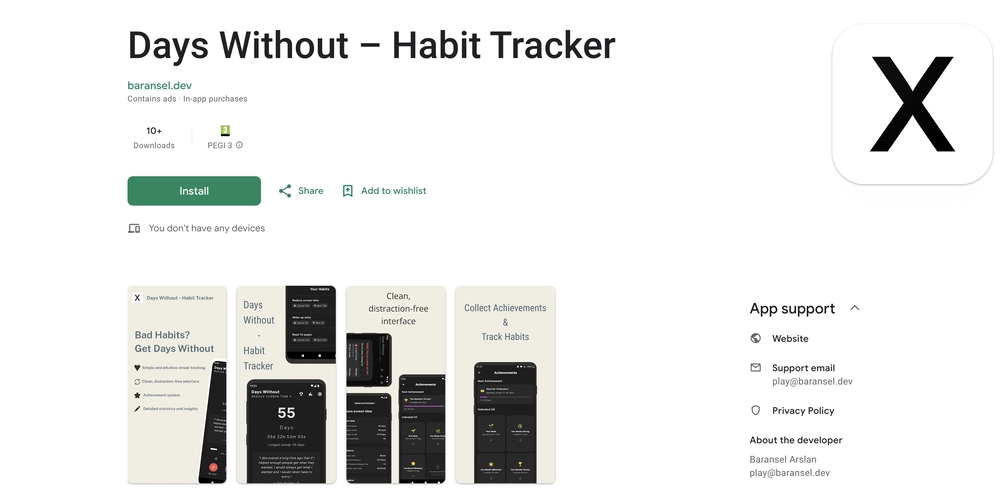
![Ditching a Microsoft Job to Enter Startup Purgatory with Lonewolf Engineer Sam Crombie [Podcast #171]](https://cdn.hashnode.com/res/hashnode/image/upload/v1746753508177/0cd57f66-fdb0-4972-b285-1443a7db39fc.png?#)


.jpg?width=1920&height=1920&fit=bounds&quality=70&format=jpg&auto=webp#)


-xl.jpg)


![Beats Studio Buds + On Sale for $99.95 [Lowest Price Ever]](https://www.iclarified.com/images/news/96983/96983/96983-640.jpg)

![New iPad 11 (A16) On Sale for Just $277.78! [Lowest Price Ever]](https://www.iclarified.com/images/news/97273/97273/97273-640.jpg)


![Apple's 11th Gen iPad Drops to New Low Price of $277.78 on Amazon [Updated]](https://images.macrumors.com/t/yQCVe42SNCzUyF04yj1XYLHG5FM=/2500x/article-new/2025/03/11th-gen-ipad-orange.jpeg)


![[Exclusive] Infinix GT DynaVue: a Prototype that could change everything!](https://www.gizchina.com/wp-content/uploads/images/2025/05/Screen-Shot-2025-05-10-at-16.07.40-PM-copy.png)


![T-Mobile discontinues a free number feature but a paid alternative exists [UPDATED]](https://m-cdn.phonearena.com/images/article/170235-two/T-Mobile-discontinues-a-free-number-feature-but-a-paid-alternative-exists-UPDATED.jpg?#)


Building a Reusable Table Component in Angular
In this article, we'll create a flexible and reusable table component in Angular that supports dynamic columns, data binding, and custom actions. Table will support sorting, filtering and can be extended to support other features. Let's break it down step by step. What will we do in this article? Basic Table Structure without Actions Extend component to support actions Enable component to enable/disable actions based on table data row Extend component to support sorting Prerequisites Before we begin, ensure you have an Angular project set up. If not, follow these commands to create a new Angular project: npm install -g @angular/cli ng new my-app cd my-app ng serve --open Once your Angular application is set up, you’re ready to proceed. Step 1. Basic Table Structure without Actions Let's start with creating a basic table structure: 1. First, define the interfaces export interface IColumnDef { headerText: string; // Column header text field?: keyof T; // Property name from data object } export interface IUser { // Sample data interface name: string; email: string; role: string; status: string; } 2. Create column definitions in constants file import { IColumnDef, IUser } from '../models/general.models'; export const COLUMN_DEFINITIONS: IColumnDef[] = [ { headerText: 'Name', field: 'name' }, { headerText: 'Email', field: 'email' }, { headerText: 'Role', field: 'role' } ]; As we have defined field property in IColumnDef as keyOf T, it will give an error while defining column definitions in case field property is not from data object, in this case it's IUser. Step 2: Create and use the Table Component Generate a new table component: ng generate component components/table Define the Component Class (table.component.ts): import { Component, input, output } from '@angular/core'; @Component({ selector: 'app-table', standalone: true, imports: [], templateUrl: './table.component.html', styleUrl: './table.component.scss' }) export class TableComponent { // Input signals for columns and data columns = input([]); tableData = input([]); } Define basic table component HTML @for(col of columns(); track col){ {{col.headerText}} } @if(tableData().length >= 0){ @for(data of tableData(); track data){ @for(col of columns(); track col){ @if(col.field){ {{data[col.field]}} } } } } Use the table component, Ex. using in app.component.ts Add app-table to HTML Define columns and Data in .ts file columns= COLUMN_DEFINITIONS; tableData:IUser[] = [ {name: 'Kapil', email:'kapilkumar0037@gmail.com', role:'admin', status:'active'}, {name: 'Kapil1', email:'kapilkumar0038@gmail.com', role:'admin', status:'active'}, ]; That's it. basic table is ready with 3 columns. Now display status column as well in the table, to do that we just need to add one more column in column definitions and import { IColumnDef, IUser } from '../models/general.models'; export const COLUMN_DEFINITIONS: IColumnDef[] = [ { headerText: 'Name', field: 'name' }, { headerText: 'Email', field: 'email' }, { headerText: 'Role', field: 'role' }, { headerText: 'Status', field: 'status' } ]; As status is already there in data, it will be displayed in the table. Next Step: Add actions to the table 1. Update IColumnDef interface export interface IColumnDef { headerText: string; field?: keyof T; columnType?: string; actions?: IActions[]; } export interface IActions { label: string; icon: string; tooltip: string; } 2. Update COLUMNN Definitions constants import { IColumnDef, IUser } from "../models/general.models"; export const COLUMN_DEFINITIONS: IColumnDef[] = [ { headerText: "Name", field: "name", sortable: true }, { headerText: "Email", field: "email" }, { headerText: "Role", field: "role" }, { headerText: "Status", field: "status" }, { headerText: "Action", columnType: "action", actions: [ { label: "Edit", icon: "pi pi-pencil", tooltip: "Edit", }, { label: "Delete", icon: "pi pi-trash", tooltip: "Delete", } ] }, ] 3. Update table component .ts file to handle action click actionClickEmit = output(); actionClick(action: IActions, rowData: T) { this.actionClickEmit.emit({action, rowData}); } 4. Update table component .html file to display ac

In this article, we'll create a flexible and reusable table component in Angular that supports dynamic columns, data binding, and custom actions. Table will support sorting, filtering and can be extended to support other features. Let's break it down step by step.
What will we do in this article?
- Basic Table Structure without Actions
- Extend component to support actions
- Enable component to enable/disable actions based on table data row
- Extend component to support sorting
Prerequisites
Before we begin, ensure you have an Angular project set up. If not, follow these commands to create a new Angular project:
npm install -g @angular/cli
ng new my-app
cd my-app
ng serve --open
Once your Angular application is set up, you’re ready to proceed.
Step 1. Basic Table Structure without Actions
Let's start with creating a basic table structure:
1. First, define the interfaces
export interface IColumnDef {
    headerText: string;     // Column header text
    field?: keyof T;       // Property name from data object
}

export interface IUser {    // Sample data interface
    name: string;
    email: string;
    role: string;
    status: string;
}
2. Create column definitions in constants file
import { IColumnDef, IUser } from '../models/general.models';

export const COLUMN_DEFINITIONS: IColumnDef[] = [
    { headerText: 'Name', field: 'name' },
    { headerText: 'Email', field: 'email' },
    { headerText: 'Role', field: 'role' }
];
As we have defined field property in IColumnDef as keyOf T, it will give an error while defining column definitions in case field property is not from data object, in this case it's IUser.
Step 2: Create and use the Table Component
Generate a new table component:
ng generate component components/table
Define the Component Class (table.component.ts):
import { Component, input, output } from '@angular/core';

@Component({
  selector: 'app-table',
  standalone: true,
  imports: [],
  templateUrl: './table.component.html',
  styleUrl: './table.component.scss'
})
export class TableComponent {
  // Input signals for columns and data
  columns = input[]>([]);
  tableData = input([]);

}
Define basic table component HTML
            @for(col of columns(); track col){
                {{col.headerText}}
            }


        @if(tableData().length >= 0){
            @for(data of tableData(); track data){

                    @for(col of columns(); track col){
                        @if(col.field){
                            {{data[col.field]}}
                        }
                    }

            }
        }
Use the table component, Ex. using in app.component.ts
Add app-table to HTML
Define columns and Data in .ts file
 columns= COLUMN_DEFINITIONS;
  tableData:IUser[] = [
    {name: 'Kapil', email:'kapilkumar0037@gmail.com', role:'admin', status:'active'},
    {name: 'Kapil1', email:'kapilkumar0038@gmail.com', role:'admin', status:'active'},

];
That's it. basic table is ready with 3 columns.
Now display status column as well in the table, to do that we just need to add one more column in column definitions and
import { IColumnDef, IUser } from '../models/general.models';

export const COLUMN_DEFINITIONS: IColumnDef[] = [
    { headerText: 'Name', field: 'name' },
    { headerText: 'Email', field: 'email' },
    { headerText: 'Role', field: 'role' },
    { headerText: 'Status', field: 'status' }
];
As status is already there in data, it will be displayed in the table.
Next Step: Add actions to the table
1. Update IColumnDef interface
export interface IColumnDef {
    headerText: string;
    field?: keyof T;
    columnType?: string;
    actions?: IActions[];
}

export interface IActions {
    label: string;
    icon: string;
    tooltip: string;
}
2. Update COLUMNN Definitions constants
import { IColumnDef, IUser } from "../models/general.models";

export const COLUMN_DEFINITIONS: IColumnDef[] = [
    {
        headerText: "Name",
        field: "name",
        sortable: true
    },
    {
        headerText: "Email",
        field: "email"
    },
    {
        headerText: "Role",
        field: "role"
    },
    {
        headerText: "Status",
        field: "status"
    },
    {
        headerText: "Action",
        columnType: "action",
        actions: [
            {
                label: "Edit",
                icon: "pi pi-pencil",
                tooltip: "Edit",
            },
            {
                label: "Delete",
                icon: "pi pi-trash",
                tooltip: "Delete",
            }
        ]
    },
]
3. Update table component .ts file to handle action click
 actionClickEmit = output<{action: IActions, rowData: T}>();

  actionClick(action: IActions, rowData: T) {
    this.actionClickEmit.emit({action, rowData});
  }
4. Update table component .html file to display actions
@for(col of columns(); track col){
{{col.headerText}}
}
@if(tableData().length >= 0){
@for(data of tableData(); track data){
@for(col of columns(); track col){
@if(col.field){
{{data[col.field]}}
} @else if(col.columnType == 'action'){
@for(action of col.actions; track action){
}
}
}
}
}
That's it, Edit and Delete actions added to the table, and it will emit the output events on click

Enable/Disable actions based on table data
Ex. The Requirement is to disable Edit if status is not active and disable the delete button if role is admin
- Edit the IActions interface to have a disabled functions
export interface IActions {
    label: string;
    icon: string;
    tooltip: string;
    disabled?: (data: T) => boolean;
}
2. Add the button disabling logic to Column definitions in the constants file
Updated actions in column definitions
disabled: (data: IUser) => data.status=== "inactive"
disabled: (data: IUser) => data.role === "admin"
export const COLUMN_DEFINITIONS: IColumnDef[] = [
    {
        headerText: "Name",
        field: "name",
        sortable: true
    },
    {
        headerText: "Email",
        field: "email"
    },
    {
        headerText: "Role",
        field: "role"
    },
    {
        headerText: "Status",
        field: "status"
    },
    {
        headerText: "Action",
        columnType: "action",
        actions: [
            {
                label: "Edit",
                icon: "pi pi-pencil",
                tooltip: "Edit",
                disabled: (data: IUser) => data.status=== "inactive"
            },
            {
                label: "Delete",
                icon: "pi pi-trash",
                tooltip: "Delete",
                disabled: (data: IUser) => data.role === "admin"
            }
        ]
    },
]
3. Update the table component HTML to call the disabled function
disable login added to button
[disabled]="action?.disabled(data)"
@for(col of columns(); track col){
{{col.headerText}}
}
@if(tableData().length >= 0){
@for(data of tableData(); track data){
@for(col of columns(); track col){
@if(col.field){
{{data[col.field]}}
} @else if(col.columnType == 'action'){
@for(action of col.actions; track action){
}
}
}
}
}
- Update user data in app component to have one inactive record
  tableData:IUser[] = [
    {name: 'Kapil', email:'kapilkumar0037@gmail.com', role:'user', status:'inactive'},
    {name: 'Kapil1', email:'kapilkumar0038@gmail.com', role:'admin', status:'active'},

];

Sorting the table
Now it's time to add the sorting logic, table component should allow sorting for one or more columns depends on configuration
1. Add sortable properties to our IColumnDef interface
export interface IColumnDef {
    headerText: string;
    field?: keyof T;
    columnType?: string;
    actions?: IActions[];
    sortable?: boolean;
    sortDirection?: 'asc' | 'desc' | '';
}
2. Update column definitions and define sortable columns
export const COLUMN_DEFINITIONS: IColumnDef[] = [
    {
        headerText: "Name",
        field: "name",
        sortable: true,
        sortDirection: "asc"
    },
    {
        headerText: "Email",
        field: "email"
    },
    {
        headerText: "Role",
        field: "role",
        sortable: true,
        sortDirection: ""
    },
    {
        headerText: "Status",
        field: "status"
    },
    {
        headerText: "Action",
        columnType: "action",
        actions: [
            {
                label: "Edit",
                icon: "pi pi-pencil",
                tooltip: "Edit",
                disabled: (data: IUser) => data.status=== "inactive"
            },
            {
                label: "Delete",
                icon: "pi pi-trash",
                tooltip: "Delete",
                disabled: (data: IUser) => data.role === "admin"
            }
        ]
    },
]
*3. Add sorting logic to table component *
As we using signal input, we can not update the same input after sorting. So adding a new signal to keep sorted data
Our component with sorting will be having below code
import { Component, computed, effect, input, output, signal } from '@angular/core';
import { IActions, IColumnDef } from '../../models/general.models';

@Component({
  selector: 'app-table',
  standalone: true,
  imports: [],
  templateUrl: './table.component.html',
  styleUrl: './table.component.scss'
})
export class TableComponent {
  columns = input[]>([]);
  tableData = input([]);
  actionClickEmit = output<{action: IActions, rowData: T}>();

  actionClick(action: IActions, rowData: T) {
    this.actionClickEmit.emit({action, rowData});
  }

  // Internal signals
  sortedData = signal([]);

  constructor() {
    // Initialize sortedData when tableData changes
    effect(() => {
      this.sortedData.set(this.tableData());
    }, { allowSignalWrites: true });
  }

  sort(column: IColumnDef) {
    if (!column.sortable || !column.field) return;

    // Reset other columns
    this.columns().forEach(col => {
      if (col !== column && col.sortDirection !== undefined) col.sortDirection = '';
    });

    // Toggle sort direction
    column.sortDirection = column.sortDirection === 'asc' ? 'desc' : 'asc';

    // Sort data
    const sorted = [...this.sortedData()].sort((a, b) => {
      const aVal = a[column.field!];
      const bVal = b[column.field!];
      return column.sortDirection === 'asc' ?
             aVal > bVal ? 1 : -1 :
             aVal < bVal ? 1 : -1;
    });

    this.sortedData.set(sorted);
  }
}
- Update table component .html file to handle sorting
@for(col of columns(); track col){
{{col.headerText}}
@if(col.sortDirection === 'asc'){↑}
@if(col.sortDirection === 'desc'){↓}
@if(col.sortDirection === ''){↓↑}
}
@if(sortedData().length >= 0){
@for(data of sortedData(); track data){
@for(col of columns(); track col){
@if(col.field){
{{data[col.field]}}
} @else if(col.columnType == 'action'){
@for(action of col.actions; track action){
}
}
}
}
}
That's it, sorting will work for all the columns now. currently in column definitions it is defined for Name and Role. if we need it for status column as well need to update column definition for status column as below and it will work.
 {
        headerText: "Status",
        field: "status",
        sortable: true,
        sortDirection: ""
    },

Key Features
- Generic Typing: The table component uses generics () to ensure type safety for different data structures
- Dynamic Columns: Columns are configured through the columns input property
- Action Buttons: Supports custom action buttons with disable conditions
- Signal-based Inputs/Outputs: Uses Angular's new signals for reactive data handling
- Sorting based on configuration
- Flexible Structure: Easy to extend with additional features like sorting, filtering, etc.
Github for complete code
Future Enhancements
- Implement filtering
- Add pagination
- Support for custom cell templates
- Add loading state
- Responsive design
- Custom styling options
Conclusion
This reusable table component provides a solid foundation for displaying tabular data in Angular applications. It's type-safe, flexible, and can be easily extended with additional features as needed.
Remember to add appropriate styling and consider adding features like filtering, and pagination based on your specific needs.