


![How to Use AI as a Productivity Tool with Mike Kaput [MAICON 2025 Speaker Series]](https://www.marketingaiinstitute.com/hubfs/v2MAICON-Speaker_Series.png)
![[The AI Show Episode 152]: ChatGPT Connectors, AI-Human Relationships, New AI Job Data, OpenAI Court-Ordered to Keep ChatGPT Logs & WPP’s Large Marketing Model](https://www.marketingaiinstitute.com/hubfs/ep%20152%20cover.png)


.jpg?width=1920&height=1920&fit=bounds&quality=70&format=jpg&auto=webp#)


_Andreas_Prott_Alamy.jpg?width=1280&auto=webp&quality=80&disable=upscale#)
_designer491_Alamy.jpg?width=1280&auto=webp&quality=80&disable=upscale#)


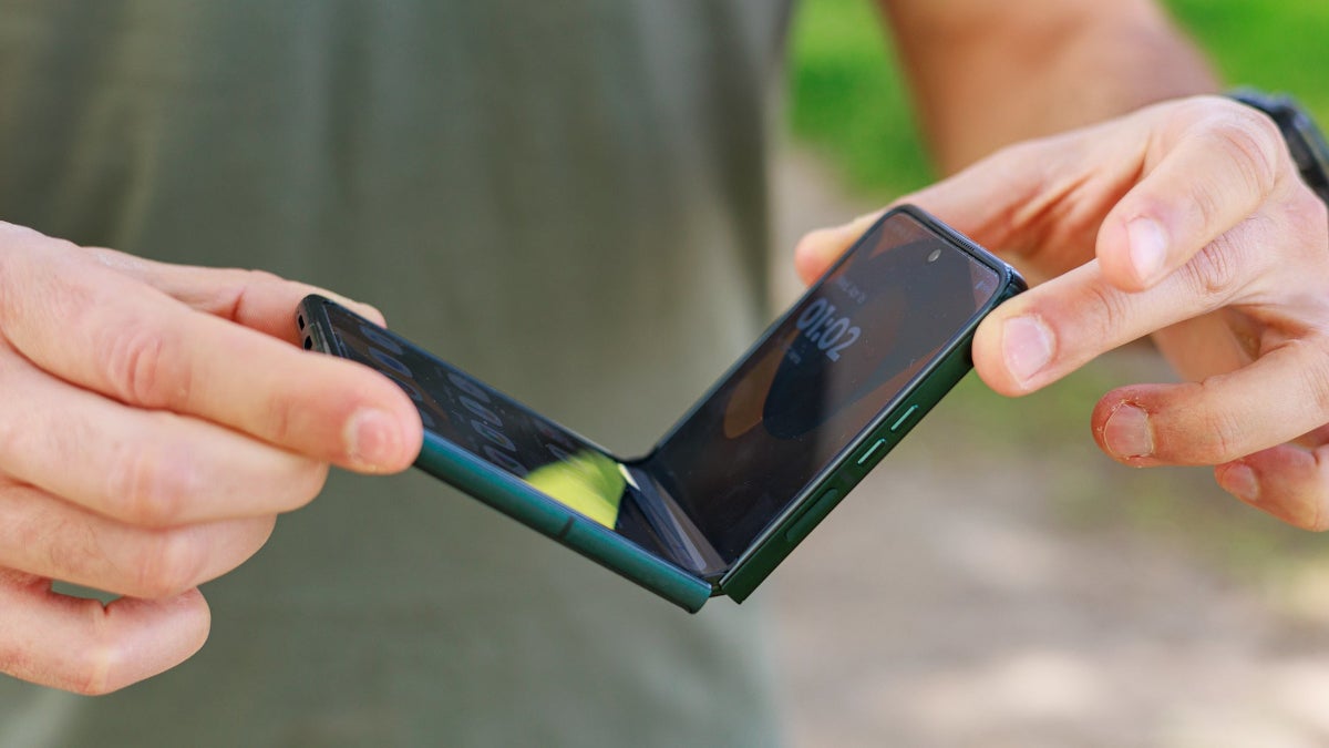
![Samsung Galaxy Tab S11 runs Geekbench, here's the chipset it will use [Updated]](https://fdn.gsmarena.com/imgroot/news/25/06/samsung-galaxy-tab-s11-ultra-geekbench/-952x498w6/gsmarena_000.jpg)


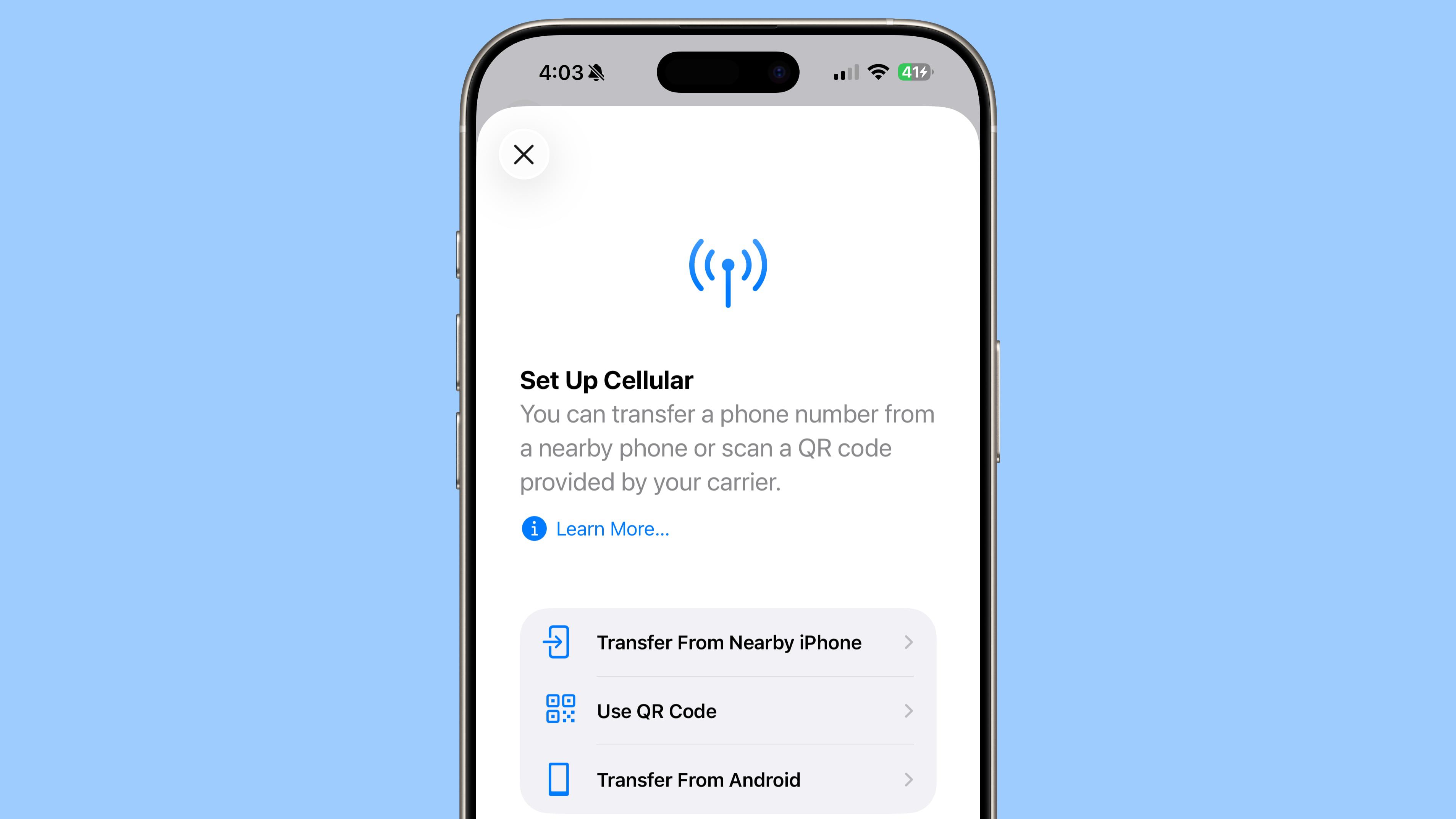
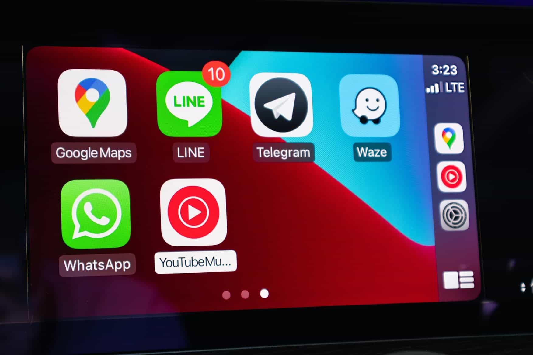
![Apple’s latest CarPlay update revives something Android Auto did right 10 years ago [Gallery]](https://i0.wp.com/9to5google.com/wp-content/uploads/sites/4/2025/06/carplay-live-activities-1.jpg?resize=1200%2C628&quality=82&strip=all&ssl=1)
![Everything new in Android 16 QPR1 Beta 2 [Gallery]](https://i0.wp.com/9to5google.com/wp-content/uploads/sites/4/2025/06/Android-16-logo-1.jpg?resize=1200%2C628&quality=82&strip=all&ssl=1)


![3DMark Launches Native Benchmark App for macOS [Video]](https://www.iclarified.com/images/news/97603/97603/97603-640.jpg)
![Craig Federighi: Putting macOS on iPad Would 'Lose What Makes iPad iPad' [Video]](https://www.iclarified.com/images/news/97606/97606/97606-640.jpg)


CSS Media Queries: When, What, Why, Which, How, Differences, and Examples
What is a CSS Media Query? A CSS Media Query is a technique used in CSS to apply styles conditionally based on the characteristics of the device or viewport displaying the content. It allows you to create responsive designs that adapt to different screen sizes, resolutions, orientations, and more. When to Use CSS Media Queries? When you want your website or app to look good on all devices (mobile, tablet, desktop). When you want to change layouts, font sizes, or hide/show elements depending on screen size. When you want to optimize performance by loading or styling content specifically for device capabilities. When you want to implement responsive web design (RWD). Why Use Media Queries? To improve user experience on different devices. To ensure your site is accessible and readable on small screens. To avoid horizontal scrolling on mobile devices. To reduce bounce rates by making your site visually appealing on all screen sizes. To save bandwidth by loading only necessary resources/styles for the device. Which Features Can Media Queries Target? Width and Height (viewport size): max-width, min-width, max-height, min-height Device width and height: device-width, device-height Orientation: portrait or landscape Resolution: dpi or dppx Aspect ratio Color and monochrome capabilities Pointer and hover abilities Light level and contrast preferences How to Write a CSS Media Query? Basic syntax: @media media-type and (condition) { /* CSS rules */ } media-type can be all, screen, print, speech, etc. condition defines when the styles inside should apply. Examples of CSS Media Queries 1. Change background color on small devices (max-width 600px) @media screen and (max-width: 600px) { body { background-color: lightblue; } } 2. Apply styles for landscape orientation @media screen and (orientation: landscape) { .container { flex-direction: row; } } 3. Different font sizes for desktop and mobile body { font-size: 18px; } @media screen and (max-width: 768px) { body { font-size: 14px; } } 4. Hide an element when printing @media print { .no-print { display: none; } } Differences: Media Queries vs Other CSS Techniques Feature Media Queries CSS Flexbox/Grid JavaScript for Responsiveness Purpose Conditional styling based on device features Layout control within CSS Dynamic styling and DOM manipulation When Applied At CSS parse/render time At CSS render time At runtime, after page load Responsiveness Automatic via conditions Layout adjustment Custom responsive logic Complexity Moderate Moderate More complex and flexible Interview Questions & Answers on CSS Media Queries Q1. What is a media query in CSS? A: A media query is a CSS technique used to apply different styles based on device characteristics such as screen size, resolution, or orientation. Q2. Why are media queries important? A: They help create responsive designs that adapt to different devices, improving user experience and accessibility. Q3. What is the difference between max-width and min-width in media queries? A: max-width applies styles up to the given width, while min-width applies styles from that width upwards. Q4. Can you target print media using media queries? A: Yes, using @media print { } you can specify styles for printing. Q5. How do media queries affect website performance? A: When used properly, they help by only applying necessary styles and potentially avoiding loading unneeded resources on certain devices. Q6. Give an example of a media query that applies styles only for devices with a minimum resolution of 300dpi. @media screen and (min-resolution: 300dpi) { /* styles here */ } Q7. Can you combine multiple conditions in a media query? A: Yes, using and, or (comma separated), and not operators. Example: @media screen and (min-width: 600px) and (orientation: landscape) { /* styles here */ } Q8. What happens if multiple media queries match the device? A: The CSS rules are applied according to CSS specificity and order; later rules with higher specificity will override earlier ones. Q9. How would you test media queries? A: Using browser developer tools with responsive design mode or by resizing the browser window manually. Q10. What are some common breakpoints used in media queries? A: Typical breakpoints include 320px (mobile), 480px (small tablets), 768px (tablets), 1024px (laptops), 1200px+ (desktops).
What is a CSS Media Query?
A CSS Media Query is a technique used in CSS to apply styles conditionally based on the characteristics of the device or viewport displaying the content. It allows you to create responsive designs that adapt to different screen sizes, resolutions, orientations, and more.
When to Use CSS Media Queries?
- When you want your website or app to look good on all devices (mobile, tablet, desktop).
- When you want to change layouts, font sizes, or hide/show elements depending on screen size.
- When you want to optimize performance by loading or styling content specifically for device capabilities.
- When you want to implement responsive web design (RWD).
Why Use Media Queries?
- To improve user experience on different devices.
- To ensure your site is accessible and readable on small screens.
- To avoid horizontal scrolling on mobile devices.
- To reduce bounce rates by making your site visually appealing on all screen sizes.
- To save bandwidth by loading only necessary resources/styles for the device.
Which Features Can Media Queries Target?
-
Width and Height (viewport size):
max-width,min-width,max-height,min-height -
Device width and height:
device-width,device-height -
Orientation:
portraitorlandscape -
Resolution:
dpiordppx - Aspect ratio
- Color and monochrome capabilities
- Pointer and hover abilities
- Light level and contrast preferences
How to Write a CSS Media Query?
Basic syntax:
@media media-type and (condition) {
  /* CSS rules */
}
-
media-type can be
all,screen,print,speech, etc. - condition defines when the styles inside should apply.
Examples of CSS Media Queries
1. Change background color on small devices (max-width 600px)
@media screen and (max-width: 600px) {
  body {
    background-color: lightblue;
  }
}
2. Apply styles for landscape orientation
@media screen and (orientation: landscape) {
  .container {
    flex-direction: row;
  }
}
3. Different font sizes for desktop and mobile
body {
  font-size: 18px;
}

@media screen and (max-width: 768px) {
  body {
    font-size: 14px;
  }
}
4. Hide an element when printing
@media print {
  .no-print {
    display: none;
  }
}
Differences: Media Queries vs Other CSS Techniques
| Feature | Media Queries | CSS Flexbox/Grid | JavaScript for Responsiveness |
|---|---|---|---|
| Purpose | Conditional styling based on device features | Layout control within CSS | Dynamic styling and DOM manipulation |
| When Applied | At CSS parse/render time | At CSS render time | At runtime, after page load |
| Responsiveness | Automatic via conditions | Layout adjustment | Custom responsive logic |
| Complexity | Moderate | Moderate | More complex and flexible |
Interview Questions & Answers on CSS Media Queries
Q1. What is a media query in CSS?
A: A media query is a CSS technique used to apply different styles based on device characteristics such as screen size, resolution, or orientation.
Q2. Why are media queries important?
A: They help create responsive designs that adapt to different devices, improving user experience and accessibility.
Q3. What is the difference between max-width and min-width in media queries?
A: max-width applies styles up to the given width, while min-width applies styles from that width upwards.
Q4. Can you target print media using media queries?
A: Yes, using @media print { } you can specify styles for printing.
Q5. How do media queries affect website performance?
A: When used properly, they help by only applying necessary styles and potentially avoiding loading unneeded resources on certain devices.
Q6. Give an example of a media query that applies styles only for devices with a minimum resolution of 300dpi.
@media screen and (min-resolution: 300dpi) {
  /* styles here */
}
Q7. Can you combine multiple conditions in a media query?
A: Yes, using and, or (comma separated), and not operators.
Example:
@media screen and (min-width: 600px) and (orientation: landscape) {
  /* styles here */
}
Q8. What happens if multiple media queries match the device?
A: The CSS rules are applied according to CSS specificity and order; later rules with higher specificity will override earlier ones.
Q9. How would you test media queries?
A: Using browser developer tools with responsive design mode or by resizing the browser window manually.
Q10. What are some common breakpoints used in media queries?
A: Typical breakpoints include 320px (mobile), 480px (small tablets), 768px (tablets), 1024px (laptops), 1200px+ (desktops).


