


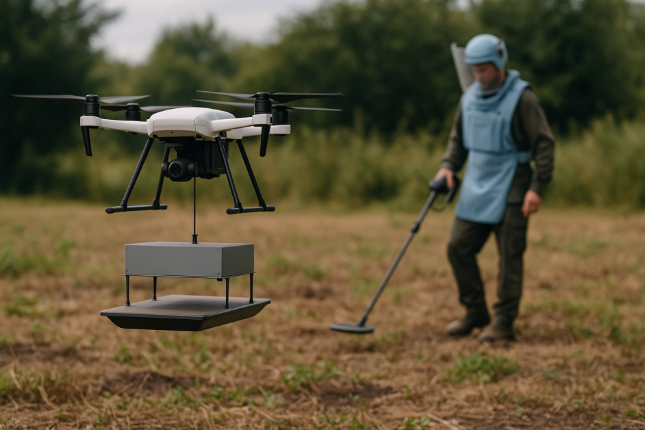
![How to Use AI as a Productivity Tool with Mike Kaput [MAICON 2025 Speaker Series]](https://www.marketingaiinstitute.com/hubfs/v2MAICON-Speaker_Series.png)
![[The AI Show Episode 152]: ChatGPT Connectors, AI-Human Relationships, New AI Job Data, OpenAI Court-Ordered to Keep ChatGPT Logs & WPP’s Large Marketing Model](https://www.marketingaiinstitute.com/hubfs/ep%20152%20cover.png)


.jpg?width=1920&height=1920&fit=bounds&quality=70&format=jpg&auto=webp#)


_Andreas_Prott_Alamy.jpg?width=1280&auto=webp&quality=80&disable=upscale#)
_designer491_Alamy.jpg?width=1280&auto=webp&quality=80&disable=upscale#)


![Apple’s latest CarPlay update revives something Android Auto did right 10 years ago [Gallery]](https://i0.wp.com/9to5google.com/wp-content/uploads/sites/4/2025/06/carplay-live-activities-1.jpg?resize=1200%2C628&quality=82&strip=all&ssl=1)


![3DMark Launches Native Benchmark App for macOS [Video]](https://www.iclarified.com/images/news/97603/97603/97603-640.jpg)
![Craig Federighi: Putting macOS on iPad Would 'Lose What Makes iPad iPad' [Video]](https://www.iclarified.com/images/news/97606/97606/97606-640.jpg)


Apple Just iOS 7’d the iPhone Again, and People Are Already Losing It
The post Apple Just iOS 7’d the iPhone Again, and People Are Already Losing It appeared first on Android Headlines.


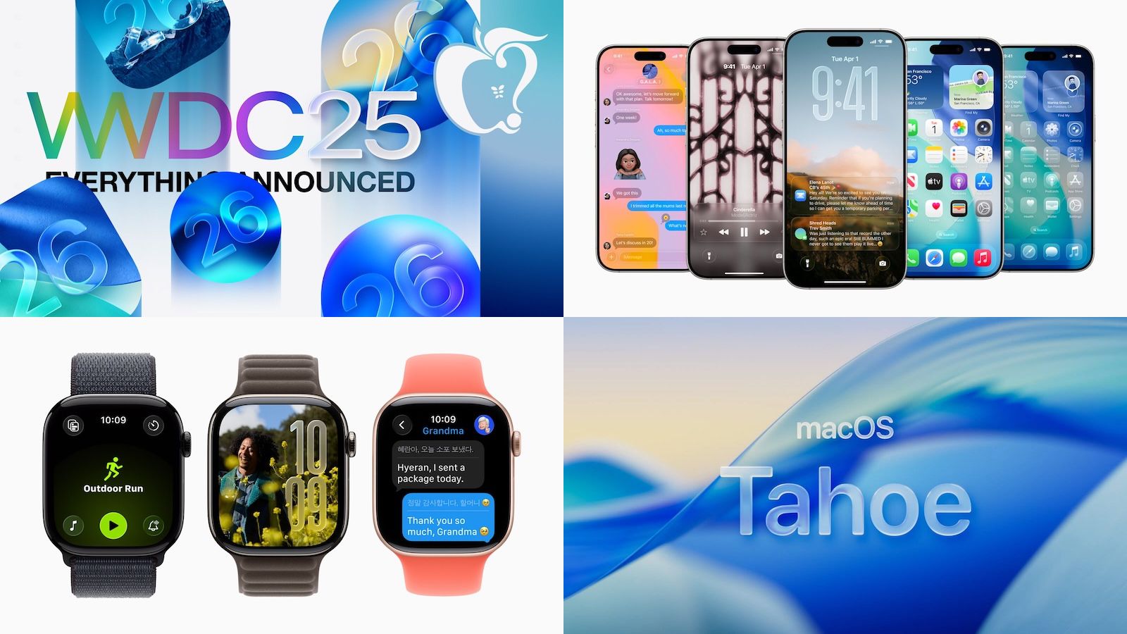
This week at WWDC, Apple introduced its first redesign of iOS in over 12 years. The last time Apple did a drastic redesign was with iOS 7, which launched in 2013. Apple is dubbing this redesign as “Liquid Glass”, and to be honest, it looks pretty nice in some parts of the OS, but in other parts, it looks cheap and not good.
As is the case with any major change like this, it’s been met with a pretty polarizing reaction. You either love it or you hate it. Which sounds familiar for some reason. That’s because it was the exact same reaction to Google’s Material 3 Expressive redesign when it was unveiled last month.
Apple released the first developer beta right after the keynote, which the company does every year. In recent years, Apple has made it easier for anybody to download the developer beta, which I believe is a mistake. Now, it’s a quick setting on the Software Update page on your iPhone or iPad. Before, you would need a developer account and get your device’s unique UDID registered to get the update. Meaning far fewer people were able to download it. I do think Apple needs to go back to limiting who can use the developer beta.
The reason for that? This is the first of probably seven or eight betas before iOS 26 ships later this year with the iPhone 17 series. Last year, with the iOS 18 Developer Beta, there were 8 betas released between June 10 and August 28. Not including a Developer Beta 3 re-release (this was to bring the developer beta on track with the public beta that launched in July). And this means that we’re going to see loads of changes before the final product ships. Just like Apple did with iOS 7 in 2013.
What’s so bad about Liquid Glass?
The design itself looks pretty cool, but it’s clear it still needs some more time in the oven. The biggest issue that I’ve noticed so far is readability.
If you’re using a wallpaper that’s not dark – like the default iOS 26 wallpaper – then readability is going to be a problem. The notifications are hard to read because they’re white on a light background with a somewhat translucent notification background.
Good morning from iOS 26. 
Does anyone know how I’m supposed to read my notifications with this new “Liquid Glass” design? pic.twitter.com/cVn7T9eS6H— Shawn (@ShawnOnTheRight) June 10, 2025
The Control Panel is also pretty bad. That’s because there’s almost no background blur behind the settings in the Control Panel, making it hard to actually see the toggles, and tell if they’re on or not. This, I think could easily be fixed with some background blur there, but we’ll see how Apple handles it in future betas.
Then there’s the icons. Apple did add a new clear mode, which in their presentation, it looked great. And I was excited to use it. But in actuality, it looks pretty bad. It’s also somewhat hard to read, but thankfully that is an option.
With the regular light or dark mode icons, it’s not that great either. With the glass look, some icons look pretty blurry. And as someone that wears glasses, I know what blurry looks like. Some apps that are really affected here include most of Google’s apps, ESPN, Facebook, Bluesky and Amazon. It really affects those that are white, with an icon in the center – which is almost every single Google app. Below, you can see a good example of how other icons look in iOS 26 vs iOS 18.
Something else Apple changed that some people love and others hate, is the text in pop ups. The text has been center-aligned for, basically the entire lifetime of the iPhone. But now in iOS 26, it’s left-aligned. Which looks a little odd, but some people like it. To me, the centered text looked better, but I’m sure I’ll get used to it. I do prefer that the options are different colors now, since some apps will rearrange options like the one for enabling Facetime.
liquid glass… whatever.
the most important thing in iOS 26?
text is *finally* left-aligned  Read More

