


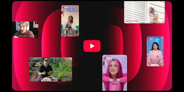
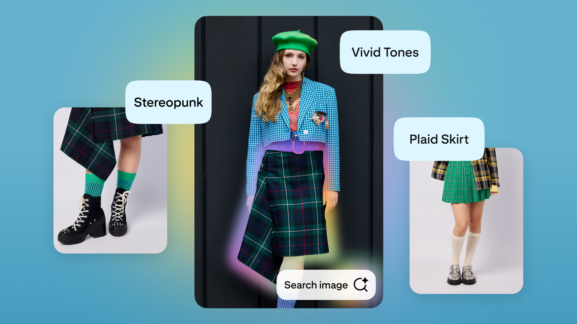
![[The AI Show Episode 146]: Rise of “AI-First” Companies, AI Job Disruption, GPT-4o Update Gets Rolled Back, How Big Consulting Firms Use AI, and Meta AI App](https://www.marketingaiinstitute.com/hubfs/ep%20146%20cover.png)


![[DEALS] The Premium Python Programming PCEP Certification Prep Bundle (67% off) & Other Deals Up To 98% Off – Offers End Soon!](https://www.javacodegeeks.com/wp-content/uploads/2012/12/jcg-logo.jpg)


_Aleksey_Funtap_Alamy.jpg?width=1280&auto=webp&quality=80&disable=upscale#)
_Sergey_Tarasov_Alamy.jpg?width=1280&auto=webp&quality=80&disable=upscale#)


![Apple Developing New Chips for Smart Glasses, Macs, AI Servers [Report]](https://www.iclarified.com/images/news/97269/97269/97269-640.jpg)
![Apple Shares New Mother's Day Ad: 'A Gift for Mom' [Video]](https://www.iclarified.com/images/news/97267/97267/97267-640.jpg)
![Apple Shares Official Trailer for 'Stick' Starring Owen Wilson [Video]](https://www.iclarified.com/images/news/97264/97264/97264-640.jpg)


Building a Dynamic Color Changer app with React and Vite
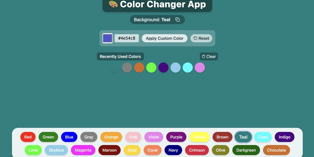
Introduction Hey there, fellow developers! Today I'm excited to share a fun little project I built using React and Vite - a dynamic background color changer app. This interactive tool allows users to easily switch between different background colors, use a custom color picker, and keep track of their color history. It's a perfect example of how React's state management can create smooth, interactive user experiences. Project Overview. Live Link The Color Changer App features: One-click color changes from a predefined palette Custom color selection with a color picker Color history tracking Smooth transition animations Copy-to-clipboard functionality Responsive design that works on all devices Tech Stack React - For building the UI components and managing state Vite - For fast development and optimized builds Lucide React - For beautiful, minimalist icons Tailwind CSS - For styling with utility classes Setting Up the Project Getting started with Vite is incredibly straightforward: npm create vite@latest color-changer --template react cd color-changer npm install npm install lucide-react If you're using Tailwind CSS: npm install -D tailwindcss postcss autoprefixer npx tailwindcss init -p Key Features Implementation State Management with React Hooks The app uses several state variables to track the current color, custom color input, color history, and UI states: const [color, setColor] = useState(""); const [customColor, setCustomColor] = useState("#4e54c8"); const [colorHistory, setColorHistory] = useState([]); const [copied, setCopied] = useState(false); const [animating, setAnimating] = useState(false); Dynamic Background Styling The background color is controlled through inline styling, with a fallback to a gradient when no color is selected: Color History Management Using useEffect, we track recently used colors and prevent duplicates: useEffect(() => { if (color && !colorHistory.includes(color)) { setColorHistory(prev => [color, ...prev.slice(0, 7)]); } }, [color]); Animation Effects Subtle animation effects are added when changing colors to enhance the user experience: useEffect(() => { if (color) { setAnimating(true); const timer = setTimeout(() => setAnimating(false), 500); return () => clearTimeout(timer); } }, [color]); Copy to Clipboard Functionality Users can copy the current color value with feedback: const copyToClipboard = () => { navigator.clipboard.writeText(color || "gradient"); setCopied(true); setTimeout(() => setCopied(false), 2000); }; UI Components Breakdown Color Palette The color palette offers a variety of predefined colors for quick selection: const colors = [ "red", "green", "blue", "gray", "orange", "pink", "violet", "purple", "yellow", "brown", "teal", "cyan", "indigo", "lime", "skyblue", "magenta", "maroon", "gold", "coral", "navy", "crimson", "olive", "darkgreen", "chocolate" ]; These are rendered as clickable buttons at the bottom of the screen: {colors.map((clr, index) => ( setColor(clr)} className="px-3 md:px-4 py-1 md:py-2 rounded-full text-white font-medium shadow-md hover:scale-110 transform transition-all duration-200 hover:ring-2 hover:ring-offset-1 capitalize text-sm md:text-base" style={{ backgroundColor: clr }} > {clr} ))} Custom Color Picker The custom color picker combines both visual selection and manual HEX input: Color History Display Recently used colors are displayed as clickable circles for easy reuse: {colorHistory.map((clr, index) => ( setColor(clr)} className="w-10 h-10 rounded-full shadow-md hover:scale-110 transform transition-all duration-200 hover:ring-2 hover:ring-white" style={{ backgroundColor: clr }} title={clr} /> ))} Styling With Tailwind CSS The project leverages Tailwind CSS for rapid styling with utility classes. Some key styling features include: Glass-morphism effects with backdrop-blur-sm and semi-transparent backgrounds Responsive design with md: breakpoints Smooth transitions with transition-all and duration-200 Hover effects with hover:scale-110 and hover:ring-2 The Deploy Process Deploying a Vite + React app is straightforward. First, build your project: npm run build This creates a dist folder with optimized assets ready for deployment. You can then deploy to platforms like Vercel, Netlify, or GitHub Pages with a few clicks. Lessons Learned Building this project taught me several valuable lessons: React State Management - Using multiple state variables effectively Effect Timing - Managing side effects with useEffect dependencies Animation in React - Creating smooth transitions between states Responsive Design - Building interface
Introduction
Hey there, fellow developers! Today I'm excited to share a fun little project I built using React and Vite - a dynamic background color changer app. This interactive tool allows users to easily switch between different background colors, use a custom color picker, and keep track of their color history. It's a perfect example of how React's state management can create smooth, interactive user experiences.
Project Overview. Live Link
The Color Changer App features:
- One-click color changes from a predefined palette
- Custom color selection with a color picker
- Color history tracking
- Smooth transition animations
- Copy-to-clipboard functionality
- Responsive design that works on all devices
Tech Stack
React - For building the UI components and managing state Vite - For fast development and optimized builds
Lucide React - For beautiful, minimalist icons
Tailwind CSS - For styling with utility classes
Setting Up the Project
Getting started with Vite is incredibly straightforward:
npm create vite@latest color-changer --template react
cd color-changer
npm install
npm install lucide-react
If you're using Tailwind CSS:
npm install -D tailwindcss postcss autoprefixer
npx tailwindcss init -p
Key Features Implementation
State Management with React Hooks
The app uses several state variables to track the current color, custom color input, color history, and UI states:
const [color, setColor] = useState("");
const [customColor, setCustomColor] = useState("#4e54c8");
const [colorHistory, setColorHistory] = useState([]);
const [copied, setCopied] = useState(false);
const [animating, setAnimating] = useState(false);
Dynamic Background Styling
The background color is controlled through inline styling, with a fallback to a gradient when no color is selected:
<div
  className={`w-full h-screen transition-all duration-500 ease-in-out flex flex-col items-center ${animating ? "scale-105" : "scale-100"}`}
  style={{
    background: color
      ? color
      : "linear-gradient(to right, #4e54c8, #8f94fb)",
  }}
>
Color History Management
Using useEffect, we track recently used colors and prevent duplicates:
useEffect(() => {
  if (color && !colorHistory.includes(color)) {
    setColorHistory(prev => [color, ...prev.slice(0, 7)]);
  }
}, [color]);
Animation Effects
Subtle animation effects are added when changing colors to enhance the user experience:
useEffect(() => {
  if (color) {
    setAnimating(true);
    const timer = setTimeout(() => setAnimating(false), 500);
    return () => clearTimeout(timer);
  }
}, [color]);
Copy to Clipboard Functionality
Users can copy the current color value with feedback:
const copyToClipboard = () => {
  navigator.clipboard.writeText(color || "gradient");
  setCopied(true);
  setTimeout(() => setCopied(false), 2000);
};
UI Components Breakdown
Color Palette
The color palette offers a variety of predefined colors for quick selection:
const colors = [
  "red", "green", "blue", "gray", "orange", "pink", "violet",
  "purple", "yellow", "brown", "teal", "cyan", "indigo", "lime",
  "skyblue", "magenta", "maroon", "gold", "coral", "navy",
  "crimson", "olive", "darkgreen", "chocolate"
];
These are rendered as clickable buttons at the bottom of the screen:
{colors.map((clr, index) => (
  <button
    key={index}
    onClick={() => setColor(clr)}
    className="px-3 md:px-4 py-1 md:py-2 rounded-full text-white font-medium shadow-md hover:scale-110 transform transition-all duration-200 hover:ring-2 hover:ring-offset-1 capitalize text-sm md:text-base"
    style={{ backgroundColor: clr }}
  >
    {clr}
  button>
))}
Custom Color Picker
The custom color picker combines both visual selection and manual HEX input:
<div className="flex items-center gap-2">
  <input
    type="color"
    value={customColor}
    onChange={handleCustomColorChange}
    className="w-10 h-10 rounded cursor-pointer"
  />
  <input
    type="text"
    value={customColor}
    onChange={handleCustomColorChange}
    className="bg-white bg-opacity-70 rounded px-2 py-1 w-24 text-center font-mono"
  />
div>
Color History Display
Recently used colors are displayed as clickable circles for easy reuse:
<div className="flex flex-wrap justify-center gap-2 px-4">
  {colorHistory.map((clr, index) => (
    <button
      key={index}
      onClick={() => setColor(clr)}
      className="w-10 h-10 rounded-full shadow-md hover:scale-110 transform transition-all duration-200 hover:ring-2 hover:ring-white"
      style={{ backgroundColor: clr }}
      title={clr}
    />
  ))}
div>
Styling With Tailwind CSS
The project leverages Tailwind CSS for rapid styling with utility classes. Some key styling features include:
- Glass-morphism effects with
backdrop-blur-smand semi-transparent backgrounds - Responsive design with
md:breakpoints - Smooth transitions with
transition-allandduration-200 - Hover effects with
hover:scale-110andhover:ring-2
The Deploy Process
Deploying a Vite + React app is straightforward. First, build your project:
npm run build
This creates a dist folder with optimized assets ready for deployment. You can then deploy to platforms like Vercel, Netlify, or GitHub Pages with a few clicks.
Lessons Learned
Building this project taught me several valuable lessons:
- React State Management - Using multiple state variables effectively
- Effect Timing - Managing side effects with useEffect dependencies
- Animation in React - Creating smooth transitions between states
- Responsive Design - Building interfaces that work on all screen sizes
- Component Organization - Structuring code for readability and maintenance
Future Enhancements
Some ideas for future improvements:
- Save color palettes to local storage
- Add gradient generation capabilities
- Implement color scheme suggestions
- Add accessibility features for color blindness
- Export color palettes as CSS variables
Conclusion
This Color Changer App demonstrates how a relatively simple React application can provide an engaging, interactive user experience. The combination of React's state management, Vite's development speed, and Tailwind's styling capabilities makes building such applications both fun and efficient.
Feel free to fork the project, submit pull requests, or use it as inspiration for your own React applications!
Happy coding!