


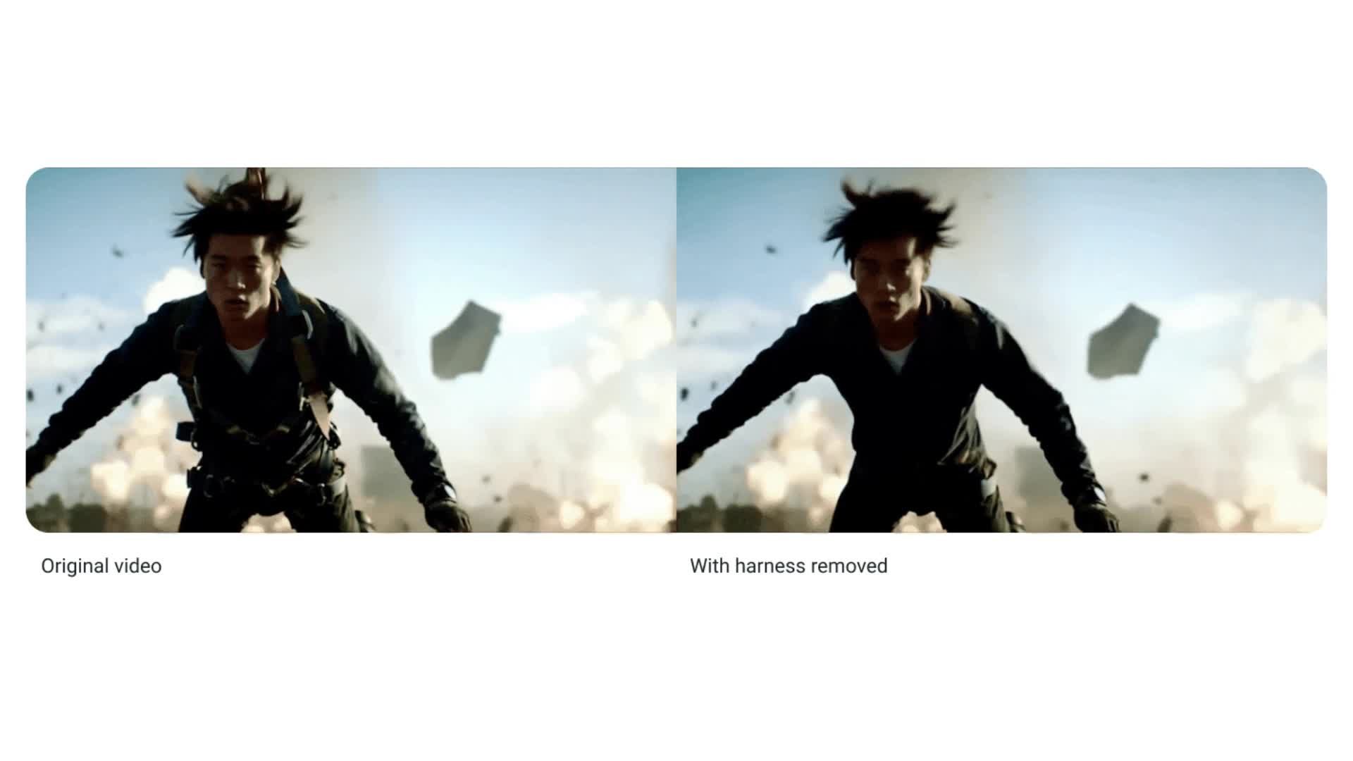
![[The AI Show Episode 143]: ChatGPT Revenue Surge, New AGI Timelines, Amazon’s AI Agent, Claude for Education, Model Context Protocol & LLMs Pass the Turing Test](https://www.marketingaiinstitute.com/hubfs/ep%20143%20cover.png)


-11.11.2024-4-49-screenshot.png?width=1920&height=1920&fit=bounds&quality=70&format=jpg&auto=webp#)


_jvphoto_Alamy.jpg?#)


.png?#)


![Apple Debuts Official Trailer for 'Murderbot' [Video]](https://www.iclarified.com/images/news/96972/96972/96972-640.jpg)
![Alleged Case for Rumored iPhone 17 Pro Surfaces Online [Image]](https://www.iclarified.com/images/news/96969/96969/96969-640.jpg)

![Apple Rushes Five Planes of iPhones to US Ahead of New Tariffs [Report]](https://www.iclarified.com/images/news/96967/96967/96967-640.jpg)


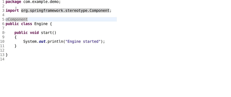
9 Clever Tailwind Code Snippets for Faster Development
Introduction: Speeding Up Your UI Development with Tailwind Hey there, fellow UI developers! Are you ready to supercharge your development process? If you're using Tailwind CSS, you're already on the right track. But what if I told you there are some nifty code snippets that could make your work even faster and more efficient? That's right – we're about to dive into 10 clever Tailwind code snippets that will help you speed up your development process and create stunning user interfaces in no time. Tailwind CSS has revolutionized the way we approach web design, offering a utility-first framework that allows for rapid UI development. But even with its extensive utility classes, there are always ways to optimize and streamline our workflow. That's where these code snippets come in handy. They're like secret weapons in your developer toolkit, ready to be deployed whenever you need them. So, grab your favorite code editor, fire up your development environment, and let's explore these time-saving Tailwind code snippets together. Whether you're a Tailwind newbie or a seasoned pro, I guarantee you'll find something useful in this list. Let's get started! 1. The Perfect Centered Container We've all been there – trying to create a perfectly centered container that looks good on all screen sizes. With Tailwind, it's easier than ever, but we can make it even simpler with this handy snippet: This snippet creates a centered container with responsive padding. The container class sets a max-width based on the current breakpoint, mx-auto centers it horizontally, and the padding classes (px-4 sm:px-6 lg:px-8) ensure your content doesn't stick to the edges on larger screens. Why is this helpful? It gives you a consistent, responsive layout without the need to write custom CSS. You can use this as a wrapper for your main content, ensuring everything stays neatly aligned and responsive across devices. 2. Responsive Grid Layout Creating a responsive grid layout is a common task in UI development. Tailwind makes it easy, but here's a snippet that sets up a flexible, responsive grid in one go: This snippet creates a grid that starts with one column on mobile devices, then increases to 2, 3, and 4 columns as the screen size grows. The gap-4 class adds some space between grid items. This is particularly useful for things like product listings, photo galleries, or any content that needs to be displayed in a grid format. It's responsive right out of the box, saving you time on layout adjustments. 3. Stylish Button with Hover Effect Buttons are everywhere in UI design, and creating a good-looking button with a smooth hover effect is crucial. Here's a Tailwind snippet for a stylish button: Click me This snippet creates a blue button with white text, rounded corners, and a subtle hover effect. The transition and duration-300 classes ensure a smooth color change when hovering. You can easily customize this by changing the color classes (e.g., bg-green-500 for a green button) or adjusting the padding and font weight to suit your design needs. 4. Responsive Navigation Menu Navigation menus can be tricky, especially when making them responsive. Here's a Tailwind snippet for a simple, responsive navigation menu: Home About Services Contact This snippet creates a dark-themed navigation bar with a logo and menu items. The menu items are hidden on mobile screens (hidden md:block) and appear on medium screens and larger. Remember, this is just the structure. You'd need to add some JavaScript to toggle the mobile menu, but this gives you a solid starting point for a responsive navigation. 5. Card Component with Hover Effect Card components are versatile UI elements used in many designs. Here's a Tailwind snippet for a card with a subtle hover effect: Card Title This is some example text for the card body. You can put any content here. #tag1 #tag2 This card has an image, title, body text, and tags. The hover:shadow-xl class creates a nice depth effect when hovering over the card. Cards are great for displaying grouped information, whether it's blog posts, product details, or user profiles. This snippet gives you a good starting point that you can easily customize to fit your specific needs. 6. Responsive Pricing Table Pricing tables are common in many web applications. Here's a Tailwind snippet for a responsive pricing table: Basic Plan Perfect for small projects $9.99/month Feature 1 Feature 2 Feature 3 Choose Plan This snippet creates a pricing card with a title, price, feature list, and call-to-action button. The layout is responsive, switchin

Introduction: Speeding Up Your UI Development with Tailwind
Hey there, fellow UI developers! Are you ready to supercharge your development process? If you're using Tailwind CSS, you're already on the right track. But what if I told you there are some nifty code snippets that could make your work even faster and more efficient? That's right – we're about to dive into 10 clever Tailwind code snippets that will help you speed up your development process and create stunning user interfaces in no time.
Tailwind CSS has revolutionized the way we approach web design, offering a utility-first framework that allows for rapid UI development. But even with its extensive utility classes, there are always ways to optimize and streamline our workflow. That's where these code snippets come in handy. They're like secret weapons in your developer toolkit, ready to be deployed whenever you need them.
So, grab your favorite code editor, fire up your development environment, and let's explore these time-saving Tailwind code snippets together. Whether you're a Tailwind newbie or a seasoned pro, I guarantee you'll find something useful in this list. Let's get started!
1. The Perfect Centered Container
We've all been there – trying to create a perfectly centered container that looks good on all screen sizes. With Tailwind, it's easier than ever, but we can make it even simpler with this handy snippet:
class="container mx-auto px-4 sm:px-6 lg:px-8">
This snippet creates a centered container with responsive padding. The container class sets a max-width based on the current breakpoint, mx-auto centers it horizontally, and the padding classes (px-4 sm:px-6 lg:px-8) ensure your content doesn't stick to the edges on larger screens.
Why is this helpful? It gives you a consistent, responsive layout without the need to write custom CSS. You can use this as a wrapper for your main content, ensuring everything stays neatly aligned and responsive across devices.
2. Responsive Grid Layout
Creating a responsive grid layout is a common task in UI development. Tailwind makes it easy, but here's a snippet that sets up a flexible, responsive grid in one go:
class="grid grid-cols-1 sm:grid-cols-2 md:grid-cols-3 lg:grid-cols-4 gap-4">