


![[The AI Show Episode 150]: AI Answers: AI Roadmaps, Which Tools to Use, Making the Case for AI, Training, and Building GPTs](https://www.marketingaiinstitute.com/hubfs/ep%20150%20cover.png)
![[The AI Show Episode 149]: Google I/O, Claude 4, White Collar Jobs Automated in 5 Years, Jony Ive Joins OpenAI, and AI’s Impact on the Environment](https://www.marketingaiinstitute.com/hubfs/ep%20149%20cover.png)


![[PHP] Upgrading from PHP 7.4 to 8.1](https://media2.dev.to/dynamic/image/width%3D1000,height%3D500,fit%3Dcover,gravity%3Dauto,format%3Dauto/https:%2F%2Fdev-to-uploads.s3.amazonaws.com%2Fuploads%2Farticles%2Fqmaaabplfbcjejg2rr5n.png)


_ArtemisDiana_Alamy.jpg?width=1280&auto=webp&quality=80&disable=upscale#)


![Apple Shares Official Trailer for 'Smoke' Starring Taron Egerton [Video]](https://www.iclarified.com/images/news/97453/97453/97453-640.jpg)
![Apple's M4 Mac Mini Drops to $488.63, New Lowest Price Ever [Deal]](https://www.iclarified.com/images/news/97456/97456/97456-1280.jpg)


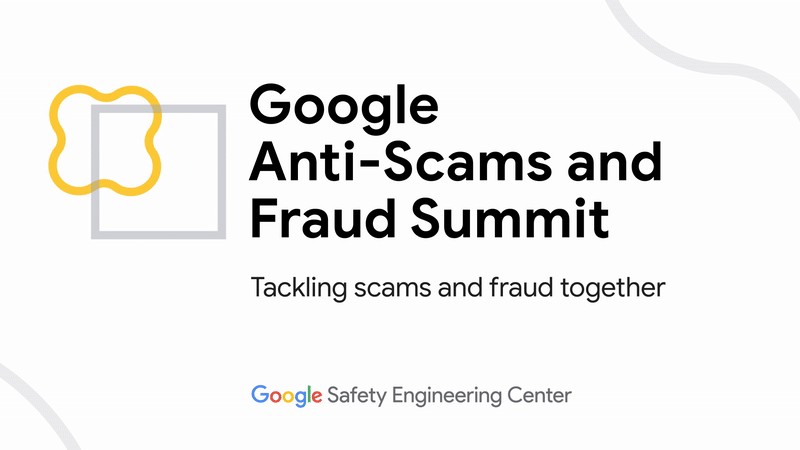
How Google’s subtle logo change can keep you from getting scammed
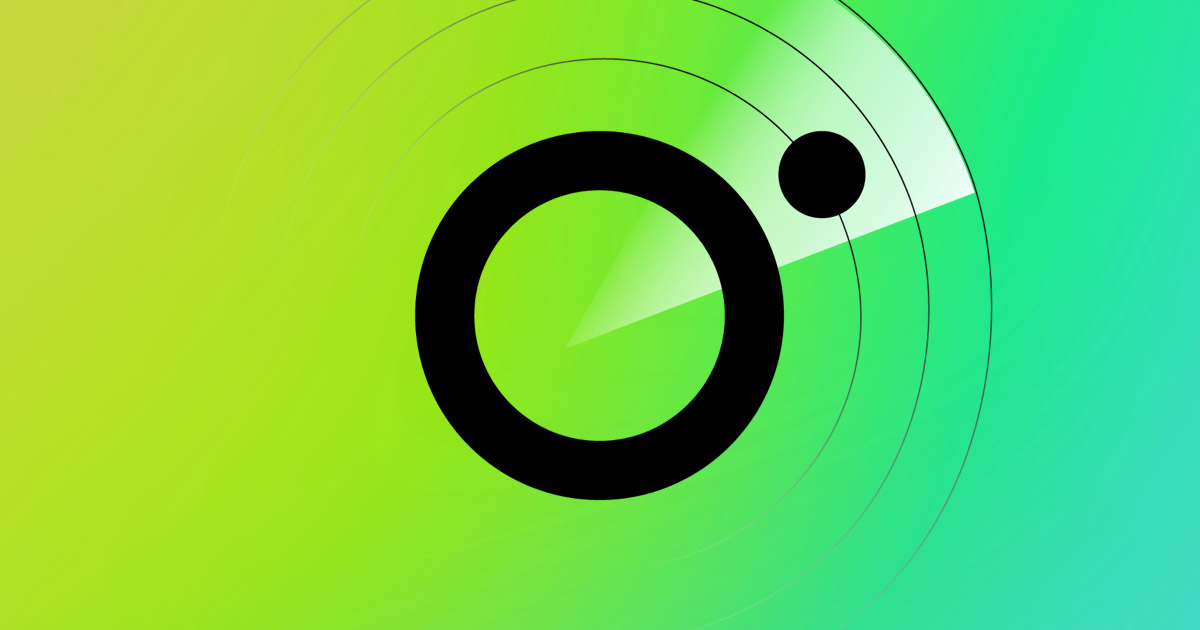
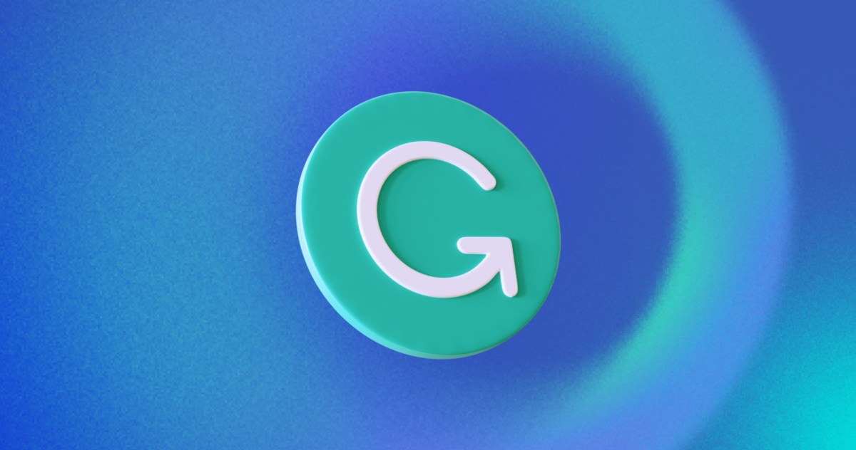
Maybe you’re like me—when a company refreshes its branding, I don’t give the news much of my time. In fact, when Google first announced an update to its favicon logo (the four-color “G”), I didn’t have a reaction. But I did memorize the change. Why? Because that info makes scam emails and phishing links easier to spot. Lazier or sloppier fraudsters sometimes use older logos (or even badly approximated logos) in their campaigns. If you know what a company’s most current branding looks like, you can quickly avoid these lower-effort scam attempts. This particular overhaul on Google’s part is notable too, as subtle as it is. After almost a decade of the four distinct color blocks in the “G,” Google’s designers switched to gradients between the red, yellow, green, and blue. (Somewhere print designers are weeping, but the web doesn’t care.) Google Of course, with AI tools aiding scammers in creating more sophisticated messages and phony websites, it no longer takes much work for phishing attacks to match a company’s new look. That’s why you should still use other techniques to help dodge scams, lest you be taken off-guard at a weak moment. The simplest and strongest defense? Choosing a login method that’s resistant to phishing attempts—i.e., passkeys. If you use a password, first make sure your password manager offers to autofill your credentials on that site (a signal that it’s the legitimate site). Also enable two-factor authentication where available—and if practical, choose the hardware key method (e.g., a YubiKey), as it’s phishing resistant compared to software-generated tokens. There’s a lot to memorize these days. But even making a fuzzy note in your brain of changes to major services can help you from falling for an online scam. For most people, Gmail acts as a linchpin for everything online—banking, travel, shopping, you name it. You don’t want to lose access to that kind of account.

Maybe you’re like me—when a company refreshes its branding, I don’t give the news much of my time. In fact, when Google first announced an update to its favicon logo (the four-color “G”), I didn’t have a reaction.
But I did memorize the change. Why? Because that info makes scam emails and phishing links easier to spot.
Lazier or sloppier fraudsters sometimes use older logos (or even badly approximated logos) in their campaigns. If you know what a company’s most current branding looks like, you can quickly avoid these lower-effort scam attempts.
This particular overhaul on Google’s part is notable too, as subtle as it is. After almost a decade of the four distinct color blocks in the “G,” Google’s designers switched to gradients between the red, yellow, green, and blue. (Somewhere print designers are weeping, but the web doesn’t care.)
Of course, with AI tools aiding scammers in creating more sophisticated messages and phony websites, it no longer takes much work for phishing attacks to match a company’s new look. That’s why you should still use other techniques to help dodge scams, lest you be taken off-guard at a weak moment. The simplest and strongest defense? Choosing a login method that’s resistant to phishing attempts—i.e., passkeys.
If you use a password, first make sure your password manager offers to autofill your credentials on that site (a signal that it’s the legitimate site). Also enable two-factor authentication where available—and if practical, choose the hardware key method (e.g., a YubiKey), as it’s phishing resistant compared to software-generated tokens.
There’s a lot to memorize these days. But even making a fuzzy note in your brain of changes to major services can help you from falling for an online scam. For most people, Gmail acts as a linchpin for everything online—banking, travel, shopping, you name it. You don’t want to lose access to that kind of account.


