


![[The AI Show Episode 151]: Anthropic CEO: AI Will Destroy 50% of Entry-Level Jobs, Veo 3’s Scary Lifelike Videos, Meta Aims to Fully Automate Ads & Perplexity’s Burning Cash](https://www.marketingaiinstitute.com/hubfs/ep%20151%20cover.png)


![[FREE EBOOKS] Solutions Architect’s Handbook, Continuous Testing, Quality, Security, and Feedback & Four More Best Selling Titles](https://www.javacodegeeks.com/wp-content/uploads/2012/12/jcg-logo.jpg)


![From electrical engineering student to CTO with Hitesh Choudhary [Podcast #175]](https://cdn.hashnode.com/res/hashnode/image/upload/v1749158756824/3996a2ad-53e5-4a8f-ab97-2c77a6f66ba3.png?#)


_Michael_Vi_Alamy.jpg?width=1280&auto=webp&quality=80&disable=upscale#)


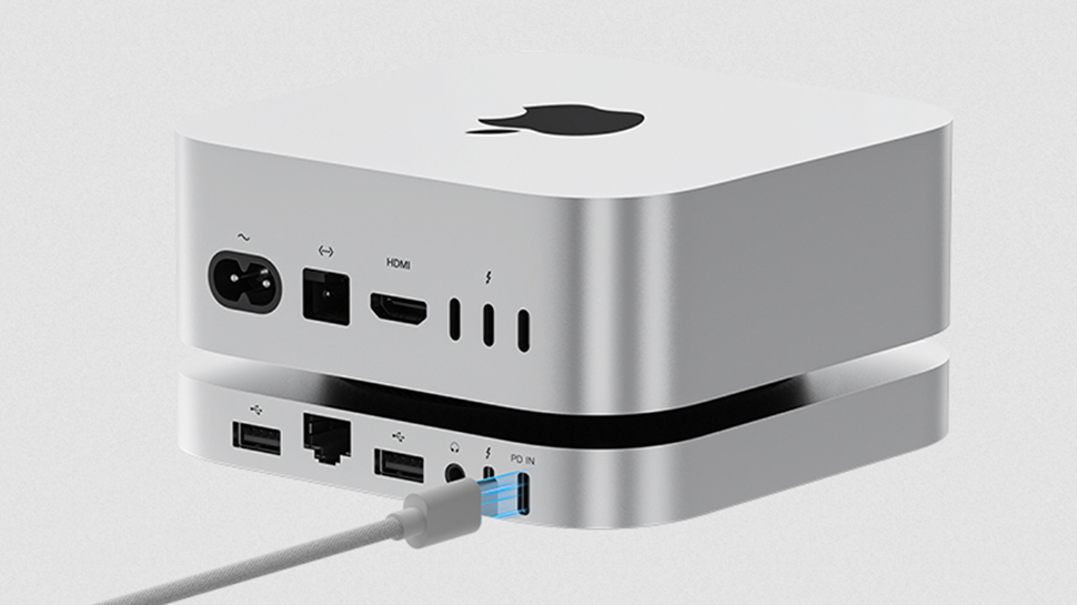
![Review: CalDigit TS5 Plus Thunderbolt 5 dock – a supercharged version of the best dock for Mac [Video]](https://i0.wp.com/9to5mac.com/wp-content/uploads/sites/6/2025/06/CalDigit-TS5-Plus-Review.jpg?resize=1200%2C628&quality=82&strip=all&ssl=1)


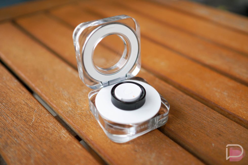
![UGREEN FineTrack Smart Tracker With Apple Find My Support Drops to $9.99 [50% Off]](https://www.iclarified.com/images/news/97529/97529/97529-640.jpg)

![watchOS 26 May Bring Third-Party Widgets to Control Center [Report]](https://www.iclarified.com/images/news/97520/97520/97520-640.jpg)


CSS Subgrid Tutorial: A Comprehensive Guide to Advanced Grid Layouts
CSS Grid is a powerful layout system that revolutionized web design, allowing developers to create complex, responsive layouts with ease. While CSS Grid provides robust tools for structuring layouts, the introduction of subgrid in CSS Grid Level 2 takes its capabilities to the next level. This tutorial will explain what CSS subgrid is, why it’s useful, how to implement it, and provide practical examples to help you master this feature. What is CSS Subgrid? CSS subgrid is a feature that allows a nested grid (a grid inside another grid) to inherit the track sizing (rows and columns) of its parent grid. This means that child elements within a nested grid can align perfectly with the parent grid’s tracks, creating consistent and harmonious layouts without the need for complex workarounds. Before subgrid, aligning nested grid items with the parent grid required manual coordination of column and row sizes, often leading to fragile or repetitive CSS. Subgrid simplifies this process by allowing nested grids to “borrow” the parent grid’s track definitions, ensuring alignment and consistency across the layout. Key Benefits of Subgrid Alignment Consistency: Nested grid items align seamlessly with the parent grid’s tracks. Simplified Code: Reduces the need for duplicate track definitions or manual sizing calculations. Responsive Design: Makes it easier to maintain consistent layouts across different screen sizes. Flexibility: Enables complex layouts with nested components that respect the parent grid’s structure. Browser Support As of June 2025, CSS subgrid is supported in all major modern browsers, including Chrome, Firefox, Edge, and Safari (since Safari 16). However, always check Can I Use for the latest browser compatibility, especially for older versions. For unsupported browsers, you can use fallbacks like regular CSS Grid or Flexbox. How Subgrid Works To use subgrid, you need a parent grid container and a nested grid container. The nested grid can then be set to use the subgrid value for its grid-template-columns or grid-template-rows (or both), allowing it to inherit the parent’s track sizing. Basic Syntax /* Parent grid */ .parent-grid { display: grid; grid-template-columns: 1fr 2fr 1fr; grid-template-rows: auto 1fr auto; } /* Nested grid using subgrid */ .nested-grid { display: grid; grid-template-columns: subgrid; /* Inherits parent’s column tracks */ grid-template-rows: subgrid; /* Inherits parent’s row tracks */ } The subgrid value tells the nested grid to use the parent grid’s column or row tracks instead of defining its own. This ensures that the nested grid’s items align with the parent grid’s structure. Step-by-Step Example: Building a Card Layout with Subgrid Let’s create a practical example to demonstrate subgrid: a card layout where each card contains a header, content, and footer that align with the parent grid’s columns. HTML Structure Header Content Footer Header Content Footer CSS with Subgrid /* Parent grid */ .parent-grid { display: grid; grid-template-columns: 1fr 2fr 1fr; gap: 20px; padding: 20px; } /* Card as a nested grid */ .card { display: grid; grid-template-columns: subgrid; /* Inherit parent’s columns */ grid-column: span 3; /* Card spans all 3 columns */ gap: 10px; background: #f9f9f9; border: 1px solid #ddd; padding: 10px; } /* Card sections */ .card-header, .card-content, .card-footer { grid-column: 1 / -1; /* Span all columns within the card */ padding: 10px; } .card-header { background: #007bff; color: white; } .card-content { background: #e9ecef; } .card-footer { background: #28a745; color: white; } Explanation Parent Grid: The .parent-grid defines a grid with three columns (1fr 2fr 1fr) and a gap of 20px. Nested Grid: Each .card is a nested grid that uses grid-template-columns: subgrid to inherit the parent’s column tracks. The grid-column: span 3 ensures the card spans all three columns of the parent grid. Card Sections: The .card-header, .card-content, and .card-footer span all columns within the card’s subgrid using grid-column: 1 / -1. Styling: Basic styling is applied to differentiate the card sections visually. This setup ensures that the card’s internal elements align with the parent grid’s columns, creating a clean and consistent layout. Advanced Use Case: Nested Form Layout Subgrid is particularly useful for aligning form elements across multiple sections. Let’s create a form with labeled inputs that align perfectly using subgrid. HTML Structure Name Email Address Phone CSS with Subgrid /* Parent grid */ .form-grid { display: grid; grid-template-columns: minmax(100px, 1fr) 2fr; gap: 15px; padding: 20px; max-width: 600px; mar
CSS Grid is a powerful layout system that revolutionized web design, allowing developers to create complex, responsive layouts with ease. While CSS Grid provides robust tools for structuring layouts, the introduction of subgrid in CSS Grid Level 2 takes its capabilities to the next level. This tutorial will explain what CSS subgrid is, why it’s useful, how to implement it, and provide practical examples to help you master this feature.
What is CSS Subgrid?
CSS subgrid is a feature that allows a nested grid (a grid inside another grid) to inherit the track sizing (rows and columns) of its parent grid. This means that child elements within a nested grid can align perfectly with the parent grid’s tracks, creating consistent and harmonious layouts without the need for complex workarounds.
Before subgrid, aligning nested grid items with the parent grid required manual coordination of column and row sizes, often leading to fragile or repetitive CSS. Subgrid simplifies this process by allowing nested grids to “borrow” the parent grid’s track definitions, ensuring alignment and consistency across the layout.
Key Benefits of Subgrid
- Alignment Consistency: Nested grid items align seamlessly with the parent grid’s tracks.
- Simplified Code: Reduces the need for duplicate track definitions or manual sizing calculations.
- Responsive Design: Makes it easier to maintain consistent layouts across different screen sizes.
- Flexibility: Enables complex layouts with nested components that respect the parent grid’s structure.
Browser Support
As of June 2025, CSS subgrid is supported in all major modern browsers, including Chrome, Firefox, Edge, and Safari (since Safari 16). However, always check Can I Use for the latest browser compatibility, especially for older versions. For unsupported browsers, you can use fallbacks like regular CSS Grid or Flexbox.
How Subgrid Works
To use subgrid, you need a parent grid container and a nested grid container. The nested grid can then be set to use the subgrid value for its grid-template-columns or grid-template-rows (or both), allowing it to inherit the parent’s track sizing.
Basic Syntax
/* Parent grid */
.parent-grid {
  display: grid;
  grid-template-columns: 1fr 2fr 1fr;
  grid-template-rows: auto 1fr auto;
}

/* Nested grid using subgrid */
.nested-grid {
  display: grid;
  grid-template-columns: subgrid; /* Inherits parent’s column tracks */
  grid-template-rows: subgrid;    /* Inherits parent’s row tracks */
}
The subgrid value tells the nested grid to use the parent grid’s column or row tracks instead of defining its own. This ensures that the nested grid’s items align with the parent grid’s structure.
Step-by-Step Example: Building a Card Layout with Subgrid
Let’s create a practical example to demonstrate subgrid: a card layout where each card contains a header, content, and footer that align with the parent grid’s columns.
HTML Structure
 class="parent-grid">
   class="card">
class="card-header">Header 


