


![[The AI Show Episode 153]: OpenAI Releases o3-Pro, Disney Sues Midjourney, Altman: “Gentle Singularity” Is Here, AI and Jobs & News Sites Getting Crushed by AI Search](https://www.marketingaiinstitute.com/hubfs/ep%20153%20cover.png)


.png?width=1920&height=1920&fit=bounds&quality=70&format=jpg&auto=webp#)


![Google Mocks Apple's 'New' iOS 26 Features in Pixel Ad [Video]](https://www.iclarified.com/images/news/97638/97638/97638-640.jpg)


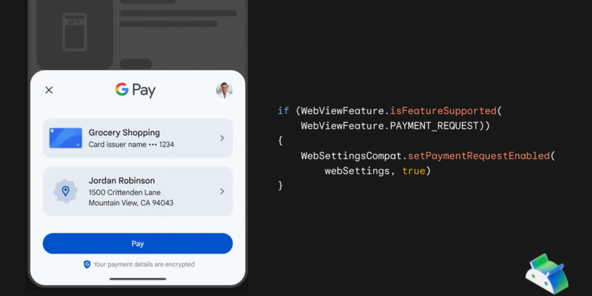
Implementing In-App Dark Mode Switching in HarmonyOS Next
Harmony OS Next Implementing In-App Dark Mode Switching in HarmonyOS Next The implementation uses @Provider and @Consume to share a lightMode variable across components, with persisted settings for consistent theme application. 1. Declare @Provide in Entry Component @Entry @Component struct QuickTestMainPage { @Provide lightMode: boolean = true; // true = Light mode, false = Dark mode } 2. Retrieve Persistent Theme Setting import { StyleFit } from './utils/StyleFit'; @Entry @Component struct QuickTestMainPage { @Provide lightMode: boolean = true; aboutToAppear() { // Retrieve saved theme preference this.lightMode = StyleFit.getLightMode(); } } 3. StyleFit Utility Class Implementation export class StyleFit { private static lightMode: boolean = true; // Default: Light mode // Initialize from persistent storage static init() { PreferencesUtil.getString("light_mode").then(value => { StyleFit.lightMode = (value === "1" || value === ""); }) } // Update theme preference static setLightMode(value: boolean) { StyleFit.lightMode = value; PreferencesUtil.putSync("light_mode", value ? "1" : "0"); } // Get current theme static getLightMode() { return StyleFit.lightMode; } } 4. Color Token Management with StyleRes export enum StyleColor { backgroundColor, // Background color pageColor, // Page color cardBgColor, // Card background cardBgActiveColor,// Active card background textNormalColor, // Normal text textBoldColor, // Bold text blackTextActiveColor, // Active black text texSubColor, // Secondary text shadowColor, // Shadow color } export class StyleRes { static getStyleColor(styleColor: StyleColor, lightMode: boolean) { switch (styleColor) { case StyleColor.backgroundColor: return lightMode ? "#ffffffff" : "#FF191B27"; case StyleColor.pageColor: return lightMode ? "#fff7f8fb" : "#FF191B27"; case StyleColor.cardBgColor: return lightMode ? "#ffffffff" : "#FF292B38"; case StyleColor.cardBgActiveColor: return lightMode ? "#FFE0EFFF" : "#FF162741"; case StyleColor.textNormalColor: return lightMode ? "#FF465069" : "#FF999FB5"; case StyleColor.textBoldColor: return lightMode ? "#FF191B27" : "#FF999FB5"; case StyleColor.blackTextActiveColor: return lightMode ? "#FF191B27" : "#FF0080FF"; case StyleColor.texSubColor: return lightMode ? "#FF465069" : "#FF999FB5"; case StyleColor.shadowColor: return lightMode ? "#14000000" : "#FF222634"; default: return "#ffffffff"; } } } 5. Applying Themes in UI Components import { StyleColor, StyleRes } from './utils/StyleRes'; @Component struct BottomTool { @Consume lightMode: boolean; // Access theme state build() { Column() { // Component content } .backgroundColor(StyleRes.getStyleColor( StyleColor.backgroundColor, this.lightMode )) } } Theme Switching Implementation: // Toggle theme in any component Button('Toggle Theme') .onClick(() => { const newMode = !this.lightMode; StyleFit.setLightMode(newMode); this.lightMode = newMode; }) Key Features: Centralized State Management: @Provide/@Consume for reactive theme updates Persistent Settings: Theme preferences saved across app sessions Token-Based Design: Central color definitions ensure consistency Simple Integration: Single-line color application in components Flexible Theming: Easy to add new color tokens or themes This implementation provides a maintainable, scalable solution for dark/light theme switching that automatically propagates changes throughout the application.

Harmony OS Next
Implementing In-App Dark Mode Switching in HarmonyOS Next
The implementation uses @Provider and @Consume to share a lightMode variable across components, with persisted settings for consistent theme application.
1. Declare @Provide in Entry Component
@Entry
@Component
struct QuickTestMainPage {
   @Provide lightMode: boolean = true; // true = Light mode, false = Dark mode
}
2. Retrieve Persistent Theme Setting
import { StyleFit } from './utils/StyleFit';

@Entry
@Component
struct QuickTestMainPage {
   @Provide lightMode: boolean = true;

  aboutToAppear() {
    // Retrieve saved theme preference
    this.lightMode = StyleFit.getLightMode();
  }
}
3. StyleFit Utility Class Implementation
export class StyleFit {
  private static lightMode: boolean = true; // Default: Light mode

  // Initialize from persistent storage
  static init() {
    PreferencesUtil.getString("light_mode").then(value => {
      StyleFit.lightMode = (value === "1" || value === "");
    })
  }

  // Update theme preference
  static setLightMode(value: boolean) {
    StyleFit.lightMode = value;
    PreferencesUtil.putSync("light_mode", value ? "1" : "0");
  }

  // Get current theme
  static getLightMode() {
    return StyleFit.lightMode;
  }
}
4. Color Token Management with StyleRes
export enum StyleColor {
  backgroundColor,  // Background color
  pageColor,        // Page color
  cardBgColor,      // Card background
  cardBgActiveColor,// Active card background
  textNormalColor,  // Normal text
  textBoldColor,    // Bold text
  blackTextActiveColor, // Active black text
  texSubColor,      // Secondary text
  shadowColor,      // Shadow color
}

export class StyleRes {
  static getStyleColor(styleColor: StyleColor, lightMode: boolean) {
    switch (styleColor) {
      case StyleColor.backgroundColor:
        return lightMode ? "#ffffffff" : "#FF191B27";
      case StyleColor.pageColor:
        return lightMode ? "#fff7f8fb" : "#FF191B27";
      case StyleColor.cardBgColor:
        return lightMode ? "#ffffffff" : "#FF292B38";
      case StyleColor.cardBgActiveColor:
        return lightMode ? "#FFE0EFFF" : "#FF162741";
      case StyleColor.textNormalColor:
        return lightMode ? "#FF465069" : "#FF999FB5";
      case StyleColor.textBoldColor:
        return lightMode ? "#FF191B27" : "#FF999FB5";
      case StyleColor.blackTextActiveColor:
        return lightMode ? "#FF191B27" : "#FF0080FF";
      case StyleColor.texSubColor:
        return lightMode ? "#FF465069" : "#FF999FB5";
      case StyleColor.shadowColor:
        return lightMode ? "#14000000" : "#FF222634";
      default:
        return "#ffffffff";
    }
  }
}
5. Applying Themes in UI Components
import { StyleColor, StyleRes } from './utils/StyleRes';

@Component
struct BottomTool {
    @Consume lightMode: boolean; // Access theme state

    build() {
      Column() {
        // Component content
      }
      .backgroundColor(StyleRes.getStyleColor(
        StyleColor.backgroundColor,
        this.lightMode
      ))
    }
}
Theme Switching Implementation:
// Toggle theme in any component
Button('Toggle Theme')
  .onClick(() => {
    const newMode = !this.lightMode;
    StyleFit.setLightMode(newMode);
    this.lightMode = newMode;
  })
Key Features:
-
Centralized State Management:
@Provide/@Consumefor reactive theme updates - Persistent Settings: Theme preferences saved across app sessions
- Token-Based Design: Central color definitions ensure consistency
- Simple Integration: Single-line color application in components
- Flexible Theming: Easy to add new color tokens or themes
This implementation provides a maintainable, scalable solution for dark/light theme switching that automatically propagates changes throughout the application.