


![How to Use AI as a Productivity Tool with Mike Kaput [MAICON 2025 Speaker Series]](https://www.marketingaiinstitute.com/hubfs/v2MAICON-Speaker_Series.png)
![[The AI Show Episode 152]: ChatGPT Connectors, AI-Human Relationships, New AI Job Data, OpenAI Court-Ordered to Keep ChatGPT Logs & WPP’s Large Marketing Model](https://www.marketingaiinstitute.com/hubfs/ep%20152%20cover.png)


.jpg?width=1920&height=1920&fit=bounds&quality=70&format=jpg&auto=webp#)


_Andreas_Prott_Alamy.jpg?width=1280&auto=webp&quality=80&disable=upscale#)

_designer491_Alamy.jpg?width=1280&auto=webp&quality=80&disable=upscale#)


![Samsung Galaxy Tab S11 runs Geekbench, here's the chipset it will use [Updated]](https://fdn.gsmarena.com/imgroot/news/25/06/samsung-galaxy-tab-s11-ultra-geekbench/-952x498w6/gsmarena_000.jpg)


![Apple’s latest CarPlay update revives something Android Auto did right 10 years ago [Gallery]](https://i0.wp.com/9to5google.com/wp-content/uploads/sites/4/2025/06/carplay-live-activities-1.jpg?resize=1200%2C628&quality=82&strip=all&ssl=1)
![Everything new in Android 16 QPR1 Beta 2 [Gallery]](https://i0.wp.com/9to5google.com/wp-content/uploads/sites/4/2025/06/Android-16-logo-1.jpg?resize=1200%2C628&quality=82&strip=all&ssl=1)


![3DMark Launches Native Benchmark App for macOS [Video]](https://www.iclarified.com/images/news/97603/97603/97603-640.jpg)
![Craig Federighi: Putting macOS on iPad Would 'Lose What Makes iPad iPad' [Video]](https://www.iclarified.com/images/news/97606/97606/97606-640.jpg)


How to validate user input in Koval UI
User input is the most marginal case in web development. Here we are dealing with a literal Human-Computer interaction and having a full set of problems related to it: such as expectation and format mismatches, human errors possibility and a risk of attack. Client-side input validation is now a cornerstone of user-friendly design. Of course, business critical validation should happen on the backend. But by catching errors on the front end, developers avoid the “round trip” to the server, which saves time and prevents the existential dread of a 500 error page. But here’s the irony: we’ve somehow managed to complicate things again. Many popular validation libraries today duplicate functionality already built into modern web browsers. Developers frequently find themselves reimplementing or working around native browser form validation features, rather than using them directly. Koval UI validation principles React components library Koval UI lets the browser do the heavy lifting. Instead of redoing the browser job, we rely on existing APIs to validate user input and inform about errors if any. This demo shows how we approach validation. The :user-invalid CSS selector allows us to customize input styling based on its validation state, while the validationMessage property of HTMLInputElement ensures consistent and reliable error display across modern browsers. Validity checks run when value changes and when the form input belongs to is submitted. Attribute-based validation In Koval UI, all input components accept standard HTMLInputElement attributes to perform validation based on their values. Required inputs The Boolean required attribute, if present, indicates that the user must specify a value for the input before the owning form can be submitted. The most fundamental check of all. By adding the boolean required attribute, you're telling the user, “I'm not asking for much, just... something.” If they try to submit the form with this field empty, the browser will gently (or not so gently) remind them of their obligation. import {InputText} from 'koval-ui'; Validate pattern The pattern attribute allows checking validity using regular expression. Here is an example using ([^@\s]+@[^@\s]+) pattern for checking email validity. import {InputText} from 'koval-ui'; 
User input is the most marginal case in web development. Here we are dealing with a literal Human-Computer interaction and having a full set of problems related to it: such as expectation and format mismatches, human errors possibility and a risk of attack.
Client-side input validation is now a cornerstone of user-friendly design. Of course, business critical validation should happen on the backend. But by catching errors on the front end, developers avoid the “round trip” to the server, which saves time and prevents the existential dread of a 500 error page.
But here’s the irony: we’ve somehow managed to complicate things again. Many popular validation libraries today duplicate functionality already built into modern web browsers. Developers frequently find themselves reimplementing or working around native browser form validation features, rather than using them directly.
Koval UI validation principles
React components library Koval UI lets the browser do the heavy lifting. Instead of redoing the browser job, we rely on existing APIs to validate user input and inform about errors if any.
This demo shows how we approach validation. The :user-invalid CSS selector allows us to customize input styling based on its validation state, while the validationMessage property of HTMLInputElement ensures consistent and reliable error display across modern browsers.

Validity checks run when value changes and when the form input belongs to is submitted.
Attribute-based validation
In Koval UI, all input components accept standard HTMLInputElement attributes to perform validation based on their values.
Required inputs
The Boolean required attribute, if present, indicates that the user must specify a value for the input before the owning form can be submitted.
The most fundamental check of all. By adding the boolean required attribute, you're telling the user, “I'm not asking for much, just... something.” If they try to submit the form with this field empty, the browser will gently (or not so gently) remind them of their obligation.
import {InputText} from 'koval-ui';

<InputText required={true} />

Validate pattern
The pattern attribute allows checking validity using regular expression. Here is an example using ([^@\s]+@[^@\s]+) pattern for checking email validity.
import {InputText} from 'koval-ui';

<InputText pattern="([^@\s]+@[^@\s]+)" />

Customize error message
Developers can customize the text of error messages displayed when a certain error happens.
Here is how to provide custom error messages for pattern validation.
The ValidityState interface represents the validity states that an element can be in, regarding constraint validation. Together, they help explain why an element's value fails to validate if it's not valid.
We default to returning an empty string ('') which signals successful validation.
const validatorFn = (_: unknown, validityState: ValidityState) => {
    if (validityState.patternMismatch) {
        return 'Please provide a valid email';
    }
    return '';
};

<InputText pattern="([^@\s]+@[^@\s]+)" validation={validatorFn} />
Custom validation with callback function
Have you noticed we were using the validation property in the latest example? This property allows us to have various custom validations and emit error message(s) based on their results.
Developers can provide a validation function for this property. This function runs every time the user changes the input value. It should return an error message string if the validation fails, and an empty string if it succeeds.
This example shows a validation callback which allows inputs not longer than 3 symbols, but also accepts fooBar as a correct value.
const validatorFn = (value?: unknown) => {
    console.log('Value captured:', value);
    if (value && 'fooBar'.includes(value.toString())) {
        return '';
    } else if (value && `${value}`.length > 3) {
        return 'Value should not be longer than 3 symbols (except "fooBar")';
    } else {
        return '';
    }
;

<InputText validation={validatorFn} />
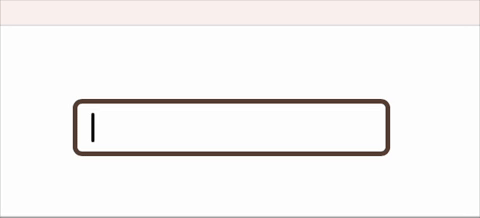
And for a more real-world scenario, here's how you could validate an IBAN (20ish symbol bank account number format) using the iban-ts library.
import {isValid} from 'iban-ts';

const validatorFn = (value?: unknown) => {
    if (value && !isValid(`${value}`)) {
        return 'Please provide valid IBAN';
    }
    return '';
}

<InputText
  validation={validatorFn}
  placeholder="DE89370400440532013000" />
Asynchronous validation
Sometimes complex validation rules have to be run asynchronously (e.g., server-side validation). Koval inputs can also accept async functions as validation callbacks. While the async function is resolving, we'll display a handy spinning loader icon, so the user knows something important is happening.
export const validatorAsync = async (value?: unknown) => {
    let result = '';
    try {
        const response = await fetch('https://example.com/', {
            method: 'POST',
            body: JSON.stringify({ inputValue: `${value}` }),
        });
        result = await response.text(); // '' | 'Validation error'
    } catch (error) {
        result = `Server error: ${error}`;
    }
    return result;
};

<InputText validation={validatorAsync} />

Don't worry about overwhelming your backend. Async validators are debounced to prevent excessive requests, ensuring we only send the latest value for validation.
Conditional validation
It is possible to take other form fields values into consideration when validating user input. validation callback receives FormState object as the third parameter.
FormState is a simple key-value object representing the current state of the entire form, letting you sneak-peek at the values of any other field. The type is a standard Record, where FormDataEntryValue is a built-in browser type for string | File.
type FormState = Record<string, FormDataEntryValue>
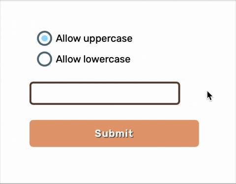
Let's look at an example. We have a form with a radio button group named case-selector and a text input. The validation rules for the text input will change based on which radio button is selected. To make this happen, we also add the revalidateOnFormChange={true} prop to our text input, which tells it to re-run its validation function whenever any other part of the form changes.
import {
    Button,
    Form,
    InputGroup,
    InputRadio,
    InputText
} from 'koval-ui';

const validatorFn = (
    value: unknown,
    _: unknown,
    formState: Record<string, FormDataEntryValue>
) => {
    if (formState['case-selector'] === 'lowercase') {
        const isLowerCase = (value as string).toLowerCase() === value;
        return isLowerCase ? '' : 'Only lower case allowed.';
    } else if (formState['case-selector'] === 'uppercase') {
        const isUpperCase = (value as string).toUpperCase() === value;
        return isUpperCase ? '' : 'Only upper case allowed.';
    }
    return '';
};

<Form>
    <InputGroup name="case-selector">
        <InputRadio
            defaultChecked={true}
            label="Allow uppercase"
            value="uppercase"
        />
        <InputRadio label="Allow lowercase" value="lowercase" />
    InputGroup>
    <InputText
        revalidateOnFormChange={true}
        validation={validatorFn}
        name="text"
        placeholder="Validity changes according to user choise"
    />
    <Button type="submit">SubmitButton>
Form>
Now, when the user switches between “Allow uppercase” and “Allow lowercase” the text input instantly knows the new rules and re-validates itself. It just works.
Password validation example
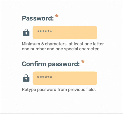
Now we are going to utilize these features to build a password fieldset with password validation and confirmation.
We'll create two fields. The first will be the main password input, armed with a regex pattern to enforce our security requirements. The second will be the password_confirmation field.
The confirmation field will use a custom validation function to peek at the main password's value and check for a match. We'll also use revalidateOnFormChange={true} so that if the user goes back and changes the original password, the confirmation field will immediately know and re-evaluate its validity.
import {
    Button,
    Form,
    FormField,
    InputPassword
} from 'koval-ui';

const validatePasswordConfirmation = (
    value: unknown,
    _: unknown,
    formState: Record<string, FormDataEntryValue>
) => {
    if (Boolean(value) && value !== formState['password']) {
        return "Passwords don't match";
    }
    return '';
},

<Form>
    <FormField
        label="Password:"
        hint="Minimum 6 characters, at least one letter, one number and one special character.">
        <InputPassword
            pattern="^(?=.*[A-Za-z])(?=.*\d)(?=.*[@$!%*#?&])[A-Za-z\d@$!%*#?&]{6,}$"
            required={true}
            name="password"
            placeholder="******"
        />
    FormField>
    <FormField
        label="Confirm password:"
        hint="Retype password from previous field.">
        <InputPassword
            validation={validatePasswordConfirmation}
            required={true}
            revalidateOnFormChange={true}
            name="password_confirmation"
            placeholder="******"
        />
    FormField>
Form>
To be continued…

