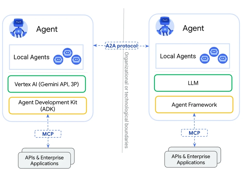


![[The AI Show Episode 146]: Rise of “AI-First” Companies, AI Job Disruption, GPT-4o Update Gets Rolled Back, How Big Consulting Firms Use AI, and Meta AI App](https://www.marketingaiinstitute.com/hubfs/ep%20146%20cover.png)


![[DEALS] The Premium Python Programming PCEP Certification Prep Bundle (67% off) & Other Deals Up To 98% Off – Offers End Soon!](https://www.javacodegeeks.com/wp-content/uploads/2012/12/jcg-logo.jpg)


_Aleksey_Funtap_Alamy.jpg?width=1280&auto=webp&quality=80&disable=upscale#)
_Sergey_Tarasov_Alamy.jpg?width=1280&auto=webp&quality=80&disable=upscale#)


![Apple Foldable iPhone to Feature New Display Tech, 19% Thinner Panel [Rumor]](https://www.iclarified.com/images/news/97271/97271/97271-640.jpg)
![Apple Developing New Chips for Smart Glasses, Macs, AI Servers [Report]](https://www.iclarified.com/images/news/97269/97269/97269-640.jpg)
![Apple Shares New Mother's Day Ad: 'A Gift for Mom' [Video]](https://www.iclarified.com/images/news/97267/97267/97267-640.jpg)
![Apple Shares Official Trailer for 'Stick' Starring Owen Wilson [Video]](https://www.iclarified.com/images/news/97264/97264/97264-640.jpg)


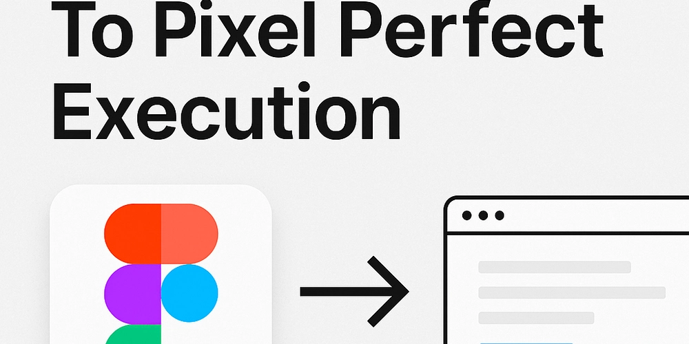
From Figma to Pixel Perfect Execution.
As a frontend developer, you've probably worked with designers and clients that quickly become 'naggy' about your execution of their designs in code. Sometimes it feels like they don't understand the flexibility and inconsistencies involved in maintaining a functional site across different platforms. Having some design background myself, I understand the time and attention that designers commit towards every single detail in their design. They just want to see their work come alive how they planned it. As frontend developers, it is our job to ensure users have as smooth an experience as possible. To achieve this, it is important to represent the intricate solutions doctored by the designer in the final implementation of the UI. Having said all that, here are some tips that should guide you to a near-pixel-perfect finish: 1. Pixel Perfect Handoff It all starts from the designer's table. Ensure the final version of your project's design is properly organised with all the details that you are expected to implement. Here's a quick checklist to guide you: Ensure all items are aligned properly and all frames are named properly. All recurring values/styles should ideally be defined as variables or styles within Figma. Even if they are not, you can define these values, colors, texts as variables in your css. Clear definition of components, their states and variations. It is important that you understand how components are intended to function, so that you can do a better job in recreating those components. Ensure you understand the layout grid and spacing system used in the design. A good design handoff should have clear and consistent use of the grid and spacing systems. All necessary assets, like images and icons should be made available in the right exportable formats and resolutions. 2. Pixel Perfect Execution Now it's time to actually build the UI using all the information you got from the designer. Small inconsistencies while transitioning between the design and implementation can lead to a final UI that feels substandard to the original design. Here are some general tips that will help you work around those inconsistencies: Proper usage of design assets - Make sure you export all assets(images, icons, illustrations etc.) in the correct format. Since user experience is your priority, ensure the exported assets are not too large so they don't cause performance bottlenecks. Use tools like Tinypng and ImageOptim to reduce image sizes without loosing too much quality. Proper Conversion of values - While inspecting elements in the Figma design, values for spacing, padding, font-size etc. are going to be defined in pixels(px). For better responsiveness and to avoid accessibility issues, it is better to use values like rem and em in your css. Browsers usually have a default font size that applies to the html element of a page and affects it's children elements. Rem is basically a division of your pixel value by that default font size. Let's say the default font size is 16px(which is the most common for most browsers), a spacing value of 60px in your Figma file would convert to 60/16, which will equal 3.75 rem in your css. Plugins like Figma hand-over can help make that conversion process easier in your Figma app. To make the conversion more intuitive, you can set the default font-size in your html element to 62.5% i.e html { font-size: 62.5%; } this sets the default font size to a fraction of the original(10px put of 16px) and allows you to make easier conversion of px values to rem. For example, a 60px spacing value will now equal 6rem. Start with the layout - After defining variables and structuring your project properly, create the skeleton(layout, containers, grids) that your components are going to live on. Start by defining general spacing, position and structure of the parent elements. If you are using a grid system, create the general grid layout and smaller grid definitions for sub-containers. 3. Pixel Perfect Production Okay, you made it, you were able to pull off a near-perfect implementation that the designer and stakeholders would love. However, the entire point is to get the perfect implementation to the end user, not the designer, not stakeholders. Users are going to be using your application in all sorts of ways and from different devices, so it's best you anticipate that. Here are some tips to ensure a consistent final output for your different users: Properly test the responsiveness and accessibility of your app using suitable breakpoints to reduce layout inconsistencies between devices. Pixel peeking - There are always going to be minor differences between the original design and a browser render of your implementation. However, pixel peeking by overlaying a screenshot of the design over your browser can help you spot minor visual deviations you might not have noticed when eyeballing. You can play with opacity values of overlaid screen
As a frontend developer, you've probably worked with designers and clients that quickly become 'naggy' about your execution of their designs in code. Sometimes it feels like they don't understand the flexibility and inconsistencies involved in maintaining a functional site across different platforms.
Having some design background myself, I understand the time and attention that designers commit towards every single detail in their design. They just want to see their work come alive how they planned it.
As frontend developers, it is our job to ensure users have as smooth an experience as possible. To achieve this, it is important to represent the intricate solutions doctored by the designer in the final implementation of the UI.
Having said all that, here are some tips that should guide you to a near-pixel-perfect finish:
1. Pixel Perfect Handoff
It all starts from the designer's table. Ensure the final version of your project's design is properly organised with all the details that you are expected to implement. Here's a quick checklist to guide you:
Ensure all items are aligned properly and all frames are named properly.
All recurring values/styles should ideally be defined as variables or styles within Figma. Even if they are not, you can define these values, colors, texts as variables in your css.
Clear definition of components, their states and variations. It is important that you understand how components are intended to function, so that you can do a better job in recreating those components.
Ensure you understand the layout grid and spacing system used in the design. A good design handoff should have clear and consistent use of the grid and spacing systems.
All necessary assets, like images and icons should be made available in the right exportable formats and resolutions.
2. Pixel Perfect Execution
Now it's time to actually build the UI using all the information you got from the designer. Small inconsistencies while transitioning between the design and implementation can lead to a final UI that feels substandard to the original design. Here are some general tips that will help you work around those inconsistencies:
Proper usage of design assets - Make sure you export all assets(images, icons, illustrations etc.) in the correct format. Since user experience is your priority, ensure the exported assets are not too large so they don't cause performance bottlenecks. Use tools like Tinypng and ImageOptim to reduce image sizes without loosing too much quality.
Proper Conversion of values - While inspecting elements in the Figma design, values for spacing, padding, font-size etc. are going to be defined in pixels(px). For better responsiveness and to avoid accessibility issues, it is better to use values like rem and em in your css. Browsers usually have a default font size that applies to the html element of a page and affects it's children elements. Rem is basically a division of your pixel value by that default font size.
Let's say the default font size is 16px(which is the most common for most browsers), a spacing value of 60px in your Figma file would convert to 60/16, which will equal 3.75 rem in your css. Plugins like Figma hand-over can help make that conversion process easier in your Figma app.
To make the conversion more intuitive, you can set the default font-size in your html element to 62.5% i.e
html {
  font-size: 62.5%;
}
this sets the default font size to a fraction of the original(10px put of 16px) and allows you to make easier conversion of px values to rem. For example, a 60px spacing value will now equal 6rem.
- Start with the layout - After defining variables and structuring your project properly, create the skeleton(layout, containers, grids) that your components are going to live on. Start by defining general spacing, position and structure of the parent elements. If you are using a grid system, create the general grid layout and smaller grid definitions for sub-containers.
3. Pixel Perfect Production
Okay, you made it, you were able to pull off a near-perfect implementation that the designer and stakeholders would love. However, the entire point is to get the perfect implementation to the end user, not the designer, not stakeholders. Users are going to be using your application in all sorts of ways and from different devices, so it's best you anticipate that. Here are some tips to ensure a consistent final output for your different users:
Properly test the responsiveness and accessibility of your app using suitable breakpoints to reduce layout inconsistencies between devices.
Pixel peeking - There are always going to be minor differences between the original design and a browser render of your implementation. However, pixel peeking by overlaying a screenshot of the design over your browser can help you spot minor visual deviations you might not have noticed when eyeballing. You can play with opacity values of overlaid screenshots or use plugins like PixelPerfect extension in chrome to trace element positions and make adjustments where necessary.
Cross browser testing - As frontend developers, we all know some browsers can be a pain in the a** when testing your final implementation(especially that one browser). However, It is important to properly test your application in the most popular browsers(chrome, Firefox, Safari, Edge) and on different devices, to avoid UI issues.
Iterative testing - Involving the designers and stakeholders in the testing process is crucial. Making iterative adjustments based on feedback would ensure the entire team arrives at the same destination.
Conclusion
Although it's almost impossible to execute and maintain a pixel perfect implementation of your UI design across borders, it is your job to come as close as possible to achieving that. With great attention to detail, patience and the tips discussed in this article, you are closer to delivering a final output that will satisfy all parties involved.