


![[The AI Show Episode 146]: Rise of “AI-First” Companies, AI Job Disruption, GPT-4o Update Gets Rolled Back, How Big Consulting Firms Use AI, and Meta AI App](https://www.marketingaiinstitute.com/hubfs/ep%20146%20cover.png)


.jpg?width=1920&height=1920&fit=bounds&quality=70&format=jpg&auto=webp#)


_Alexey_Kotelnikov_Alamy.jpg?width=1280&auto=webp&quality=80&disable=upscale#)
_Brian_Jackson_Alamy.jpg?width=1280&auto=webp&quality=80&disable=upscale#)


 Stolen 884,000 Credit Card Details on 13 Million Clicks from Users Worldwide.webp?#)


![Roku clarifies how ‘Pause Ads’ work amid issues with some HDR content [U]](https://i0.wp.com/9to5google.com/wp-content/uploads/sites/4/2025/05/roku-pause-ad-1.jpg?resize=1200%2C628&quality=82&strip=all&ssl=1)


![Apple Seeds visionOS 2.5 RC to Developers [Download]](https://www.iclarified.com/images/news/97240/97240/97240-640.jpg)
![Apple Seeds tvOS 18.5 RC to Developers [Download]](https://www.iclarified.com/images/news/97243/97243/97243-640.jpg)


My Go-To Toolkit: Top 10 Shadcn/ui Components I Rely On for Modern Web Development
The landscape of frontend development is constantly evolving, especially when it comes to UI components. For years, we've juggled comprehensive libraries like Material UI, Ant Design, or Chakra UI. They offer a wealth of pre-built components, but often come with trade-offs: heavy bundle sizes, complex style overrides, and a feeling of being locked into their specific ecosystem and design opinions. Then came Shadcn/ui, and for many developers like myself, it fundamentally changed the game. Shadcn/ui isn't a component library in the traditional sense. It's better described as a curated collection of beautifully designed, highly reusable UI primitives and components built using Radix UI for behaviour and accessibility, and Tailwind CSS for styling. The magic lies in its approach: you don't install it as a dependency. Instead, you use its CLI tool to copy the actual component code directly into your project. This means you own the code. You can tweak, modify, and style it exactly as you need, without fighting against library internals or complex specificity rules. This approach offers incredible flexibility, promotes understanding of the underlying code, and keeps your application lean by only including what you actually use. It perfectly blends the power of well-architected primitives (thanks to Radix) with the utility-first styling prowess of Tailwind CSS. After integrating Shadcn/ui into several projects, a set of core components has emerged as my absolute go-to toolkit. These aren't just functional; they are elegant, accessible, and drastically speed up development while maintaining high quality. Here are the top 10 Shadcn/ui components I find myself reaching for again and again: 1. The Humble Hero: Button It might seem basic, but a solid Button component is the bedrock of any UI. Shadcn's Button is exemplary. Why it's great: It comes pre-configured with sensible defaults and several useful variants out-of-the-box: default, destructive, outline, secondary, ghost, and link. It also includes size variations. This covers probably 95% of button styling needs immediately. Common Use Cases: Submit actions, navigation links styled as buttons, triggering modals, confirmation actions, secondary actions – literally anywhere user interaction is required. Shadcn Advantage: The asChild prop is a game-changer. It allows you to compose the Button with other elements, like a Next.js , inheriting the button's styling while retaining the child's functionality (e.g., client-side routing). This avoids awkward workarounds or redundant styling. Because you own the code, adding a new custom variant (like premium or warning) is as simple as adding a few lines to the component's file and defining the corresponding Tailwind classes in the variants configuration. 2. Focused Interaction: Dialog Modals or dialog boxes are essential for focused tasks, confirmations, or displaying critical information without navigating away from the current context. Shadcn's Dialog component, built on Radix UI's Dialog primitive, is superb. Why it's great: It handles all the tricky accessibility concerns automatically: focus trapping (keeping keyboard navigation within the modal), closing via the Escape key, and proper ARIA attributes for screen readers. The styling is clean and easily customizable. Common Use Cases: Confirmation prompts ("Are you sure you want to delete?"), displaying forms for quick edits or creation (like adding a new item), showing detailed information, login/signup forms. Shadcn Advantage: Its compositional nature (DialogTrigger, DialogContent, DialogHeader, DialogTitle, DialogDescription, DialogFooter, DialogClose) makes it incredibly flexible. You structure the dialog exactly how you need it using these building blocks. This is far more intuitive than passing complex configuration objects to a monolithic modal component. 3. The Foundation of Forms: Input No web application is complete without forms, and the Input component is the most fundamental building block. Why it's great: Shadcn's Input provides a consistently styled, simple text input based on standard HTML. It integrates seamlessly with Tailwind for easy adjustments to padding, borders, focus states, etc. Common Use Cases: Text fields, email inputs, password fields, search bars. Shadcn Advantage: While simple, its strength lies in consistency and easy customization via Tailwind utilities directly in your project. It pairs beautifully with the Label component (also recommended) for accessible forms and integrates perfectly with the Form component pattern (see #10). You're not fighting predefined styles; you're applying standard Tailwind classes. 4. Structuring Content: Card Cards are ubiquitous in modern UI design, used to group related information into a digestible, visually distinct block. Why it's great: The Card component provides a structured container with optional, pre-styled sub-components: CardHeader, CardTitle,
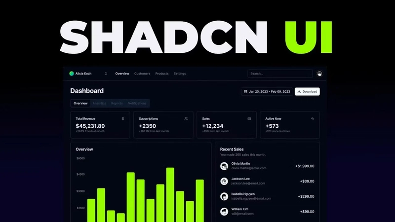
The landscape of frontend development is constantly evolving, especially when it comes to UI components. For years, we've juggled comprehensive libraries like Material UI, Ant Design, or Chakra UI. They offer a wealth of pre-built components, but often come with trade-offs: heavy bundle sizes, complex style overrides, and a feeling of being locked into their specific ecosystem and design opinions. Then came Shadcn/ui, and for many developers like myself, it fundamentally changed the game.
Shadcn/ui isn't a component library in the traditional sense. It's better described as a curated collection of beautifully designed, highly reusable UI primitives and components built using Radix UI for behaviour and accessibility, and Tailwind CSS for styling. The magic lies in its approach: you don't install it as a dependency. Instead, you use its CLI tool to copy the actual component code directly into your project. This means you own the code. You can tweak, modify, and style it exactly as you need, without fighting against library internals or complex specificity rules.
This approach offers incredible flexibility, promotes understanding of the underlying code, and keeps your application lean by only including what you actually use. It perfectly blends the power of well-architected primitives (thanks to Radix) with the utility-first styling prowess of Tailwind CSS. After integrating Shadcn/ui into several projects, a set of core components has emerged as my absolute go-to toolkit. These aren't just functional; they are elegant, accessible, and drastically speed up development while maintaining high quality.
Here are the top 10 Shadcn/ui components I find myself reaching for again and again:
1. The Humble Hero: Button

It might seem basic, but a solid Button component is the bedrock of any UI. Shadcn's Button is exemplary.
- Why it's great: It comes pre-configured with sensible defaults and several useful variants out-of-the-box:
default,destructive,outline,secondary,ghost, andlink. It also includes size variations. This covers probably 95% of button styling needs immediately. - Common Use Cases: Submit actions, navigation links styled as buttons, triggering modals, confirmation actions, secondary actions – literally anywhere user interaction is required.
- Shadcn Advantage: The
asChildprop is a game-changer. It allows you to compose theButtonwith other elements, like a Next.js, inheriting the button's styling while retaining the child's functionality (e.g., client-side routing). This avoids awkward workarounds or redundant styling. Because you own the code, adding a new custom variant (likepremiumorwarning) is as simple as adding a few lines to the component's file and defining the corresponding Tailwind classes in thevariantsconfiguration.
2. Focused Interaction: Dialog

Modals or dialog boxes are essential for focused tasks, confirmations, or displaying critical information without navigating away from the current context. Shadcn's Dialog component, built on Radix UI's Dialog primitive, is superb.
- Why it's great: It handles all the tricky accessibility concerns automatically: focus trapping (keeping keyboard navigation within the modal), closing via the Escape key, and proper ARIA attributes for screen readers. The styling is clean and easily customizable.
- Common Use Cases: Confirmation prompts ("Are you sure you want to delete?"), displaying forms for quick edits or creation (like adding a new item), showing detailed information, login/signup forms.
- Shadcn Advantage: Its compositional nature (
DialogTrigger,DialogContent,DialogHeader,DialogTitle,DialogDescription,DialogFooter,DialogClose) makes it incredibly flexible. You structure the dialog exactly how you need it using these building blocks. This is far more intuitive than passing complex configuration objects to a monolithic modal component.
3. The Foundation of Forms: Input

No web application is complete without forms, and the Input component is the most fundamental building block.
- Why it's great: Shadcn's
Inputprovides a consistently styled, simple text input based on standard HTML. It integrates seamlessly with Tailwind for easy adjustments to padding, borders, focus states, etc. - Common Use Cases: Text fields, email inputs, password fields, search bars.
- Shadcn Advantage: While simple, its strength lies in consistency and easy customization via Tailwind utilities directly in your project. It pairs beautifully with the
Labelcomponent (also recommended) for accessible forms and integrates perfectly with theFormcomponent pattern (see #10). You're not fighting predefined styles; you're applying standard Tailwind classes.
4. Structuring Content: Card

Cards are ubiquitous in modern UI design, used to group related information into a digestible, visually distinct block.
- Why it's great: The
Cardcomponent provides a structured container with optional, pre-styled sub-components:CardHeader,CardTitle,CardDescription,CardContent, andCardFooter. This encourages consistency in how you present information blocks. - Common Use Cases: Displaying user profiles, product summaries, blog post previews, feature blocks on a landing page, dashboard widgets.
- Shadcn Advantage: Composition is key here. You only use the parts you need (
CardHeader,CardContent, etc.), keeping the markup clean. Customizing the spacing, borders, and background is trivial using Tailwind classes directly on the components within your project'scard.tsxfile.
5. Actions and Options: DropdownMenu

When you need to present a list of actions or options related to a specific element without cluttering the main interface, the DropdownMenu is invaluable.
- Why it's great: Built on Radix UI's accessible Dropdown Menu primitive, it handles keyboard navigation, focus management, and screen reader support flawlessly. It supports nested submenus, separators, checkbox items, and radio groups within the menu.
- Common Use Cases: User profile menus (Settings, Logout), action menus on list items (Edit, Delete, View), selection options for components.
- Shadcn Advantage: The declarative API using components like
DropdownMenuTrigger,DropdownMenuContent,DropdownMenuItem,DropdownMenuSeparator,DropdownMenuSub, etc., makes complex menus easy to construct. Customizing the appearance via Tailwind feels natural and straightforward.
6. Displaying Data: Table

Displaying tabular data is a core requirement for many applications, especially dashboards and admin panels. Shadcn's Table component provides a clean, styled foundation.
- Why it's great: It leverages standard HTML table elements (