


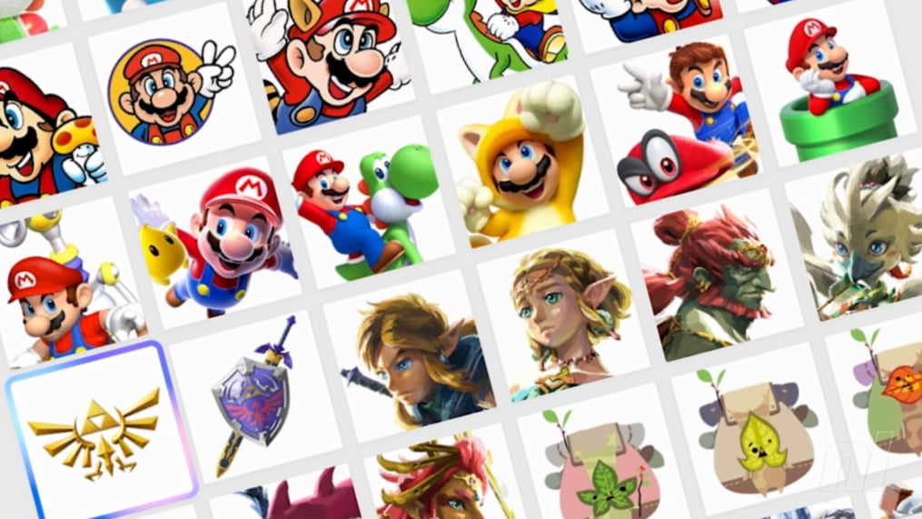
![[The AI Show Episode 146]: Rise of “AI-First” Companies, AI Job Disruption, GPT-4o Update Gets Rolled Back, How Big Consulting Firms Use AI, and Meta AI App](https://www.marketingaiinstitute.com/hubfs/ep%20146%20cover.png)


.jpg?width=1920&height=1920&fit=bounds&quality=70&format=jpg&auto=webp#)


_Alexey_Kotelnikov_Alamy.jpg?width=1280&auto=webp&quality=80&disable=upscale#)
_Brian_Jackson_Alamy.jpg?width=1280&auto=webp&quality=80&disable=upscale#)


 Stolen 884,000 Credit Card Details on 13 Million Clicks from Users Worldwide.webp?#)


![Roku clarifies how ‘Pause Ads’ work amid issues with some HDR content [U]](https://i0.wp.com/9to5google.com/wp-content/uploads/sites/4/2025/05/roku-pause-ad-1.jpg?resize=1200%2C628&quality=82&strip=all&ssl=1)
![Look at this Chrome Dino figure and its adorable tiny boombox [Gallery]](https://i0.wp.com/9to5google.com/wp-content/uploads/sites/4/2025/05/chrome-dino-youtube-boombox-1.jpg?resize=1200%2C628&quality=82&strip=all&ssl=1)


![Apple Seeds visionOS 2.5 RC to Developers [Download]](https://www.iclarified.com/images/news/97240/97240/97240-640.jpg)
![Apple Seeds tvOS 18.5 RC to Developers [Download]](https://www.iclarified.com/images/news/97243/97243/97243-640.jpg)


How to Create Documentation with docs.page – A Beginner's Tutorial
One of the most tedious tasks for every startup, company, and open-source project is often building and managing documentation – especially for medium to large-scale documentation websites. docs.page is an open-source documentation tool that helps yo...

One of the most tedious tasks for every startup, company, and open-source project is often building and managing documentation – especially for medium to large-scale documentation websites.
docs.page is an open-source documentation tool that helps you create instant, fast, beautiful, and responsive documentation websites with minimal configuration. It is an open-source project developed by Invertase, a company known for creating developer tools and SDKs.
docs.page is designed to streamline the process of publishing documentation by sourcing content directly from public GitHub repositories.
Key Features:
Zero configuration: you create a 'docs.json' file and a 'docs' directory. Inside the docs directory, you can create files using the .mdx extension, and docs.page will generate your documentation site.
Customizable: docs.page allows you to add your logo, social links, theme, analytics, navigation, and more through a simple configuration file.
Live previews: enables viewing of documentation for any branch, pull request, or specific commit, facilitating real-time collaboration and review.
Hot reload: the Hot Reload feature provides real-time previews of documentation changes while editing Markdown (.mdx) files. This feature enhances the local development workflow, enabling instant updates without manual refreshes or rebuilds.
GitHub bot integration: provides a GitHub bot that automatically generates URLs for pull request documentation previews.
MDX support: you can write documentation in Markdown to utilize MDX, which enables you to use React components, such as tabs, Cards, Tweets, and Steps, directly within your Markdown file.
Search functionality: integrates with DocSearch to offer full-text search capabilities within your documentation.
Responsive resign: ensures that your documentation is accessible and visually appealing across a range of devices and screen sizes.
Dark/light mode: offers theme customization to switch between dark and light modes.
Code block highlighting: provides syntax highlighting and content copying features for code blocks.
Check out the code available in my GitHub repository.
Table of Contents:
How Does docs.page Work?
You can easily start creating your documentation page using the docs.page CLI. It helps you set up a local documentation project by running the following command:
pnpm dlx @docs.page/cli init docs.page
The command output appears as follows:
pnpm dlx @docs.page/cli init docs.page
? Are you sure you want to setup and install docs.page in /home/officialrajdeepsingh/medium/docs.page? yes
Files created:
 - docs.json: Configuration file for your documentation site
 - docs/index.mdx: The home page of your documentation site
 - docs/next-steps.mdx: A page to help you get started with docs.page

Initialization complete. To preview your documentation site, vist https://docs.page/preview in your browser.
After creating your project with the docs.page CLI, your project structure should appear as follows:
.
├── docs
│   ├── index.mdx
│   └── next-steps.mdx
└── docs.json

2 directories, 3 files
The docs folder contains the Markdown file for your documentation, and the docs.json file includes the configuration for your website, such as the header, sidebar, logo, theme, and other settings.
How to Enable Live Preview in docs.page
You can set up live preview of your local documentation in real-time in the browser – but it's a little different: you don't need to run any development commands on your laptop or machine.
To open the live preview of your local documentation, first visit https://docs.page and click the Local Preview button.

Next, select the documentation project on your laptop or machine and click the "Select Directory" button.

After clicking the "Select Directory" button, a new window will open depending on your operating system. Its UI may appear different. Then you need to select the project.

After selecting the folder, you will see the following alert message in the browser (“Let site view files?”). To view the live preview of your documentation website, click the "View files" button.

Now you can see a local live preview of the documentation website in the browser, and any changes you make locally will instantly reflect in the browser. By default, your documentation website should appear as follows:

Next, you’ll learn about configuring the Logo, Theme, Header, Social Links, Sidebar, SEO, search, and more on your docs. You’ll also learn how to use the pre-built components, Front Matter, and assets on docs.page, and finally, how to deploy your documentation website.
How to Configure docs.page

The docs.json file is the primary file for configuring your documentation. Below is a list of all available configuration options, which you can use to modify the logos, theme, analytics, and more on your docs.
Properties
Basic properties
Logo
Theme
Header
Anchors
Social Links
SEO
Variables
Search
Scripts
Content
Tabs
Sidebar
There’s so much you can configure using docs.page – but in this tutorial, we’ll focus on some of the most important options:
Basic Properties

docs.page includes basic common properties, such as name, description, and favicon, which is very important for SEO.
name (string): The name of your project. It appears in the header and is used for things like SEO metadata.
description (string): A summary of your project. This is used in meta tags and social preview images.
favicon (string | Favicon object): Specifies the favicon shown in the browser tab. You can provide either a single string URL or use a Favicon object to define different icons for light and dark modes:
light (string): URL for the favicon in light mode.
dark (string): URL for the favicon in dark mode.
// docs.json
{
  "name": "Docs.page",
  "description": "Ship documentation, like you ship code",
  "favicon": "https://static.invertase.io/assets/docs.page/docs-page-logo.png",
   # or
  "favicon": {
    "light": "https://cdn-icons-png.flaticon.com/24/9664/9664027.png",
    "dark": "https://cdn-icons-png.flaticon.com/24/9643/9643115.png"
  }
}
Logo

Now it’s time to configure the logo for your documentation, which will appear in the header and be used for social preview images.
The minimum height of the logo must be 24px. You can provide URLS for both a light and a dark logo. If you only provide a light or dark logo, and it doesn't work, you may experience issues where your logo doesn't appear on the website when toggling the theme.
You can add the logo to the documentation in two ways:
- First way:
// docs.json
{
  "name": "My Docs",
  "logo": "https://cdn-icons-png.flaticon.com/24/2702/2702154.png",
}
- Second way:
// docs.json
{
  "name": "My Docs",
  "logo": {
    "light": "https://cdn-icons-png.flaticon.com/24/2702/2702154.png",
    "dark": "https://cdn-icons-png.flaticon.com/24/2702/2702172.png"
  }
}
Theme
Configuring the theme in your documentation is easy. If you don’t provide a theme, the default theme will be used in your documentation.
docs.page includes a theme property in docs.json, which holds a Theme object as its value with the properties defaultTheme, primary, primaryLight, backgroundLight, and backgroundDark.
defaultTheme: You can select a theme, dark or light.primary: The primary colour is used for links, buttons, and other interactive elements.primaryLight: TheprimaryLightcolour option is used in light mode. If your primary light option is not specified in thedocs.jsonfile, then the primary colour will be used.primaryDark: TheprimaryDarkcolour option is used in dark mode. If yourprimaryDarkoption is not specified in thedocs.jsonfile, then the primary color will be used.backgroundLight: ThebackgroundLightoption is used to specify the background color of your documentation in light mode.backgroundDark: ThebackgroundDarkoption is used to specify the background color of your documentation in dark mode.
// docs.json
{
  "theme": {
    "defaultTheme": "dark",
    "primary": "#de40eb",
    "primaryLight": "#BFA213",
    "backgroundLight": "#e0cfff",
    "backgroundDark": "#00101f"
  },
}
Header

Configuring the header in your documentation includes the following properties: showName, showThemeToggle, showGitHubCard, and links.
showName: TheshowNameoption displays the documentation name next to the logo in the header and defaults it is true.showThemeToggle: TheshowThemeToggleoption displays the theme toggle button in the header (and defaults to true).showGitHubCard: TheshowGitHubCardoption displays the GitHub card in the header and defaults to true.Links: The links option contains an array of Link objects to display a navigation in the header of your documentation.
// docs.json
{
  "header": {
    "showName": false,
    "showGitHubCard": false,
    "links": [
      {
        "title": "GitHub",
        "href": "https://github.com/officialrajdeepsingh/docs-page-demo"
      },
      {
        "title": "X",
        "href": "https://x.com/Official_R_deep"
      },
      {
        "title": "Linkedin",
        "href": "https://www.linkedin.com/in/officalrajdeepsingh"
      }
    ]
  }
}
Social Links

The social option contains an object of key-value pairs where the key represents the social platform and the value corresponds to the username or ID. Here’s how you can add them:
// docs.json
{
  "social": {
    "github": "officialrajdeepsingh/docs-page-demo",
    "x": "@Official_R_deep",
    "linkedin": "officalrajdeepsingh"
  }
}
SEO
The SEO option configures the SEO settings for your documentation. The noindex option tells search engines not to index your documentation, and it defaults to false.
// docs.json
{
  noindex: true
}
Search

To enable search functionality on your documentation site, you can integrate Algolia DocSearch by configuring the docsearch object in your docs.json file like this:
// docs.json
{
 "search": {
    "docsearch": {
      "appId": "YOUR_APP_ID",
      "apiKey": "YOUR_API_KEY",
      "indexName": "YOUR_INDEX_NAME"
    }
  }
}
Tabs

Tabs are an array of objects displayed at the top of your documentation website.
Properties
Each Tab object includes the following properties:
id (string, required): A unique identifier for the tab.
title (string, required): The text label displayed on the tab.
href (string, required): The URL to navigate to when the tab is clicked.
locale (string, optional): If set, this tab is displayed only when viewing documentation for the specified locale.
Here’s an example of a couple tabs:
{
  "tabs": [
    {
      "id": "root",
      "title": "Documentation",
      "href": "/"
    },
    {
      "id": "components",
      "title": "Components",
      "href": "/components"
    }
  ],
}
Sidebar
To display the sidebar on your website, you can configure or define it in the docs.json file your documentation, which will appear in the sidebar of your site.

Essentially, a sidebar is a list of links that appears on the side of your documentation. You can organize links using groups and pages by providing an array of sidebar objects.
Options:
pages: The pages option takes a list of page links to display in the sidebar. It accepts the following options:
title (required): The title of the sidebar item.
href (required): The URL to link to when the sidebar item is clicked.
icon (optional): The icon to display next to the sidebar item.
group (string): The title of the group under which the sidebar item will be displayed. If not provided, the item will appear at the top level of the sidebar.
href (string): The URL the sidebar item will link to when clicked.
icon (string): The name of the icon to display next to the sidebar item.
tab (string): If set, the sidebar item will only be shown when a specific tab (matching the provided tab ID) is active.
// docs.json
{
"sidebar": [
    {
      "pages": [
        {
          "title": "Overview",
          "href": "/",
          "icon": "book"
        },
        {
          "title": "Configuration",
          "href": "/configuration",
          "icon": "gear"
        }
      ]
    },
    {
      "group": "Components",
      "icon": "grip",
      "pages": [
        {
          "title": "Getting Started",
          "href": "/components",
          "icon": "rocket"
        },
        {
          "title": "Accordion",
          "href": "/components/accordion",
          "icon": "square-caret-down"
        },
        {
          "title": "Callouts",
          "href": "/components/callouts",
          "icon": "bullhorn"
        },
        {
          "title": "Cards",
          "href": "/components/cards",
          "icon": "square-full"
        }
      ]
    }
  ]
}
If you want to learn more about this, check out the documentation here.
How to Use Pre-built Components in docs.page
docs.page comes with 15 pre-built components, so you don't need to import components into your MDX file. You can use them directly in your MDX file.
In the following example, I’m using the Info Callout component directly within the MDX file, without importing it.
// index.mdx
---
title: Welcome to docs.page!
description: Get started with docs.page
---

Welcome to docs.page! The init command you just ran has created a basic file struture in your project to help you get started.

## Walkthrough

### Configuration

In the root of your directory a new `docs.json` file has been created. This file is used to configure your documentation site. You can customize the name, description, and sidebar, theme, logos and more using this file.


<Info>Here's a basic example of what the file looks like: Info>
How to Diagnose Errors in docs.page
If you encounter any errors on your documentation website, you can view all the errors by clicking the diagnostics button.

How to Use Frontmatter
Front matter is a block of YAML placed at the beginning of a Markdown file, enclosed between triple-dash (---) lines.
Frontmatter is a way to customise the metadata page directly within your Markdown files, and most importantly, frontmatter is used for SEO.
# docs/getting-started.mdx
---
title: Welcome to Awesome Project
description: Some awesome docs!
---

# Welcome!
Below is a list of some of the important frontmatter properties in docs.page, including their type and default values:
title(string): The page’s title used in metadata, social cards, and displayed as the main heading.description(string): A summary of the page appears in metadata for SEO and link previews.image(string): URL of an asset used in social cards and (if enabled) shown at the top of the page.redirect(string): A URL to forward visitors to. When set, the page’s content is bypassed.showPageTitle(boolean): Toggle whether the page title appears as a heading at the top.showPageImage(boolean): Toggle whether the front-matter image is rendered at the top.noindex(boolean): If true, instructs search engines not to index the page.
Refer to the documentation for more detail and other frontmatter property information.
How to Add Assets to Your Docs
You can include assets, such as images and videos, in your documentation. You can add both remote and local assets.
Remote Assets
To add remote assets to your documentation, you can reference them directly in your markdown files.
For example, to include an image from a URL:
# getting-started.mdx
---
title: Welcome to get started
description: Some awesome docs!
---
# Welcome!

Local Assets
To use local assets in your documentation, create an assets folder inside the docs/ directory. Then, add images and videos to the assets folder and reference them in your Markdown files.
Check out the following to better understand:
docs/
  assets/
    natural.png
  index.mdx
Within your markdown file, you can reference the image using a relative path:

Different between Local vs Remote Assets
Local assets (PNG, JPG, PDF, and so on) are files stored within your project's public folder, while remote assets are files hosted on an external server. You can access your local assets using your domain URL.

On the other hand, remote assets are stored on a different server (image hosting), as I mentioned. You can access remote assets with a full URL.
The best examples of remote assets include images from Unsplash, Pixabay, and Pexels that can be used directly in your MDX file.
You can use remote and local assets based on your requirements – both have advantages and disadvantages. With remote assets, you can add an image directly in your mdx file. When using local assets, you add an image to the public folder and then reference it in your mdx file.
How to Publish Your Documentation Website
With docs.page, you can easily publish your documentation website. No configuration is required – once your documentation website is ready, you can just push your local code to a GitHub repository.
You can now access your documentation website immediately via the docs.page domain.
For example, if your GitHub repository is officialrajdeepsingh/docs-page-demo, your documentation will be available at https://docs.page/officialrajdeepsingh/docs-page-demo.

How to Live Preview Upcoming Changes to Your Docs Website
You can view previews of upcoming changes to your documentation before going public. As your documentation website grows, use the docs.page Github app – any pull request you create in your Github repository automatically generates a unique live preview URL.

To configure the docs page of the GitHub application in your repository, follow these steps:
Click on the install button.
Select the GitHub account
Select All and single repository.
Click on the install button
Next, enter the password and OTP.
Now if your application is successful, install it in your repository.

Whenever you or another developer create a pull request in your repository, the docs page application creates live previews for you.
Conclusion
docs.page is a free, open-source project that allows you to create instant, fast, and beautiful documentation without requiring any configuration.
I think docs.page offers the best solution for documentation. You can easily set up and deploy your documentation website with the help of docs.page cloud service.
For now, it’s completely free to deploy a documentation website with a docs.page, and I hope it stays that way.
If docs.page ever decides to charge for their services, that could be troublesome. Hopefully, in that case, they’ll provide a clear guide on how to deploy your website on another cloud platform.