


.jpg)


![[The AI Show Episode 148]: Microsoft’s Quiet AI Layoffs, US Copyright Office’s Bombshell AI Guidance, 2025 State of Marketing AI Report, and OpenAI Codex](https://www.marketingaiinstitute.com/hubfs/ep%20148%20cover%20%281%29.png)


![[The AI Show Episode 146]: Rise of “AI-First” Companies, AI Job Disruption, GPT-4o Update Gets Rolled Back, How Big Consulting Firms Use AI, and Meta AI App](https://www.marketingaiinstitute.com/hubfs/ep%20146%20cover.png)


.jpg?width=1920&height=1920&fit=bounds&quality=70&format=jpg&auto=webp#)


.jpg?width=1920&height=1920&fit=bounds&quality=70&format=jpg&auto=webp#)


_Alan_Wilson_Alamy.jpg?width=1280&auto=webp&quality=80&disable=upscale#)
_pichetw_Alamy.jpg?width=1280&auto=webp&quality=80&disable=upscale#)


-xl.jpg)


![Some Pixel Tablet accessories we can’t live without [Video]](https://i0.wp.com/9to5google.com/wp-content/uploads/sites/4/2024/10/Pixel-Tablet-Header.jpg?resize=1200%2C628&quality=82&strip=all&ssl=1)


![Apple Leads Global Wireless Earbuds Market in Q1 2025 [Chart]](https://www.iclarified.com/images/news/97394/97394/97394-640.jpg)

![OpenAI Acquires Jony Ive's 'io' to Build Next-Gen AI Devices [Video]](https://www.iclarified.com/images/news/97399/97399/97399-640.jpg)
![Apple Shares Teaser for 'Chief of War' Starring Jason Momoa [Video]](https://www.iclarified.com/images/news/97400/97400/97400-640.jpg)


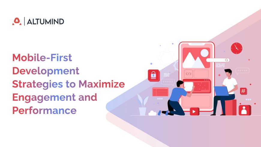
Mobile-First Development Strategies to Maximize Engagement and Performance
Mobile-first development or mobile-first design prioritizes the mobile experience. So, when you design a webpage, consider how it’d fare on mobile and then adapt it for larger screens.
A lot of what we see online is shifting to smartphones. Many web experiences begin on a phone and often end on it. What would’ve been on a Desktop or Laptop is now more prevalent on a Smartphone. If this is the case, optimizing for Smartphones makes sense, so much so that you consider going mobile-first.
Mobile-first development or mobile-first design prioritizes the mobile experience. So, when you design a webpage, consider how it’d fare on mobile and then adapt it for larger screens. Start with a mobile-friendly UI for your website before figuring out desktop-specific enhancements. Let’s explore why this makes sense for modern-day websites.
5 Key Benefits of Mobile-First Development
1. Enhanced user experience: Seeing as the primary touchpoint is now phones, it makes sense to optimize the digital experiences on them. By designing a mobile page with adaptive UI/UX frameworks and gesture-based navigation, you’ll create a frictionless experience. Developers can craft touch-optimized pages with minimal latency and lower UX fragmentation, leading to higher engagement and improved interaction.
2. Better website performance: Mobile-first development prioritizes lightweight architectures and efficient asset delivery alongside asynchronous loading and lazy image rendering, resulting in a high-performance web experience. Optimized CSS media queries, AMP, PWA enhancements, adaptive image compression (WebP/AVIF), and minified JavaScript optimize Core Web Vitals — leading to lowered page load times and time-to-interaction (TTI) even on bandwidth-constrained networks.
3. Mobile Visibility & SEO Boost: A mobile-first development approach significantly expands your reach and boosts your search engine visibility. With more users accessing the internet via smartphones than desktops, optimizing your digital experience for mobile ensures broader accessibility especially among younger, mobile-native audiences.
Additionally, search engines like Google prioritize mobile-optimized websites through mobile-first indexing. This means that sites with responsive layouts, touch-friendly UI, mobile-friendly metadata, and AMP support are more likely to rank higher on search engine results pages (SERPs). By going mobile-first, you’re not only reaching more users but also improving your chances of being discovered by them.
4. Higher conversion rates: A higher ranking on SERP will mean more impressions. More impressions mean a higher Click Through Rate (CTR). A higher CTR will mean more traffic to the site, and more traffic increases the likelihood of conversion. Further, users seeking a captivating mobile experience will stay back, engage, navigate the site, and buy or become a lead. So, invariably, a mobile-development approach will lead to higher conversions.
5. Integration with mobile-centric features: From geolocation-based targeting to biometric authentication, voice search optimization, etc., a mobile-first design approach makes it easier to align the website with cutting-edge mobile-centric capabilities. Businesses can capture evolving mobile-first consumer behavior by leveraging NFC payments, haptic feedback, QR code scans, and push notifications. Users won’t have to switch from laptop to phone. Getting a user-friendly mobile site/app means they can complete their journey on the phone.
How to Implement Mobile-First Development
Web design: Design responsive interfaces using flexible grids and fluid layouts. Utilize media queries to adjust styling for different screen sizes and orientations. Employ relative units (%, ems, rems) over fixed ones (px) to ensure adaptability across devices. Maintain clear hierarchy with accessible color contrasts, legible fonts, and consistent spacing. Streamline navigation and interactions to reduce cognitive load and increase usability.
Touch-friendly design: Design larger tap targets, ideally at least 48px by 48px as per Material Design guidelines, optimized for finger inputs rather than mouse clicks. Allow adequate spacing between elements to prevent unintended taps. Incorporate gesture-based navigation like swiping and pinching. Also, show effects around buttons using “:active” CSS pseudo-class to provide visual feedback upon touching that element. Implement mobile-optimized navigation like hamburger menus and bottom tab bars. Further, integrate mobile-optimized forms with autofill, input masks, and minimal fields.
Content for small screens: Optimize fonts and typography for scalability and legibility on smaller screens. Use relative units such as “rem” to adapt font sizes dynamically for different screen sizes. Leave enough whitespace between paragraphs, keep them succinct (fewer lines), avoid fixed dimensions, and use the viewport meta tag for proper scaling between devices. Ensure sufficient padding and target areas and follow Apple’s Human Interface Guidelines or Material Design specifications. Keep the search box and CTAs big, reduce form fields, and use fewer intrusive pop-ups.
Performance Optimization: Minimize HTTP requests using CSS sprites, inline SVGs, and lazy loading, which fetches only what’s needed, reducing initial load times. Enable browser caching and compression with Gzip, Brotli, and Service Workers. Use asynchronous loading via deferred JavaScript execution, fetch() or Axios, and manage with async/await to prevent UI blocking.
Leverage CDNs (Content Delivery Networks) to cache and deliver assets closer to users, reducing latency. Design efficient RESTful or GraphQL APIs, and optimize data transfer by querying only required fields and compressing responses. Use tools like Google Lighthouse and WebPageTest to analyze and improve mobile performance.
For media, use adaptive bitrate streaming (HLS or MPEG-DASH) to adjust quality based on bandwidth. Serve images in modern formats like WebP or AVIF. Implement responsive media using <picture> and srcset, scale vector graphics via SVGs, and apply CSS media queries for adaptive backgrounds. Compress assets with tools like TinyPNG or Squoosh while preserving quality. Keep alt text consistent and descriptive across devices to support accessibility.
Frameworks: Use mobile-first CSS Frameworks like Bootstrap, Tailwind, or Foundation. You’d get pre-built components and utilities like responsive classes, grid systems, and breakpoints to ease device adaptability. Also, leverage frameworks like Redux, Zustand, or Context API to maintain the “state” of an application, avoiding data duplication on complex apps and ensuring its components remain consistent. Further, use lightweight frameworks such as AMP (Accelerated Mobile Pages) on pages for better speeds. Use React or Vue frameworks for JavaScript-heavy applications.
Progressive Web Apps: Use React or Angular to craft a responsive and adaptive UI for the PWA. Leverage Service Workers to get offline capabilities and seamless UX in areas with low connectivity. Use the Web App Manifest to define the app name, theme color, and icons, letting users add the PWA to their home screen. Apply the “App Shell” model — helps separate static and dynamic content and reduces load times. Further, optimize API calls through “request throttling” or “batching” to minimize bandwidth usage.
Google Guidelines to Keep in Mind
- Have the same structured data on mobile and desktop
- If using Data Highlighter, check the Data Highlighter dashboard for extraction errors
- Don’t use different “robots” meta tags on the mobile and desktop — fails to crawl & index
- Ensure Google bots can see lazy-loaded content
- Use the same URL for resources on mobile and desktop
To know more, visit Google’s mobile site and mobile-first indexing best practices webpage.
Wrapping Up
The world is shifting towards mobile, so it only makes sense for a business to have a mobile-first strategy. It’s simple, if your audience prefers mobile, your design priorities must reflect that before considering desktop enhancements. The best part, Google wants to see the same, so you get SEO rewards as well. A mobile-first design sets your business up for more traffic, engagement, and conversions. “A well-executed mobile-first strategy isn’t just future-friendly, it’s business-critical.
73.1% of web designers think that non-responsive design is a top reason why visitors leave a website — GoodFirms
All you need now is an expert mobile-first development company, think Altumind. Altumind brings years of critical thinking and in-depth experience crafting aesthetic, responsive, and intuitive mobile pages across industry verticals for different business types. Our artistic front-end designers and developers are the most reliable when it comes to creating a top-notch mobile presence tailored to your unique business needs.


