


![[The AI Show Episode 146]: Rise of “AI-First” Companies, AI Job Disruption, GPT-4o Update Gets Rolled Back, How Big Consulting Firms Use AI, and Meta AI App](https://www.marketingaiinstitute.com/hubfs/ep%20146%20cover.png)


![[DEALS] The Premium Python Programming PCEP Certification Prep Bundle (67% off) & Other Deals Up To 98% Off – Offers End Soon!](https://www.javacodegeeks.com/wp-content/uploads/2012/12/jcg-logo.jpg)


_Aleksey_Funtap_Alamy.jpg?width=1280&auto=webp&quality=80&disable=upscale#)
_Sergey_Tarasov_Alamy.jpg?width=1280&auto=webp&quality=80&disable=upscale#)


![Apple Foldable iPhone to Feature New Display Tech, 19% Thinner Panel [Rumor]](https://www.iclarified.com/images/news/97271/97271/97271-640.jpg)
![Apple Developing New Chips for Smart Glasses, Macs, AI Servers [Report]](https://www.iclarified.com/images/news/97269/97269/97269-640.jpg)
![Apple Shares New Mother's Day Ad: 'A Gift for Mom' [Video]](https://www.iclarified.com/images/news/97267/97267/97267-640.jpg)
![Apple Shares Official Trailer for 'Stick' Starring Owen Wilson [Video]](https://www.iclarified.com/images/news/97264/97264/97264-640.jpg)


MUI Material Styling: How to Implement it in Your React App
Let’s face it—building sleek, responsive user interfaces can be a tedious. But Material UI (MUI) can make it easier. If you're working with React, MUI is one of the best libraries out there for whipping up beautiful UIs. With its ready-made components and powerful styling tools (based on Google’s Material Design), your app won’t just work well—it’ll look good too. In this guide, we'll dive into how to use MUI's styling solution and implement it in your React project. Why MUI Styling? MUI’s styling solution is one of the standout features of the library. It allows developers to style components using JavaScript, enabling better maintainability, dynamic theming, and a more seamless integration with the React ecosystem. The primary benefits include: Customizability: Easily tweak components to suit your brand. Theming: Create a consistent design language using a global theme. Responsiveness: MUI makes it easy to build responsive layouts. Simplicity: The syntax and concepts are easy to grasp, especially for those already familiar with CSS-in-JS. Getting Started with MUI Styling Step 1: Install MUI in Your React Project Before diving into styling, make sure that MUI is installed in your project. You can add MUI and its required dependencies by running: npm install @mui/material @emotion/react @emotion/styled This will install the core Material UI components and the Emotion library for styling (Emotion is the default styling engine for MUI). Step 2: Basic Usage with sx Prop MUI comes with the sx prop, a powerful and flexible way to style components directly. The sx prop is a shorthand for adding custom styles to components and is a key feature of MUI 5. For example, to style a button: import { Button } from '@mui/material'; function MyButton() { return ( Click Me ); } The sx prop accepts an object with CSS properties, making it simple to apply inline styles. You can also leverage theme values directly in this object, such as theme.palette.primary.main. Step 3: Theming with ThemeProvider One of MUI’s greatest strengths is its theming capabilities. You can create a global theme that applies consistent styles across your application. To create a theme, use MUI's createTheme function and wrap your application with the ThemeProvider component. Here's an example of setting up a custom theme: import { createTheme, ThemeProvider } from '@mui/material/styles'; import { Button } from '@mui/material'; const theme = createTheme({ palette: { primary: { main: '#1976d2', // Custom primary color }, secondary: { main: '#dc004e', // Custom secondary color }, }, }); function App() { return ( Primary Button Secondary Button ); } In this example: We created a theme with custom primary and secondary colors. The ThemeProvider component makes the theme available to all child components, allowing them to access theme values. Step 4: Using styled API for Custom Components MUI also provides the styled utility, which enables you to define custom styled components with JavaScript. This works similarly to CSS-in-JS libraries but with the full power of the MUI theme. For instance, let’s create a custom-styled Card component: import { styled } from '@mui/system'; import { Card, CardContent, Typography } from '@mui/material'; const CustomCard = styled(Card)(({ theme }) => ({ backgroundColor: theme.palette.primary.light, padding: theme.spacing(3), boxShadow: theme.shadows[3], })); function App() { return ( Custom Card This is a custom-styled card using MUI's styled API. ); } In this example: We used the styled function to create a custom Card component. The styles are dynamically generated using the MUI theme. Step 5: Responsive Design with MUI’s Grid System MUI also includes a powerful grid system, which allows you to create responsive layouts easily. Here’s an example of a responsive layout using MUI's Grid components: import { Grid, Paper } from '@mui/material'; function ResponsiveLayout() { return ( Item 1 Item 2 Item 3 ); } In this layout: The Grid component is used to create a flexible and responsive grid system. The xs, sm, and md props define how the items behave on different screen sizes (e.g., full width on small screens and one-third width on medium screens). Best Practices Use the sx prop for simple customizations: If you're making minor tweaks to an MUI component, the sx prop is the way to go. Leverage the theme: Use the theme to define global design standards (e.g., color palette, typography) and ensure consistency throughout your app. Modular styling: For complex components, consider using the styled API to create reusable, custom-styled components. Stay responsive: MUI's grid and responsive utilities help you build layouts that adapt well to various
Let’s face it—building sleek, responsive user interfaces can be a tedious. But Material UI (MUI) can make it easier. If you're working with React, MUI is one of the best libraries out there for whipping up beautiful UIs. With its ready-made components and powerful styling tools (based on Google’s Material Design), your app won’t just work well—it’ll look good too.
In this guide, we'll dive into how to use MUI's styling solution and implement it in your React project.
Why MUI Styling?
MUI’s styling solution is one of the standout features of the library. It allows developers to style components using JavaScript, enabling better maintainability, dynamic theming, and a more seamless integration with the React ecosystem. The primary benefits include:
Customizability:
Easily tweak components to suit your brand.Theming: Create a consistent design language using a global theme.
Responsiveness: MUI makes it easy to build responsive layouts.
Simplicity: The syntax and concepts are easy to grasp, especially for those already familiar with CSS-in-JS.
Getting Started with MUI Styling
Step 1: Install MUI in Your React Project
Before diving into styling, make sure that MUI is installed in your project. You can add MUI and its required dependencies by running:
npm install @mui/material @emotion/react @emotion/styled
This will install the core Material UI components and the Emotion library for styling (Emotion is the default styling engine for MUI).
Step 2: Basic Usage with sx Prop
MUI comes with the sx prop, a powerful and flexible way to style components directly. The sx prop is a shorthand for adding custom styles to components and is a key feature of MUI 5.
For example, to style a button:
import { Button } from '@mui/material';
function MyButton() {
return (
);
}
The sx prop accepts an object with CSS properties, making it simple to apply inline styles. You can also leverage theme values directly in this object, such as theme.palette.primary.main.
Step 3: Theming with ThemeProvider
One of MUI’s greatest strengths is its theming capabilities. You can create a global theme that applies consistent styles across your application.
To create a theme, use MUI's createTheme function and wrap your application with the ThemeProvider component. Here's an example of setting up a custom theme:
import { createTheme, ThemeProvider } from '@mui/material/styles';
import { Button } from '@mui/material';
const theme = createTheme({
palette: {
primary: {
main: '#1976d2', // Custom primary color
},
secondary: {
main: '#dc004e', // Custom secondary color
},
},
});
function App() {
return (
);
}
In this example:
We created a theme with custom primary and secondary colors.
The ThemeProvider component makes the theme available to all child components, allowing them to access theme values.
Step 4: Using styled API for Custom Components
MUI also provides the styled utility, which enables you to define custom styled components with JavaScript. This works similarly to CSS-in-JS libraries but with the full power of the MUI theme.
For instance, let’s create a custom-styled Card component:
import { styled } from '@mui/system';
import { Card, CardContent, Typography } from '@mui/material';

const CustomCard = styled(Card)(({ theme }) => ({
  backgroundColor: theme.palette.primary.light,
  padding: theme.spacing(3),
  boxShadow: theme.shadows[3],
}));

function App() {
  return (


        Custom Card
        This is a custom-styled card using MUI's styled API.


  );
}
In this example:
We used the styled function to create a custom Card component.
The styles are dynamically generated using the MUI theme.
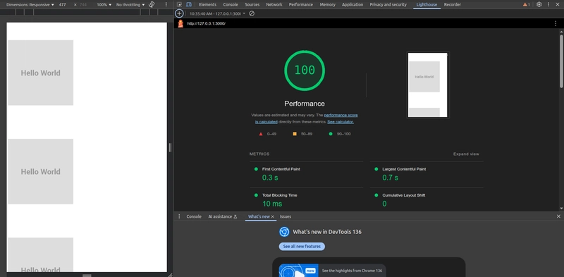
Step 5: Responsive Design with MUI’s Grid System
MUI also includes a powerful grid system, which allows you to create responsive layouts easily.
Here’s an example of a responsive layout using MUI's Grid components:
import { Grid, Paper } from '@mui/material';

function ResponsiveLayout() {
  return (


        Item 1


        Item 2


        Item 3


  );
}
In this layout:
The Grid component is used to create a flexible and responsive grid system.
The xs, sm, and md props define how the items behave on different screen sizes (e.g., full width on small screens and one-third width on medium screens).
Best Practices
Use the sx prop for simple customizations: If you're making minor tweaks to an MUI component, the sx prop is the way to go.
Leverage the theme: Use the theme to define global design standards (e.g., color palette, typography) and ensure consistency throughout your app.
Modular styling: For complex components, consider using the styled API to create reusable, custom-styled components.
Stay responsive: MUI's grid and responsive utilities help you build layouts that adapt well to various screen sizes.
Core Takeaways
MUI’s styling system brings the best of both worlds: design consistency and development flexibility. Whether you’re fine-tuning a button or creating a full design system, MUI gives you the tools to do it fast—and do it right.
Sources:
Material UI