


![[The AI Show Episode 146]: Rise of “AI-First” Companies, AI Job Disruption, GPT-4o Update Gets Rolled Back, How Big Consulting Firms Use AI, and Meta AI App](https://www.marketingaiinstitute.com/hubfs/ep%20146%20cover.png)


![[DEALS] The Premium Python Programming PCEP Certification Prep Bundle (67% off) & Other Deals Up To 98% Off – Offers End Soon!](https://www.javacodegeeks.com/wp-content/uploads/2012/12/jcg-logo.jpg)


_Aleksey_Funtap_Alamy.jpg?width=1280&auto=webp&quality=80&disable=upscale#)
_Sergey_Tarasov_Alamy.jpg?width=1280&auto=webp&quality=80&disable=upscale#)


![Apple Foldable iPhone to Feature New Display Tech, 19% Thinner Panel [Rumor]](https://www.iclarified.com/images/news/97271/97271/97271-640.jpg)
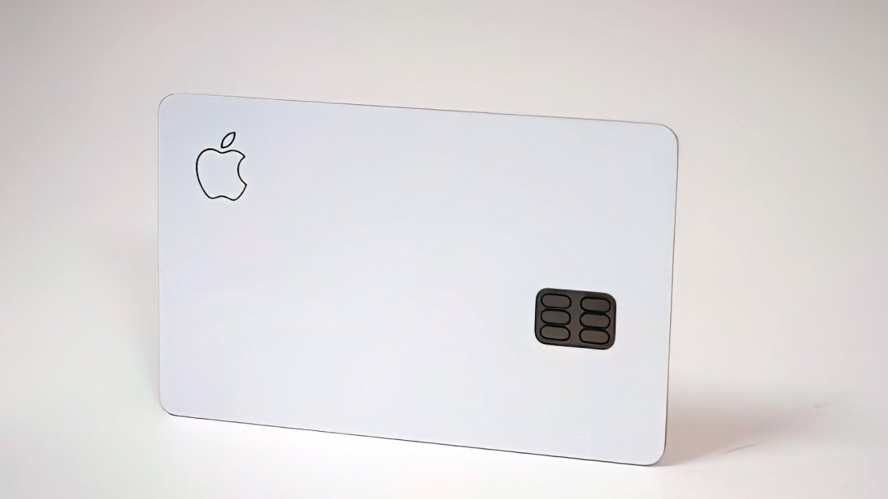
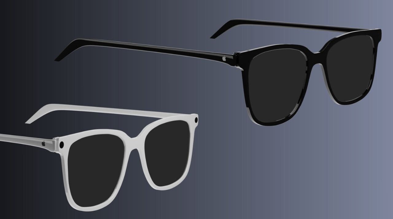
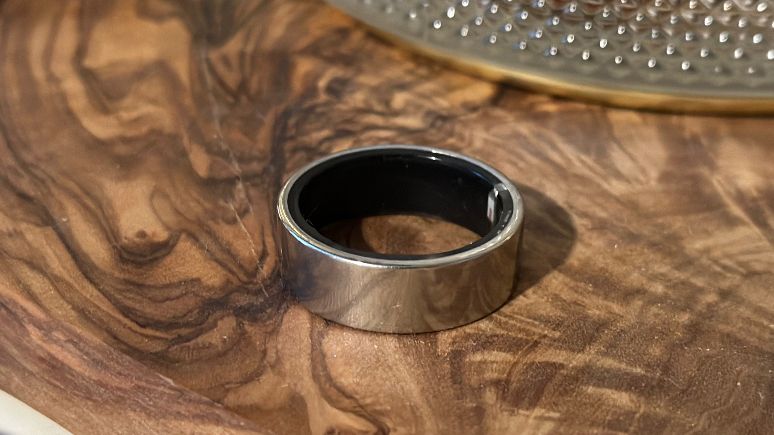
![Apple Developing New Chips for Smart Glasses, Macs, AI Servers [Report]](https://www.iclarified.com/images/news/97269/97269/97269-640.jpg)
![Apple Shares New Mother's Day Ad: 'A Gift for Mom' [Video]](https://www.iclarified.com/images/news/97267/97267/97267-640.jpg)
![Apple Shares Official Trailer for 'Stick' Starring Owen Wilson [Video]](https://www.iclarified.com/images/news/97264/97264/97264-640.jpg)


How to Fix Mobile Image Quality Issues in HTML
When creating a mobile website, you might encounter some image quality issues, especially when the images seem to stretch or lose clarity on smaller screens. This article will provide insights into why these problems occur and share effective solutions to ensure your images display correctly across all devices. Why Do Images Lose Quality on Mobile? Many developers face issues where images look fine on desktop but appear stretched or pixelated on mobile devices. This typically results from how browsers interpret image resolution in relation to device screens. Here are some common reasons: Fixed Dimensions: Setting fixed dimensions for images in your HTML or CSS might work well on larger screens but could distort the images on smaller screens due to scaling. Viewport Settings: If your viewport settings aren’t optimized, it might affect how images scale based on the device's width. CSS Background Images: Using background images without considering their size properties may lead to poor rendering. Ensure Proper Viewport Settings To get started, ensure your viewport settings are correctly defined. Use the following meta tag in the section of your HTML: This code tells browsers to adjust the page's dimensions to that of the device's display, thus optimizing the rendering of images and other elements. Using the Correct Image Sizes When embedding images, consider using relative units instead of fixed pixel values because fixed dimensions can lead to distortion. Here’s how you can adjust your image code: Example: HTML Image Tag Instead of using fixed width and height, use CSS to control the image fully responsive: The width: 100%; ensures the image will take up the entire width of its parent container while height: auto; maintains the aspect ratio of the image. Example: CSS Background Images If you’re using CSS for background images, make sure to set them to scale correctly: #myImg { width: 100%; height: auto; background-image: url(img/my_img.png); background-size: cover; /* Optionally use contain */ background-position: center; } background-size: cover; will ensure that the image covers the entire element, maintaining its aspect ratio. background-position: center; helps to focus on the center of the image, which is particularly useful for images that might get cropped during scaling. Testing Across Devices After applying these adjustments, it’s crucial to test your website on various devices to check how the images look. Use browser developer tools to simulate different screen sizes or physically check on mobile devices if available. This way, you can identify any remaining issues you need to address. Frequently Asked Questions (FAQ) Q1: What is the best image format for mobile sites? A1: For the best quality and performance, use modern formats like WebP, which provide high quality with smaller file sizes compared to JPEG or PNG. Q2: How do I ensure images load faster on mobile? A2: Use image compression tools to reduce file sizes, optimize image delivery through Content Delivery Networks (CDN), and implement responsive image techniques using the tag. Q3: Should I use lazy loading for images? A3: Yes, implementing lazy loading helps improve load times by only loading images that are in the user’s viewport, thus enhancing performance on mobile devices. By following these guidelines and strategies, you’ll significantly enhance the quality of images on your mobile site while providing a better user experience.

When creating a mobile website, you might encounter some image quality issues, especially when the images seem to stretch or lose clarity on smaller screens. This article will provide insights into why these problems occur and share effective solutions to ensure your images display correctly across all devices.
Why Do Images Lose Quality on Mobile?
Many developers face issues where images look fine on desktop but appear stretched or pixelated on mobile devices. This typically results from how browsers interpret image resolution in relation to device screens. Here are some common reasons:
- Fixed Dimensions: Setting fixed dimensions for images in your HTML or CSS might work well on larger screens but could distort the images on smaller screens due to scaling.
- Viewport Settings: If your viewport settings aren’t optimized, it might affect how images scale based on the device's width.
- CSS Background Images: Using background images without considering their size properties may lead to poor rendering.
Ensure Proper Viewport Settings
To get started, ensure your viewport settings are correctly defined. Use the following meta tag in the section of your HTML:
This code tells browsers to adjust the page's dimensions to that of the device's display, thus optimizing the rendering of images and other elements.
Using the Correct Image Sizes
When embedding images, consider using relative units instead of fixed pixel values because fixed dimensions can lead to distortion. Here’s how you can adjust your image code:
Example: HTML Image Tag
Instead of using fixed width and height, use CSS to control the image fully responsive:

The width: 100%; ensures the image will take up the entire width of its parent container while height: auto; maintains the aspect ratio of the image.
Example: CSS Background Images
If you’re using CSS for background images, make sure to set them to scale correctly:
#myImg {
    width: 100%;
    height: auto;
    background-image: url(img/my_img.png);
    background-size: cover;  /* Optionally use contain */
    background-position: center;
}
-
background-size: cover;will ensure that the image covers the entire element, maintaining its aspect ratio. -
background-position: center;helps to focus on the center of the image, which is particularly useful for images that might get cropped during scaling.
Testing Across Devices
After applying these adjustments, it’s crucial to test your website on various devices to check how the images look. Use browser developer tools to simulate different screen sizes or physically check on mobile devices if available. This way, you can identify any remaining issues you need to address.
Frequently Asked Questions (FAQ)
Q1: What is the best image format for mobile sites?
A1: For the best quality and performance, use modern formats like WebP, which provide high quality with smaller file sizes compared to JPEG or PNG.
Q2: How do I ensure images load faster on mobile?
A2: Use image compression tools to reduce file sizes, optimize image delivery through Content Delivery Networks (CDN), and implement responsive image techniques using the
Q3: Should I use lazy loading for images?
A3: Yes, implementing lazy loading helps improve load times by only loading images that are in the user’s viewport, thus enhancing performance on mobile devices.
By following these guidelines and strategies, you’ll significantly enhance the quality of images on your mobile site while providing a better user experience.