


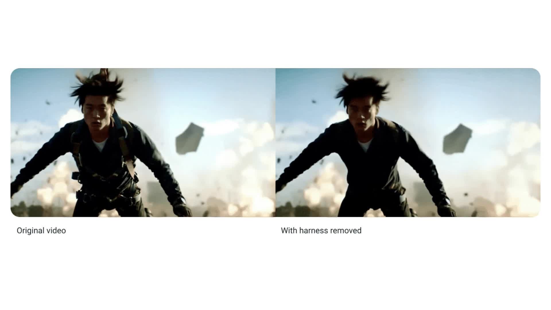
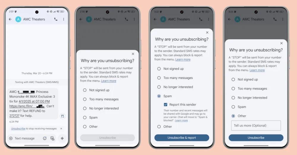
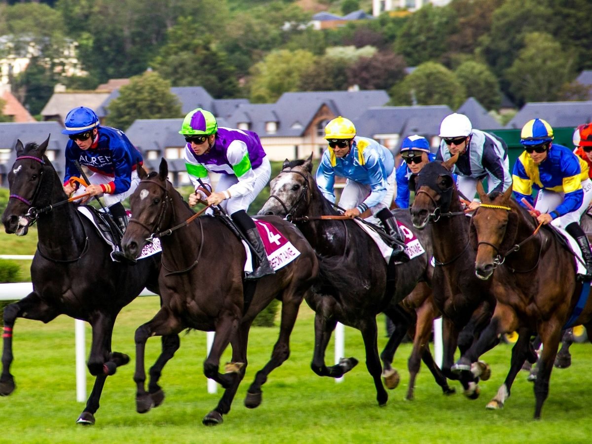
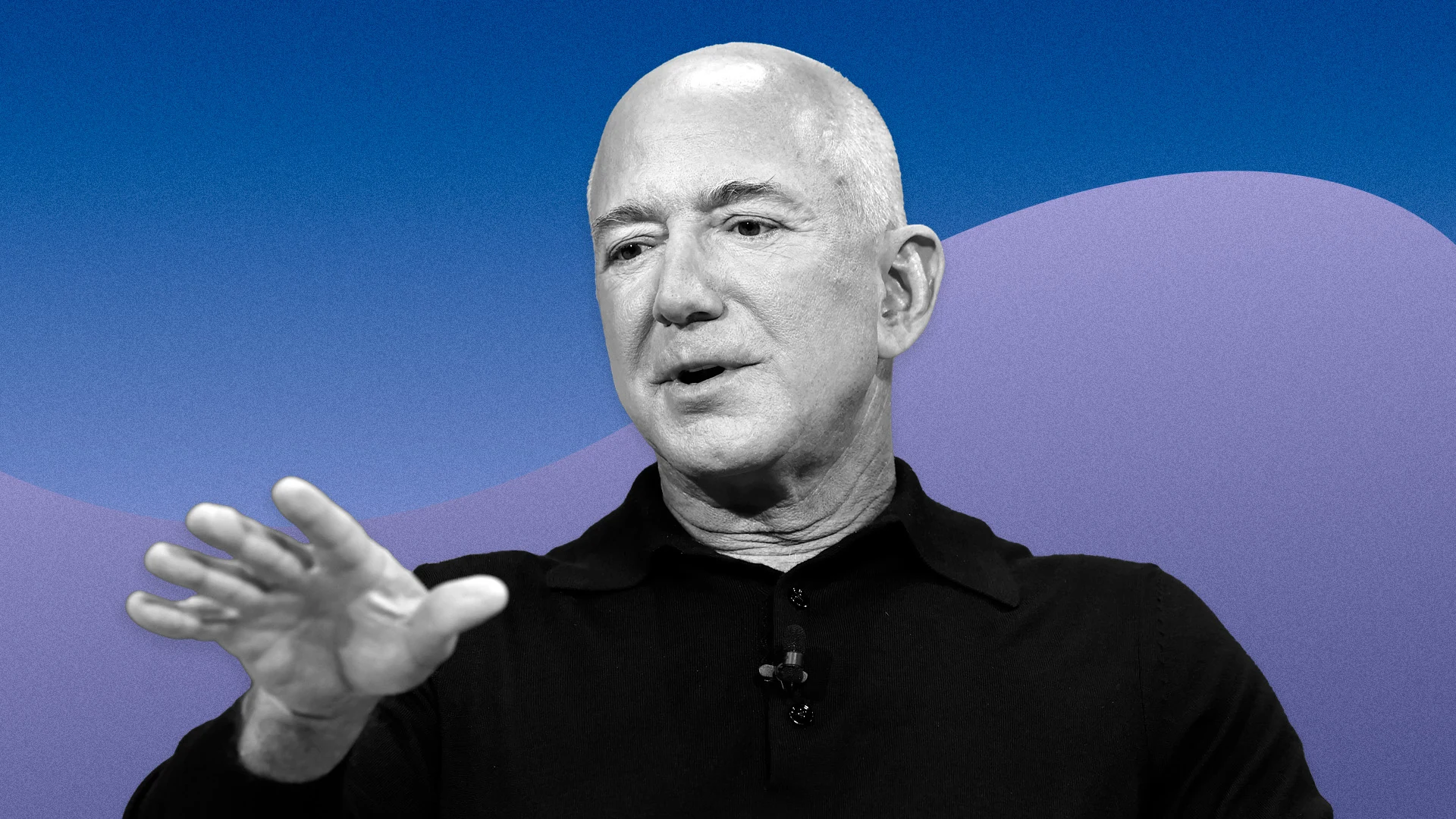
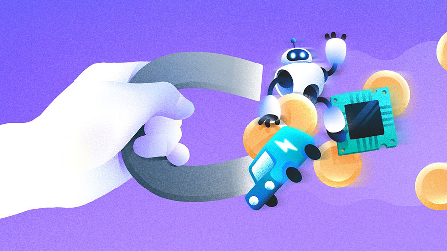
![[The AI Show Episode 143]: ChatGPT Revenue Surge, New AGI Timelines, Amazon’s AI Agent, Claude for Education, Model Context Protocol & LLMs Pass the Turing Test](https://www.marketingaiinstitute.com/hubfs/ep%20143%20cover.png)


![From drop-out to software architect with Jason Lengstorf [Podcast #167]](https://cdn.hashnode.com/res/hashnode/image/upload/v1743796461357/f3d19cd7-e6f5-4d7c-8bfc-eb974bc8da68.png?#)


![QA - Best methods for getting large amount of test data into event consuming applications generated from an API application [closed]](https://cdn.sstatic.net/Sites/softwareengineering/Img/apple-touch-icon@2.png?v=1ef7363febba)


.jpeg?#)


-11.11.2024-4-49-screenshot.png?width=1920&height=1920&fit=bounds&quality=70&format=jpg&auto=webp#)


_jvphoto_Alamy.jpg?#)


![Apple Debuts Official Trailer for 'Murderbot' [Video]](https://www.iclarified.com/images/news/96972/96972/96972-640.jpg)
![Alleged Case for Rumored iPhone 17 Pro Surfaces Online [Image]](https://www.iclarified.com/images/news/96969/96969/96969-640.jpg)

![Apple Rushes Five Planes of iPhones to US Ahead of New Tariffs [Report]](https://www.iclarified.com/images/news/96967/96967/96967-640.jpg)


HarmonyOS NEXT 实战系列02-布局基础
ArkTS以声明方式组合和扩展组件来描述应用程序的UI,同时还提供了基本的属性、事件和子组件配置方法,帮助开发者实现应用交互逻辑。 1. ArkUI-布局-线性布局 线性布局(LinearLayout)是开发中最常用的布局,通过线性容器 Row 和 Column 构建。Column容器内子元素按照垂直方向排列,Row容器内子元素按照水平方向排列。根据不同的排列方向,开发者可选择使用Row或Column容器创建线性布局。 ① 基本使用 Column({ space: 20 }) { Row().width('90%').height(50).backgroundColor('#006699') Row().width('90%').height(50).backgroundColor('#006699') Row().width('90%').height(50).backgroundColor('#006699') }.width('100%') Row({ space: 20 }) { Row().width('10%').height(150).backgroundColor('#006699') Row().width('10%').height(150).backgroundColor('#006699') Row().width('10%').height(150).backgroundColor('#006699') }.width('90%') ② 子元素主轴排列方式 属性 描述 Start 首端对齐 Center 居中对齐 End 尾部对齐 Spacebetween 两端对齐子元素之间间距相等 SpaceAround 子元素两侧间距相等第一个元素到行首的距离和最后一个元素到行尾的距离 是相邻元素之间距离的一半 SpaceEvenly 相邻元素之间的距离、第一个元素与行首的间距、最后一个元素到行尾的间距都完全一样 ③ 子元素在交叉轴上的对齐方式 Column 组件 HorizontalAlign Row 组件 VerticalAlign ④ 自适应拉伸 Row(){ Text('关于微信') Blank() Text('版本 8.0.54') Text(' > ') } .width('100%') .height(50) ⑤ 自适应缩放 父容器尺寸确定时,使用layoutWeight属性设置子元素和兄弟元素在主轴上的权重,忽略元素本身尺寸设置,使它们在任意尺寸的设备下自适应占满剩余空间。 Row() { Column() { Text('layoutWeight(1)') .textAlign(TextAlign.Center) } .layoutWeight(1) .backgroundColor('#0099ff') .height('100%') Column() { Text('layoutWeight(2)') .textAlign(TextAlign.Center) } .layoutWeight(2) .backgroundColor('#00eeff') .height('100%') Column() { Text('layoutWeight(3)') .textAlign(TextAlign.Center) } .layoutWeight(3) .backgroundColor('#0099ff') .height('100%') } .height(100) 2. ArkUI-布局-基础组件 基础组件:Text Button Image TextInput ... 通用属性:width() height() size() backgroundColor() margin() padding() ... 尺寸单位:vp fp ... vp 虚拟像素 (virtual pixel) 是一台设备针对应用而言所具有的虚拟尺寸 (区别于屏幕硬件本身的像素单位)。vp 是灵活的单位,它可在任何屏幕上缩放以具有统一的尺寸体量。它提供了一种灵活的方式来适应不同屏幕密度的显示效果。 使用虚拟像素,使 UI 元素在不同密度的设备上具有一致性大小视觉感受 fp 字体像素 (font pixel)默认情况下与 vp 相同,即默认情况下 1 fp = 1vp。如果用户在设置中选择了更大的字体,字体的实际显示大小就会在 vp 的基础上乘以 scale 系数,即 1 fp = 1 vp * scale。 ArkUI-布局-常见样式 ① 文本 参考链接 颜色、尺寸、字重、行高、溢出处理 // 颜色 Text('字体颜色') .fontColor(Color.Pink) // 尺寸 Text('字体大小') .fontSize(30) // 字重 Text('字体粗细') .fontWeight(FontWeight.Bold) // 行高 Text('HarmonyOS 是新一代的智能终端操作系统,为不同设备的智能化、互联与协同提供了统一的语言。带来简洁,流畅,连续,安全可靠的全场景交互体验。') .lineHeight(40) // 溢出隐藏 Text('HarmonyOS 是新一代的智能终端操作系统,为不同设备的智能化、互联与协同提供了统一的语言。带来简洁,流畅,连续,安全可靠的全场景交互体验。') .maxLines(2) // 超长文本使用省略号代替 .textOverflow({overflow: TextOverflow.Ellipsis}) ② 背景 参考链接 颜色、图片 // 背景颜色 Text('组件') .width(300) .height(100) .backgroundColor(Color.Pink) // 背景图片 Text('组件') .width(300) .height(100) .backgroundImage($r('app.media.flower')) ③ 间距 参考链接 内间距、外间距 // 内间距 Text('文字') .backgroundColor(Color.Pink) // 单值:四个方向padding相同 .padding(20) // 对象:单独设置某个方向 .padding({ top: 10, right: 20, bottom: 40, left: 80 }) // 外间距 Text('文字') .backgroundColor(Color.Orange) // 单值:四个方向margin相同 .margin(20) // 对象:单独设置某个方向 .margin({ top: 10, right: 20, bottom: 40, left: 80 }) ④ 边框 参考链接 边框、圆角 Text('边框') .width(100) .height(40) // 红色 虚线 边框 .border({width: 1, color: 'red', style: BorderStyle.Dashed}) // 四个方向 .border({ width: {left: 1, top: 3, right: 5, bottom: 7}, color: {left: 'red', top: '#ff0', right: '#f60', bottom: '#ccc'}, style: {top: BorderStyle.Dashed, right: BorderStyle.Dotted} }) Text('圆角') .width(100) .height(40) .backgroundColor('#f60') // 四个角一致 .borderRadius(5) // 四个角不一致 .borderRadius({ topLeft: 5, topRight: 10, bottomRight: 20, bottomLeft: 40 }) 1.18 ArkUI-布局-@Extend 作用:扩展原生组件样式,用于样式的重用 语法:@Extend(UIComponentName) function functionName { ... } 代码: import { promptAction } from '@kit.ArkUI' @Extend(Button) function customButton(color: Color, message: string) { .fontColor(color) .backgroundColor('#CCCCCC') .fontSize(14) .height(50) .onClick(() => { promptAction.showToast({ message: message }) }) } @Entry @Component struct TestPage { build() { Column({ space: 20 }) { // Button('按钮1') // .fontColor(Color.Red) // .backgroundColor('#CCCCCC') // .fontSize(14) // .height(50) // .onClick(() => { // promptAction.showToast({ message: '红色' }) // }) // Button('按钮2') // .fontColor(Color.Green) // .backgroundColor('#CCCCCC') // .fontSize(14) // .height(50) // .onClick(() => { // promptAction.showTo
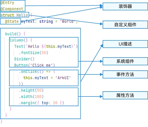
ArkTS以声明方式组合和扩展组件来描述应用程序的UI,同时还提供了基本的属性、事件和子组件配置方法,帮助开发者实现应用交互逻辑。
1. ArkUI-布局-线性布局
线性布局(LinearLayout)是开发中最常用的布局,通过线性容器 Row 和 Column 构建。Column容器内子元素按照垂直方向排列,Row容器内子元素按照水平方向排列。根据不同的排列方向,开发者可选择使用Row或Column容器创建线性布局。
① 基本使用
Column({ space: 20 }) {
  Row().width('90%').height(50).backgroundColor('#006699')
  Row().width('90%').height(50).backgroundColor('#006699')
  Row().width('90%').height(50).backgroundColor('#006699')
}.width('100%')


Row({ space: 20 }) {
  Row().width('10%').height(150).backgroundColor('#006699')
  Row().width('10%').height(150).backgroundColor('#006699')
  Row().width('10%').height(150).backgroundColor('#006699')
}.width('90%')
② 子元素主轴排列方式
属性
描述
Start
首端对齐
Center
居中对齐
End
尾部对齐
Spacebetween
两端对齐子元素之间间距相等
SpaceAround
子元素两侧间距相等第一个元素到行首的距离和最后一个元素到行尾的距离
是相邻元素之间距离的一半
SpaceEvenly
相邻元素之间的距离、第一个元素与行首的间距、最后一个元素到行尾的间距都完全一样
③ 子元素在交叉轴上的对齐方式
Column 组件 HorizontalAlign
Row 组件 VerticalAlign
④ 自适应拉伸
Row(){
      Text('关于微信')
      Blank()
      Text('版本 8.0.54')
      Text('  > ')
    }
    .width('100%')
    .height(50)
⑤ 自适应缩放
父容器尺寸确定时,使用layoutWeight属性设置子元素和兄弟元素在主轴上的权重,忽略元素本身尺寸设置,使它们在任意尺寸的设备下自适应占满剩余空间。
Row() {
      Column() {
        Text('layoutWeight(1)')
          .textAlign(TextAlign.Center)
      }
      .layoutWeight(1)
      .backgroundColor('#0099ff')
      .height('100%')

      Column() {
        Text('layoutWeight(2)')
          .textAlign(TextAlign.Center)
      }
      .layoutWeight(2)
      .backgroundColor('#00eeff')
      .height('100%')

      Column() {
        Text('layoutWeight(3)')
          .textAlign(TextAlign.Center)
      }
      .layoutWeight(3)
      .backgroundColor('#0099ff')
      .height('100%')

    }
    .height(100)
2. ArkUI-布局-基础组件
基础组件:Text Button Image TextInput ...
通用属性:width() height() size() backgroundColor() margin() padding() ...
尺寸单位:vp fp ...
vp
虚拟像素 (virtual pixel) 是一台设备针对应用而言所具有的虚拟尺寸 (区别于屏幕硬件本身的像素单位)。vp 是灵活的单位,它可在任何屏幕上缩放以具有统一的尺寸体量。它提供了一种灵活的方式来适应不同屏幕密度的显示效果。
使用虚拟像素,使 UI 元素在不同密度的设备上具有一致性大小视觉感受
fp
字体像素 (font pixel)默认情况下与 vp 相同,即默认情况下 1 fp = 1vp。如果用户在设置中选择了更大的字体,字体的实际显示大小就会在 vp 的基础上乘以 scale 系数,即 1 fp = 1 vp * scale。
- ArkUI-布局-常见样式 ① 文本 参考链接
颜色、尺寸、字重、行高、溢出处理
// 颜色
Text('字体颜色')
        .fontColor(Color.Pink)
// 尺寸
Text('字体大小')
        .fontSize(30)

// 字重
Text('字体粗细')
        .fontWeight(FontWeight.Bold)
// 行高
Text('HarmonyOS 是新一代的智能终端操作系统,为不同设备的智能化、互联与协同提供了统一的语言。带来简洁,流畅,连续,安全可靠的全场景交互体验。')
        .lineHeight(40)
// 溢出隐藏
Text('HarmonyOS 是新一代的智能终端操作系统,为不同设备的智能化、互联与协同提供了统一的语言。带来简洁,流畅,连续,安全可靠的全场景交互体验。')
        .maxLines(2)
        // 超长文本使用省略号代替
        .textOverflow({overflow: TextOverflow.Ellipsis})
② 背景 参考链接
颜色、图片
// 背景颜色
Text('组件')
        .width(300)
        .height(100)
        .backgroundColor(Color.Pink)

// 背景图片
Text('组件')
        .width(300)
        .height(100)
        .backgroundImage($r('app.media.flower'))
③ 间距 参考链接
内间距、外间距
// 内间距
Text('文字')
        .backgroundColor(Color.Pink)
        // 单值:四个方向padding相同
        .padding(20)
        // 对象:单独设置某个方向
        .padding({
          top: 10,
          right: 20,
          bottom: 40,
          left: 80
        })

// 外间距
Text('文字')
          .backgroundColor(Color.Orange)
        // 单值:四个方向margin相同
         .margin(20)
        // 对象:单独设置某个方向
          .margin({
            top: 10,
            right: 20,
            bottom: 40,
            left: 80
          })
④ 边框 参考链接
边框、圆角
Text('边框')
        .width(100)
        .height(40)
        // 红色 虚线 边框
        .border({width: 1, color: 'red', style: BorderStyle.Dashed})
       // 四个方向
       .border({
          width: {left: 1, top: 3, right: 5, bottom: 7},
          color: {left: 'red', top: '#ff0', right: '#f60', bottom: '#ccc'},
          style: {top: BorderStyle.Dashed, right: BorderStyle.Dotted}
        })

Text('圆角')
        .width(100)
        .height(40)
        .backgroundColor('#f60')
        // 四个角一致
        .borderRadius(5)
        // 四个角不一致
       .borderRadius({
          topLeft: 5,
          topRight: 10,
          bottomRight: 20,
          bottomLeft: 40
        })
1.18 ArkUI-布局-@Extend
作用:扩展原生组件样式,用于样式的重用
语法:@Extend(UIComponentName) function functionName { ... }
代码:
import { promptAction } from '@kit.ArkUI'

@Extend(Button)
function customButton(color: Color, message: string) {
  .fontColor(color)
  .backgroundColor('#CCCCCC')
  .fontSize(14)
  .height(50)
  .onClick(() => {
    promptAction.showToast({ message: message })
  })
}

@Entry
@Component
struct TestPage {
  build() {
    Column({ space: 20 }) {
      // Button('按钮1')
      //   .fontColor(Color.Red)
      //   .backgroundColor('#CCCCCC')
      //   .fontSize(14)
      //   .height(50)
      //   .onClick(() => {
      //     promptAction.showToast({ message: '红色' })
      //   })
      // Button('按钮2')
      //   .fontColor(Color.Green)
      //   .backgroundColor('#CCCCCC')
      //   .fontSize(14)
      //   .height(50)
      //   .onClick(() => {
      //     promptAction.showToast({ message: '绿色' })
      //   })
      Button('按钮1')
        .customButton(Color.Red, '红色')
      Button('按钮2')
        .customButton(Color.Green, '绿色')
    }
    .padding(50)
  }
}
注意:
@Eextend 仅在全局定义,不支持组件内部,不支持 export
- ArkUI-布局-@styles 作用:可以将多条样式设置提炼成一个方法,直接在组件声明的位置调用,仅支持通用属性和通用事件。
语法:
全局 @styles function functionName() { ... }
组件 @styles functionName(){ ... }
代码:
@Entry
@Component
struct TestPage {
  @Styles
  customButton() {
    .width(200)
    .height(100)
    .borderRadius(20)
  }

  build() {
    Column({ space: 20 }) {
      // Text('灰色按钮')
      //   .width(200)
      //   .height(100)
      //   .borderRadius(20)
      //   .backgroundColor('#CCCCCC')
      //   .textAlign(TextAlign.Center)
      // Image($r('app.media.flower'))
      //   .width(200)
      //   .height(100)
      //   .borderRadius(20)
      Text('灰色按钮')
        .customButton()
        .backgroundColor('#CCCCCC')
        .textAlign(TextAlign.Center)
      Image($r('app.media.flower'))
        .customButton()
    }
    .padding(50)
  }
}
注意:@styles 方法不能有参数
- ArkUI-布局-@builder 作用:轻量的UI元素复用机制@Builder,包含样式和事件
语法:
全局 @builder function MyGlobalBuilderFunction() { ... }
使用 MyGlobalBuilderFunction()
私有 @builder MyBuilderFunction() {}
使用 this.MyBuilderFunction()
代码:
import { promptAction } from '@kit.ArkUI'

@Entry
@Component
struct TestPage {
  @Builder
  navItem(icon: Resource, text: string) {
    Column() {
      Image(icon)
        .width(24)
        .aspectRatio(1)
      Text(text)
        .fontSize(12)
    }
    .layoutWeight(1)
    .onClick(() => {
      promptAction.showToast({ message: text })
    })
  }

  build() {
    Column({ space: 20 }) {
      Row()
        .layoutWeight(1)
      Row() {
        // Column(){
        //   Image($r('sys.media.ohos_ic_public_email'))
        //     .width(24)
        //     .aspectRatio(1)
        //   Text('邮件')
        //     .fontSize(12)
        // }
        // .layoutWeight(1)
        // .onClick(() => {
        //   promptAction.showToast({ message: '邮件' })
        // })
        // Column(){
        //   Image($r('sys.media.ohos_ic_public_express'))
        //     .width(24)
        //     .aspectRatio(1)
        //   Text('快递')
        //     .fontSize(12)
        // }
        // .layoutWeight(1)
        // .onClick(() => {
        //   promptAction.showToast({ message: '快递' })
        // })
        this.navItem($r('sys.media.ohos_ic_public_email'), '邮件')
        this.navItem($r('sys.media.ohos_ic_public_express'), '快递')
      }
      .height(50)
      .width('100%')
      .backgroundColor('#cccccc')
    }
    .width('100%')
    .height('100%')
  }
}
注意:@builder 是轻量UI封装,将来的自定义组件封装能力更强
- 条件&循环渲染 ① 条件渲染
 // 铜牌 | 银牌 | 金牌
  // level: number = 0 | 1 | 2

  @Builder
  LevelBuilder(level: number) {
    if (level === 1) {
      Text('