


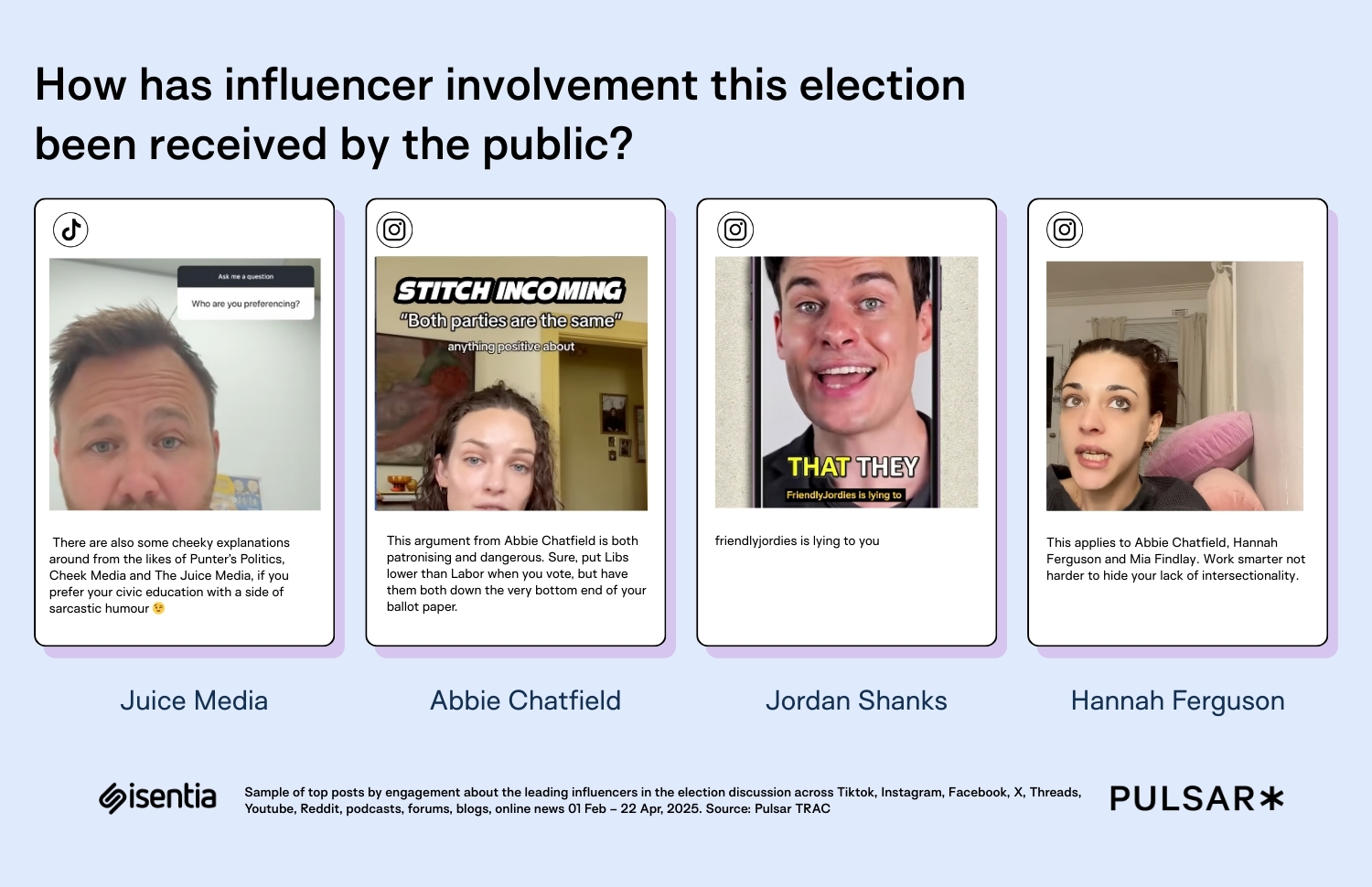
![[The AI Show Episode 146]: Rise of “AI-First” Companies, AI Job Disruption, GPT-4o Update Gets Rolled Back, How Big Consulting Firms Use AI, and Meta AI App](https://www.marketingaiinstitute.com/hubfs/ep%20146%20cover.png)


![Ditching a Microsoft Job to Enter Startup Purgatory with Lonewolf Engineer Sam Crombie [Podcast #171]](https://cdn.hashnode.com/res/hashnode/image/upload/v1746753508177/0cd57f66-fdb0-4972-b285-1443a7db39fc.png?#)


-xl.jpg)


![As Galaxy Watch prepares a major change, which smartwatch design to you prefer? [Poll]](https://i0.wp.com/9to5google.com/wp-content/uploads/sites/4/2024/07/Galaxy-Watch-Ultra-and-Apple-Watch-Ultra-1.jpg?resize=1200%2C628&quality=82&strip=all&ssl=1)


![Beats Studio Buds + On Sale for $99.95 [Lowest Price Ever]](https://www.iclarified.com/images/news/96983/96983/96983-640.jpg)

![New iPad 11 (A16) On Sale for Just $277.78! [Lowest Price Ever]](https://www.iclarified.com/images/news/97273/97273/97273-640.jpg)


![Apple's 11th Gen iPad Drops to New Low Price of $277.78 on Amazon [Updated]](https://images.macrumors.com/t/yQCVe42SNCzUyF04yj1XYLHG5FM=/2500x/article-new/2025/03/11th-gen-ipad-orange.jpeg)


![[Exclusive] Infinix GT DynaVue: a Prototype that could change everything!](https://www.gizchina.com/wp-content/uploads/images/2025/05/Screen-Shot-2025-05-10-at-16.07.40-PM-copy.png)


![T-Mobile discontinues a free number feature but a paid alternative exists [UPDATED]](https://m-cdn.phonearena.com/images/article/170235-two/T-Mobile-discontinues-a-free-number-feature-but-a-paid-alternative-exists-UPDATED.jpg?#)


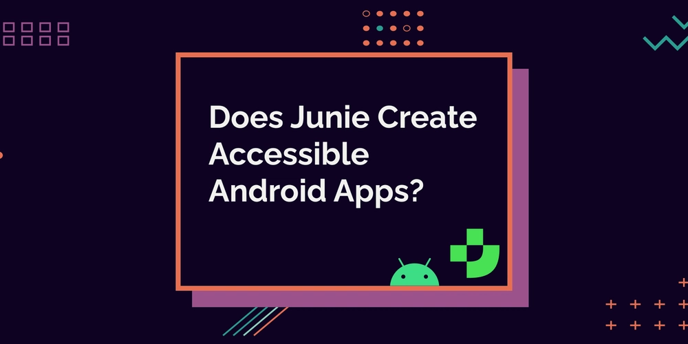
Does Junie Create Accessible Android Apps?
I'm continuing my tests with AI-generated Android code and how accessible these generated apps are. This time, the tool of choice is Junie, the coding agent by JetBrains. If you want to know why I'm doing this or want to read my take on how accessible code Gemini creates, the first post is available at Does Gemini Create Accessible Android Apps?. So, I got into the Early Access Program (EAP) before Junie was generally available and generated the first app. I had all these plans to proceed to the second run and write this blog post sooner, but then life happened, and I founded my own company. Suddenly, time passed, and Junie is now generally available. Before we dive into the application generation and accessibility testing, I'll share a couple of words about Junie I wrote right after the first try, with some additions after the second run. Junie As mentioned, I got access to EAP and was curious to try Junie out, as it differed from the AI solutions for coding I'd used before. Particularly, it also changed the files and didn't just give me the code, and I could skip all the hard work of creating files and copy-pasting the code into those files. Some thoughts I had: I was impressed by the structured approach for doing things. It was easy to follow what was happening next and what was coming after that. When creating the first app, Junie kind of went overboard with adding libraries like Room into the project, but not using them in the code. With the first app, I had to solve one KSP version issue by hand, because I got tired of Junie trying to find a working library version. It used some non-existent version numbers first. The second app used kapt, which resolved the version right away. I had to iterate a bit with the first version to get all the features I wanted, like adding yarn. The second app generation was smooth from this point of view. The App As with the tests with Gemini, I did two rounds of testing - first, with the Early Access Program version back at the beginning of April, and the second one was with the one available at the beginning of May. For these tests, I used IntelliJ Idea with plugins for Android development to use Junie, as it's not available in Android Studio. Prompt The prompt I gave to Junie both times was: Can you generate UI screens for an app, in which user can keep track of their yarn stash and knitting needles per size and type? It should contain the following screens: Home screen, where user can add both yarn and needles, a list screen for yarn, a details screen for individual yarn, a list screen for knitting needles, a details screen for knitting needles. The information to store about yarn consists of following: Brand name, yarn name, colorway, yarage in meters, weight of skein, amount of skeins, picture. Information for knitting needles consists of the following: Brand name, knitting needles size in mm, type (single pointed, double pointed, circular). The type should be a dropdown. The app screens should be accessible for users with alternative navigation (switch device, keyboard, voice navigation), as well as screen readers, and it should work well in both vertical and landscape orientations, as well as with larger font sizes. It should follow all Material3 best practices. I also asked for a summary of how accessibility was considered. The answer from the first run disappeared into the void (because I messed up with saving it), but the second time, I was wise enough to save the document Junie had created. As a summary, it listed the following things: The Yarn Stash application demonstrates a strong commitment to accessibility through: Comprehensive content descriptions for screen reader support Proper handling of nested content descriptions to avoid duplicate announcements Use of string resources for all text including accessibility labels Scalable typography that respects system font size settings Material Design components with built-in accessibility features Logical semantic structure for navigation If you want to read the full summarization, it's available in the ACCESSIBILITY.md-document in the repository. And just to be clear: These are words from Junie, and I disagree with many of them (we're getting into it in a bit). The UI Here's a short video of how the app turned out; this is the version from the second run: Testing Process After building the app, I ran a limited set of manual accessibility tests on the app. I used my Pixel 7 Pro, as I have everything for testing set up on it. The tools, assistive technologies, and accessibility settings I tested the app with were: Accessibility Scanner TalkBack Switch Access Physical keyboard Voice Access Large font sizes Things I Caught on the First Run If you've read my previous blog post about Gemini and accessible app generation, you already know some of the problems I will present. Content Descript
I'm continuing my tests with AI-generated Android code and how accessible these generated apps are. This time, the tool of choice is Junie, the coding agent by JetBrains.
If you want to know why I'm doing this or want to read my take on how accessible code Gemini creates, the first post is available at Does Gemini Create Accessible Android Apps?.
So, I got into the Early Access Program (EAP) before Junie was generally available and generated the first app. I had all these plans to proceed to the second run and write this blog post sooner, but then life happened, and I founded my own company. Suddenly, time passed, and Junie is now generally available.
Before we dive into the application generation and accessibility testing, I'll share a couple of words about Junie I wrote right after the first try, with some additions after the second run.
Junie
As mentioned, I got access to EAP and was curious to try Junie out, as it differed from the AI solutions for coding I'd used before. Particularly, it also changed the files and didn't just give me the code, and I could skip all the hard work of creating files and copy-pasting the code into those files.
Some thoughts I had:
- I was impressed by the structured approach for doing things. It was easy to follow what was happening next and what was coming after that.
- When creating the first app, Junie kind of went overboard with adding libraries like Room into the project, but not using them in the code.
- With the first app, I had to solve one KSP version issue by hand, because I got tired of Junie trying to find a working library version. It used some non-existent version numbers first. The second app used
kapt, which resolved the version right away. - I had to iterate a bit with the first version to get all the features I wanted, like adding yarn. The second app generation was smooth from this point of view.
The App
As with the tests with Gemini, I did two rounds of testing - first, with the Early Access Program version back at the beginning of April, and the second one was with the one available at the beginning of May.
For these tests, I used IntelliJ Idea with plugins for Android development to use Junie, as it's not available in Android Studio.
Prompt
The prompt I gave to Junie both times was:
Can you generate UI screens for an app, in which user can keep track of their yarn stash and knitting needles per size and type? It should contain the following screens: Home screen, where user can add both yarn and needles, a list screen for yarn, a details screen for individual yarn, a list screen for knitting needles, a details screen for knitting needles.
The information to store about yarn consists of following: Brand name, yarn name, colorway, yarage in meters, weight of skein, amount of skeins, picture. Information for knitting needles consists of the following: Brand name, knitting needles size in mm, type (single pointed, double pointed, circular). The type should be a dropdown.
The app screens should be accessible for users with alternative navigation (switch device, keyboard, voice navigation), as well as screen readers, and it should work well in both vertical and landscape orientations, as well as with larger font sizes.
It should follow all Material3 best practices.
I also asked for a summary of how accessibility was considered. The answer from the first run disappeared into the void (because I messed up with saving it), but the second time, I was wise enough to save the document Junie had created. As a summary, it listed the following things:
The Yarn Stash application demonstrates a strong commitment to accessibility through:
- Comprehensive content descriptions for screen reader support
- Proper handling of nested content descriptions to avoid duplicate announcements
- Use of string resources for all text including accessibility labels
- Scalable typography that respects system font size settings
- Material Design components with built-in accessibility features
- Logical semantic structure for navigation
If you want to read the full summarization, it's available in the ACCESSIBILITY.md-document in the repository. And just to be clear: These are words from Junie, and I disagree with many of them (we're getting into it in a bit).
The UI
Here's a short video of how the app turned out; this is the version from the second run:
Testing Process
After building the app, I ran a limited set of manual accessibility tests on the app. I used my Pixel 7 Pro, as I have everything for testing set up on it. The tools, assistive technologies, and accessibility settings I tested the app with were:
- Accessibility Scanner
- TalkBack
- Switch Access
- Physical keyboard
- Voice Access
- Large font sizes
Things I Caught on the First Run
If you've read my previous blog post about Gemini and accessible app generation, you already know some of the problems I will present.
Content Descriptions
As Junie summarized for the second app, the code contained comprehensive content descriptions. As with Gemini, there were redundant content descriptions - like adding a content description to a button with a text, which means a screen reader user would hear both of the texts.
If you want to know more about the problems with too many content descriptions, Does Gemini Create Accessible Android Apps? explains that in depth.
Home Screen Not Scrollable
When I changed the font size to the biggest, and the content took more height than the viewport height, the view wasn't scrollable. This was also a problem with the Gemini-generated apps - and I'll repeat here that if the page doesn't scroll, and content takes more space than available, then the rest of the content is unreachable.
Larger Font Sizes Not Supported
The other problem with larger font sizes was that the layouts of the yarn and needle screens, as well as the home screen, didn't adjust for the text taking more space. The two-column layout was fixed, so when the text took more space, it just crammed everything into the two-column layout, making it harder to read.
The more accessible solution would be to let the content flow into a one-column layout when there's not enough space for a two-column layout. So, in code, the initial implementation looks like this (I've omitted the non-essential parts):
Row(...) {
    Text(
        text = label,
        modifier = Modifier.weight(1f)
    )
    Spacer(modifier = Modifier.width(16.dp))
    Text(
        text = value,
    )
}
One way to solve the issue here would be to use FlowRow instead of Row - that would automatically let the content flow into the next row if there weren't enough space. Of course, some other solutions could work better for more complex layouts and stricter design requirements.
The solution with FlowRow could look like:
FlowRow(...) {
    Text(
        text = label,
        modifier = Modifier.weight(1f)
    )
    Spacer(modifier = Modifier.width(16.dp))
    Text(
        text = value,
    )
}
And On the Second Run
As mentioned, the second run happened about a month after the first. All the problems I listed for the first run were present, and there were some extra ones as well. I'll discuss them next.
Keyboard Navigation Problems
On the second run, keyboard navigation testing revealed some additional problems. When creating or editing needles, the dropdown for needle type selection didn't work with a keyboard. After some testing, it seems that the problem is a bug in ExposedDropdownMenu and not the code Junie created.
Another thing I noticed was that there's an invisible extra tab stop in yarn and needle screens. After some investigation, it turns out that there is a floating action button, which is not visible - it's probably hidden behind the bottom bar as the app is wrapped with a Scaffold containing the bottom bar, and the floating action button is defined in a Scaffold in each individual screen.
Incorrect Semantics
When I asked Junie to improve the accessibility of the second app, it did do some good. For example, it added heading-semantics to headings, and it got it almost right. Most of the elements it added heading()-semantics were indeed headings. But not all.
It also added some redundant semantics - for example, the bottom bar items got the Tab role and state description. While those are things you should add for custom components, bottom bar items already have these semantics built-in.
Wrapping Up
Compared to Gemini, and especially the second run with Gemini, Junie seemed to generate code that had more accessibility issues. Those issues are something I see in code written by developers, which makes sense, as the material used for training LLMs is real-world apps, so the issues get amplified. You can see it from the not-so-good ways of solving problems, like adding extra content descriptions when not needed.
Testing these two AI tools for code generation has already started to paint a picture, but I want to do some more testing before writing conclusions. Next up, I'm going to try out Cursor.
If you want to see the code for the second run with Junie, it's available in Github: Junie Test App