


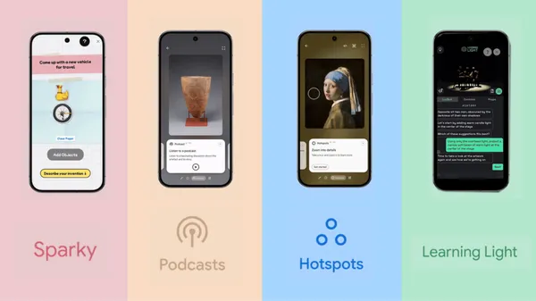
![[The AI Show Episode 142]: ChatGPT’s New Image Generator, Studio Ghibli Craze and Backlash, Gemini 2.5, OpenAI Academy, 4o Updates, Vibe Marketing & xAI Acquires X](https://www.marketingaiinstitute.com/hubfs/ep%20142%20cover.png)


![From drop-out to software architect with Jason Lengstorf [Podcast #167]](https://cdn.hashnode.com/res/hashnode/image/upload/v1743796461357/f3d19cd7-e6f5-4d7c-8bfc-eb974bc8da68.png?#)


(1).jpg?width=1920&height=1920&fit=bounds&quality=80&format=jpg&auto=webp#)


_NicoElNino_Alamy.png?#)
.webp?#)
.webp?#)


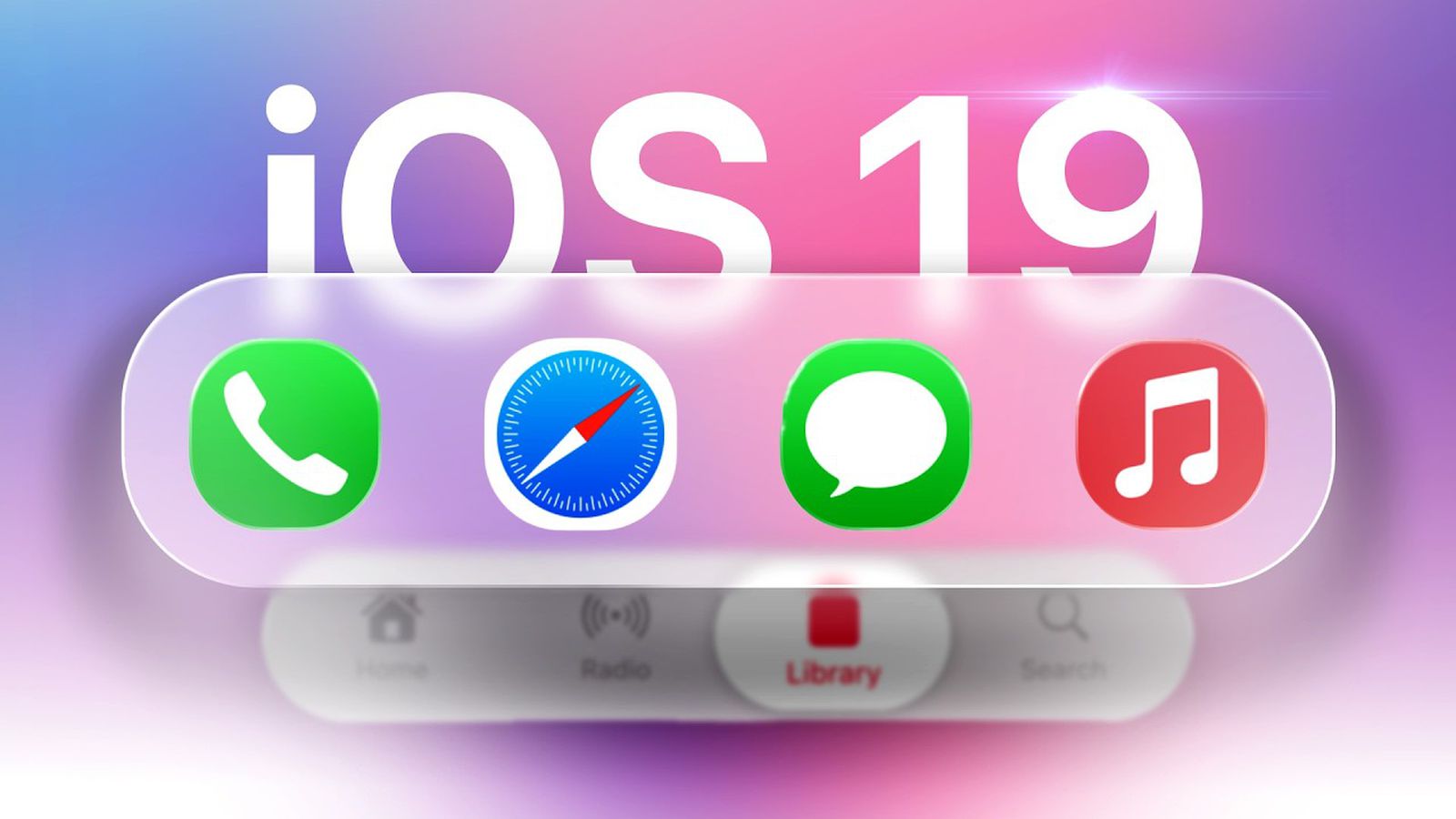
![New iOS 19 Leak Allegedly Reveals Updated Icons, Floating Tab Bar, More [Video]](https://www.iclarified.com/images/news/96958/96958/96958-640.jpg)

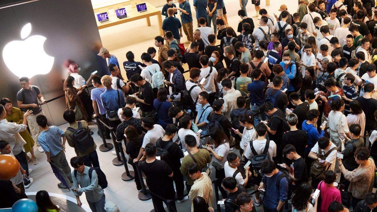
![Apple to Source More iPhones From India to Offset China Tariff Costs [Report]](https://www.iclarified.com/images/news/96954/96954/96954-640.jpg)
![Blackmagic Design Unveils DaVinci Resolve 20 With Over 100 New Features and AI Tools [Video]](https://www.iclarified.com/images/news/96951/96951/96951-640.jpg)


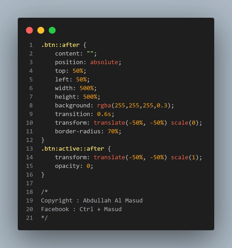
CSS Magic: Turn any button into a ripple-effect wonder!
→ Uses ::after pseudo-element ✅ → Smooth transition ✅ → Scales from center outward ✅ .btn { position: relative; padding: 10px 20px; font-size: 1.2rem; color: white; background: #ff5733; border: none; overflow: hidden; } .btn::after { content: ""; position: absolute; top: 50%; left: 50%; width: 500%; height: 500%; background: rgba(255,255,255,0.3); transition: 0.6s; transform: translate(-50%, -50%) scale(0); border-radius: 70%; } .btn:active::after { transform: translate(-50%, -50%) scale(1); opacity: 0; } /* Copyright : Abdullah Al Masud Facebook : Ctrl + Masud */ Pro tip: Adjust width/height and transition-duration for different effects. Try it in your project!