


![[The AI Show Episode 146]: Rise of “AI-First” Companies, AI Job Disruption, GPT-4o Update Gets Rolled Back, How Big Consulting Firms Use AI, and Meta AI App](https://www.marketingaiinstitute.com/hubfs/ep%20146%20cover.png)


_Aleksey_Funtap_Alamy.jpg?width=1280&auto=webp&quality=80&disable=upscale#)
_Sergey_Tarasov_Alamy.jpg?width=1280&auto=webp&quality=80&disable=upscale#)


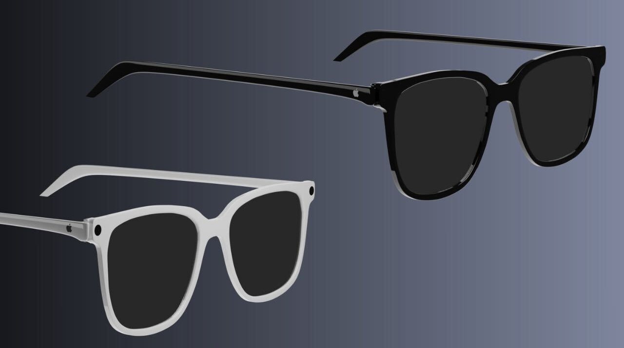


![Apple Developing New Chips for Smart Glasses, Macs, AI Servers [Report]](https://www.iclarified.com/images/news/97269/97269/97269-640.jpg)
![Apple Shares New Mother's Day Ad: 'A Gift for Mom' [Video]](https://www.iclarified.com/images/news/97267/97267/97267-640.jpg)
![Apple Shares Official Trailer for 'Stick' Starring Owen Wilson [Video]](https://www.iclarified.com/images/news/97264/97264/97264-640.jpg)


Trust & Conversion: The Minimalist Design Advantage in Web & App Development
Let’s be real: when you land on a website or open an app, you judge it in a heartbeat. Cluttered layouts, garish colors, or confusing navigation? You’re out the door before you even read the first sentence. But a sleek, minimalistic design that’s easy on the eyes? That’s the kind of vibe that makes you stick around, trust the brand, and maybe even hit that “Buy Now” button. As a UX designer who’s spent years obsessing over what makes digital experiences click, I’ve seen firsthand how aesthetic, minimalistic design isn’t just a trend—it’s a game-changer for building trust and driving conversions. In this deep dive, I’ll unpack the science, share real-world examples, and toss in some charts to show why less really is more when it comes to designing websites and apps. With the right approach—plus a bit of testing and tweaking—web developers and app developers can create digital experiences that are not just pretty, but powerful. What’s So Special About Minimalistic Design? Minimalism is all about stripping away the fluff to focus on what matters. Think clean lines, plenty of white space, simple fonts, and just a handful of colors that don’t fight for attention. Aesthetic design, on the other hand, is about making it pretty—using balance, contrast, and harmony to create something that feels polished and professional. When you blend the two, you get interfaces that are both gorgeous and dead-simple to use. The Science: Why Minimalism Works 1. You Had Me at First Glance Ever notice how you can tell if a website’s legit in under a second? That’s not just a gut feeling—science says we form first impressions in about 50 milliseconds. A 2006 study by Gitte Lindgaard and her team found that visual appeal is the biggest driver of those snap judgments. A clean, professional design screams “trustworthy,” while a cluttered one feels sketchy. Back in 2017, Microsoft Research dug deeper and found that users give a website 10-20 seconds to prove it’s worth their time, with design leading the charge. They even coined something called the Aesthetic-Usability Effect, which basically says we’re more forgiving of small hiccups (like a slightly slow load time) if the site looks good. It’s why a sleek portfolio site feels more reliable than a flashy one, even if both have solid content. 2. Less Noise, More Focus Minimalism is like a breath of fresh air for your brain. By cutting out distractions, it makes it easier to find what you need and take action. Google’s 2015 research on simplicity nailed this: clean designs help users understand and engage faster. The Nielsen Norman Group echoed this in 2020, pointing out that uncluttered layouts with clear calls-to-action (like a bold “Sign Up” button) keep users focused and ready to commit. 3. Conversions Love Simplicity Here’s where it gets juicy: minimalism doesn’t just make users happy—it makes them act. A 2019 case study by VWO showed that a minimalist redesign of an e-commerce checkout page boosted conversions by 13%, just by clearing out visual noise and simplifying the form. HubSpot’s 2021 data took it further, reporting that sites with clean, aesthetic designs saw conversion rates climb by as much as 20%. Why? Because users feel confident when the interface doesn’t overwhelm them. The Secret Sauce: Principles of Minimalistic Design So, what makes a design minimal and effective? • White Space Is Your Friend: It’s not “empty” space—it’s breathing room that highlights what matters. Think of it like a gallery framing a painting. • Keep Fonts Simple: Clean, readable typography builds trust and keeps things cohesive. No Comic Sans disasters here. • Stick to a Few Colors: A tight color palette creates harmony. Use bold hues sparingly to draw eyes to buttons or links. • Make Navigation a Breeze: Clear menus and straightforward CTAs mean users don’t have to think too hard to get where they’re going. • Invest in Quality Visuals: Crisp images or subtle icons scream professionalism without cluttering the vibe. These aren’t just rules—they’re the difference between a site that converts and one that sends users running. Real-Life Wins: Brands Nailing Minimalism Let’s look at some heavy hitters who’ve mastered this approach and reaped the rewards. 1. Apple: Simplicity Is Power Apple’s website is the poster child for minimalism. With its oceans of white space, elegant fonts, and jaw-dropping product shots, it feels like a digital art gallery. Every element is intentional, guiding you toward exploring products or making a purchase. Google’s 2015 simplicity study called out Apple as a gold standard, and it’s no wonder—their design has helped make their site one of the most visited (and profitable) in the world. Why It Works: Apple’s minimalist vibe screams premium quality, building trust and driving sky-high conversions. 2. Airbnb: Making Trust Look Luxe Airbnb’s website is another minimalist masterpiece. Stunning photos, simple te

Let’s be real: when you land on a website or open an app, you judge it in a heartbeat. Cluttered layouts, garish colors, or confusing navigation? You’re out the door before you even read the first sentence. But a sleek, minimalistic design that’s easy on the eyes? That’s the kind of vibe that makes you stick around, trust the brand, and maybe even hit that “Buy Now” button. As a UX designer who’s spent years obsessing over what makes digital experiences click, I’ve seen firsthand how aesthetic, minimalistic design isn’t just a trend—it’s a game-changer for building trust and driving conversions.
In this deep dive, I’ll unpack the science, share real-world examples, and toss in some charts to show why less really is more when it comes to designing websites and apps. With the right approach—plus a bit of testing and tweaking—web developers and app developers can create digital experiences that are not just pretty, but powerful.
What’s So Special About Minimalistic Design?
Minimalism is all about stripping away the fluff to focus on what matters. Think clean lines, plenty of white space, simple fonts, and just a handful of colors that don’t fight for attention. Aesthetic design, on the other hand, is about making it pretty—using balance, contrast, and harmony to create something that feels polished and professional. When you blend the two, you get interfaces that are both gorgeous and dead-simple to use.
The Science: Why Minimalism Works
1. You Had Me at First Glance
Ever notice how you can tell if a website’s legit in under a second? That’s not just a gut feeling—science says we form first impressions in about 50 milliseconds. A 2006 study by Gitte Lindgaard and her team found that visual appeal is the biggest driver of those snap judgments. A clean, professional design screams “trustworthy,” while a cluttered one feels sketchy.
Back in 2017, Microsoft Research dug deeper and found that users give a website 10-20 seconds to prove it’s worth their time, with design leading the charge. They even coined something called the Aesthetic-Usability Effect, which basically says we’re more forgiving of small hiccups (like a slightly slow load time) if the site looks good. It’s why a sleek portfolio site feels more reliable than a flashy one, even if both have solid content.
2. Less Noise, More Focus
Minimalism is like a breath of fresh air for your brain. By cutting out distractions, it makes it easier to find what you need and take action. Google’s 2015 research on simplicity nailed this: clean designs help users understand and engage faster. The Nielsen Norman Group echoed this in 2020, pointing out that uncluttered layouts with clear calls-to-action (like a bold “Sign Up” button) keep users focused and ready to commit.
3. Conversions Love Simplicity
Here’s where it gets juicy: minimalism doesn’t just make users happy—it makes them act. A 2019 case study by VWO showed that a minimalist redesign of an e-commerce checkout page boosted conversions by 13%, just by clearing out visual noise and simplifying the form. HubSpot’s 2021 data took it further, reporting that sites with clean, aesthetic designs saw conversion rates climb by as much as 20%. Why? Because users feel confident when the interface doesn’t overwhelm them.
The Secret Sauce: Principles of Minimalistic Design
So, what makes a design minimal and effective?
• White Space Is Your Friend: It’s not “empty” space—it’s breathing room that highlights what matters. Think of it like a gallery framing a painting.
• Keep Fonts Simple: Clean, readable typography builds trust and keeps things cohesive. No Comic Sans disasters here.
• Stick to a Few Colors: A tight color palette creates harmony. Use bold hues sparingly to draw eyes to buttons or links.
• Make Navigation a Breeze: Clear menus and straightforward CTAs mean users don’t have to think too hard to get where they’re going.
• Invest in Quality Visuals: Crisp images or subtle icons scream professionalism without cluttering the vibe.
These aren’t just rules—they’re the difference between a site that converts and one that sends users running.
Real-Life Wins: Brands Nailing Minimalism
Let’s look at some heavy hitters who’ve mastered this approach and reaped the rewards.
1. Apple: Simplicity Is Power
Apple’s website is the poster child for minimalism. With its oceans of white space, elegant fonts, and jaw-dropping product shots, it feels like a digital art gallery. Every element is intentional, guiding you toward exploring products or making a purchase. Google’s 2015 simplicity study called out Apple as a gold standard, and it’s no wonder—their design has helped make their site one of the most visited (and profitable) in the world.
Why It Works: Apple’s minimalist vibe screams premium quality, building trust and driving sky-high conversions.
2. Airbnb: Making Trust Look Luxe
Airbnb’s website is another minimalist masterpiece. Stunning photos, simple text, and tons of white space create a sense of luxury and ease. A 2023 write-up by Yarsa Labs pointed out how Airbnb leans into the Aesthetic-Usability Effect—its beautiful listings make you trust the platform, even for a stranger’s apartment. Plus, the navigation is so smooth you can book a stay in minutes.
Case Study: In 2019, Airbnb revamped its booking flow with a cleaner design, cutting out extra steps. The result? A 10% jump in conversions, according to UX blogs. Simplicity pays.
3. Dropbox: Clear and Compelling
Dropbox keeps it chill with a no-fuss website that’s all about clarity. A muted color scheme, straightforward layout, and crystal-clear CTAs make it easy to understand their service and sign up. Octet Design’s 2025 article gave Dropbox props for this approach, noting how it builds trust and keeps users coming back.
Why It Works: By focusing on the essentials, Dropbox turns curious visitors into loyal subscribers.
4. VWO’s E-Commerce Experiment
One of my favorite case studies comes from VWO in 2019. They took an e-commerce checkout form and gave it a minimalist makeover—more white space, fewer fields, and a cohesive look. The result? A 3.6% conversion boost, which added up to an estimated €450,000 in extra revenue per year. That’s the kind of impact that makes you rethink every pixel.
The Numbers Don’t Lie
Let’s break down some stats to show just how powerful minimalism is.
Chart 1: What Drives Website Trust?
A 2017 study by B.J. Fogg at Stanford found that design is the top factor in whether users trust a site. Here’s how it stacks up:
This chart is a wake-up call: aesthetics aren’t just fluff—they’re the foundation of trust.
Chart 2: Conversion Boosts from Minimalism
Data from VWO and HubSpot (2019-2021) shows how minimalist redesigns lift conversions across industries:

Source: VWO (2019), HubSpot (2021).
E-commerce sites see the biggest wins, thanks to streamlined checkouts that make buying a no-brainer.
The Catch: Minimalism Isn’t Foolproof
I’ll be honest—minimalism isn’t a one-size-fits-all fix. Go too sparse, and you risk leaving out critical info, especially for complex products. A 2024 piece by TheSustainableUX warned that over-minimal designs can confuse users if key details are missing.
Another thing? Not every audience loves the minimalist vibe. A 2020 Adobe study noted that younger users sometimes crave bolder, more dynamic designs. And if you’re not careful, minimalism can feel cold or impersonal. Creative Market’s 2024 article suggested adding warmth with soft colors or subtle visuals to keep things inviting.
The fix? Test, test, test. Tools like Plerdy can track how users interact with your design, so you can tweak it to perfection.
How to Nail Minimalistic Design
Here’s what I’ve learned from years of designing (and redesigning) websites and apps:
• Start Simple: Pick a clean template and build from there. It’s easier to add than subtract.
• Focus on What Matters: Cut any content or visuals that don’t serve a purpose. Be ruthless.
• Stay Consistent: Stick to one font family and a tight color scheme for a polished look.
• Speed It Up: Minimal designs load faster, which keeps users happy and boosts SEO.
• Keep Testing: Use analytics to see what’s working and what’s not. A/B testing is your best friend.
Wrapping It Up: Simplicity Is Your Superpower
If there’s one thing I’ve learned, it’s that a beautiful, minimalistic design can make or break your website or app. The science is crystal clear—studies from Lindgaard (2006) to HubSpot (2021) show that clean, aesthetic interfaces build trust fast, keep users engaged, and turn clicks into conversions. Brands like Apple, Airbnb, and Dropbox are living proof, and case studies like VWO’s e-commerce win show the dollars-and-cents impact.
But it’s not about just slapping on some white space and calling it a day. You’ve got to balance simplicity with clarity, make sure it vibes with your audience, and keep it warm enough to feel human. With the right approach—plus a bit of testing and tweaking—you can create a digital experience that’s not just pretty, but powerful.