


![[The AI Show Episode 148]: Microsoft’s Quiet AI Layoffs, US Copyright Office’s Bombshell AI Guidance, 2025 State of Marketing AI Report, and OpenAI Codex](https://www.marketingaiinstitute.com/hubfs/ep%20148%20cover%20%281%29.png)
![[The AI Show Episode 146]: Rise of “AI-First” Companies, AI Job Disruption, GPT-4o Update Gets Rolled Back, How Big Consulting Firms Use AI, and Meta AI App](https://www.marketingaiinstitute.com/hubfs/ep%20146%20cover.png)


.jpg?width=1920&height=1920&fit=bounds&quality=70&format=jpg&auto=webp#)


.jpg?width=1920&height=1920&fit=bounds&quality=70&format=jpg&auto=webp#)


_Alan_Wilson_Alamy.jpg?width=1280&auto=webp&quality=80&disable=upscale#)


_pichetw_Alamy.jpg?width=1280&auto=webp&quality=80&disable=upscale#)


![Apple Leads Global Wireless Earbuds Market in Q1 2025 [Chart]](https://www.iclarified.com/images/news/97394/97394/97394-640.jpg)

![OpenAI Acquires Jony Ive's 'io' to Build Next-Gen AI Devices [Video]](https://www.iclarified.com/images/news/97399/97399/97399-640.jpg)
![Apple Shares Teaser for 'Chief of War' Starring Jason Momoa [Video]](https://www.iclarified.com/images/news/97400/97400/97400-640.jpg)


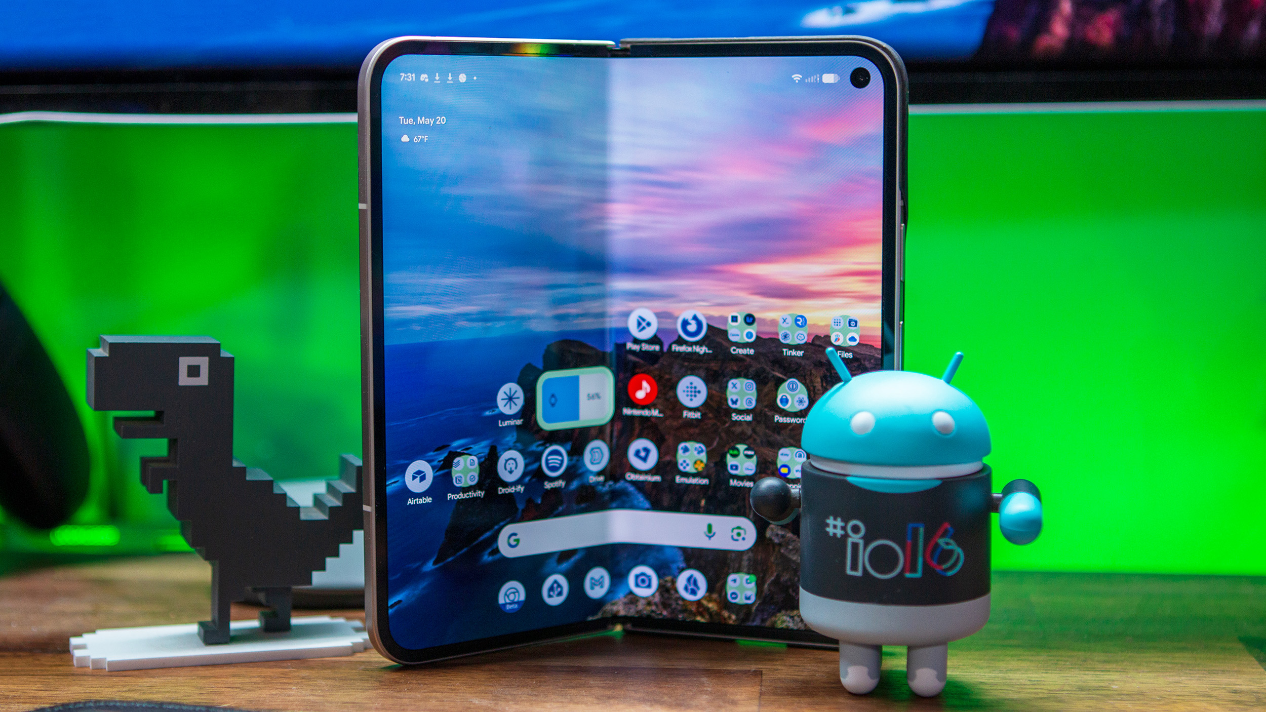
I Wanted to Roast Android 16’s Redesign — Now I Love it
The post I Wanted to Roast Android 16’s Redesign — Now I Love it appeared first on Android Headlines.


Google is officially rolling out its Material 3 Expressive redesign in Android 16 QPR1 Beta 1, and it’s the biggest visual overhaul to Android in years. While the redesign wasn’t part of the initial Android 16 beta, it has now arrived as part of the Quarterly Platform Release, bringing new animations, font changes, lockscreen tweaks, and a major refresh to Quick Settings.
In the beginning, I was not a huge fan of the redesign. Like many others, I thought the redesign looked pretty childish. And very iOS-like. As someone that uses iOS, that’s not what I wanted from my Pixel.
However, now after having downloaded and installed the Android 16 QPR1 Beta 1 and played with it for a little bit, I actually really like this redesign. Google changed a few little things that make using a Pixel so much better. Like the ability to resize toggles in the Quick Settings shade. Yes, sure, that was copied from iOS. But so what. It needed to be done. Those long rectangular toggles were dumb, and I hated them myself. They took up more space than they needed to.
The cool thing with the Quick Settings toggles is that each toggle can be adjusted. So you could have two small toggles with a large toggle between them, have all small toggles, all large toggles, or a mixture of both. That’s the beauty of Android, choice.
Lockscreen Changes in Android 16’s Material 3 Expressive Redesign
Google also updated the lockscreen, though you probably wouldn’t notice at first glance. Now, you can choose from a compact or a normal list of notifications. This is actually exactly what Samsung has been doing on One UI for a few years now. Where by default, it will show you icons of your notifications on the lock screen, instead of a full list. Now, that works the same way on the Pixel. Google does also let you go back to the old notification style too, which is really nice to see.
It’s a subtle change that you’ll see is a theme with this Material 3 Expressive update.
The new font
I’m actually really digging this new font on Material 3 Expressive. It looks great, it’s a bit darker and bolder than before, and looks amazing on the Pixel 9 Pro. Though, the new font is really only visible in the system, and not in specific apps. You’ll see it in some Google apps, but most have not been updated for Material 3 Expressive just yet.
The status bar also got some changes here, which many are comparing to iOS right now. And yeah, they are similar, but not quite the same. For one, Google’s WiFi icon is now more rounded than what iOS offers, and Google also has more signal bars versus iOS.
Android 16s new icons  Read More

