


![[The AI Show Episode 146]: Rise of “AI-First” Companies, AI Job Disruption, GPT-4o Update Gets Rolled Back, How Big Consulting Firms Use AI, and Meta AI App](https://www.marketingaiinstitute.com/hubfs/ep%20146%20cover.png)


![[DEALS] The Premium Python Programming PCEP Certification Prep Bundle (67% off) & Other Deals Up To 98% Off – Offers End Soon!](https://www.javacodegeeks.com/wp-content/uploads/2012/12/jcg-logo.jpg)


_Aleksey_Funtap_Alamy.jpg?width=1280&auto=webp&quality=80&disable=upscale#)
_Sergey_Tarasov_Alamy.jpg?width=1280&auto=webp&quality=80&disable=upscale#)


![Apple Developing New Chips for Smart Glasses, Macs, AI Servers [Report]](https://www.iclarified.com/images/news/97269/97269/97269-640.jpg)
![Apple Shares New Mother's Day Ad: 'A Gift for Mom' [Video]](https://www.iclarified.com/images/news/97267/97267/97267-640.jpg)
![Apple Shares Official Trailer for 'Stick' Starring Owen Wilson [Video]](https://www.iclarified.com/images/news/97264/97264/97264-640.jpg)


CSS Clamp: Tools That Make Fluid Design Effortless
Responsive design used to mean endless media queries, rigid breakpoints, and lots of trial and error. But modern CSS offers something better — the power of clamp(). Still, using clamp() across different layout properties (like spacing, widths, typography) isn't always intuitive. So let’s simplify it.
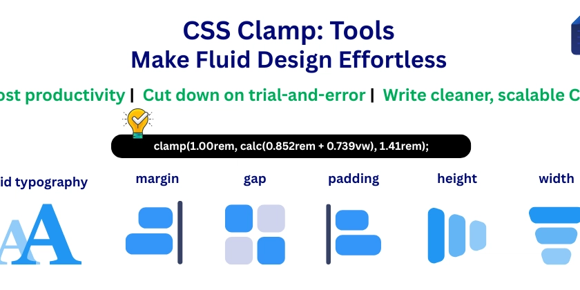
Responsive design used to mean endless media queries, rigid breakpoints, and lots of trial and error.
But modern CSS offers something better — the power of clamp().
Still, using clamp() across different layout properties (like spacing, widths, typography) isn't always intuitive.
So let’s simplify it.