


![[The AI Show Episode 143]: ChatGPT Revenue Surge, New AGI Timelines, Amazon’s AI Agent, Claude for Education, Model Context Protocol & LLMs Pass the Turing Test](https://www.marketingaiinstitute.com/hubfs/ep%20143%20cover.png)


.png?#)


.png?width=1920&height=1920&fit=bounds&quality=70&format=jpg&auto=webp#)


.webp?#)


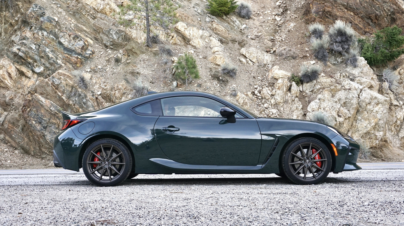
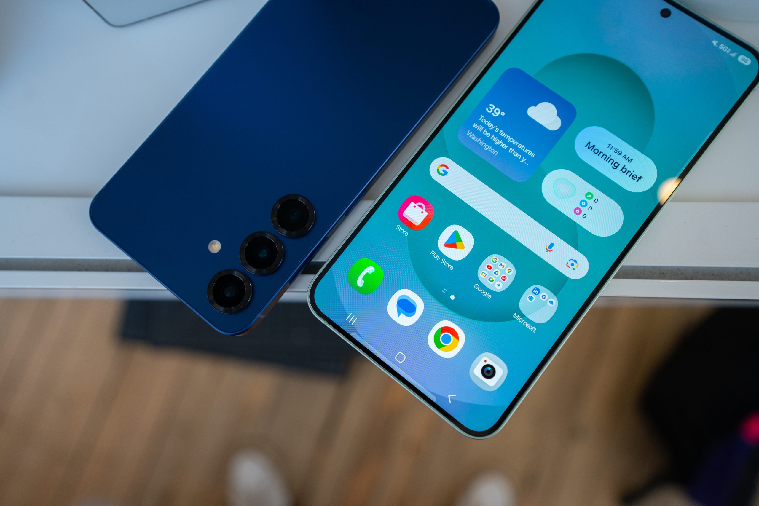
![Leaker vaguely comments on under-screen camera in iPhone Fold [U]](https://i0.wp.com/9to5mac.com/wp-content/uploads/sites/6/2025/04/iPhone-Fold-will-have-Face-ID-embedded-in-the-display-%E2%80%93-leaker.webp?resize=1200%2C628&quality=82&strip=all&ssl=1)


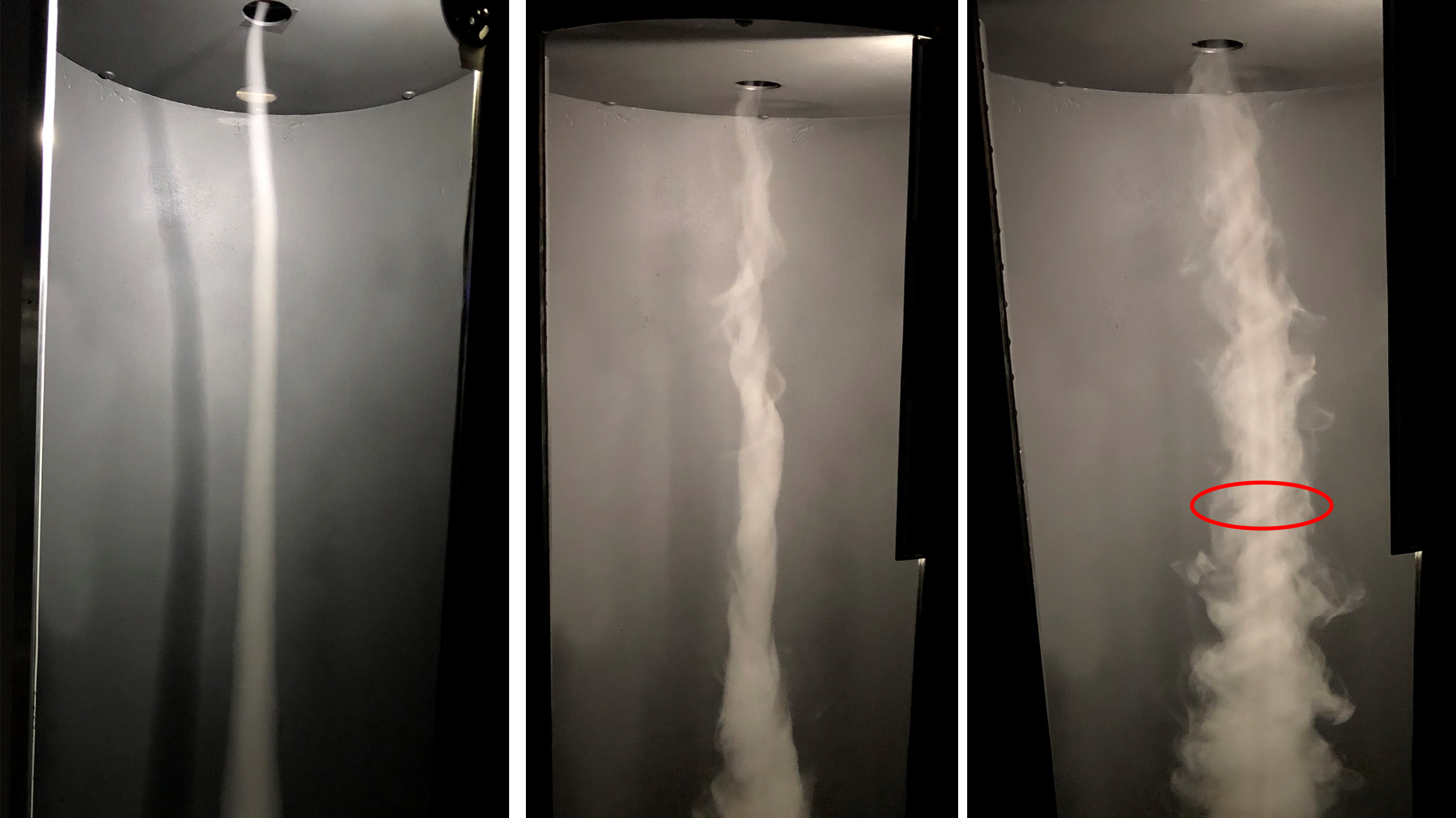
![[Fixed] Gemini app is failing to generate Audio Overviews](https://i0.wp.com/9to5google.com/wp-content/uploads/sites/4/2025/03/Gemini-Audio-Overview-cover.jpg?resize=1200%2C628&quality=82&strip=all&ssl=1)


![Apple Seeds tvOS 18.5 Beta 2 to Developers [Download]](https://www.iclarified.com/images/news/97011/97011/97011-640.jpg)
![Apple Releases macOS Sequoia 15.5 Beta 2 to Developers [Download]](https://www.iclarified.com/images/news/97014/97014/97014-640.jpg)


Creating a Fully Responsive Navigation Bar Using Only CSS (No JavaScript)
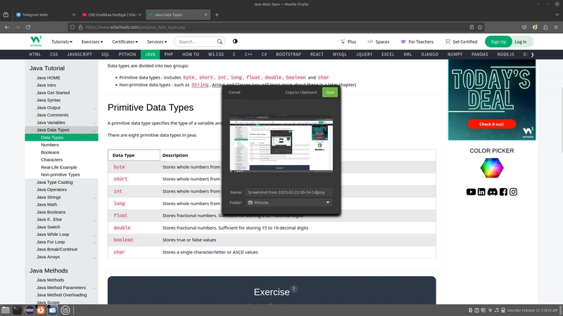
Creating a Fully Responsive Navigation Bar Using Only CSS (No JavaScript) A clean, responsive navigation bar is one of the most essential parts of any website. In this guide, you'll learn how to build a responsive navbar using only HTML and CSS — no JavaScript required. Step 1: Basic HTML Structure Start with a simple HTML layout for the navbar. Include a container, brand/logo, nav links, and a checkbox toggle for mobile devices. MySite ☰ Home About Services Contact Step 2: CSS for Styling and Layout Use Flexbox for layout and hide/show the menu using the checkbox toggle. body { margin: 0; font-family: sans-serif; } .navbar { background-color: #333; color: white; display: flex; align-items: center; padding: 0 20px; height: 60px; position: relative; } .logo { font-size: 1.5rem; font-weight: bold; } .menu { list-style: none; display: flex; margin-left: auto; } .menu li a { color: white; text-decoration: none; padding: 0 15px; display: block; line-height: 60px; } .hamburger { display: none; font-size: 1.8rem; cursor: pointer; margin-left: auto; } #toggle { display: none; } /* Responsive Rules */ @media (max-width: 768px) { .hamburger { display: block; } .menu { position: absolute; top: 60px; left: 0; right: 0; background-color: #333; flex-direction: column; display: none; } .menu li a { line-height: 40px; padding: 10px 20px; } #toggle:checked + .logo + .hamburger + .menu { display: flex; } } Step 3: Explanation of the Toggle Logic The input checkbox is hidden and acts as a trigger. When checked, it reveals the mobile menu using the adjacent sibling selector + in CSS. This approach avoids JavaScript entirely while still enabling interaction. Conclusion With this setup, you've built a mobile-friendly, fully responsive navigation bar using just HTML and CSS. It's lightweight, elegant, and ready to use in your next project. If you found this guide helpful and want to support more content like this, consider buying me a coffee: https://buymeacoffee.com/hexshift

Creating a Fully Responsive Navigation Bar Using Only CSS (No JavaScript)
A clean, responsive navigation bar is one of the most essential parts of any website. In this guide, you'll learn how to build a responsive navbar using only HTML and CSS — no JavaScript required.
Step 1: Basic HTML Structure
Start with a simple HTML layout for the navbar. Include a container, brand/logo, nav links, and a checkbox toggle for mobile devices.
Step 2: CSS for Styling and Layout
Use Flexbox for layout and hide/show the menu using the checkbox toggle.
body {
  margin: 0;
  font-family: sans-serif;
}

.navbar {
  background-color: #333;
  color: white;
  display: flex;
  align-items: center;
  padding: 0 20px;
  height: 60px;
  position: relative;
}

.logo {
  font-size: 1.5rem;
  font-weight: bold;
}

.menu {
  list-style: none;
  display: flex;
  margin-left: auto;
}

.menu li a {
  color: white;
  text-decoration: none;
  padding: 0 15px;
  display: block;
  line-height: 60px;
}

.hamburger {
  display: none;
  font-size: 1.8rem;
  cursor: pointer;
  margin-left: auto;
}

#toggle {
  display: none;
}

/* Responsive Rules */
@media (max-width: 768px) {
  .hamburger {
    display: block;
  }

  .menu {
    position: absolute;
    top: 60px;
    left: 0;
    right: 0;
    background-color: #333;
    flex-direction: column;
    display: none;
  }

  .menu li a {
    line-height: 40px;
    padding: 10px 20px;
  }

  #toggle:checked + .logo + .hamburger + .menu {
    display: flex;
  }
}
Step 3: Explanation of the Toggle Logic
The input checkbox is hidden and acts as a trigger. When checked, it reveals the mobile menu using the adjacent sibling selector + in CSS. This approach avoids JavaScript entirely while still enabling interaction.
Conclusion
With this setup, you've built a mobile-friendly, fully responsive navigation bar using just HTML and CSS. It's lightweight, elegant, and ready to use in your next project.
If you found this guide helpful and want to support more content like this, consider buying me a coffee: