


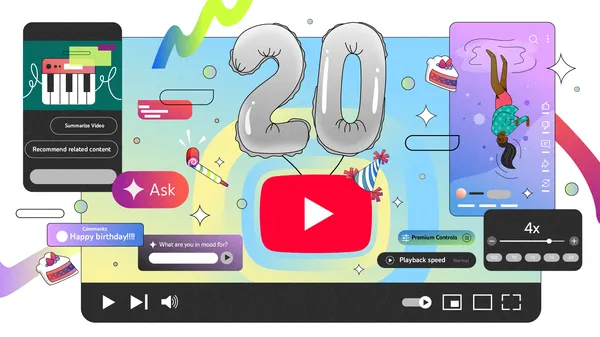
![[The AI Show Episode 144]: ChatGPT’s New Memory, Shopify CEO’s Leaked “AI First” Memo, Google Cloud Next Releases, o3 and o4-mini Coming Soon & Llama 4’s Rocky Launch](https://www.marketingaiinstitute.com/hubfs/ep%20144%20cover.png)


![Is This Programming Paradigm New? [closed]](https://miro.medium.com/v2/resize:fit:1200/format:webp/1*nKR2930riHA4VC7dLwIuxA.gif)


-Classic-Nintendo-GameCube-games-are-coming-to-Nintendo-Switch-2!-00-00-13.png?width=1920&height=1920&fit=bounds&quality=70&format=jpg&auto=webp#)


![New iPhone 17 Dummy Models Surface in Black and White [Images]](https://www.iclarified.com/images/news/97106/97106/97106-640.jpg)


![Hands-On With 'iPhone 17 Air' Dummy Reveals 'Scary Thin' Design [Video]](https://www.iclarified.com/images/news/97100/97100/97100-640.jpg)


50 CSS Tricks to Master in 2025: Enhance Your Web Design Skills
CSS (Cascading Style Sheets) has become a vital tool in web development. Whether you're building your first website or you're a seasoned developer, mastering advanced CSS techniques is essential to creating modern, interactive, and visually stunning websites. In this article, I will walk you through 50 CSS tricks that you should master in 2025 to take your web design skills to the next level. Let’s dive in! These CSS tricks cover everything from layout strategies to animation effects, image handling, and UI improvements. Perfect for beginners and advanced developers alike, mastering these tricks will significantly enhance your ability to build professional websites and applications. Code Block 1: Flexbox, Grid, and Basic Effects /* 50 CSS Tricks to Master in 2025 */ /* Created by Dhanian @e_opore on X */ /* 1. Centering an element using Flexbox */ .center-flex { display: flex; justify-content: center; align-items: center; height: 100vh; } /* 2. Equal height columns with Flexbox */ .equal-columns { display: flex; flex-direction: row; } .column { flex: 1; padding: 20px; } /* 3. Create a responsive grid layout */ .responsive-grid { display: grid; grid-template-columns: repeat(auto-fill, minmax(200px, 1fr)); gap: 20px; } /* 4. Animating a button on hover */ .button-hover:hover { transform: scale(1.1); transition: transform 0.3s ease-in-out; } /* 5. Create a full-screen hero section */ .hero { height: 100vh; background-image: url('path/to/image.jpg'); background-size: cover; background-position: center; display: flex; justify-content: center; align-items: center; } /* 6. Custom scrollbar */ .custom-scrollbar { scrollbar-width: thin; scrollbar-color: #888 #ccc; } /* 7. Make a circular element */ .circle { width: 100px; height: 100px; border-radius: 50%; background-color: #3498db; } /* 8. Parallax scrolling effect */ .parallax { background-image: url('background.jpg'); background-attachment: fixed; background-position: center; background-size: cover; height: 100vh; } /* 9. Sticky header */ .sticky-header { position: sticky; top: 0; background-color: #333; color: white; padding: 10px; z-index: 1000; } /* 10. Responsive images */ .responsive-image { max-width: 100%; height: auto; } Code Block 2: Advanced Styling and Custom Elements /* 50 CSS Tricks to Master in 2025 */ /* Created by Dhanian @e_opore on X */ /* 11. Box-shadow effect */ .shadow-effect { box-shadow: 0 4px 8px rgba(0, 0, 0, 0.2); } /* 12. Responsive font size */ .responsive-font { font-size: calc(16px + 1vw); } /* 13. Gradient background */ .gradient-background { background: linear-gradient(to right, #f06, #4a90e2); } /* 14. CSS Grid with named areas */ .grid-areas { display: grid; grid-template-areas: 'header header header' 'sidebar content content' 'footer footer footer'; } /* 15. Fade in on page load */ .fade-in { opacity: 0; animation: fadeIn 2s forwards; } @keyframes fadeIn { to { opacity: 1; } } /* 16. Custom checkbox styling */ .custom-checkbox input[type="checkbox"] { display: none; } .custom-checkbox input[type="checkbox"] + label { position: relative; padding-left: 30px; } .custom-checkbox input[type="checkbox"] + label:before { content: ''; position: absolute; left: 0; top: 0; width: 20px; height: 20px; border: 2px solid #000; border-radius: 5px; } /* 17. Custom radio button */ .custom-radio input[type="radio"] { display: none; } .custom-radio input[type="radio"] + label:before { content: ''; display: inline-block; width: 20px; height: 20px; border-radius: 50%; border: 2px solid #000; margin-right: 10px; } /* 18. Image overlay with text */ .image-overlay { position: relative; display: inline-block; } .image-overlay img { width: 100%; height: auto; } .image-overlay .overlay { position: absolute; top: 0; left: 0; right: 0; bottom: 0; background-color: rgba(0, 0, 0, 0.5); color: white; display: flex; justify-content: center; align-items: center; opacity: 0; transition: opacity 0.3s; } .image-overlay:hover .overlay { opacity: 1; } /* 19. Hover effect for images */ .image-hover img:hover { transform: scale(1.1); transition: transform 0.3s ease; } /* 20. Make text bold on hover */ .text-bold:hover { font-weight: bold; } Code Block 3: Transition Effects and Layouts /* 50 CSS Tricks to Master in 2025 */ /* Created by Dhanian @e_opore on X */ /* 21. CSS Transitions */ .transition-example { background-color: #4CAF50; transition: background-color 0.5s ease; } .transition-example:hover { background-color: #45a049; } /* 22. Floating labels */ .floating-label { position: relative; margin: 20px 0; } .floating-label input { width: 100%; padding: 10px; font-size: 16px; border: 1px solid #ccc; border-radius: 4px; } .floating-label label { position: absolu
CSS (Cascading Style Sheets) has become a vital tool in web development. Whether you're building your first website or you're a seasoned developer, mastering advanced CSS techniques is essential to creating modern, interactive, and visually stunning websites. In this article, I will walk you through 50 CSS tricks that you should master in 2025 to take your web design skills to the next level. Let’s dive in!
These CSS tricks cover everything from layout strategies to animation effects, image handling, and UI improvements. Perfect for beginners and advanced developers alike, mastering these tricks will significantly enhance your ability to build professional websites and applications.
Code Block 1: Flexbox, Grid, and Basic Effects
/* 50 CSS Tricks to Master in 2025 */
/* Created by Dhanian @e_opore on X */

/* 1. Centering an element using Flexbox */
.center-flex {
  display: flex;
  justify-content: center;
  align-items: center;
  height: 100vh;
}

/* 2. Equal height columns with Flexbox */
.equal-columns {
  display: flex;
  flex-direction: row;
}

.column {
  flex: 1;
  padding: 20px;
}

/* 3. Create a responsive grid layout */
.responsive-grid {
  display: grid;
  grid-template-columns: repeat(auto-fill, minmax(200px, 1fr));
  gap: 20px;
}

/* 4. Animating a button on hover */
.button-hover:hover {
  transform: scale(1.1);
  transition: transform 0.3s ease-in-out;
}

/* 5. Create a full-screen hero section */
.hero {
  height: 100vh;
  background-image: url('path/to/image.jpg');
  background-size: cover;
  background-position: center;
  display: flex;
  justify-content: center;
  align-items: center;
}

/* 6. Custom scrollbar */
.custom-scrollbar {
  scrollbar-width: thin;
  scrollbar-color: #888 #ccc;
}

/* 7. Make a circular element */
.circle {
  width: 100px;
  height: 100px;
  border-radius: 50%;
  background-color: #3498db;
}

/* 8. Parallax scrolling effect */
.parallax {
  background-image: url('background.jpg');
  background-attachment: fixed;
  background-position: center;
  background-size: cover;
  height: 100vh;
}

/* 9. Sticky header */
.sticky-header {
  position: sticky;
  top: 0;
  background-color: #333;
  color: white;
  padding: 10px;
  z-index: 1000;
}

/* 10. Responsive images */
.responsive-image {
  max-width: 100%;
  height: auto;
}
Code Block 2: Advanced Styling and Custom Elements
/* 50 CSS Tricks to Master in 2025 */
/* Created by Dhanian @e_opore on X */

/* 11. Box-shadow effect */
.shadow-effect {
  box-shadow: 0 4px 8px rgba(0, 0, 0, 0.2);
}

/* 12. Responsive font size */
.responsive-font {
  font-size: calc(16px + 1vw);
}

/* 13. Gradient background */
.gradient-background {
  background: linear-gradient(to right, #f06, #4a90e2);
}

/* 14. CSS Grid with named areas */
.grid-areas {
  display: grid;
  grid-template-areas:
    'header header header'
    'sidebar content content'
    'footer footer footer';
}

/* 15. Fade in on page load */
.fade-in {
  opacity: 0;
  animation: fadeIn 2s forwards;
}

@keyframes fadeIn {
  to {
    opacity: 1;
  }
}

/* 16. Custom checkbox styling */
.custom-checkbox input[type="checkbox"] {
  display: none;
}

.custom-checkbox input[type="checkbox"] + label {
  position: relative;
  padding-left: 30px;
}

.custom-checkbox input[type="checkbox"] + label:before {
  content: '';
  position: absolute;
  left: 0;
  top: 0;
  width: 20px;
  height: 20px;
  border: 2px solid #000;
  border-radius: 5px;
}

/* 17. Custom radio button */
.custom-radio input[type="radio"] {
  display: none;
}

.custom-radio input[type="radio"] + label:before {
  content: '';
  display: inline-block;
  width: 20px;
  height: 20px;
  border-radius: 50%;
  border: 2px solid #000;
  margin-right: 10px;
}

/* 18. Image overlay with text */
.image-overlay {
  position: relative;
  display: inline-block;
}

.image-overlay img {
  width: 100%;
  height: auto;
}

.image-overlay .overlay {
  position: absolute;
  top: 0;
  left: 0;
  right: 0;
  bottom: 0;
  background-color: rgba(0, 0, 0, 0.5);
  color: white;
  display: flex;
  justify-content: center;
  align-items: center;
  opacity: 0;
  transition: opacity 0.3s;
}

.image-overlay:hover .overlay {
  opacity: 1;
}

/* 19. Hover effect for images */
.image-hover img:hover {
  transform: scale(1.1);
  transition: transform 0.3s ease;
}

/* 20. Make text bold on hover */
.text-bold:hover {
  font-weight: bold;
}
Code Block 3: Transition Effects and Layouts
/* 50 CSS Tricks to Master in 2025 */
/* Created by Dhanian @e_opore on X */

/* 21. CSS Transitions */
.transition-example {
  background-color: #4CAF50;
  transition: background-color 0.5s ease;
}

.transition-example:hover {
  background-color: #45a049;
}

/* 22. Floating labels */
.floating-label {
  position: relative;
  margin: 20px 0;
}

.floating-label input {
  width: 100%;
  padding: 10px;
  font-size: 16px;
  border: 1px solid #ccc;
  border-radius: 4px;
}

.floating-label label {
  position: absolute;
  top: 10px;
  left: 10px;
  font-size: 16px;
  transition: 0.3s;
}

.floating-label input:focus + label,
.floating-label input:not(:placeholder-shown) + label {
  top: -10px;
  left: 10px;
  font-size: 12px;
}

/* 23. CSS Grid for layout */
.grid-layout {
  display: grid;
  grid-template-columns: repeat(3, 1fr);
  gap: 10px;
}

.grid-item {
  padding: 20px;
  background-color: #f0f0f0;
}

/* 24. CSS Masking */
.masked {
  width: 300px;
  height: 300px;
  background-image: url('image.jpg');
  mask-image: radial-gradient(circle, rgba(0, 0, 0, 1) 50%, rgba(0, 0, 0, 0) 100%);
}

/* 25. CSS Variables */
:root {
  --primary-color: #3498db;
}

.variable-style {
  background-color: var(--primary-color);
  color: white;
  padding: 20px;
}

/* 26. Image Zoom Effect */
.zoom-effect {
  overflow: hidden;
}

.zoom-effect img {
  transition: transform 0.5s ease;
}

.zoom-effect:hover img {
  transform: scale(1.2);
}

/* 27. Border animation */
.border-animation {
  border: 3px solid transparent;
  background-image: linear-gradient(white, white),
                    linear-gradient(to left, #ff7e5f, #feb47b);
  background-origin: border-box;
  background-clip: content-box, border-box;
  transition: background 0.5s ease;
}

.border-animation:hover {
  background-image: linear-gradient(white, white),
                    linear-gradient(to left, #42a5f5, #478ed1);
}
Code Block 4: UI Elements and Animation
/* 50 CSS Tricks to Master in 2025 */
/* Created by Dhanian @e_opore on X */

/* 28. Vertical text */
.vertical-text {
  writing-mode: vertical-rl;
  transform: rotate(180deg);
}

/* 29. Horizontal scroll */
.scroll-horizontal {
  overflow-x: scroll;
  white-space: nowrap;
}

.scroll-horizontal div {
  display: inline-block;
  width: 200px;
  margin: 10px;
}

/* 30. Create a toast notification */
.toast {
  position: fixed;
  bottom: 20px;
  right: 20px;
  background-color: #333;
  color: white;
  padding: 10px 20px;
  border-radius: 5px;
  box-shadow: 0px 4px 6px rgba(0, 0, 0, 0.1);
  opacity: 0;
  animation: showToast 3s forwards;
}

@keyframes showToast {
  0% {
    opacity: 0;
    transform: translateY(20px);
  }
  100% {
    opacity: 1;
    transform: translateY(0);
  }
}

/* 31. CSS Shapes */
.shape {
  width: 100px;
  height: 100px;
  background-color: #3498db;
  clip-path: polygon(50% 0%, 100% 100%, 0% 100%);
}

/* 32. Custom tooltips */
.tooltip {
  position: relative;
  display: inline-block;
}

.tooltip .tooltiptext {
  visibility: hidden;
  width: 120px;
  background-color: #555;
  color: #fff;
  text-align: center;
  border-radius: 5px;
  padding: 5px 0;
  position: absolute;
  z-index: 1;
  bottom: 125%; /* Position above the tooltip text */
  left: 50%;
  margin-left: -60px;
  opacity: 0;
  transition: opacity 0.3s;
}

.tooltip:hover .tooltiptext {
  visibility: visible;
  opacity: 1;
}

/* 33. Transparent background */
.transparent-background {
  background-color: rgba(255, 255, 255, 0.5);
}

/* 34. CSS only lightbox */
.lightbox {
  display: none;
}

.lightbox:checked + .modal {
  display: block;
}

.modal {
  position: fixed;
  top: 0;
  left: 0;
  width: 100%;
  height: 100%;
  background-color: rgba(0, 0, 0, 0.7);
}

.modal img {
  position: absolute;
  top: 50%;
  left: 50%;
  transform: translate(-50%, -50%);
}

/* 35. Animated gradient */
.gradient-animation {
  background: linear-gradient(45deg, #f06, #4a90e2, #7bed9f, #f39c12);
  background-size: 400% 400%;
  animation: gradient 10s ease infinite;
}

@keyframes gradient {
  0% { background-position: 0% 50%; }
  50% { background-position: 100% 50%; }
  100% { background-position: 0% 50%; }
}
Learn More
If you’re looking to dive deeper into mastering CSS and other web development skills, check out my book available on Gumroad, where I provide an in-depth guide to mastering the essentials of web design. You can also support my work directly via my Ko-fi link.
Mastering CSS is an ongoing journey—keep practicing these tricks, and you'll be creating stunning websites in no time! Happy coding!