


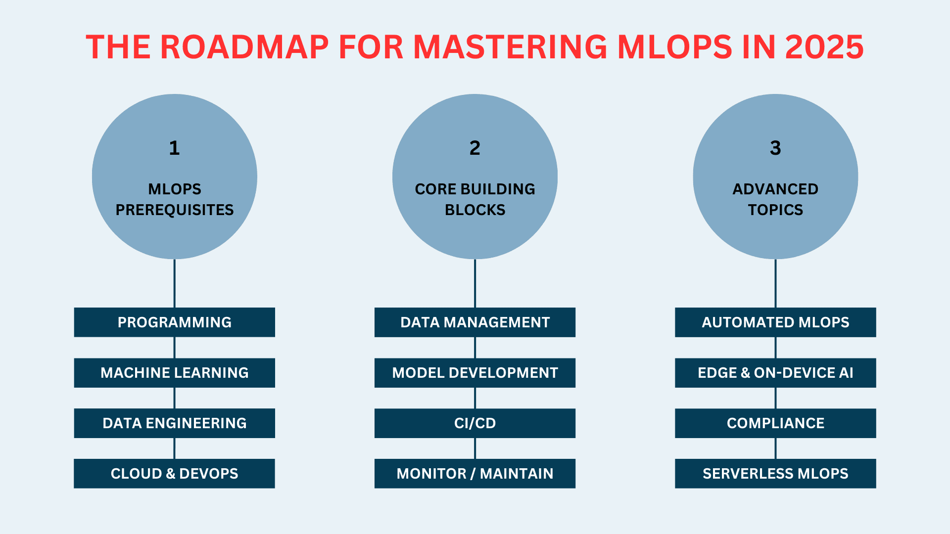
![[The AI Show Episode 143]: ChatGPT Revenue Surge, New AGI Timelines, Amazon’s AI Agent, Claude for Education, Model Context Protocol & LLMs Pass the Turing Test](https://www.marketingaiinstitute.com/hubfs/ep%20143%20cover.png)


![From drop-out to software architect with Jason Lengstorf [Podcast #167]](https://cdn.hashnode.com/res/hashnode/image/upload/v1743796461357/f3d19cd7-e6f5-4d7c-8bfc-eb974bc8da68.png?#)


![QA - Best methods for getting large amount of test data into event consuming applications generated from an API application [closed]](https://cdn.sstatic.net/Sites/softwareengineering/Img/apple-touch-icon@2.png?v=1ef7363febba)


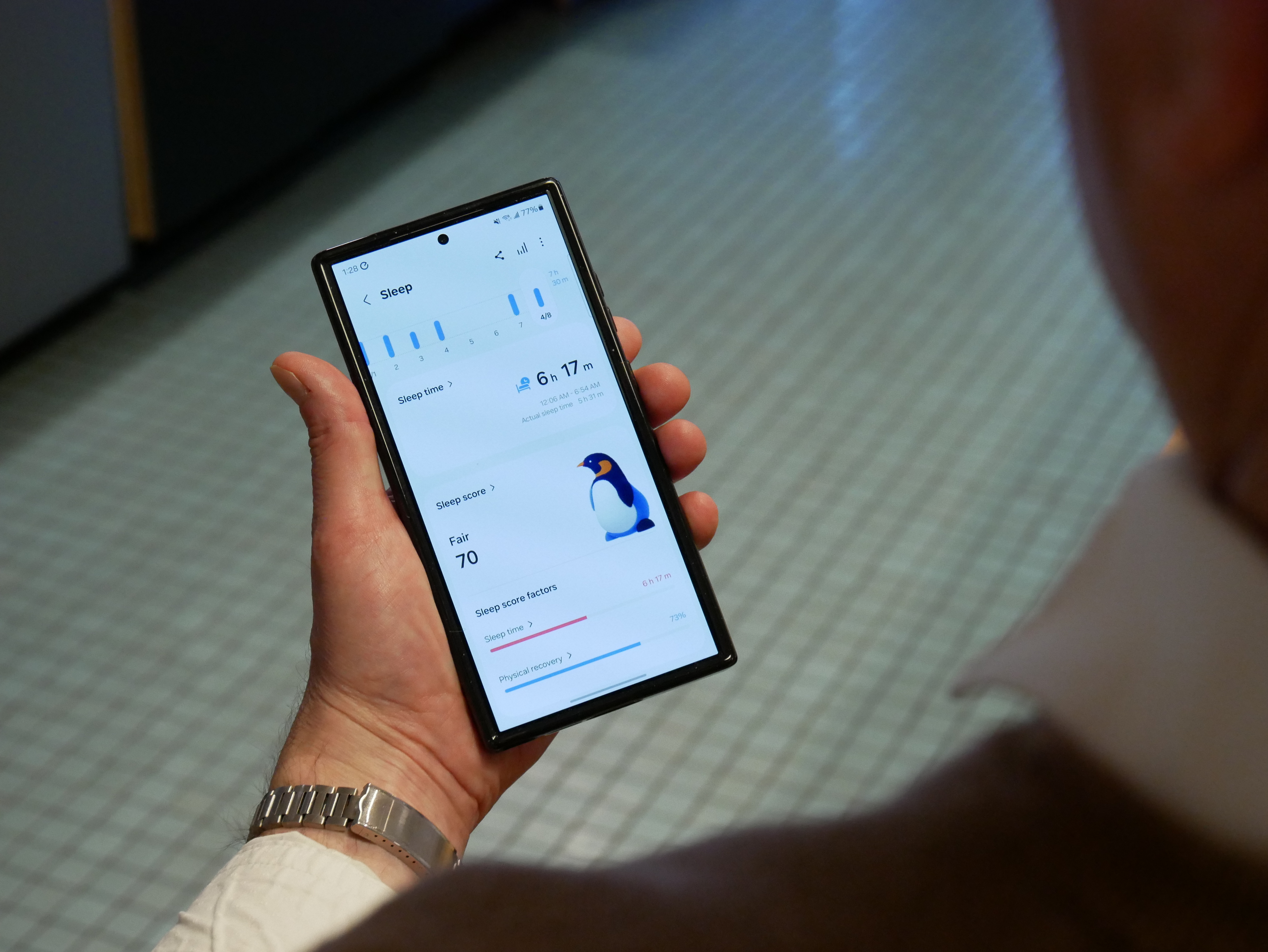
.jpeg?#)


-11.11.2024-4-49-screenshot.png?width=1920&height=1920&fit=bounds&quality=70&format=jpg&auto=webp#)


_jvphoto_Alamy.jpg?#)


.png?#)


![Apple Debuts Official Trailer for 'Murderbot' [Video]](https://www.iclarified.com/images/news/96972/96972/96972-640.jpg)
![Alleged Case for Rumored iPhone 17 Pro Surfaces Online [Image]](https://www.iclarified.com/images/news/96969/96969/96969-640.jpg)

![Apple Rushes Five Planes of iPhones to US Ahead of New Tariffs [Report]](https://www.iclarified.com/images/news/96967/96967/96967-640.jpg)


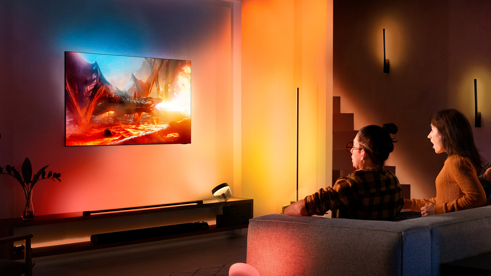


Why I Built a VS Code Theme That Feels Like a Warm Blanket
I’ll be real: I didn’t set out to make yet another dark theme. I just wanted to stop rubbing my eyes like a sleepy toddler by 10 PM. Here’s the story: After burning out my retinas with neon-colored brackets one too many times, I started experimenting with darker, warmer tones. The goal? A theme that felt like sipping herbal tea — soothing, not stimulating. The “Aha!” Moment: I showed an early version to a friend who said, “Wait… why does this feel easier to read?” Turns out, the subtle teal-and-charcoal palette (#101E21 and #17363D) reduced visual noise without sacrificing clarity. What I Learned: Good themes aren’t about looking “cool” — they’re about disappearing so you can focus. Tiny details matter (like making JSON keys just slightly lighter than the background). Try it yourself: Ocean Mist And if you hate it? Tell me why! I’m just a dev with a color picker, not a designer.
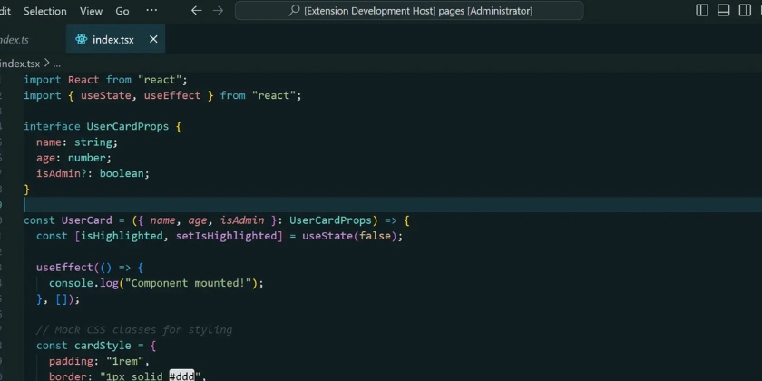
I’ll be real: I didn’t set out to make yet another dark theme. I just wanted to stop rubbing my eyes like a sleepy toddler by 10 PM.
Here’s the story:
After burning out my retinas with neon-colored brackets one too many times, I started experimenting with darker, warmer tones. The goal? A theme that felt like sipping herbal tea — soothing, not stimulating.
The “Aha!” Moment:
I showed an early version to a friend who said, “Wait… why does this feel easier to read?” Turns out, the subtle teal-and-charcoal palette (#101E21 and #17363D) reduced visual noise without sacrificing clarity.
What I Learned:
- Good themes aren’t about looking “cool” — they’re about disappearing so you can focus.
- Tiny details matter (like making JSON keys just slightly lighter than the background).
Try it yourself: Ocean Mist
And if you hate it? Tell me why! I’m just a dev with a color picker, not a designer.