


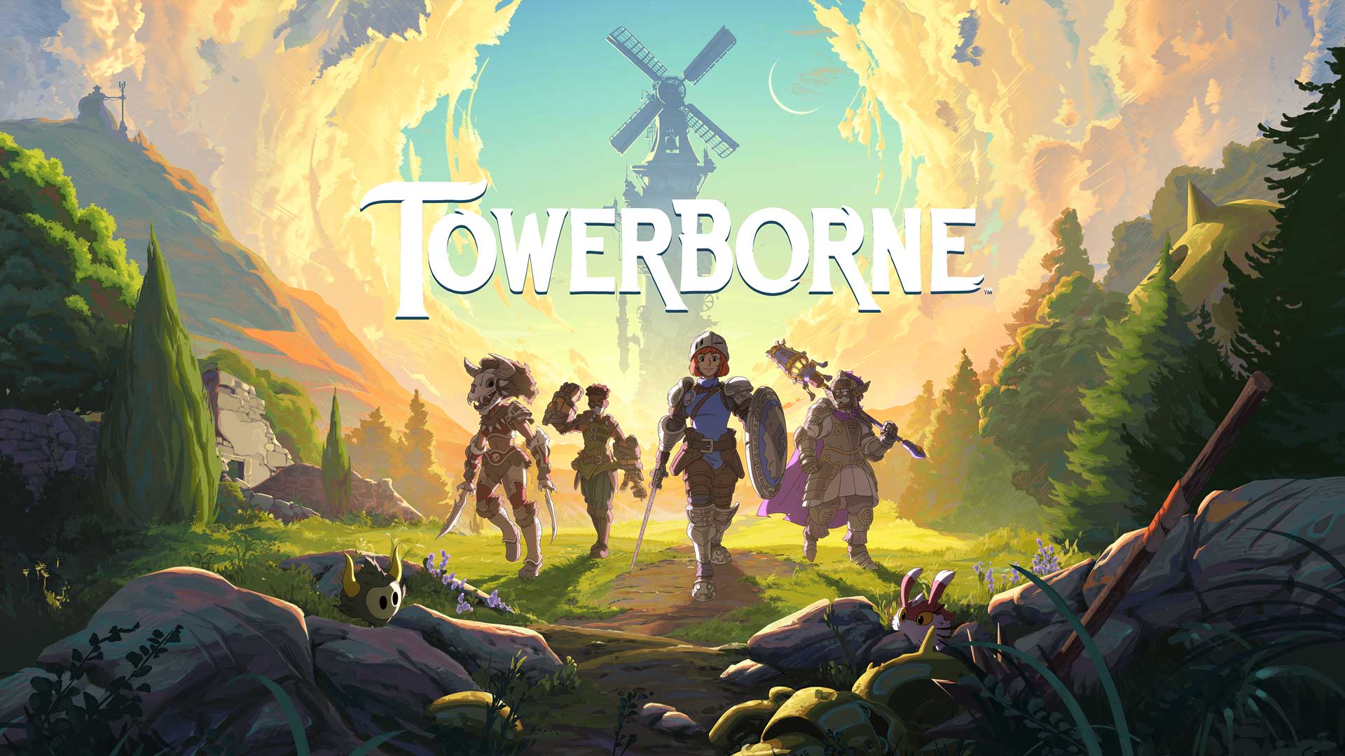
![[The AI Show Episode 145]: OpenAI Releases o3 and o4-mini, AI Is Causing “Quiet Layoffs,” Executive Order on Youth AI Education & GPT-4o’s Controversial Update](https://www.marketingaiinstitute.com/hubfs/ep%20145%20cover.png)


.jpg?#)


_NicoElNino_Alamy.jpg?width=1280&auto=webp&quality=80&disable=upscale#)


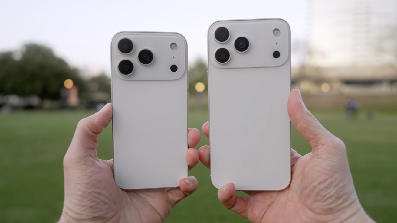
![Standalone Meta AI App Released for iPhone [Download]](https://www.iclarified.com/images/news/97157/97157/97157-640.jpg)


Exploring CSS Layouts: Your Guide to Commonly Used Techniques
Hi there! I'm Shrijith Venkatrama, founder of Hexmos. Right now, I’m building LiveAPI, a tool that makes generating API docs from your code ridiculously easy. CSS layouts are the backbone of web design. They control how elements are arranged on a page, making your site functional and visually appealing. Whether you're building a simple blog or a complex dashboard, choosing the right layout technique is critical. This guide dives into the most commonly used CSS layout methods, with detailed examples, tables, and tips to help you understand and apply them effectively. We'll cover 7 key layout techniques, each with practical code you can copy and run. Expect clear explanations, minimal fluff, and a focus on what works for developers. Let’s get started. 1. Why CSS Layouts Matter Before jumping into code, let’s talk about why layouts are a big deal. A good layout ensures your content is accessible, responsive, and easy to navigate. CSS provides multiple ways to achieve this, from old-school floats to modern flexbox and grid. Each method has its strengths, and knowing when to use them saves time and frustration. Here’s a quick comparison of the layout techniques we’ll cover: Technique Best For Browser Support Complexity Floats Legacy layouts, simple designs Excellent Low Flexbox Single-axis layouts, dynamic spacing Excellent Medium CSS Grid Complex, two-dimensional layouts Excellent Medium-High Inline-Block Simple, inline layouts Excellent Low Table Display Table-like structures Excellent Low Position Overlays, precise positioning Excellent Medium Multi-Column Magazine-style text layouts Good Medium This table sets the stage for what’s coming. Let’s dive into each technique with examples. 2. Floats: The Classic Layout Approach Floats were the go-to for layouts before flexbox and grid. They’re still used in legacy projects or for specific cases like wrapping text around images. Floats move elements left or right, letting content flow around them. Example: Two-Column Layout with Floats Here’s a simple two-column layout using floats. The left column is fixed-width, and the right column takes the remaining space. Float Layout .container { width: 100%; overflow: auto; /* Clearfix for floated children */ } .sidebar { float: left; width: 200px; background: #f0f0f0; padding: 10px; } .content { margin-left: 220px; /* Space for sidebar */ padding: 10px; background: #e0e0e0; } Sidebar Content Main Content Key Points Use overflow: auto on the parent to clear floated children. Floats can be tricky with responsive designs—media queries are often needed. Avoid floats for complex layouts; flexbox or grid is better. Resource: MDN on CSS Floats 3. Flexbox: Flexible and Dynamic Layouts Flexbox is a game-changer for single-axis layouts. It’s perfect for aligning items in a row or column, with dynamic sizing and responsive behavior. Flexbox shines in navigation bars, card layouts, or centering content. Example: Responsive Card Layout with Flexbox This example creates a responsive card layout that wraps cards onto new lines as the screen size changes. Flexbox Layout .container { display: flex; flex-wrap: wrap; gap: 20px; padding: 20px; } .card { flex: 1 1 200px; /* Grow, shrink, basis */ background: #f0f0f0; padding: 15px; border: 1px solid #ccc; box-sizing: border-box; } Card 1 Card 2 Card 3 Card 4 Key Points Use flex-wrap: wrap for responsive layouts. The gap property simplifies spacing between flex items. Flexbox is ideal for one-dimensional layouts but less suited for grids. Resource: CSS-Tricks Flexbox Guide 4. CSS Grid: Mastering Two-Dimensional Layouts CSS Grid is the go-to for complex, two-dimensional layouts. It lets you define rows and columns, making it ideal for dashboards, galleries, or full-page layouts. Grid is powerful but has a steeper learning curve. Example: Dashboard Layout with CSS Grid This example creates a dashboard with a header, sidebar, main content, and footer. Grid Layout .container { display: grid; grid-template-areas: "header header" "sidebar main" "footer footer"; grid-template-columns: 200px 1fr; grid-template-rows: auto 1fr auto; height: 100vh; gap: 10px; } .header { grid-area: header; background: #d0d0d0; padding: 20px; } .sidebar { grid-area: sidebar; background: #e0e0e0; padding: 20px; } .main { grid-area: main; background: #f0f0f0; padding: 20px; } .footer { grid-area: footer; background: #d0d0d0; padding: 20px; } Header Sidebar Main Content Footer Key Points Use grid-template-ar
Hi there! I'm Shrijith Venkatrama, founder of Hexmos. Right now, I’m building LiveAPI, a tool that makes generating API docs from your code ridiculously easy.
CSS layouts are the backbone of web design. They control how elements are arranged on a page, making your site functional and visually appealing. Whether you're building a simple blog or a complex dashboard, choosing the right layout technique is critical. This guide dives into the most commonly used CSS layout methods, with detailed examples, tables, and tips to help you understand and apply them effectively.
We'll cover 7 key layout techniques, each with practical code you can copy and run. Expect clear explanations, minimal fluff, and a focus on what works for developers. Let’s get started.
1. Why CSS Layouts Matter
Before jumping into code, let’s talk about why layouts are a big deal. A good layout ensures your content is accessible, responsive, and easy to navigate. CSS provides multiple ways to achieve this, from old-school floats to modern flexbox and grid. Each method has its strengths, and knowing when to use them saves time and frustration.
Here’s a quick comparison of the layout techniques we’ll cover:
| Technique | Best For | Browser Support | Complexity |
|---|---|---|---|
| Floats | Legacy layouts, simple designs | Excellent | Low |
| Flexbox | Single-axis layouts, dynamic spacing | Excellent | Medium |
| CSS Grid | Complex, two-dimensional layouts | Excellent | Medium-High |
| Inline-Block | Simple, inline layouts | Excellent | Low |
| Table Display | Table-like structures | Excellent | Low |
| Position | Overlays, precise positioning | Excellent | Medium |
| Multi-Column | Magazine-style text layouts | Good | Medium |
This table sets the stage for what’s coming. Let’s dive into each technique with examples.
2. Floats: The Classic Layout Approach
Floats were the go-to for layouts before flexbox and grid. They’re still used in legacy projects or for specific cases like wrapping text around images. Floats move elements left or right, letting content flow around them.
Example: Two-Column Layout with Floats
Here’s a simple two-column layout using floats. The left column is fixed-width, and the right column takes the remaining space.
lang="en">
charset="UTF-8">
</span>Float Layout<span class="nt">
class="container">
class="sidebar">Sidebar Content