


![[The AI Show Episode 145]: OpenAI Releases o3 and o4-mini, AI Is Causing “Quiet Layoffs,” Executive Order on Youth AI Education & GPT-4o’s Controversial Update](https://www.marketingaiinstitute.com/hubfs/ep%20145%20cover.png)


.jpg?#)


_NicoElNino_Alamy.jpg?width=1280&auto=webp&quality=80&disable=upscale#)


![Craft adds Readwise integration for working with book notes and highlights [50% off]](https://i0.wp.com/9to5mac.com/wp-content/uploads/sites/6/2025/04/craft3.jpg.png?resize=1200%2C628&quality=82&strip=all&ssl=1)


![Standalone Meta AI App Released for iPhone [Download]](https://www.iclarified.com/images/news/97157/97157/97157-640.jpg)


Deep Research UIs - Perplexity vs. Manus vs. ChatGPT vs. Gemini
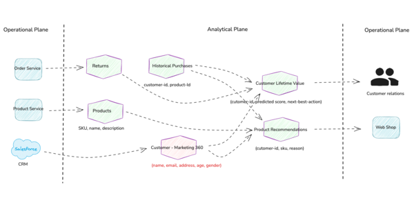
Building chat applications often involves tackling complex user interfaces. This is especially true for "deep research" tasks where information density is high. Components like reports, research steps, sources, and source citations create unique UI challenges. This post looks at how four AI chat tools (Perplexity, Manus, ChatGPT, and Gemini) approach these challenges. By checking out their UI decisions and trade-offs, particularly using Vercel's AI SDK message schema, we can find valuable lessons for designing effective research-focused chat interfaces. Vercel AI SDK UI message schema The Vercel AI SDK provides a structured approach for building chat interfaces through its message schema. Understanding this schema helps us analyze how different research tools implement their interfaces. A simplified version of the Vercel AI SDK UI message schema includes: UiMessage: A message in the chat. It represents the entire message unit from either a user or the AI assistant. Annotation: Information tied to a message that can be streamed before the response is written. These are useful for showing intermediate research steps, thinking processes, or source gathering. UiMessagePart: A piece of a message like text, code, or an image. Complex research responses often combine multiple part types to create rich information displays. // Simplified relationship between UiMessage, Annotation, and UiMessagePart // UiMessagePart represents different parts of the message content type TextUIPart = { type: 'text' text: string } type ToolInvocationUIPart = { type: 'tool-invocation' toolInvocation: ToolInvocation // Tool invocation is a discriminated union of tool info (results and calls) } // UiMessage represents a complete message unit in the chat type UiMessage = { id: string role: 'user' | 'assistant' createdAt: Date parts: Array // A message consists of multiple parts. A discriminated union of parts types annotations?: JSONValue[] // A discriminated union of annotation types } When implementing a research interface, developers can use these components to create different arrangements of information. Each research tool we look at makes different choices about how to structure and present information using similar underlying components. The complexity comes from balancing information density with usability. Research interfaces must present substantial information without overwhelming users. How each tool handles this balance is a core part of our analysis. Perplexity UI breakdown Perplexity uses a simple approach for research presentation. Their interface emphasizes readability while keeping the contextual richness needed for deep research tasks. The main answer or "report" appears as a standard message in the chat. It has no special formatting to distinguish it from other messages. This simplifies the UI but might make it harder for users to spot the final answer among regular conversation messages. What stands out most about Perplexity is its treatment of sources. Sources appear in many places: Inline citations within the text (numbered references) A dedicated sources panel at the top of each research response + available as a "Sources" tab This dual approach gives sources high visual prominence while maintaining the flow of the main content. Implementing this in the Vercel AI SDK schema might use: A primary UiMessagePart for the text content Annotation components to hold the source references Custom styling to visually link inline citations with their corresponding entries Key benefits: Builds user trust through clear attribution Makes fact-checking easy with prominent sources Keeps content flow clean with numbered references Drawbacks: Interface can become cluttered with many sources Perplexity also includes suggested follow-up questions at the end of responses. They serve as navigation aids and subtle guides toward productive use of the tool. Manus UI breakdown Manus takes a different approach to research interfaces. It makes the research process itself a central part of the user experience. Their interface splits attention between the research output and the research method. "Research Steps" occupy a significant portion of the screen real estate. This makes the process transparent to users. Unlike interfaces focusing solely on the result, Manus treats the journey as equally important. One notable feature is how Manus handles planning. The interface displays an explicit research plan but doesn't pause for user confirmation or feedback. It does ask clarifying questions when needed, though. This can create a smoother experience when it gets things right, but it depends heavily on the quality of the decision making. Manus generates multiple documents during research, providing info about intermediate steps. While informative, this approach can reduce the visual importance of the primary document requested
Building chat applications often involves tackling complex user interfaces. This is especially true for "deep research" tasks where information density is high. Components like reports, research steps, sources, and source citations create unique UI challenges. This post looks at how four AI chat tools (Perplexity, Manus, ChatGPT, and Gemini) approach these challenges. By checking out their UI decisions and trade-offs, particularly using Vercel's AI SDK message schema, we can find valuable lessons for designing effective research-focused chat interfaces.
Vercel AI SDK UI message schema
The Vercel AI SDK provides a structured approach for building chat interfaces through its message schema. Understanding this schema helps us analyze how different research tools implement their interfaces.
A simplified version of the Vercel AI SDK UI message schema includes:
- UiMessage: A message in the chat. It represents the entire message unit from either a user or the AI assistant.
- Annotation: Information tied to a message that can be streamed before the response is written. These are useful for showing intermediate research steps, thinking processes, or source gathering.
- UiMessagePart: A piece of a message like text, code, or an image. Complex research responses often combine multiple part types to create rich information displays.
// Simplified relationship between UiMessage, Annotation, and UiMessagePart

// UiMessagePart represents different parts of the message content
type TextUIPart = {
  type: 'text'
  text: string
}

type ToolInvocationUIPart = {
  type: 'tool-invocation'
  toolInvocation: ToolInvocation // Tool invocation is a discriminated union of tool info (results and calls)
}

// UiMessage represents a complete message unit in the chat
type UiMessage = {
  id: string
  role: 'user' | 'assistant'
  createdAt: Date
  parts: Array<
    | TextUIPart
    | ReasoningUIPart
    | ToolInvocationUIPart
    | SourceUIPart
    | FileUIPart
    | StepStartUIPart
  > // A message consists of multiple parts. A discriminated union of parts types
  annotations?: JSONValue[] // A discriminated union of annotation types
}
When implementing a research interface, developers can use these components to create different arrangements of information. Each research tool we look at makes different choices about how to structure and present information using similar underlying components.
The complexity comes from balancing information density with usability. Research interfaces must present substantial information without overwhelming users. How each tool handles this balance is a core part of our analysis.
Perplexity UI breakdown
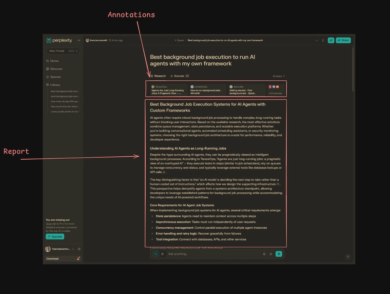
Perplexity uses a simple approach for research presentation. Their interface emphasizes readability while keeping the contextual richness needed for deep research tasks.
The main answer or "report" appears as a standard message in the chat. It has no special formatting to distinguish it from other messages. This simplifies the UI but might make it harder for users to spot the final answer among regular conversation messages.
What stands out most about Perplexity is its treatment of sources. Sources appear in many places:
- Inline citations within the text (numbered references)
- A dedicated sources panel at the top of each research response + available as a "Sources" tab
This dual approach gives sources high visual prominence while maintaining the flow of the main content. Implementing this in the Vercel AI SDK schema might use:
- A primary
UiMessagePartfor the text content -
Annotationcomponents to hold the source references - Custom styling to visually link inline citations with their corresponding entries
Key benefits:
- Builds user trust through clear attribution
- Makes fact-checking easy with prominent sources
- Keeps content flow clean with numbered references
Drawbacks:
- Interface can become cluttered with many sources
Perplexity also includes suggested follow-up questions at the end of responses. They serve as navigation aids and subtle guides toward productive use of the tool.
Manus UI breakdown
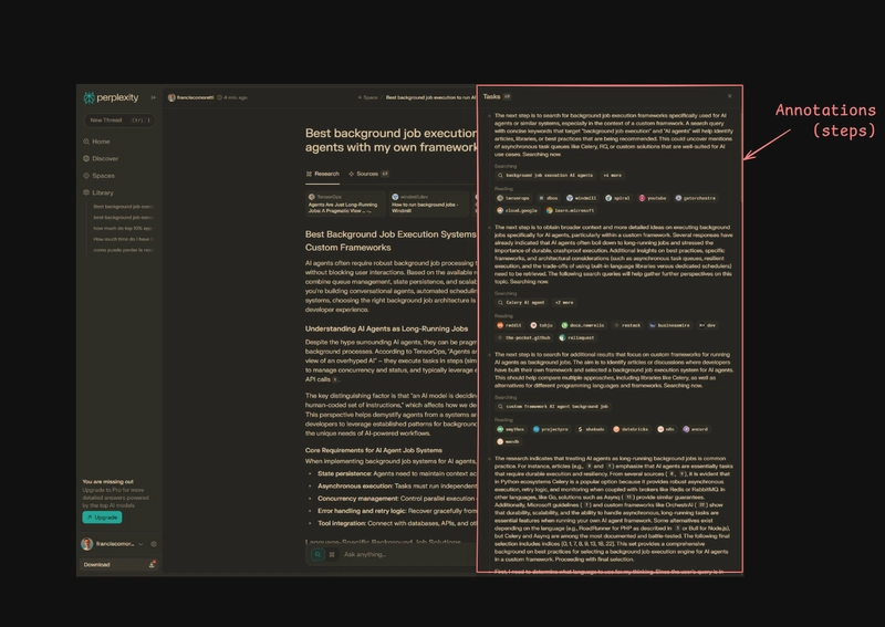
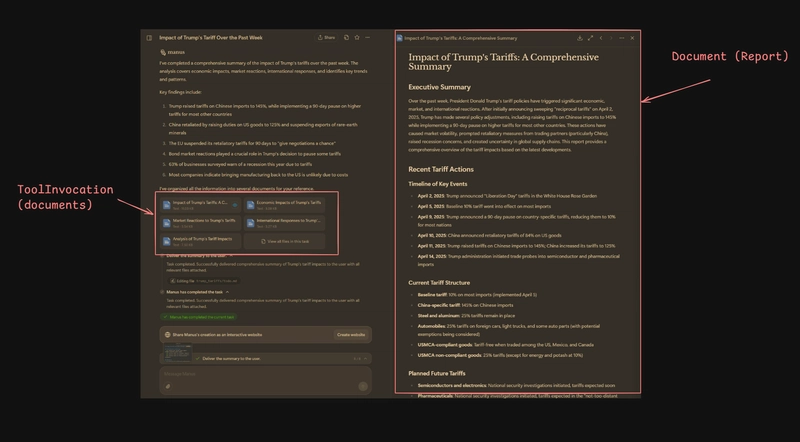
Manus takes a different approach to research interfaces. It makes the research process itself a central part of the user experience. Their interface splits attention between the research output and the research method.
"Research Steps" occupy a significant portion of the screen real estate. This makes the process transparent to users. Unlike interfaces focusing solely on the result, Manus treats the journey as equally important.
One notable feature is how Manus handles planning. The interface displays an explicit research plan but doesn't pause for user confirmation or feedback. It does ask clarifying questions when needed, though. This can create a smoother experience when it gets things right, but it depends heavily on the quality of the decision making.
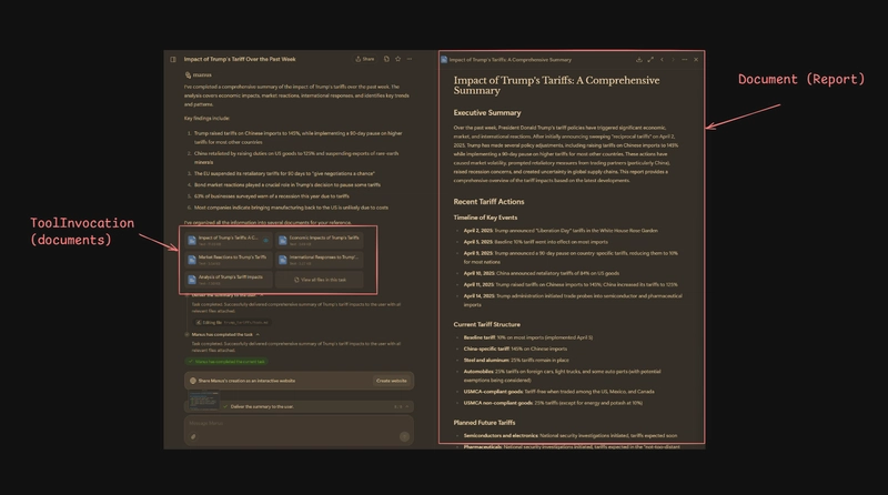
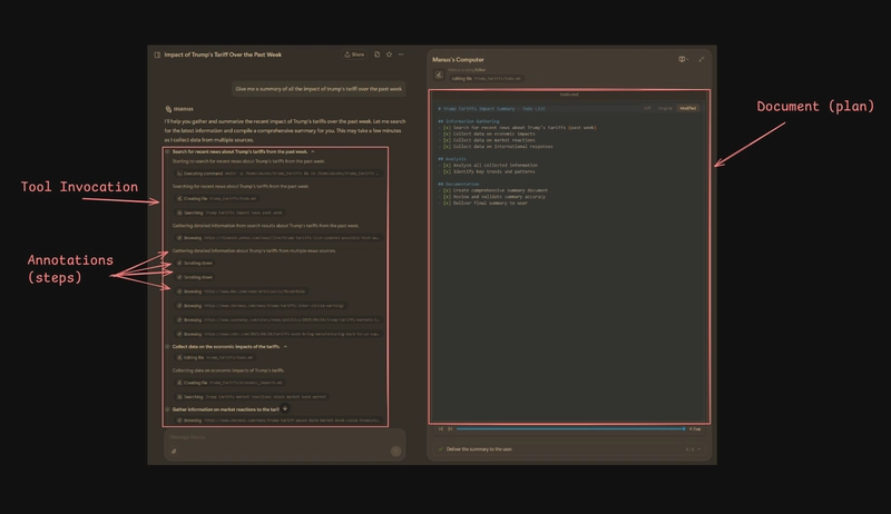
Manus generates multiple documents during research, providing info about intermediate steps. While informative, this approach can reduce the visual importance of the primary document requested by the user. The final output becomes just one of several documents, not the clear focal point.
The 2-panel layout with a "computer view" on the right aims to show how the agent works in real time. This provides transparency but uses significant screen space. Its value diminishes during routine web browsing, which makes up most of the research process.
Using the Vercel AI SDK schema, this approach might be implemented with:
- Multiple
UiMessagecomponents for different document types -
Annotationobjects to represent each research step - A mechanism for
Annotationobjects representing tool calls to fetch and show the correct 'computer view' content for that step
Key benefits:
- Process transparency builds user trust
- Research journey visibility helps understanding
- Real-time insights into AI thinking
Drawbacks:
- Interface feels busier and potentially overwhelming
- Requires complex state management
ChatGPT UI breakdown
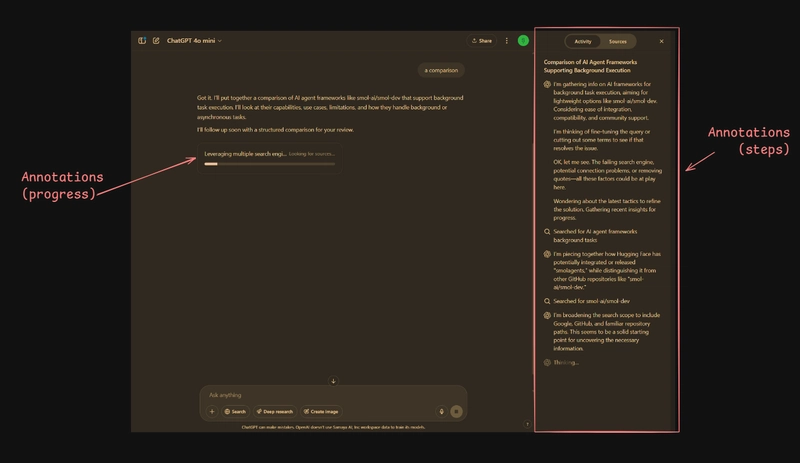
ChatGPT takes a more balanced approach to research interfaces. It focuses on user control while keeping a clean presentation. It starts with a plan as a TextUIPart that needs feedback via a normal conversation message. This offers familiarity, practicality, and flexibility.
Before conducting research, ChatGPT typically presents a research plan as a regular text message part and asks for user feedback. This creates a pause point that gives users agency in the research process. They can approve, modify, or redirect the plan before execution starts.
For research steps, ChatGPT initially displays them in an expandable sheet that updates in real time. This keeps the research process visible without dominating the interface. Once research finishes, these steps collapse into a compact component within the conversation. This creates a clean history that can be referenced if needed.
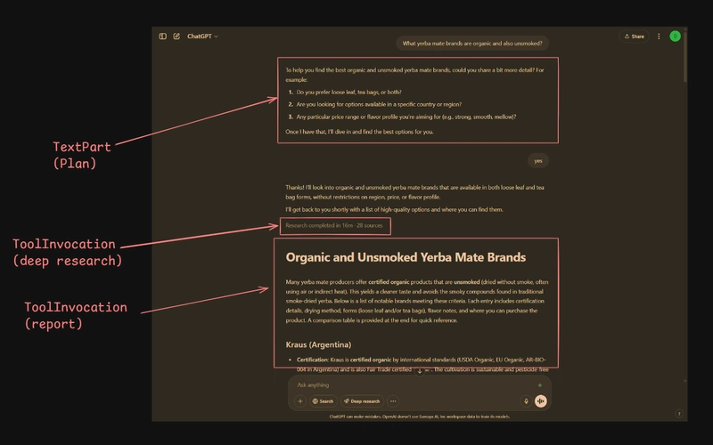
The final report appears as a ToolInvocation piece of the regular answer, styled like a card. This works well for shorter reports but can become cluttered for longer, more complex responses. The lack of dedicated document viewing capabilities limits the reading experience for extended content.
Using the Vercel AI SDK schema, this approach might be implemented with:
- A normal text
UiMessagePartfor the initial plan -
Annotationobjects for the research steps that can toggle between expanded and collapsed states - A
ToolInvocationpart for the final report content
Key benefits:
- User control through plan feedback
- Clean interface maintains familiarity
- Collapsible research steps reduce clutter
Drawbacks:
- Limited support for longer reports
- Reading experience suffers in standard chat format
Gemini UI breakdown
Gemini offers a distinct approach to research interfaces. It has a strong focus on the final output while still providing process transparency. The interface uses a two-panel design that separates the conversation from research details.
The planning approach in Gemini appears as a special UI element (a tool result), though the core content is primarily text with minimal formatting. Plan acceptance is handled through a button that creates a standard message response, rather than specialized UI controls.
Research progress updates appear in the secondary panel labeled "Thoughts". This provides insight into the ongoing process and creates clear separation between the conversation and the research mechanics.
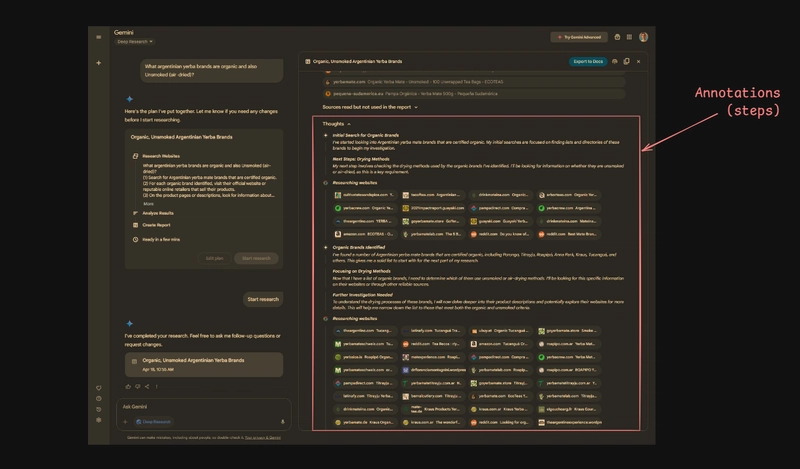
When research completes, Gemini displays the document (report) in the secondary panel. Research steps are positioned below the report content. This creates a hierarchy that emphasizes results over process. However, this arrangement requires significant scrolling to review the research steps, making them less accessible than in other interfaces.
Sources receive some visual emphasis in the Gemini UI but remain integrated within the report. This approach creates a cleaner appearance but may reduce source prominence compared to interfaces like Perplexity that highlight attribution more explicitly.
Using the Vercel AI SDK schema, this approach might be implemented with:
- A
ToolInvocationfor the initial plan -
Annotationobjects for the "Thoughts" that update during research - Another
ToolInvocationfor the final report - A separate UI component outside the main message thread for displaying both the report and research steps
Key benefits:
- Clear focus on final output
- Clean conversation, separate from research details
- Good separation of conversation and supporting information
Drawbacks:
- Reduced visibility of research steps after completion
- Sources less prominent than other approaches
- Requires managing a more complex layout
Conclusion
Comparing these four tools reveals a spectrum of UI strategies for deep research. Perplexity prioritizes source prominence and readability, Manus emphasizes process transparency, ChatGPT balances user control with a clean interface, and Gemini focuses strongly on the final report within a separated layout. Each approach involves trade-offs between information density, process visibility, user control, and interface complexity. Understanding these design choices and their implications offers valuable insights for developers building AI-powered research tools.