


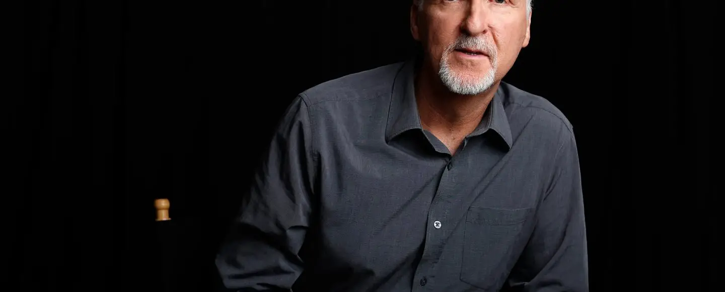
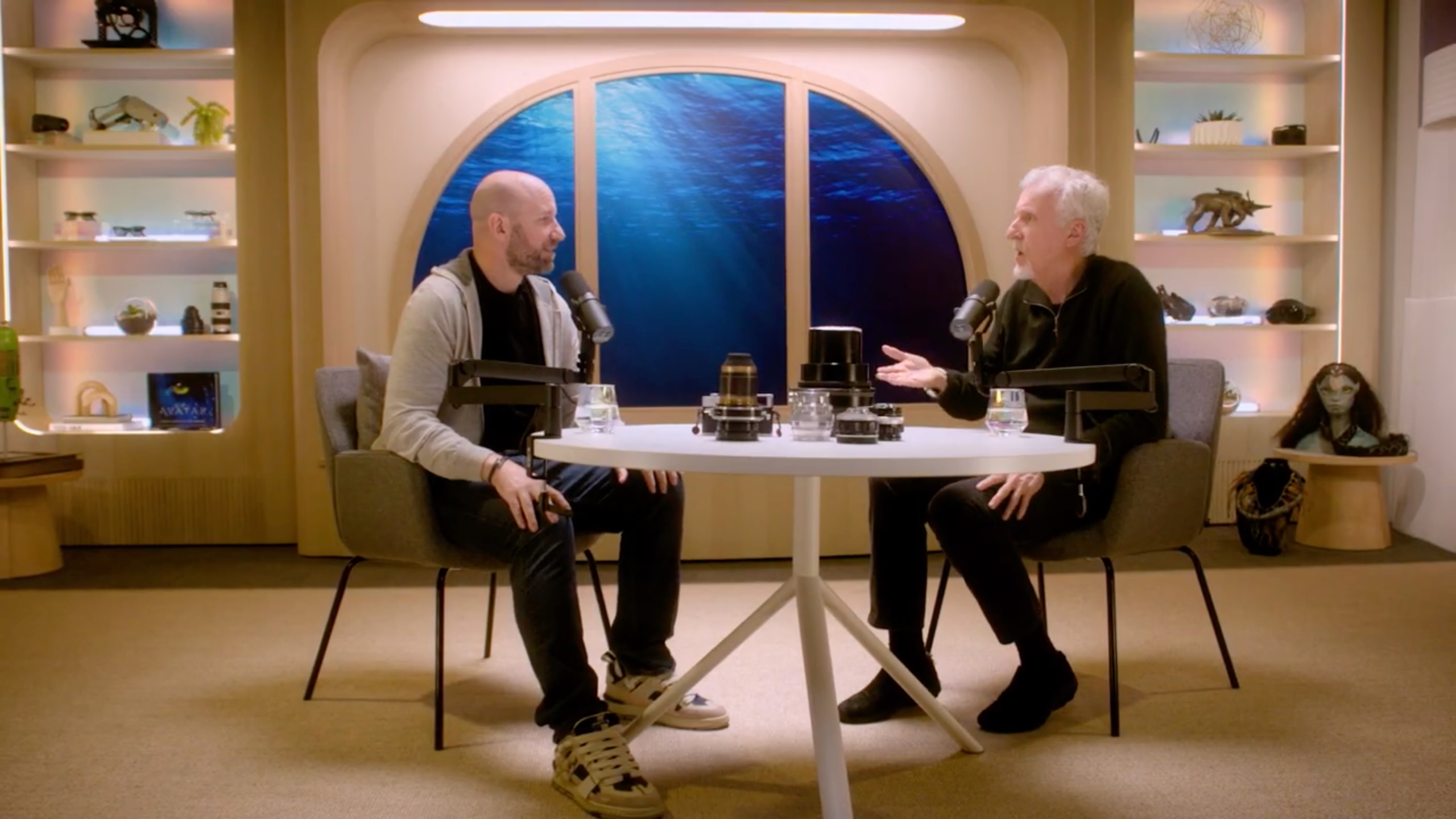
![[The AI Show Episode 143]: ChatGPT Revenue Surge, New AGI Timelines, Amazon’s AI Agent, Claude for Education, Model Context Protocol & LLMs Pass the Turing Test](https://www.marketingaiinstitute.com/hubfs/ep%20143%20cover.png)


.png?width=1920&height=1920&fit=bounds&quality=70&format=jpg&auto=webp#)


.png?#)


.webp?#)


![[Fixed] Gemini app is failing to generate Audio Overviews](https://i0.wp.com/9to5google.com/wp-content/uploads/sites/4/2025/03/Gemini-Audio-Overview-cover.jpg?resize=1200%2C628&quality=82&strip=all&ssl=1)

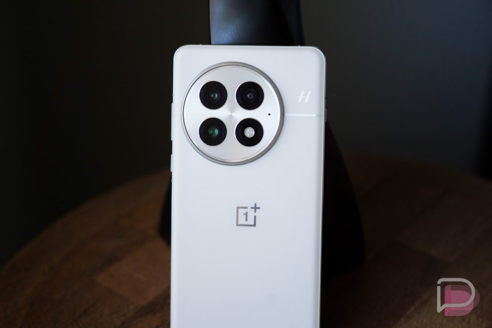
![What’s new in Android’s April 2025 Google System Updates [U: 4/14]](https://i0.wp.com/9to5google.com/wp-content/uploads/sites/4/2025/01/google-play-services-3.jpg?resize=1200%2C628&quality=82&strip=all&ssl=1)


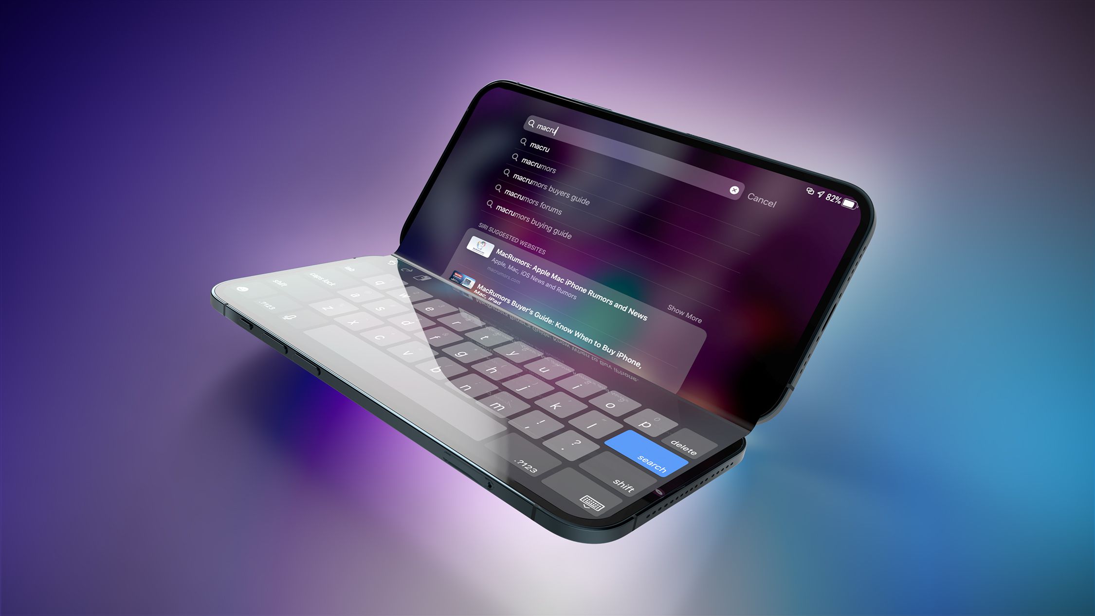
![Apple Seeds tvOS 18.5 Beta 2 to Developers [Download]](https://www.iclarified.com/images/news/97011/97011/97011-640.jpg)
![Apple Releases macOS Sequoia 15.5 Beta 2 to Developers [Download]](https://www.iclarified.com/images/news/97014/97014/97014-640.jpg)


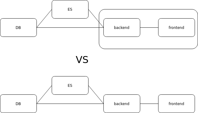
Why I chose not to make the homepage responsive: the reality behind some technical choices.
Introduction: When developing a website, the golden rule is: it must be responsive. But in some cases, this rule is set aside for practical or aesthetic reasons. In this article, I want to share my experience with one of my projects, Pentainferno, where the homepage is not responsive due to a deliberate and requested choice. The Context: I created this site for a project called "Pentainferno." I was asked to follow a very specific, predefined design with a precise arrangement of elements and images. Specifically, the homepage had a fixed desktop layout, requested to maintain the visual composition created by the designer. In other words, I couldn’t alter the layout to make it mobile-friendly, as it would have distorted the intended look. I Can Make It Responsive, But It Wasn't a Priority Here: Let me clarify: I know how to create responsive layouts. For other projects, I use media queries, flexbox, and grid to adapt everything to various screen sizes. But in this case, I made a conscious choice: I put responsiveness aside to respect the requested graphical direction. What I Learned: This experience taught me a few things: Sometimes, following the requested design is more important than applying standard technical rules. You need to be adaptable, especially when working for others. It's useful to know alternatives: I could have suggested a similar responsive solution, but in this case, it wasn’t what was needed. Conclusion: The "right way" isn't always the most technical: sometimes, it’s the one that best responds to a specific request. What about you? Have you ever had to sacrifice responsiveness to follow a design? Let me know in the comments!
Introduction:
When developing a website, the golden rule is: it must be responsive. But in some cases, this rule is set aside for practical or aesthetic reasons.
In this article, I want to share my experience with one of my projects, Pentainferno, where the homepage is not responsive due to a deliberate and requested choice.
The Context:
I created this site for a project called "Pentainferno." I was asked to follow a very specific, predefined design with a precise arrangement of elements and images.
Specifically, the homepage had a fixed desktop layout, requested to maintain the visual composition created by the designer.
In other words, I couldn’t alter the layout to make it mobile-friendly, as it would have distorted the intended look.
I Can Make It Responsive, But It Wasn't a Priority Here:
Let me clarify: I know how to create responsive layouts. For other projects, I use media queries, flexbox, and grid to adapt everything to various screen sizes.
But in this case, I made a conscious choice: I put responsiveness aside to respect the requested graphical direction.
What I Learned:
This experience taught me a few things:
Sometimes, following the requested design is more important than applying standard technical rules.
You need to be adaptable, especially when working for others.
It's useful to know alternatives: I could have suggested a similar responsive solution, but in this case, it wasn’t what was needed.
Conclusion:
The "right way" isn't always the most technical: sometimes, it’s the one that best responds to a specific request.
What about you? Have you ever had to sacrifice responsiveness to follow a design?
Let me know in the comments!