


![[Free Webinar] Guide to Securing Your Entire Identity Lifecycle Against AI-Powered Threats](https://blogger.googleusercontent.com/img/b/R29vZ2xl/AVvXsEjqbZf4bsDp6ei3fmQ8swm7GB5XoRrhZSFE7ZNhRLFO49KlmdgpIDCZWMSv7rydpEShIrNb9crnH5p6mFZbURzO5HC9I4RlzJazBBw5aHOTmI38sqiZIWPldRqut4bTgegipjOk5VgktVOwCKF_ncLeBX-pMTO_GMVMfbzZbf8eAj21V04y_NiOaSApGkM/s1600/webinar-play.jpg?#)


![[The AI Show Episode 145]: OpenAI Releases o3 and o4-mini, AI Is Causing “Quiet Layoffs,” Executive Order on Youth AI Education & GPT-4o’s Controversial Update](https://www.marketingaiinstitute.com/hubfs/ep%20145%20cover.png)


![Google Home app fixes bug that repeatedly asked to ‘Set up Nest Cam features’ for Nest Hub Max [U]](https://i0.wp.com/9to5google.com/wp-content/uploads/sites/4/2022/08/youtube-premium-music-nest-hub-max.jpg?resize=1200%2C628&quality=82&strip=all&ssl=1)


![Epic Games Wins Major Victory as Apple is Ordered to Comply With App Store Anti-Steering Injunction [Updated]](https://images.macrumors.com/t/Z4nU2dRocDnr4NPvf-sGNedmPGA=/2250x/article-new/2022/01/iOS-App-Store-General-Feature-JoeBlue.jpg)


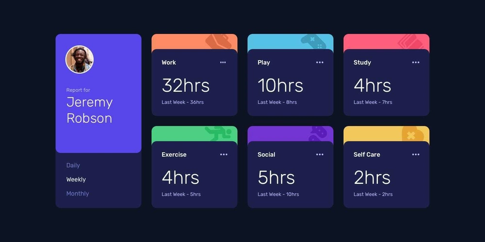
Time Tracking Dashboard Solution
Hello everyone! I’ve completed another Frontend Mentor challenge—the Time Tracking Dashboard—and I’m excited to share an in-depth breakdown of my process. In this project, I built a responsive dashboard that dynamically displays time stats for different activities, learning valuable skills like data fetching, error handling, and accessibility along the way. Let’s dive in! The Challenge The goal of this Frontend Mentor challenge was to build a responsive Time Tracking Dashboard that fetches time stats for six activities (Work, Play, Study, Exercise, Social, and Self Care) from a JSON file and displays them on cards. Users should be able to switch between Daily, Weekly, and Monthly timeframes, view layouts optimized for mobile, tablet, and desktop screens, and interact with hover states on buttons. I used the provided Figma design file to guide my layout and ensure the functionality matched the design. My Build Process Planning I started by reviewing the Figma design file provided by Frontend Mentor, breaking down the layouts for mobile, tablet, and desktop into notes. Typically, I sketch my own designs in a notebook or on a whiteboard, noting functionalities, colors, and other details—but since the design was provided, I focused on analyzing the layouts to plan my HTML structure. Setup With my notes ready, I set up the project files: creating index.html, styles.css, and main.js, linking them properly, and importing the required fonts. I also defined CSS variables for colors in the :root selector, typography classes, and applied a CSS reset (e.g., setting box-sizing: border-box) to ensure consistent styling before writing the HTML. HTML Layout I structured the HTML with accessibility and semantic best practices in mind, using appropriate tags, ARIA attributes, and classes for styling and JavaScript interaction. The page is wrapped in a container that holds two sections: the profile section and the activity cards section. Profile Section Layout The profile section contains two containers: A container for the profile information, including the profile picture and the report owner’s name (e.g., “Report for Jeremy Robson”). A navigation container for the timeframe options (Daily, Weekly, Monthly), which I marked up as a tab list for accessibility using role="tablist". Report for Jeremy Robson Daily Weekly Monthly I used semantic elements like and , and added role="tablist" and role="tab" to the navigation to improve accessibility for screen readers. The data-timeframe attributes and js-nav-btn classes were added for JavaScript interaction. Activity Section Layout The activity cards section contains six cards, one for each activity (Work, Play, Study, Exercise, Social, and Self Care). Each card is represented by an element with a data-activity attribute (e.g., data-activity="work") for JavaScript identification. Each card has two containers: one for the activity icon and one for the stats, which are dynamically updated by JavaScript but hardcoded initially for layout purposes. Here’s a simplified version of one activity card’s HTML: Work Icon Work 32hrs Last Week – 36hrs The js-current and js-previous classes were added to the elements to target them with JavaScript for dynamic updates. Page Layout Next, I styled the page to create responsive layouts for mobile (375px), tablet (768px), and desktop (1440px) screens, following a mobile-first approach. I started by styling the mobile layout, using Flexbox to stack the profile section and activity cards vertically. Then, I used media queries to adjust the layout for larger screens: for tablets, I tweaked the padding and spacing, and for desktops, I switched to a grid layout to display the profile section on the left and the activity cards in a 3x2 grid on the right, matching the Figma design. I had already defined CSS variables for colors (e.g., --primary-blue) in the :root selector and typography classes, which I applied to the HTML elements. This made it easy to maintain consistency across the design while using Flexbox and Grid to handle the layout changes. Page Functionality With the layout complete, I moved on to the JavaScript functionality. The goal was to fetch data from a data.json file, display it on the activity cards for the Daily, Weekly, and Monthly timeframes, and allow users to switch between timeframes using the navigation buttons. As a beginner in JavaScript, this felt daunting at first, but I broke it down into five manageable steps: Prepare the HTML for JavaScript manipulation Fetch the data from the JSON file Display the weekly data on page load (default state) Add event listeners to the navigation buttons Testing and debugging Step 1: prepare the HTML for JavaScript I started by adding classes and
Hello everyone! I’ve completed another Frontend Mentor challenge—the Time Tracking Dashboard—and I’m excited to share an in-depth breakdown of my process. In this project, I built a responsive dashboard that dynamically displays time stats for different activities, learning valuable skills like data fetching, error handling, and accessibility along the way. Let’s dive in!
The Challenge
The goal of this Frontend Mentor challenge was to build a responsive Time Tracking Dashboard that fetches time stats for six activities (Work, Play, Study, Exercise, Social, and Self Care) from a JSON file and displays them on cards. Users should be able to switch between Daily, Weekly, and Monthly timeframes, view layouts optimized for mobile, tablet, and desktop screens, and interact with hover states on buttons. I used the provided Figma design file to guide my layout and ensure the functionality matched the design.
My Build Process
Planning
I started by reviewing the Figma design file provided by Frontend Mentor, breaking down the layouts for mobile, tablet, and desktop into notes. Typically, I sketch my own designs in a notebook or on a whiteboard, noting functionalities, colors, and other details—but since the design was provided, I focused on analyzing the layouts to plan my HTML structure.
Setup
With my notes ready, I set up the project files: creating index.html, styles.css, and main.js, linking them properly, and importing the required fonts. I also defined CSS variables for colors in the :root selector, typography classes, and applied a CSS reset (e.g., setting box-sizing: border-box) to ensure consistent styling before writing the HTML.
HTML Layout
I structured the HTML with accessibility and semantic best practices in mind, using appropriate tags, ARIA attributes, and classes for styling and JavaScript interaction. The page is wrapped in a container that holds two sections: the profile section and the activity cards section.
Profile Section Layout
The profile section contains two containers:
A container for the profile information, including the profile picture and the report owner’s name (e.g., “Report for Jeremy Robson”).
A navigation container for the timeframe options (Daily, Weekly, Monthly), which I marked up as a tab list for accessibility using role="tablist".

Report for Jeremy Robson
I used semantic elements like and , and added role="tablist" and role="tab" to the navigation to improve accessibility for screen readers. The data-timeframe attributes and js-nav-btn classes were added for JavaScript interaction.
Activity Section Layout
The activity cards section contains six cards, one for each activity (Work, Play, Study, Exercise, Social, and Self Care). Each card is represented by an element with a data-activity attribute (e.g., data-activity="work") for JavaScript identification. Each card has two containers: one for the activity icon and one for the stats, which are dynamically updated by JavaScript but hardcoded initially for layout purposes.
Here’s a simplified version of one activity card’s HTML:
Work
32hrs
Last Week – 36hrs
The js-current and js-previous classes were added to the elements to target them with JavaScript for dynamic updates.
Page Layout
Next, I styled the page to create responsive layouts for mobile (375px), tablet (768px), and desktop (1440px) screens, following a mobile-first approach. I started by styling the mobile layout, using Flexbox to stack the profile section and activity cards vertically. Then, I used media queries to adjust the layout for larger screens: for tablets, I tweaked the padding and spacing, and for desktops, I switched to a grid layout to display the profile section on the left and the activity cards in a 3x2 grid on the right, matching the Figma design.
I had already defined CSS variables for colors (e.g., --primary-blue) in the :root selector and typography classes, which I applied to the HTML elements. This made it easy to maintain consistency across the design while using Flexbox and Grid to handle the layout changes.
Page Functionality
With the layout complete, I moved on to the JavaScript functionality. The goal was to fetch data from a data.json file, display it on the activity cards for the Daily, Weekly, and Monthly timeframes, and allow users to switch between timeframes using the navigation buttons. As a beginner in JavaScript, this felt daunting at first, but I broke it down into five manageable steps:
- Prepare the HTML for JavaScript manipulation
- Fetch the data from the JSON file
- Display the weekly data on page load (default state)
- Add event listeners to the navigation buttons
- Testing and debugging
Step 1: prepare the HTML for JavaScript
I started by adding classes and data attributes to the HTML for JavaScript interaction:
- Added the js-nav-btn class to the navigation buttons for DOM selection
- Added data-timeframe attributes (e.g, data-timeframe="daily") to the buttons to identify the timeframe.
- Added js-current and js-previous classes to the
elements in the activity cards for updating the time stats.
Step 2: Fetch the Data
I used the Fetch API to retrieve the data from data.json. First, I defined a global activityData variable to store the data. Then, I created a fetchData function that fetches the JSON file, checks if the response is okay, and handles errors using a .catch() block. Finally, I called fetchData and stored the response in activityData, logging it to the console to verify:
let activityData;

 function fetchData() {
   return fetch('./data.json')
     .then((response) => {
       if (!response.ok) throw new Error(`Error: ${response.status} ${response.statusText}`);

       return response.json();
     })
     .catch((error) => {
     console.error('Error fetching data:', error)
     });
 }

 fetchData().then((data) => {
   activityData = data;
   console.log(activityData);
 });
Step 3: Display the Fetched Data
The default state of the dashboard is to display the weekly timeframe data. I created an updateCards function that takes a timeframe parameter (e.g., "weekly") and updates the cards accordingly. The function first checks if activityData exists, then loops through each activity to update its card.
A key challenge was displaying the "previous" hours with the correct prefix (e.g., "Last Week – 36hrs" for the Work card in the weekly timeframe). Since the prefix changes based on the timeframe, I created a timeFrameMap object to map each timeframe to its prefix:
const timeFrameMap = {
  daily: 'Yesterday',
  weekly: 'Last Week',
  monthly: 'Last Month'
};
For each activity, I:
- Normalized the activity title (e.g., "Self Care" to "self-care") to match the data-activity attribute in the HTML, using toLowerCase() and replace(/\s+/g, '-') to convert spaces to hyphens.
- Selected the corresponding card using document.querySelector.
- Updated the .js-current and .js-previous elements with the current and previous hours for the given timeframe, using the timeFrameMap for the prefix. Here’s the core logic of updateCards:
function updateCards(timeframe) {
  if (!activityData) {
    console.error('No activity data available');
    return;
  }

  const timeFrameMap = {
    daily: 'Last Day',
    weekly: 'Last Week',
    monthly: 'Last Month'
  };

  activityData.forEach((activity) => {
    const activityTitle = activity.title;
    const normalizedTitle = activityTitle.toLowerCase().replace(/\s+/g, '-');
    const card = document.querySelector(`[data-activity="${normalizedTitle}"]`);

    if (!card) {
      console.error(`Card not found for activity: ${activityTitle}`);
      return;
    }

    const currentElement = card.querySelector('.js-current');
    const previousElement = card.querySelector('.js-previous');

    const currentHours = activity.timeframes[timeframe].current;
    const previousHours = activity.timeframes[timeframe].previous;

    currentElement.textContent = `${currentHours}hrs`;
    previousElement.textContent = `${timeFrameMap[timeframe]} – ${previousHours}hrs`;
  });
}
I called updateCards('weekly') after fetching the data to set the default state.
Step 4: Add Event Listeners to Navigation Buttons
To allow users to switch timeframes, I added event listeners to the navigation buttons. I selected all buttons with the js-nav-btn class and added both click and keydown event listeners to support mouse and keyboard interaction. When a button is activated, the updateCards function is called with the button’s data-timeframe value, and the active state is updated by toggling the active class and aria-selected attribute (since I used role="tablist" for accessibility).
const navButtons = document.querySelectorAll('.js-nav-btn');

const handleButtonActivation = (button) => {
  const timeframe = button.dataset.timeframe;
  updateCards(timeframe);

  navButtons.forEach((btn) => {
    btn.classList.remove('active');
    btn.setAttribute('aria-selected', 'false');
  });

  button.classList.add('active');
  button.setAttribute('aria-selected', 'true');
};

navButtons.forEach((button) => {
  button.addEventListener('click', () => {
    handleButtonActivation(button);
  });

  button.addEventListener('keydown', (event) => {
    if (event.key === 'Enter' || event.key === ' ') {
      event.preventDefault();
      handleButtonActivation(button);
    }
  });
});
This ensures the dashboard is interactive and accessible, allowing users to switch timeframes with a mouse, Enter, or Space key while maintaining proper ARIA attributes for screen readers.
Testing
After implementing the functionality, I thoroughly tested the dashboard:
Data Display: I refreshed the page to confirm the default weekly data displayed correctly (e.g., Work: 32hrs, Last Week – 36hrs) and clicked each navigation button to verify the Daily and Monthly timeframes updated as expected.
Interactivity: I tested the hover states on the navigation buttons to ensure they matched the Figma design, and I used the Tab, Enter, and Space keys to confirm keyboard navigation worked.
Accessibility: Using a screen reader (VoiceOver), I verified that the navigation buttons were announced correctly (e.g., “Weekly, tab, 2 of 3, selected”) thanks to the role="tablist" and aria-selected attributes.
Error Handling: I checked the console to ensure no errors were thrown during data fetching or card updates.
Project Solution Summary
This project was both fun and challenging, pushing me to think critically and break down complex tasks into manageable steps. I learned how to fetch data with the Fetch API, handle errors effectively, and ensure accessibility for all users—skills I’ll continue to refine in future projects. I highly recommend Frontend Mentor to anyone looking for engaging challenges, whether you’re a beginner or an experienced developer. Their community is incredibly supportive, offering feedback and encouragement that helped me grow throughout this project. Thanks for reading!