


![[The AI Show Episode 144]: ChatGPT’s New Memory, Shopify CEO’s Leaked “AI First” Memo, Google Cloud Next Releases, o3 and o4-mini Coming Soon & Llama 4’s Rocky Launch](https://www.marketingaiinstitute.com/hubfs/ep%20144%20cover.png)


![Did I Discover A New Programming Paradigm? [closed]](https://miro.medium.com/v2/resize:fit:1200/format:webp/1*nKR2930riHA4VC7dLwIuxA.gif)


-Classic-Nintendo-GameCube-games-are-coming-to-Nintendo-Switch-2!-00-00-13.png?width=1920&height=1920&fit=bounds&quality=70&format=jpg&auto=webp#)


.jpg?width=1920&height=1920&fit=bounds&quality=70&format=jpg&auto=webp#)


.jpg?#)


_Wavebreakmedia_Ltd_FUS1507-1_Alamy.jpg?width=1280&auto=webp&quality=80&disable=upscale#)


![Hands-On With 'iPhone 17 Air' Dummy Reveals 'Scary Thin' Design [Video]](https://www.iclarified.com/images/news/97100/97100/97100-640.jpg)
![Mike Rockwell is Overhauling Siri's Leadership Team [Report]](https://www.iclarified.com/images/news/97096/97096/97096-640.jpg)


Introducing NuvoUI: A Developer-First SCSS Framework
In the ever-evolving world of front-end development, speed, flexibility, and scalability are critical. After working extensively across projects of every scale - from startups to enterprises — we realized the existing CSS frameworks either overloaded projects with unnecessary styles or lacked true developer-first flexibility. This insight led to the birth of NuvoUI — a lightweight, modular, and powerfully customizable SCSS framework designed by developers, for developers. Why We Built NuvoUI Performance at the Core NuvoUI’s default behavior generates zero utility classes unless explicitly enabled, keeping your compiled CSS extremely lightweight and fast. Developer Control Like Never Before With the powerful @include NuvoUI.apply() mixin, developers can compose utility classes on the fly, fully type-safe, modular, and ready for complex state and responsive scenarios — without bloating the codebase. Real-World Experience Integrated NuvoUI solves common layout problems directly, such as advanced gap and fill handling in flex layouts, removing typical flexbox frustrations seen in other frameworks, responsive mixins and lots of other great ones. BEM-First Thinking, Utility-Class Flexibility Whether you prefer scalable BEM structures or utility-driven designs, NuvoUI adapts without forcing you into a rigid system. Minimal Setup, Maximum Scalability Configure only what you need. Enable or disable any feature individually to perfectly match project requirements. Small example of layout creating with Utility Classes Following example on our NuvoUI page is created by utility classes Who Should Use NuvoUI? Developers tired of bloated frameworks slowing down their projects Teams who demand precise control over CSS output Projects where scalability and maintainability are critical from day one Designers and developers seeking cleaner SCSS architecture with real responsive and state control baked-in Utility Mixins Below are solid examples of NuvoUI utility classes and how they are used both directly and via the include NuvoUI.apply() mixin, along with their expected CSS output. First include the NuvoUI into your SCSS file @use '@nuvoui/core/src/styles/index.scss' as NuvoUI and just start using the power of NuvoUI. Simple spacing: navbar { @include NuvoUI.mt(1); } will output navbar { margin-top: 1rem; } NuvoUI.apply mixin The real power comes with the NuvoUI.apply mixin. Here are few examples Typography and color: @include NuvoUI.apply(text(xl), font(semibold), text(gray, 700)); Ouptput font-size: 1.25rem; font-weight: 600; color: #374151; // Based on theme scale for gray-700 Flexbox layout: @include NuvoUI.apply(flex, row, center, between, gap(0.75)); Output display: flex; flex-direction: row; align-items: center; justify-content: space-between; gap: 0.75rem; Responsive + state: @include NuvoUI.apply(bg(white), rounded(lg), bg(gray, 100) hover md); Output background-color: #ffffff; border-radius: 0.5rem; @media (min-width: 768px) { &:hover { background-color: #f3f4f6; } } Combined utilities for button: @include NuvoUI.apply( px(2), py(5px), bg(primary), text(white), rounded(md), shadow(sm), bg(primary, 700) hover, scale(.95) active ); Output padding-left: 2rem; padding-right: 2rem; padding-top: 2px; padding-bottom: 2px; background-color: #3b82f6; color: #ffffff; border-radius: 0.375rem; box-shadow: 0 1px 2px rgba(0,0,0,0.05); &:hover { background-color: #1d4ed8; } &:active { transform: scale(0.95); } Some example for customizing SCSS @use '@nuvoui/core/src/styles/index.scss' as NuvoUI with ( // Number of Columns for column layout, default is 12 $column-count: 16, // Change the default colors available $primary: #0091ff, $warning: #F8AF08, $danger: #FF3B30, $success: #34C759, $color-primitives: ( "gray": #6b7280, "red": #ef4444, "blue": #3b82f6, "green": #22c55e, "yellow": #eab308, "purple": #a855f7, "pink": #FF88FF, "orange": #ff6f00, ), // Enable utility classes generation so you can directly use them in your HTML $generate-utility-classes: true, // After enabling utility classes, you can choose to disable specific utility classes $feature-flags: ( "alignments": false, "animations": false, "backdrops": false, "container-queries": false, "cursors": false, "grid": false, "opacity": false, "position": true, "shadows": false, "transforms": false, "transitions": false, "z-index": false, ), ); NuvoUI Learning Curve NuvoUI is designed for SCSS-first developers who value structure, readability, and modularity. Easy for: Developers with strong SCSS experience. Teams familiar

In the ever-evolving world of front-end development, speed, flexibility, and scalability are critical. After working extensively across projects of every scale - from startups to enterprises — we realized the existing CSS frameworks either overloaded projects with unnecessary styles or lacked true developer-first flexibility.
This insight led to the birth of NuvoUI — a lightweight, modular, and powerfully customizable SCSS framework designed by developers, for developers.
Why We Built NuvoUI
Performance at the Core
NuvoUI’s default behavior generates zero utility classes unless explicitly enabled, keeping your compiled CSS extremely lightweight and fast.
Developer Control Like Never Before
With the powerful @include NuvoUI.apply() mixin, developers can compose utility classes on the fly, fully type-safe, modular, and ready for complex state and responsive scenarios — without bloating the codebase.
Real-World Experience Integrated
NuvoUI solves common layout problems directly, such as advanced gap and fill handling in flex layouts, removing typical flexbox frustrations seen in other frameworks, responsive mixins and lots of other great ones.
BEM-First Thinking, Utility-Class Flexibility
Whether you prefer scalable BEM structures or utility-driven designs, NuvoUI adapts without forcing you into a rigid system.
Minimal Setup, Maximum Scalability
Configure only what you need. Enable or disable any feature individually to perfectly match project requirements.
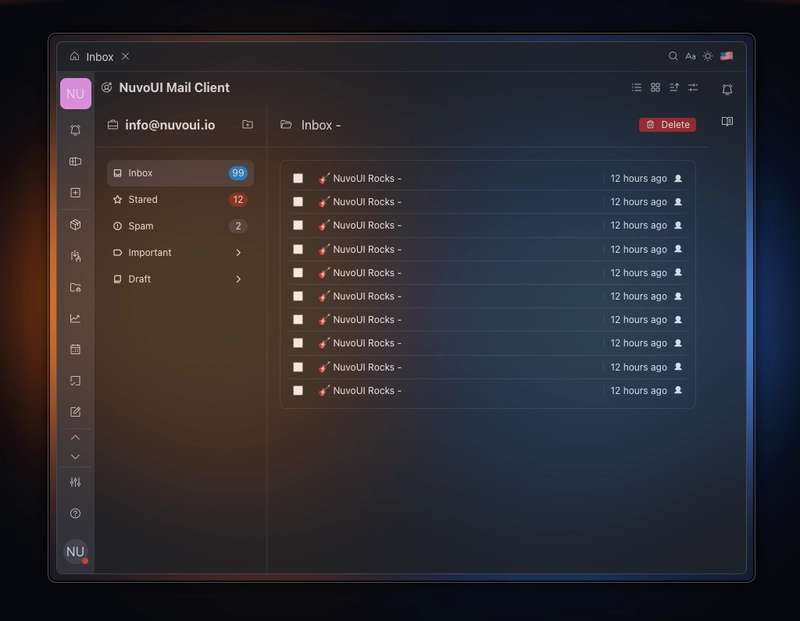
Small example of layout creating with Utility Classes
Following example on our NuvoUI page is created by utility classes
Who Should Use NuvoUI?
- Developers tired of bloated frameworks slowing down their projects
- Teams who demand precise control over CSS output
- Projects where scalability and maintainability are critical from day one
- Designers and developers seeking cleaner SCSS architecture with real responsive and state control baked-in
Utility Mixins
Below are solid examples of NuvoUI utility classes and how they are used both directly and via the include NuvoUI.apply() mixin, along with their expected CSS output.
First include the NuvoUI into your SCSS file
@use '@nuvoui/core/src/styles/index.scss' as NuvoUI
and just start using the power of NuvoUI.
Simple spacing:
navbar {
    @include NuvoUI.mt(1);
}
will output
navbar {
    margin-top: 1rem;
}
NuvoUI.apply mixin
The real power comes with the NuvoUI.apply mixin. Here are few examples
Typography and color:
@include NuvoUI.apply(text(xl), font(semibold), text(gray, 700));
Ouptput
font-size: 1.25rem;
font-weight: 600;
color: #374151; // Based on theme scale for gray-700
Flexbox layout:
@include NuvoUI.apply(flex, row, center, between, gap(0.75));
Output
display: flex;
flex-direction: row;
align-items: center;
justify-content: space-between;
gap: 0.75rem;
Responsive + state:
@include NuvoUI.apply(bg(white), rounded(lg), bg(gray, 100) hover md);
Output
background-color: #ffffff;
border-radius: 0.5rem;
@media (min-width: 768px) {
  &:hover {
    background-color: #f3f4f6;
  }
}
Combined utilities for button:
@include NuvoUI.apply(
  px(2), py(5px), bg(primary), text(white), rounded(md), shadow(sm),
 bg(primary, 700) hover, scale(.95) active
);
Output
padding-left: 2rem;
padding-right: 2rem;
padding-top: 2px;
padding-bottom: 2px;
background-color: #3b82f6;
color: #ffffff;
border-radius: 0.375rem;
box-shadow: 0 1px 2px rgba(0,0,0,0.05);

&:hover {
  background-color: #1d4ed8;
}

&:active {
  transform: scale(0.95);
}
Some example for customizing SCSS
@use '@nuvoui/core/src/styles/index.scss' as NuvoUI with (
  // Number of Columns for column layout, default is 12
  $column-count: 16,

  // Change the default colors available
  $primary: #0091ff,
  $warning: #F8AF08,
  $danger: #FF3B30,
  $success: #34C759,
  $color-primitives: (
    "gray": #6b7280,
    "red": #ef4444,
    "blue": #3b82f6,
    "green": #22c55e,
    "yellow": #eab308,
    "purple": #a855f7,
    "pink": #FF88FF,
    "orange": #ff6f00,
  ),

  // Enable utility classes generation so you can directly use them in your HTML
  $generate-utility-classes: true,

  // After enabling utility classes, you can choose to disable specific utility classes
  $feature-flags: (
    "alignments": false,
    "animations": false,
    "backdrops": false,
    "container-queries": false,
    "cursors": false,
    "grid": false,
    "opacity": false,
    "position": true,
    "shadows": false,
    "transforms": false,
    "transitions": false,
    "z-index": false,
  ),
);
NuvoUI Learning Curve
NuvoUI is designed for SCSS-first developers who value structure, readability, and modularity.
Easy for:
- Developers with strong SCSS experience.
- Teams familiar with mixins, media queries, and nested styles.
- Projects preferring clean HTML with logic in stylesheets.
Challenging for:
- Freshers or beginners with limited SCSS background.
- Developers expecting pre-built components or visual design tools.
- Those unfamiliar with BEM or utility logic patterns.
⸻
Current State
NuvoUI is in active development. Documentation is evolving and features are being refined. Your feedback will directly shape its future.
This is just the beginning—lightweight, powerful, and community-driven.
We invite you to explore it and contribute your ideas.