


![[The AI Show Episode 146]: Rise of “AI-First” Companies, AI Job Disruption, GPT-4o Update Gets Rolled Back, How Big Consulting Firms Use AI, and Meta AI App](https://www.marketingaiinstitute.com/hubfs/ep%20146%20cover.png)


.jpg?width=1920&height=1920&fit=bounds&quality=70&format=jpg&auto=webp#)


_Brian_Jackson_Alamy.jpg?width=1280&auto=webp&quality=80&disable=upscale#)

_Steven_Jones_Alamy.jpg?width=1280&auto=webp&quality=80&disable=upscale#)


 Stolen 884,000 Credit Card Details on 13 Million Clicks from Users Worldwide.webp?#)


![Apple Watch Shipments Declined 19% Year-over-Year in 2024 [Report]](https://www.iclarified.com/images/news/97229/97229/97229-640.jpg)

![Google Mocks Rumored 'iPhone 17 Air' Design in New Pixel Ad [Video]](https://www.iclarified.com/images/news/97224/97224/97224-640.jpg)


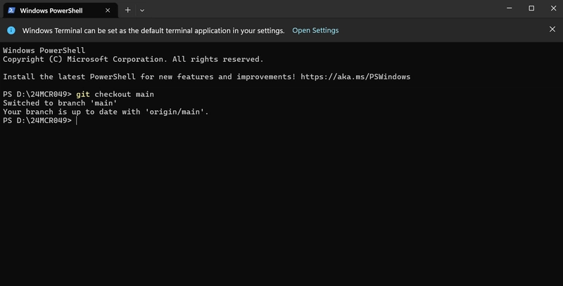
How to Fix Flexbox Proportional Shrinking Issues in HTML?
Introduction Having trouble with Flexbox in your HTML and CSS designs, particularly with the expected behavior of flex-shrinking elements? It's a common issue that many developers face, especially when trying to create responsive layouts. In this article, we will examine a specific scenario involving two sidebars and a paragraph element to understand why certain elements shrink disproportionately. Understanding the Flexbox Model Flexbox, or the Flexible Box Layout, is a CSS layout mode that helps distribute space along a single row or column. When using Flexbox, items can grow or shrink to fill available space. The flex property is a shorthand that combines three properties: flex-grow, flex-shrink, and flex-basis. Flex Properties Explained flex-grow: This defines the ability for a flex item to grow if necessary, making it occupy additional space. flex-shrink: This defines the ability for a flex item to shrink if necessary, allowing it to fit within the container. flex-basis: This defines the default size of a flex item before the remaining space is distributed. In your example, both the .sidebar and elements have an implicit flex-shrink: 1, meaning they share the container's available space when it resizes. However, the actual space they occupy can be affected by other properties, especially flex-basis. Why Is This Happening? Issue Breakdown In your case, you observe that: Each .sidebar ends up taking around 125px The element consumes roughly 1250px The core reason behind this discrepancy relates to the default sizing behavior of the Flexbox model and how the flex-basis is being interpreted for these elements. By default, the flex-basis for the .sidebar will be its width in your layout, while the paragraph () inherits its size from its contents, which can lead to unexpected proportional shrinking. Analyzing Your CSS Code .container { border: 2px solid black; width: 1500px; height: 700px; margin: 40px auto; display: flex; justify-content: center; } .sidebar { background-color: palevioletred; flex: 100%; /* shorthand for flex: 1 1 100% */ } p { background-color: darkseagreen; margin: 0px; /* no flex explicitly set, defaulting to flex: 0 1 auto */ } Here, each sidebar is being set to flex: 100%, essentially giving it flexibility to fill available space, while the default behavior of the paragraph tag does not explicitly set its flex properties. Step-by-Step Solution To achieve a more balanced proportional shrinking between the .sidebar and elements, we can manipulate the flex properties more effectively. Applying Flex Settings Step 1: Update .sidebar Flex Property Change the .sidebar definition in your CSS: .sidebar { background-color: palevioletred; flex: 1; /* Allow for equal sharing of space */ } Step 2: Set the Paragraph Flex Property Now, let's define the paragraph flex property to align it: p { background-color: darkseagreen; margin: 0; flex: 2; /* Allow it to take twice as much space as sidebar */ } Final CSS Example Putting it all together, your CSS should look like this: .container { border: 2px solid black; width: 1500px; height: 700px; margin: 40px auto; display: flex; justify-content: center; } .sidebar { background-color: palevioletred; flex: 1; } p { background-color: darkseagreen; margin: 0; flex: 2; } This adjustment allows the .sidebar and to share space more proportionately, with the paragraph taking twice as much space as each sidebar. FAQ Why did I see disproportionate shrinking? The difference in space allocation comes down to how the flex-shrink property interacts with the flex-basis setting of each element. Without explicitly setting flex values, the browser determines flex sizing based on content. How can I control the proportions of my elements in Flexbox? Adjusting the flex values allows for greater control over space distribution among flex items. Consider the ratios you want each item to adhere to and set your flex values accordingly. Conclusion In conclusion, controlling the proportional shrinking of flex elements can be nuanced but manageable by adjusting the flex properties appropriately. This small change will provide a more harmonious layout and allow for better responsive design. By understanding how Flexbox determines space allocation, you can create layouts that behave predictably, even as they adapt to varying screen sizes.

Introduction
Having trouble with Flexbox in your HTML and CSS designs, particularly with the expected behavior of flex-shrinking elements? It's a common issue that many developers face, especially when trying to create responsive layouts. In this article, we will examine a specific scenario involving two sidebars and a paragraph element to understand why certain elements shrink disproportionately.
Understanding the Flexbox Model
Flexbox, or the Flexible Box Layout, is a CSS layout mode that helps distribute space along a single row or column. When using Flexbox, items can grow or shrink to fill available space. The flex property is a shorthand that combines three properties: flex-grow, flex-shrink, and flex-basis.
Flex Properties Explained
-
flex-grow: This defines the ability for a flex item to grow if necessary, making it occupy additional space. -
flex-shrink: This defines the ability for a flex item to shrink if necessary, allowing it to fit within the container. -
flex-basis: This defines the default size of a flex item before the remaining space is distributed.
In your example, both the .sidebar and elements have an implicit flex-shrink: 1, meaning they share the container's available space when it resizes. However, the actual space they occupy can be affected by other properties, especially flex-basis.
Why Is This Happening?
Issue Breakdown
In your case, you observe that:
- Each
.sidebarends up taking around 125px - The
element consumes roughly 1250px
The core reason behind this discrepancy relates to the default sizing behavior of the Flexbox model and how the flex-basis is being interpreted for these elements. By default, the flex-basis for the .sidebar will be its width in your layout, while the paragraph () inherits its size from its contents, which can lead to unexpected proportional shrinking.
Analyzing Your CSS Code
.container {
  border: 2px solid black;
  width: 1500px;
  height: 700px;
  margin: 40px auto;
  display: flex;
  justify-content: center;
}

.sidebar {
  background-color: palevioletred;
  flex: 100%; /* shorthand for flex: 1 1 100% */
}

p {
  background-color: darkseagreen;
  margin: 0px;
  /* no flex explicitly set, defaulting to flex: 0 1 auto */
}
Here, each sidebar is being set to flex: 100%, essentially giving it flexibility to fill available space, while the default behavior of the paragraph tag does not explicitly set its flex properties.
Step-by-Step Solution
To achieve a more balanced proportional shrinking between the .sidebar and elements, we can manipulate the flex properties more effectively.
Applying Flex Settings
Step 1: Update .sidebar Flex Property
Change the .sidebar definition in your CSS:
.sidebar {
  background-color: palevioletred;
  flex: 1; /* Allow for equal sharing of space */
}
Step 2: Set the Paragraph Flex Property
Now, let's define the paragraph flex property to align it:
p {
  background-color: darkseagreen;
  margin: 0;
  flex: 2; /* Allow it to take twice as much space as sidebar */
}
Final CSS Example
Putting it all together, your CSS should look like this:
.container {
  border: 2px solid black;
  width: 1500px;
  height: 700px;
  margin: 40px auto;
  display: flex;
  justify-content: center;
}

.sidebar {
  background-color: palevioletred;
  flex: 1;
}

p {
  background-color: darkseagreen;
  margin: 0;
  flex: 2;
}
This adjustment allows the .sidebar and to share space more proportionately, with the paragraph taking twice as much space as each sidebar.
FAQ
Why did I see disproportionate shrinking?
The difference in space allocation comes down to how the flex-shrink property interacts with the flex-basis setting of each element. Without explicitly setting flex values, the browser determines flex sizing based on content.
How can I control the proportions of my elements in Flexbox?
Adjusting the flex values allows for greater control over space distribution among flex items. Consider the ratios you want each item to adhere to and set your flex values accordingly.
Conclusion
In conclusion, controlling the proportional shrinking of flex elements can be nuanced but manageable by adjusting the flex properties appropriately. This small change will provide a more harmonious layout and allow for better responsive design. By understanding how Flexbox determines space allocation, you can create layouts that behave predictably, even as they adapt to varying screen sizes.