


![[The AI Show Episode 143]: ChatGPT Revenue Surge, New AGI Timelines, Amazon’s AI Agent, Claude for Education, Model Context Protocol & LLMs Pass the Turing Test](https://www.marketingaiinstitute.com/hubfs/ep%20143%20cover.png)


.png?width=1920&height=1920&fit=bounds&quality=70&format=jpg&auto=webp#)


.png?#)


.webp?#)


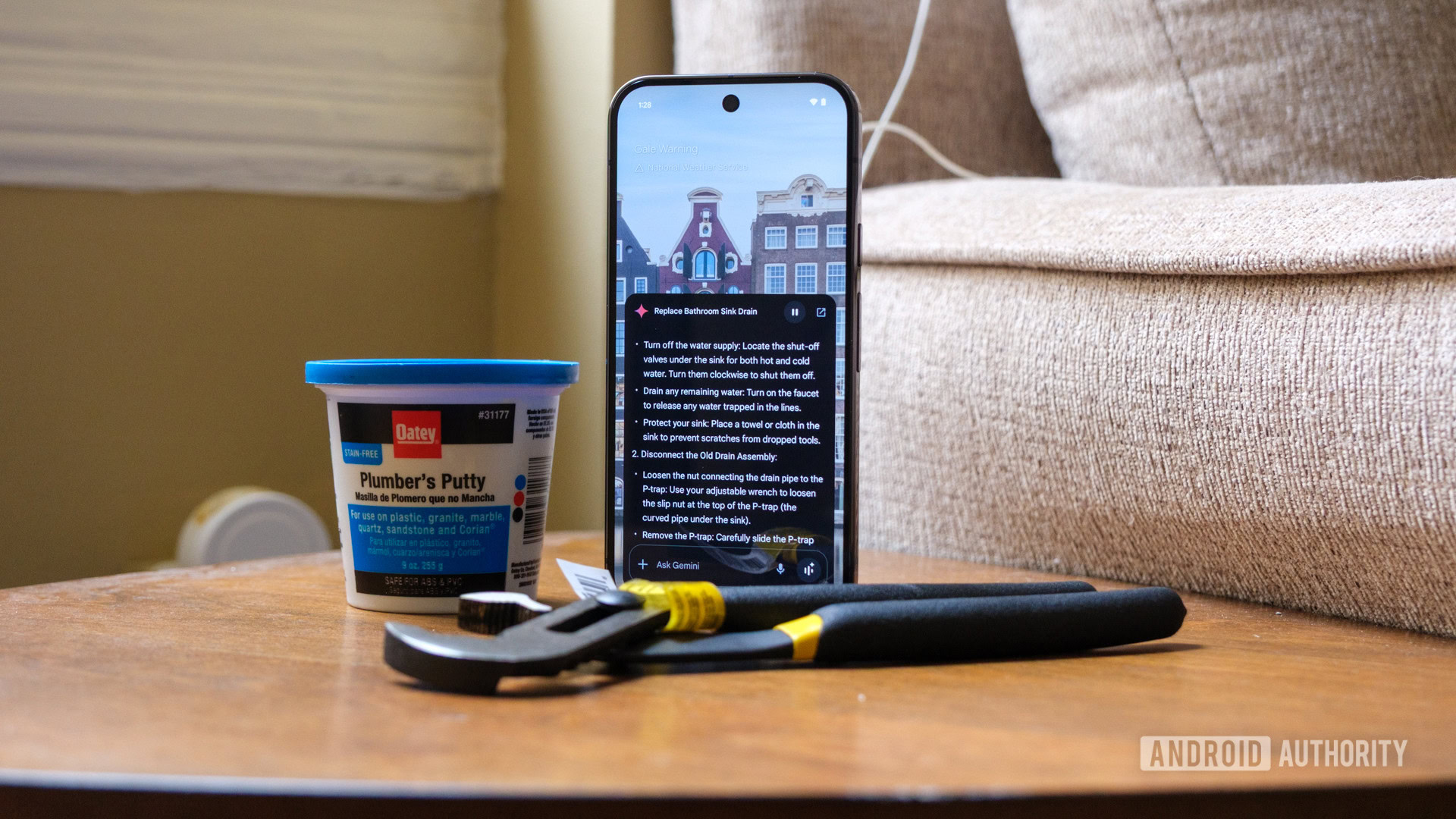
![[Fixed] Gemini app is failing to generate Audio Overviews](https://i0.wp.com/9to5google.com/wp-content/uploads/sites/4/2025/03/Gemini-Audio-Overview-cover.jpg?resize=1200%2C628&quality=82&strip=all&ssl=1)

![What’s new in Android’s April 2025 Google System Updates [U: 4/14]](https://i0.wp.com/9to5google.com/wp-content/uploads/sites/4/2025/01/google-play-services-3.jpg?resize=1200%2C628&quality=82&strip=all&ssl=1)


![Apple Seeds tvOS 18.5 Beta 2 to Developers [Download]](https://www.iclarified.com/images/news/97011/97011/97011-640.jpg)
![Apple Releases macOS Sequoia 15.5 Beta 2 to Developers [Download]](https://www.iclarified.com/images/news/97014/97014/97014-640.jpg)


Flexbox CSS: Best Practices from Beginner to Advanced
Flexbox is a powerful CSS layout module that makes it easy to design flexible and responsive layouts. Whether you're just starting or looking to refine your skills, this guide covers best practices from beginner to advanced levels. 1. Beginner Level: The Basics What is Flexbox? Flexbox (Flexible Box Layout) is a one-dimensional layout model that allows you to distribute space and align items efficiently within a container. Setting Up a Flex Container To use Flexbox, define a flex container: .container { display: flex; } This turns all direct children (flex items) into flexible items. Basic Flex Properties flex-direction – Controls the direction of flex items (row, column, row-reverse, column-reverse). justify-content – Aligns items along the main axis (flex-start, center, flex-end, space-between, space-around). align-items – Aligns items along the cross axis (flex-start, center, flex-end, stretch, baseline). Example: Centering Items .container { display: flex; justify-content: center; /* horizontal */ align-items: center; /* vertical */ } Common Mistakes Beginners Make Forgetting to set display: flex on the parent. Confusing justify-content (main axis) and align-items (cross axis). Not using flex-wrap for responsive layouts. 2. Intermediate Level: Better Control Flex Wrap for Responsive Layouts By default, flex items try to fit in one line. Use flex-wrap to allow wrapping: .container { display: flex; flex-wrap: wrap; } Flex Item Properties flex-grow – Defines how much an item grows relative to others. flex-shrink – Defines how much an item shrinks. flex-basis – Sets the initial size before remaining space is distributed. Shorthand: .item { flex: 1 1 200px; /* (grow, shrink, basis) */ } Aligning Multiple Lines with align-content If items wrap into multiple lines, use align-content to control their spacing: .container { display: flex; flex-wrap: wrap; align-content: space-between; } Nested Flex Containers Flexbox works well with nested structures: Inner Item .item { display: flex; } 3. Advanced Level: Optimization & Tricks Using gap for Consistent Spacing Instead of margins, use gap to space items evenly: .container { display: flex; gap: 1rem; /* Adds space between items */ } Note: gap works in modern browsers but may need fallbacks for older ones. Ordering Items Dynamically Change the visual order without altering HTML: .item:nth-child(1) { order: 2; } .item:nth-child(2) { order: 1; } Flexbox for Equal Height Columns Flexbox makes equal-height columns easy: .container { display: flex; } .item { flex: 1; /* All items take equal width */ } Flexbox + Grid Combination For complex layouts, combine Flexbox with CSS Grid: .container { display: grid; grid-template-columns: repeat(auto-fit, minmax(200px, 1fr)); } .item { display: flex; align-items: center; } Performance Considerations Avoid excessive nested flex containers. Use flex-basis instead of fixed widths for better responsiveness. Prefer gap over margins for consistent spacing. Final Tips ✅ Use Flexbox for: Navigation bars Card layouts Centering elements Equal-height columns ❌ Avoid Flexbox for: Full-page layouts (consider CSS Grid) Extremely complex 2D layouts Conclusion Flexbox is a game-changer for modern CSS layouts. Start with the basics, experiment with intermediate techniques, and optimize with advanced practices. What’s your favorite Flexbox trick? Share in the comments!

Flexbox is a powerful CSS layout module that makes it easy to design flexible and responsive layouts. Whether you're just starting or looking to refine your skills, this guide covers best practices from beginner to advanced levels.
1. Beginner Level: The Basics
What is Flexbox?
Flexbox (Flexible Box Layout) is a one-dimensional layout model that allows you to distribute space and align items efficiently within a container.
Setting Up a Flex Container
To use Flexbox, define a flex container:
.container {
  display: flex;
}
This turns all direct children (flex items) into flexible items.
Basic Flex Properties
-
flex-direction– Controls the direction of flex items (row, column, row-reverse, column-reverse). -
justify-content– Aligns items along the main axis (flex-start, center, flex-end, space-between, space-around). -
align-items– Aligns items along the cross axis (flex-start, center, flex-end, stretch, baseline).
Example: Centering Items
.container {
  display: flex;
  justify-content: center; /* horizontal */
  align-items: center;     /* vertical */
}
Common Mistakes Beginners Make
- Forgetting to set
display: flexon the parent. - Confusing
justify-content(main axis) andalign-items(cross axis). - Not using
flex-wrapfor responsive layouts.
2. Intermediate Level: Better Control
Flex Wrap for Responsive Layouts
By default, flex items try to fit in one line. Use flex-wrap to allow wrapping:
.container {
  display: flex;
  flex-wrap: wrap;
}
Flex Item Properties
-
flex-grow– Defines how much an item grows relative to others. -
flex-shrink– Defines how much an item shrinks. -
flex-basis– Sets the initial size before remaining space is distributed.
Shorthand:
.item {
  flex: 1 1 200px; /* (grow, shrink, basis) */
}
Aligning Multiple Lines with align-content
If items wrap into multiple lines, use align-content to control their spacing:
.container {
  display: flex;
  flex-wrap: wrap;
  align-content: space-between;
}
Nested Flex Containers
Flexbox works well with nested structures:
 class="container">
   class="item">
     class="nested-flex">Inner Item