


![[Free Webinar] Guide to Securing Your Entire Identity Lifecycle Against AI-Powered Threats](https://blogger.googleusercontent.com/img/b/R29vZ2xl/AVvXsEjqbZf4bsDp6ei3fmQ8swm7GB5XoRrhZSFE7ZNhRLFO49KlmdgpIDCZWMSv7rydpEShIrNb9crnH5p6mFZbURzO5HC9I4RlzJazBBw5aHOTmI38sqiZIWPldRqut4bTgegipjOk5VgktVOwCKF_ncLeBX-pMTO_GMVMfbzZbf8eAj21V04y_NiOaSApGkM/s1600/webinar-play.jpg?#)


![[The AI Show Episode 145]: OpenAI Releases o3 and o4-mini, AI Is Causing “Quiet Layoffs,” Executive Order on Youth AI Education & GPT-4o’s Controversial Update](https://www.marketingaiinstitute.com/hubfs/ep%20145%20cover.png)


![Google Home app fixes bug that repeatedly asked to ‘Set up Nest Cam features’ for Nest Hub Max [U]](https://i0.wp.com/9to5google.com/wp-content/uploads/sites/4/2022/08/youtube-premium-music-nest-hub-max.jpg?resize=1200%2C628&quality=82&strip=all&ssl=1)


![New Hands-On iPhone 17 Dummy Video Shows Off Ultra-Thin Air Model, Updated Pro Designs [Video]](https://www.iclarified.com/images/news/97171/97171/97171-640.jpg)
![Apple Shares Trailer for First Immersive Feature Film 'Bono: Stories of Surrender' [Video]](https://www.iclarified.com/images/news/97168/97168/97168-640.jpg)


Enhancing User Experience: Implementing Notifications, Modals and Loaders in a React-based CMS
If you need a source code for this tutorial you can get it here. Enhancing user experience is crucial for any modern Content Management System. In this article, we'll dive into implementing three essential UI components that will significantly improve the interactivity and feedback of our React-based CMS: Notifications for user feedback, and Loaders for managing loading states. These components will not only make our CMS more professional but also provide users with clear visual feedback during their interactions. So, let's start: 1. Implementing the Notification System One of the most important things that we need to understand is that all these UX parts will be components that we will need to use on many different pages, so they need to be available globally. This task will solve our "Redux" storage, which we implemented in our previous article. Also, we will create a notification system where we can show many messages at the same time, that is why we will need an Array as a container for messages list and message component itself. Don't worry, everything will be clear when we start coding. create a new folder in the "store", we will call it "base"; inside "base" folder we will create "base.reducer.js", "base.action.js", "base.selector.js", "base.types.js" files; inside the "types" file we need to add two types for creating and removing messages; const BASE_ACTION_TYPES = { PUSH_NEW_NOTIFICATION: 'base/PUSH_NEW_NOTIFICATION', REMOVE_NOTIFICATION: 'base/REMOVE_NOTIFICATION', }; export default BASE_ACTION_TYPES; "state" will contain an empty array of our notifications, and "reducer" will have two cases (push new notification, and filter only active notifications); import BASE_ACTION_TYPES from './base.types'; export const BASE_INITIAL_STATE = { notifications: [], }; export const baseReducer = (state = BASE_INITIAL_STATE, action = {}) => { const { type, payload } = action; switch (type) { case BASE_ACTION_TYPES.PUSH_NEW_NOTIFICATION: return { ...state, notifications: [payload, ...state.notifications] }; case BASE_ACTION_TYPES.REMOVE_NOTIFICATION: return { ...state, notifications: state.notifications.filter((n) => n.id !== payload) }; default: return state; } }; the "action" file will also contain two actions, the first one will create a new notification with a unique ID and set a timeout value that will remove this notification from the list, and the second one will remove one notification by ID; import { v4 as uuid } from 'uuid'; import BASE_ACTION_TYPES from './base.types'; import { createAction } from '../../utils/reducer.utils'; export const aPushNewNotification = (notification) => { return (dispatch) => { notification.id = uuid(); dispatch(createAction(BASE_ACTION_TYPES.PUSH_NEW_NOTIFICATION, notification)); setTimeout(() => { dispatch(aRemoveNotification(notification.id)); }, 5000); }; }; export const aRemoveNotification = (id) => createAction(BASE_ACTION_TYPES.REMOVE_NOTIFICATION, id); "selector" will simply return the list of notifications; export const sNotificationsList = (state) => state.base.notifications; It looks great, we prepared our storage for implementing Notifications functionality into our React CMS, now we can move to the "notifications" components. create a new "UI" folder inside "components", and a new "notification" folder; add a new "Notification.component.jsx" file that will import the "useDispatch" hook, a list of icons from the "MUI" library, and a "remove" notification action. It will have a remove notification function that will call our action, and this component will return three types of notifications (success, error, warning), that will depend on the notification type; import React from 'react'; import { useDispatch } from 'react-redux'; import { aRemoveNotification } from '../../../store/base/base.action'; import CheckIcon from '@mui/icons-material/Check'; import CloseOutlinedIcon from '@mui/icons-material/CloseOutlined'; import PriorityHighOutlinedIcon from '@mui/icons-material/PriorityHighOutlined'; import ReportProblemOutlinedIcon from '@mui/icons-material/ReportProblemOutlined'; const Notification = ({ notification }) => { const dispatch = useDispatch(); const closeNotification = () => { dispatch(aRemoveNotification(notification.id)); } if (notification.type === 'error') { return ( {notification.text} ); } else if (notification.type === 'success') { return ( {notification.text} ); } else if (noti

If you need a source code for this tutorial you can get it here.
Enhancing user experience is crucial for any modern Content Management System. In this article, we'll dive into implementing three essential UI components that will significantly improve the interactivity and feedback of our React-based CMS: Notifications for user feedback, and Loaders for managing loading states. These components will not only make our CMS more professional but also provide users with clear visual feedback during their interactions. So, let's start:
1. Implementing the Notification System
One of the most important things that we need to understand is that all these UX parts will be components that we will need to use on many different pages, so they need to be available globally. This task will solve our "Redux" storage, which we implemented in our previous article. Also, we will create a notification system where we can show many messages at the same time, that is why we will need an Array as a container for messages list and message component itself. Don't worry, everything will be clear when we start coding.
create a new folder in the "store", we will call it "base";
inside "base" folder we will create "base.reducer.js", "base.action.js", "base.selector.js", "base.types.js" files;
inside the "types" file we need to add two types for creating and removing messages;
const BASE_ACTION_TYPES = {
    PUSH_NEW_NOTIFICATION: 'base/PUSH_NEW_NOTIFICATION',
    REMOVE_NOTIFICATION: 'base/REMOVE_NOTIFICATION',
};

export default BASE_ACTION_TYPES;
- "state" will contain an empty array of our notifications, and "reducer" will have two cases (push new notification, and filter only active notifications);
import BASE_ACTION_TYPES from './base.types';

export const BASE_INITIAL_STATE = {
    notifications: [],
};
export const baseReducer = (state = BASE_INITIAL_STATE, action = {}) => {
    const { type, payload } = action;
    switch (type) {
        case BASE_ACTION_TYPES.PUSH_NEW_NOTIFICATION:
            return { ...state, notifications: [payload, ...state.notifications] };
        case BASE_ACTION_TYPES.REMOVE_NOTIFICATION:
            return { ...state, notifications: state.notifications.filter((n) => n.id !== payload) };
        default:
            return state;
    }
};
- the "action" file will also contain two actions, the first one will create a new notification with a unique ID and set a timeout value that will remove this notification from the list, and the second one will remove one notification by ID;
import { v4 as uuid } from 'uuid';
import BASE_ACTION_TYPES from './base.types';
import { createAction } from '../../utils/reducer.utils';

export const aPushNewNotification = (notification) => {
  return (dispatch) => {
    notification.id = uuid();
    dispatch(createAction(BASE_ACTION_TYPES.PUSH_NEW_NOTIFICATION, notification));
    setTimeout(() => {
      dispatch(aRemoveNotification(notification.id));
    }, 5000);
  };
};

export const aRemoveNotification = (id) =>
  createAction(BASE_ACTION_TYPES.REMOVE_NOTIFICATION, id);
- "selector" will simply return the list of notifications;
export const sNotificationsList = (state) => state.base.notifications;
It looks great, we prepared our storage for implementing Notifications functionality into our React CMS, now we can move to the "notifications" components.
create a new "UI" folder inside "components", and a new "notification" folder;
add a new "Notification.component.jsx" file that will import the "useDispatch" hook, a list of icons from the "MUI" library, and a "remove" notification action. It will have a remove notification function that will call our action, and this component will return three types of notifications (success, error, warning), that will depend on the notification type;
import React from 'react';
import { useDispatch } from 'react-redux';
import { aRemoveNotification } from '../../../store/base/base.action';
import CheckIcon from '@mui/icons-material/Check';
import CloseOutlinedIcon from '@mui/icons-material/CloseOutlined';
import PriorityHighOutlinedIcon from '@mui/icons-material/PriorityHighOutlined';
import ReportProblemOutlinedIcon from '@mui/icons-material/ReportProblemOutlined';

const Notification = ({ notification }) => {
    const dispatch = useDispatch();
    const closeNotification = () => {
        dispatch(aRemoveNotification(notification.id));
    }

    if (notification.type === 'error') {
        return (
            <div className="notification">
                <div className="alert alert-error">
                    <div className="icon__wrapper">
                        <PriorityHighOutlinedIcon className="icon-style" />
                    </div>
                    <p>{notification.text}</p>
                    <CloseOutlinedIcon className="close" onClick={closeNotification} />
                </div>
            </div>
        );
    } else if (notification.type === 'success') {
        return (
            <div className="notification">
                <div className="alert alert-success">
                    <div className="icon__wrapper">
                        <CheckIcon className="icon-style" />
                    </div>
                    <p>{notification.text}</p>
                    <CloseOutlinedIcon className="close" onClick={closeNotification} />
                </div>
            </div>
        );
    } else if (notification.type === 'warning') {
        return (
            <div className="notification">
                <div className="alert alert-warning">
                    <div className="icon__wrapper">
                        <ReportProblemOutlinedIcon className="icon-style" />
                    </div>
                    <p>{notification.text}</p>
                    <CloseOutlinedIcon className="close" onClick={closeNotification} />
                </div>
            </div>
        );
    }
};
export default Notification;
- add a "NotificationContainer.component.jsx" file that will import our "Notification" component, and render a list of notifications from our storage;
import React from 'react';
import { useSelector } from 'react-redux';
import { sNotificationsList } from '../../../store/base/base.selector';
import Notification from './Notification.component';
import './notification.styles.scss';

const NotificationContainer = () => {
    const notificationsList = useSelector(sNotificationsList);
    return (
        <div className="notification-container">
            {notificationsList.map((notification) => (
                <Notification key={notification.id} notification={notification} />
            ))}
        </div>
    );
};
export default NotificationContainer;
Awesome. We finished with notification development, now we can add this container to the layouts.
import React from 'react';
import { Outlet } from 'react-router-dom';
import NotificationContainer from '../../components/ui/notification/NotificationContainer.component';
import './emptyLayout.styles.scss';

const EmptyLayout = () => {
  return (
    <div className='emptyLayout'>
      <NotificationContainer />
      <Outlet />
    </div>
  );
};
export default EmptyLayout;
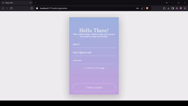
And finally, we can use it on every page we will need it. For example, let's add a notification to our "registration" function so that our app can inform users about successes or errors.
const handleSubmit = async (e) => {
    e.preventDefault();
    const result = await registerNewUser({name, email, password});
    if (result.status === 'success') {
        navigate('/auth/login');
        dispatch(aPushNewNotification({
            type: 'success',
            text: 'You have successfully registered. Please login.',
        }));
    } else {
        dispatch(aPushNewNotification({
            type: 'error',
            text: result.message,
        }));
    }
}
Restart the CMS frontend part, and try the registration process from the beginning to check the result.
Yes, it works, great job and let's move on.
2. Reusable Modal System
A modal is a UI component that appears as an overlay on top of the main content, typically used to display important information, forms, or user actions without navigating away from the current page. It often requires user interaction to close or proceed. We will create a reusable "modal" component so that we can use it whenever we need, as a confirmation popup for example, let's start:
- add new data (modal status and modal type) into the state and new reducers to update those states into the "base.reducer.js" file;
modalStatus: false,
modalType: '',

case BASE_ACTION_TYPES.UPDATE_MODAL_STATUS:
    return { ...state, modalStatus: payload };
case BASE_ACTION_TYPES.UPDATE_MODAL_TYPE:
    return { ...state, modalType: payload };
- we will need two new selectors;
export const sModalStatus = (state) => state.base.modalStatus
export const sModalType = (state) => state.base.modalType
- two new actions and types;
export const aUpdateModalStatus = (status) =>
  createAction(BASE_ACTION_TYPES.UPDATE_MODAL_STATUS, status);
export const aUpdateModalType = (type) =>
  createAction(BASE_ACTION_TYPES.UPDATE_MODAL_TYPE, type);

UPDATE_MODAL_STATUS: 'base/UPDATE_MODAL_STATUS',
UPDATE_MODAL_TYPE: 'base/UPDATE_MODAL_TYPE',
create a new "Modal.component.jsx" file in the "components" folder;
we need to import modal selectors, actions, and main hooks;
import React from "react";
import { useDispatch, useSelector } from 'react-redux';

import { aUpdateModalStatus } from '../../../store/base/base.action';
import { sModalType } from '../../../store/base/base.selector';
import "./modal.styles.scss";
- we will create a "Modal" functional component, that will return "div" that will contain a function that will dynamically return the component as a type of modal itself;
const Modal = () => {
    const dispatch = useDispatch();
    const modalType = useSelector(sModalType);
    const renderModalType = (type) => {
        switch (type) {
            case 'removePost':
                return <RemovePost />;
            case 'filterModal':
                return <FilterModal />;
            default:
                return null;
        }
    }
    return (
        <div className="modal">
            <div className="modal__content">
                <div className="modal__close">
                    <CloseOutlinedIcon onClick={() => dispatch(aUpdateModalStatus(false))}/>
                </div>
                {renderModalType(modalType)}
            </div>
        </div>
    );
};
export default Modal;
Great, now, whenever we would need a modal, we can create a neccesary component itself, and our reusable modal will render that component. We will check its functionality in one of our next article.
3. Basic Loader Implementation
A Loader is a visual element that provides feedback to users when content or data is being processed, typically displayed during asynchronous operations like API calls or page transitions. It helps improve user experience by indicating that the application is working rather than frozen, and can take various forms such as spinning animations, progress bars, or skeleton screens.
I like spinners and I like the "CSS Loaders" service with a huge amount of beautiful loaders. I chose a simple spinner, and let's start implementing it.
create a new "loader" folder inside the "ui" folder;
create new, simple "Loader.component.jsx", and "loader.styles.scss" files;
add a simple component that will return a "div" tag;
import React from "react";
import "./loader.styles.scss";

const Loader = () => {
    return (
        <div className="loader"></div>
    );
};
export default Loader;
copy and paste CSS styles from the "CSS Loaders" service;
open the "Registration" component and import the "Loader" component;
create a new "loading" state, that will control appearance;
update "Create Account" button (we need to show loader or text);
<button
    className='ghost-round full-width loader-styles'
    onClick={handleSubmit}>
    {loading ? <Loader /> : 'Create Account'}
</button>
- and we need to update our "Submit" function so that it changes the "loading" state (true at the beginning and false at the end);
const handleSubmit = async (e) => {
    e.preventDefault();
    setLoading(true);
    const result = await registerNewUser({name, email, password});
    if (result.status === 'success') {
        setLoading(false);
        navigate('/auth/login');
        dispatch(aPushNewNotification({
            type: 'success',
            text: 'You have successfully registered. Please login.',
        }));
    } else {
        setLoading(false);
        dispatch(aPushNewNotification({
            type: 'error',
            text: result.message,
        }));
    }
}
Done. We finished with Loader and Notifications, and we can restart our dev server and check the result.
In this article, we've successfully enhanced our React-based CMS with two essential UI components that significantly improve user experience. We implemented a flexible notification system that provides clear feedback through success, error, and warning messages, managed globally through Redux. We also added a sleek loader component that gives users visual feedback during asynchronous operations.
These additions make our CMS more professional and user-friendly. With these components in place, our CMS now offers a more polished and responsive user experience. In the next articles, we'll continue building more advanced features to make our CMS even more powerful and user-friendly.
If you need a source code for this tutorial you can get it here.
Found this post useful? ☕ A coffee-sized contribution goes a long way in keeping me inspired! Thank you)

Next step: "React and Node.js CMS Series: Implementing Post Lists with Advanced Table Features"