


![[The AI Show Episode 145]: OpenAI Releases o3 and o4-mini, AI Is Causing “Quiet Layoffs,” Executive Order on Youth AI Education & GPT-4o’s Controversial Update](https://www.marketingaiinstitute.com/hubfs/ep%20145%20cover.png)


_NicoElNino_Alamy.jpg?width=1280&auto=webp&quality=80&disable=upscale#)


![Standalone Meta AI App Released for iPhone [Download]](https://www.iclarified.com/images/news/97157/97157/97157-640.jpg)


Dash with PropelAuth: Add Authentication to Your Data Apps with Just a Few Lines of Code
Original author: Paul Vatterott We’re excited to announce our new integration with Dash, the powerful Python framework from Plotly that enables data scientists and analysts to build interactive web applications with beautiful dashboard and reactive data visualizations. Let’s say you’ve built a powerful and interactive data dashboard with Dash. It’s insightful, dynamic, and looks great. But as your application grows and handles sensitive data, the critical question becomes: how do you ensure the right people see the right data? That’s where PropelAuth comes in. Here at PropelAuth we’re huge fans of the NBA. With the NBA playoffs in full swing we wanted to show how you can use PropelAuth and Dash to display stats for each member of a team. Just as NBA teams need the right combination of talent and strategy to win, your Dash applications need the right mix of visualization power and authentication to succeed. Let’s get started! Building a Secure NBA Stats Dashboard with PropelAuth and Dash Let’s walk through a real-world example: building a secure NBA team stats dashboard that displays player performance data based on team membership. If you haven’t already, start a Dash project by following the guide here. Then, install PropelAuth by following our installation guide. Using PropelAuth Organizations for NBA Teams We want to make sure that each NBA team’s data is protected so only members of each team can see their own data. To do this, we’ll use PropelAuth’s organizations! Go ahead and create an organization in PropelAuth. In this example we’ll be using the Minnesota Timberwolves. Later on we’ll be getting the name of this organization which will correspond to the NBA team, so make sure it’s the name of the team, such as “Timberwolves”, “Warriors”, or “Nuggets”. Once you have your organization, go ahead and create a user and add the user to your new organization. We’re all set up on the PropelAuth side so let’s get the data and start coding! Getting the Data We’ll be using a Kaggle data set for all of our player stats. Go ahead and download the data here and place the .csv files in your project directory. We can then import the data into Dash like so: import pandas # Load the data games_df = pd.read_csv('Games.csv') player_stats_df = pd.read_csv('PlayerStatistics.csv') # Convert gameDate to datetime for proper sorting games_df['gameDate'] = pd.to_datetime(games_df['gameDate']) player_stats_df['gameDate'] = pd.to_datetime(player_stats_df['gameDate']) Getting the User’s Team Let’s create a function that will get the user’s team (or organization). We’ll assume that each user only belongs to one team for this scenario. We’ll be using this later on when filtering our data to only include players in our team. def get_user_team(): try: if 'user' in session: user = auth.get_user(session['user']['sub']) team_name = user.get_orgs()[0].org_name return team_name except Exception as e: print(f"Error getting user team: {e}") return "Timberwolves" # Default fallback Filtering the Data Now that we know which team to display data for, let’s filter the data to only include players who belong to our team. We’ll then create a dropdown menu with each member of our team. def serve_layout(): # Get the user's team team_name = get_user_team() # Filter for the team's players team_stats = player_stats_df[player_stats_df['playerteamName'] == team_name] # Get unique players for this team team_players = team_stats.drop_duplicates(subset=['firstName', 'lastName']) player_options = [ {'label': f"{row['firstName']} {row['lastName']}", 'value': f"{row['firstName']}|{row['lastName']}"} for _, row in team_players.iterrows() ] return html.Div([ html.H1(team_name), html.Div([ html.Label("Select Player:"), dcc.Dropdown( id='player-dropdown', options=player_options, value=player_options[0]['value'] if player_options else None, style={'width': '100%'} ), ], style={'width': '50%', 'margin': '20px auto'}), # Store the team name in a hidden div for callbacks html.Div(id='team-name-store', children=team_name, style={'display': 'none'}), dcc.Graph(id='points-graph'), html.Div(id='game-details', style={'margin': '20px', 'padding': '10px', 'backgroundColor': '#f9f9f9'}) ], style={'fontFamily': 'Arial', 'margin': '20px'}) app.layout = serve_layout Looking at our app, we now have a dropdown that lists each member of the Timberwolves! But hey, no data is showing and I swear Julius Randle has been playing great recently. It looks like we’ll have to update the graph with the player’s stats. Let’s go ahead and do that. import plotly.express as px @callback( [Output('points-graph', 'figure'), Output('game-details', 'children')], [Input('player-dropdown', 'value')
Original author: Paul Vatterott
We’re excited to announce our new integration with Dash, the powerful Python framework from Plotly that enables data scientists and analysts to build interactive web applications with beautiful dashboard and reactive data visualizations.
Let’s say you’ve built a powerful and interactive data dashboard with Dash. It’s insightful, dynamic, and looks great. But as your application grows and handles sensitive data, the critical question becomes: how do you ensure the right people see the right data? That’s where PropelAuth comes in.
Here at PropelAuth we’re huge fans of the NBA. With the NBA playoffs in full swing we wanted to show how you can use PropelAuth and Dash to display stats for each member of a team. Just as NBA teams need the right combination of talent and strategy to win, your Dash applications need the right mix of visualization power and authentication to succeed. Let’s get started!
Building a Secure NBA Stats Dashboard with PropelAuth and Dash
Let’s walk through a real-world example: building a secure NBA team stats dashboard that displays player performance data based on team membership.
If you haven’t already, start a Dash project by following the guide here. Then, install PropelAuth by following our installation guide.
Using PropelAuth Organizations for NBA Teams
We want to make sure that each NBA team’s data is protected so only members of each team can see their own data. To do this, we’ll use PropelAuth’s organizations!
Go ahead and create an organization in PropelAuth. In this example we’ll be using the Minnesota Timberwolves. Later on we’ll be getting the name of this organization which will correspond to the NBA team, so make sure it’s the name of the team, such as “Timberwolves”, “Warriors”, or “Nuggets”.
Once you have your organization, go ahead and create a user and add the user to your new organization. We’re all set up on the PropelAuth side so let’s get the data and start coding!
Getting the Data
We’ll be using a Kaggle data set for all of our player stats. Go ahead and download the data here and place the .csv files in your project directory. We can then import the data into Dash like so:
import pandas

# Load the data
games_df = pd.read_csv('Games.csv')
player_stats_df = pd.read_csv('PlayerStatistics.csv')

# Convert gameDate to datetime for proper sorting
games_df['gameDate'] = pd.to_datetime(games_df['gameDate'])
player_stats_df['gameDate'] = pd.to_datetime(player_stats_df['gameDate'])
Getting the User’s Team
Let’s create a function that will get the user’s team (or organization). We’ll assume that each user only belongs to one team for this scenario. We’ll be using this later on when filtering our data to only include players in our team.
def get_user_team():
    try:
        if 'user' in session:
            user = auth.get_user(session['user']['sub'])
            team_name = user.get_orgs()[0].org_name
            return team_name
    except Exception as e:
        print(f"Error getting user team: {e}")
        return "Timberwolves"  # Default fallback
Filtering the Data
Now that we know which team to display data for, let’s filter the data to only include players who belong to our team. We’ll then create a dropdown menu with each member of our team.
def serve_layout():
  # Get the user's team
  team_name = get_user_team()

  # Filter for the team's players
  team_stats = player_stats_df[player_stats_df['playerteamName'] == team_name]

  # Get unique players for this team
  team_players = team_stats.drop_duplicates(subset=['firstName', 'lastName'])
  player_options = [
    {'label': f"{row['firstName']} {row['lastName']}",
     'value': f"{row['firstName']}|{row['lastName']}"}
    for _, row in team_players.iterrows()
  ]

  return html.Div([
    html.H1(team_name),

    html.Div([
      html.Label("Select Player:"),
      dcc.Dropdown(
          id='player-dropdown',
          options=player_options,
          value=player_options[0]['value'] if player_options else None,
          style={'width': '100%'}
      ),
    ], style={'width': '50%', 'margin': '20px auto'}),

    # Store the team name in a hidden div for callbacks
    html.Div(id='team-name-store', children=team_name, style={'display': 'none'}),

    dcc.Graph(id='points-graph'),

    html.Div(id='game-details', style={'margin': '20px', 'padding': '10px', 'backgroundColor': '#f9f9f9'})
  ], style={'fontFamily': 'Arial', 'margin': '20px'})

app.layout = serve_layout
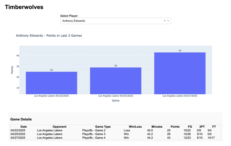
Looking at our app, we now have a dropdown that lists each member of the Timberwolves!
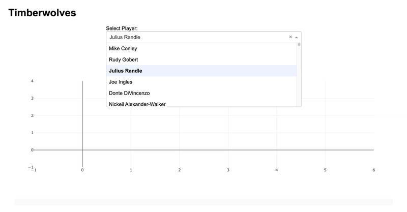
But hey, no data is showing and I swear Julius Randle has been playing great recently. It looks like we’ll have to update the graph with the player’s stats. Let’s go ahead and do that.
import plotly.express as px

@callback(
  [Output('points-graph', 'figure'),
   Output('game-details', 'children')],
  [Input('player-dropdown', 'value'),
   Input('team-name-store', 'children')]
)
def update_graph(selected_player, team_name):
  if not selected_player:
    return px.bar(), html.P("No player selected.")

  # Extract first and last name from the selected value
  first_name, last_name = selected_player.split('|')

  # Filter for the selected player's data
  player_stats = player_stats_df[
    (player_stats_df['firstName'] == first_name) &
    (player_stats_df['lastName'] == last_name)
  ]

  # Sort by game date and get the last 3 games
  player_stats = player_stats.sort_values('gameDate', ascending=False).head(3)

  # If no data found, return empty figure with message
  if player_stats.empty:
    return px.bar(), html.P(f"No recent game data found for {first_name} {last_name}.")

  # Sort in chronological order for display
  player_stats = player_stats.sort_values('gameDate')

  # Create labels for the x-axis showing opponent and date
  player_stats['game_label'] = player_stats.apply(
    lambda row: f"{row['opponentteamCity']} {row['opponentteamName']}\\n{row['gameDate'].strftime('%m/%d/%Y')}",
      axis=1
  )

  # Create the bar chart for points
  fig = px.bar(
    player_stats,
    x='game_label',
    y='points',
    title=f"{first_name} {last_name} - Points in Last 3 Games",
    labels={'game_label': 'Game', 'points': 'Points'},
    text='points'
  )

  fig.update_traces(
    textposition='outside'
  )

  # Create table with game details
  game_details = html.Div([
    html.H3("Game Details"),
    html.Table([
      html.Thead(
        html.Tr([
          html.Th("Date"),
          html.Th("Opponent"),
          html.Th("Game Type"),
          html.Th("Win/Loss"),
          html.Th("Minutes"),
          html.Th("Points"),
          html.Th("FG"),
          html.Th("3PT"),
          html.Th("FT"),
        ])
        ),
        html.Tbody([
          html.Tr([
            html.Td(row['gameDate'].strftime('%m/%d/%Y')),
            html.Td(f"{row['opponentteamCity']} {row['opponentteamName']}"),
            html.Td(f"{row['gameType']} - {row['gameSubLabel']}"),
            html.Td("Win" if row['win'] == 1 else "Loss"),
            html.Td(f"{row['numMinutes']:.1f}" if pd.notna(row['numMinutes']) else "N/A"),
            html.Td(f"{row['points']:.0f}"),
            html.Td(f"{row['fieldGoalsMade']:.0f}/{row['fieldGoalsAttempted']:.0f}"),
            html.Td(f"{row['threePointersMade']:.0f}/{row['threePointersAttempted']:.0f}"),
            html.Td(f"{row['freeThrowsMade']:.0f}/{row['freeThrowsAttempted']:.0f}"),
        ]) for _, row in player_stats.iterrows()
        ])
    ], style={'width': '100%', 'border': '1px solid #ddd', 'borderCollapse': 'collapse'}),
  ])

  return fig, game_details
Let’s refresh our app and see what it looks like.
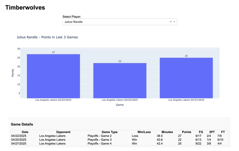
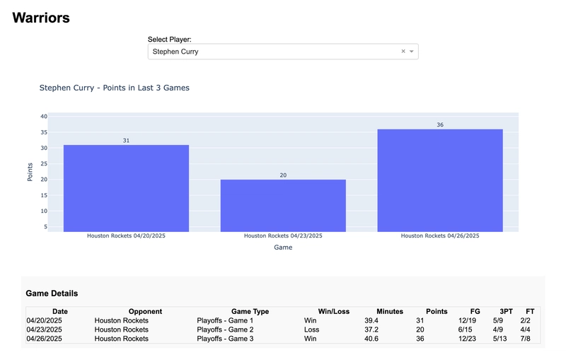
There we go! It looks like the Lakers have had their hands full recently. But what if we want to view the Warrior’s stats? We can do so by creating a “Warriors” organization, adding a new user to it, and logging in with the new user.
And we’re done! We just created a Dash application that protects data based on organization membership while also easily displaying the data thanks to Dash. But what else can you do with PropelAuth?
What else is Included?
Our Dash integration offers all the powerful features you’d expect from PropelAuth:
User management: Registration, login, password reset, and profile management
Organization management: Create and manage organizations with roles and permissions
Multi-factor authentication: Add an extra layer of security by requiring your users to login with MFA.
Multiple login methods: Email/password, social logins, SSO, and SAML
User impersonation: Debug user issues by seeing exactly what they see
Ready to Get Started?
Whether you’re building a simple data dashboard or a complex analytics platform, getting your Dash app up and running with PropelAuth is quick and easy. Check out our comprehensive Dash integration guide or sign up for PropelAuth.