Web Accessibility Guide: Building Inclusive Websites in 2023
As a best-selling author, I invite you to explore my books on Amazon. Don't forget to follow me on Medium and show your support. Thank you! Your support means the world!
The internet has transformed how we interact with information, but not everyone experiences it equally. As a web developer with over a decade of experience, I've seen firsthand how thoughtful, inclusive design practices can dramatically improve accessibility for all users.
When I first started coding, accessibility was often an afterthought. Today, I recognize it as essential to good web development. Let me share practical approaches to building websites that work for everyone, regardless of their abilities or how they access the web.
Semantic HTML: The Foundation of Accessible Websites
Semantic HTML forms the bedrock of accessible web development. When we use HTML elements based on their intended meaning rather than their appearance, we create a document structure that's intelligible to both humans and machines.
Screen readers and other assistive technologies rely on semantic structure to navigate content. Using proper heading hierarchies (h1 through h6) creates a logical outline of your page, giving users a mental map of your content.
Consider this example of poorly structured HTML:
Welcome to Our Site
About Our Services
We offer the following services...
And compare it with semantically structured HTML:
Welcome to Our Site
About Our Services
We offer the following services...
The second example communicates the structure clearly to all users, including those using screen readers.
Landmarks such as , , , and help users navigate directly to significant sections of your page. For example:
Company Name
Home
Products
Contact
Featured Content
Copyright 2023
This structure allows users to jump directly to the navigation or main content, saving considerable time for screen reader users.
ARIA Attributes: Enhancing HTML Semantics
ARIA (Accessible Rich Internet Applications) attributes enhance HTML semantics when native elements aren't sufficient. They communicate states, properties, and roles to assistive technologies.
A key principle to remember is that ARIA should supplement HTML, not replace it. As the first rule of ARIA states: "If you can use a native HTML element with the semantics and behavior you require, do so."
For interactive components like tabs, accordions, or modal dialogs, ARIA becomes essential:
Product Features
Technical Specs
Our product includes these amazing features...
Technical specifications include...
The JavaScript to support this would manage focus and update aria-selected states when tabs are activated.
Live regions notify screen reader users of dynamic content changes:
document.getElementById('status-message').textContent = 'Your form has been submitted successfully';
The "polite" value ensures the announcement won't interrupt the user, while "atomic" means the entire region will be announced when changed.
Keyboard Accessibility: No Mouse Required
Not everyone can use a mouse. Some users rely exclusively on keyboards or alternative input devices. I've learned that testing keyboard navigation is one of the quickest ways to identify accessibility issues.
Every interactive element should be accessible and operable via keyboard, maintaining a logical tab order that follows the visual layout. Users should be able to:
Navigate using the Tab key
Activate buttons and links with Enter or Space
Operate complex widgets with arrow keys and other key combinations
Focus indicators must be clearly visible. Many developers remove these for aesthetic reasons, leaving keyboard users unable to track their position on the page:
/* Poor practice */
:focus {
outline: none;
}
/* Better practice */
:focus {
outline: 3px solid #4d90fe;
}
/* Even better - accommodate high contrast mode too */
:focus {
outline: 3px solid #4d90fe;
outline-offset: 2px;
}
/* Focus-visible for modern browsers */
:focus:not(:focus-visible) {
outline: none;
}
:focus-visible {
outline: 3px solid #4d90fe;
outline-offset: 2px;
}
For custom components, explicitly managing focus becomes crucial. For example, when opening a modal:
function openModal() {
// Display the modal
const modal = document.getElementById('modal');
modal.hidden = false;
// Set focus to the first focusable element
const firstFocusable = modal.querySelector('button, [href], input, select, textarea, [tabindex]:not([tabindex="-1"])');
firstFocusable.focus();
// Trap focus within the modal
modal.addEventListener('keydown', trapFocus);
}
function trapFocus(e) {
// Implementation of focus trapping
// ...
}
I once worked on a website where users struggled with form submission. The issue? A custom button that looked great but wasn't keyboard accessible. After fixing this
Apr 11, 2025 - 13:09
0
As a best-selling author, I invite you to explore my books on Amazon. Don't forget to follow me on Medium and show your support. Thank you! Your support means the world!
The internet has transformed how we interact with information, but not everyone experiences it equally. As a web developer with over a decade of experience, I've seen firsthand how thoughtful, inclusive design practices can dramatically improve accessibility for all users.
When I first started coding, accessibility was often an afterthought. Today, I recognize it as essential to good web development. Let me share practical approaches to building websites that work for everyone, regardless of their abilities or how they access the web.
Semantic HTML: The Foundation of Accessible Websites
Semantic HTML forms the bedrock of accessible web development. When we use HTML elements based on their intended meaning rather than their appearance, we create a document structure that's intelligible to both humans and machines.
Screen readers and other assistive technologies rely on semantic structure to navigate content. Using proper heading hierarchies (h1 through h6) creates a logical outline of your page, giving users a mental map of your content.
Consider this example of poorly structured HTML:
class="heading">Welcome to Our Site
class="subheading">About Our Services
class="content">We offer the following services...
And compare it with semantically structured HTML:
Welcome to Our Site
About Our Services
We offer the following services...
The second example communicates the structure clearly to all users, including those using screen readers.
Landmarks such as , , , and help users navigate directly to significant sections of your page. For example:
  Company Name
   aria-label="Main">

       href="/">Home
       href="/products">Products
       href="/contact">Contact


    Featured Content


  Copyright 2023
This structure allows users to jump directly to the navigation or main content, saving considerable time for screen reader users.
ARIA Attributes: Enhancing HTML Semantics
ARIA (Accessible Rich Internet Applications) attributes enhance HTML semantics when native elements aren't sufficient. They communicate states, properties, and roles to assistive technologies.
A key principle to remember is that ARIA should supplement HTML, not replace it. As the first rule of ARIA states: "If you can use a native HTML element with the semantics and behavior you require, do so."
For interactive components like tabs, accordions, or modal dialogs, ARIA becomes essential:
role="tablist">id="tab1"role="tab"aria-selected="true"aria-controls="panel1">Product Features
id="tab2"role="tab"aria-selected="false"aria-controls="panel2">Technical Specs
id="panel1"role="tabpanel"aria-labelledby="tab1">Our product includes these amazing features...
document.getElementById('status-message').textContent='Your form has been submitted successfully';
The "polite" value ensures the announcement won't interrupt the user, while "atomic" means the entire region will be announced when changed.
Keyboard Accessibility: No Mouse Required
Not everyone can use a mouse. Some users rely exclusively on keyboards or alternative input devices. I've learned that testing keyboard navigation is one of the quickest ways to identify accessibility issues.
Every interactive element should be accessible and operable via keyboard, maintaining a logical tab order that follows the visual layout. Users should be able to:
Navigate using the Tab key
Activate buttons and links with Enter or Space
Operate complex widgets with arrow keys and other key combinations
Focus indicators must be clearly visible. Many developers remove these for aesthetic reasons, leaving keyboard users unable to track their position on the page:
/* Poor practice */:focus{outline:none;}/* Better practice */:focus{outline:3pxsolid#4d90fe;}/* Even better - accommodate high contrast mode too */:focus{outline:3pxsolid#4d90fe;outline-offset:2px;}/* Focus-visible for modern browsers */:focus:not(:focus-visible){outline:none;}:focus-visible{outline:3pxsolid#4d90fe;outline-offset:2px;}
For custom components, explicitly managing focus becomes crucial. For example, when opening a modal:
functionopenModal(){// Display the modalconstmodal=document.getElementById('modal');modal.hidden=false;// Set focus to the first focusable elementconstfirstFocusable=modal.querySelector('button, [href], input, select, textarea, [tabindex]:not([tabindex="-1"])');firstFocusable.focus();// Trap focus within the modalmodal.addEventListener('keydown',trapFocus);}functiontrapFocus(e){// Implementation of focus trapping// ...}
I once worked on a website where users struggled with form submission. The issue? A custom button that looked great but wasn't keyboard accessible. After fixing this, completion rates improved significantly.
Color Contrast and Visual Design
Color contrast affects readability for everyone, especially users with low vision or color blindness. The Web Content Accessibility Guidelines (WCAG) recommend specific contrast ratios:
4.5:1 for normal text
3:1 for large text (18pt or 14pt bold)
3:1 for visual elements that convey information
I use tools like the Chrome DevTools color contrast analyzer or WebAIM's contrast checker to verify my designs. Here's how to improve contrast in CSS:
/* Poor contrast */.button{background-color:#add8e6;/* Light blue */color:#808080;/* Gray text */}/* Improved contrast */.button{background-color:#add8e6;/* Light blue */color:#000000;/* Black text */}
Color should never be the only method of conveying information. Icons, patterns, or text labels should accompany color cues:
Fields marked in red are required
type="text"class="required-field">Fields marked with an asterisk (*) are required
for="name">Name *
id="name"type="text"aria-required="true">
I've found that designing for high contrast from the start leads to cleaner, more usable interfaces that benefit all users.
Alternative Text for Images
Alternative text (alt text) provides textual descriptions of images for users who cannot see them. Writing effective alt text requires considering the image's purpose and context.
For informative images, describe the content and function concisely:
src="chart-quarterly-sales.png"alt="Bar chart showing quarterly sales increasing from Q1 to Q4 2022, with Q4 reaching $1.2 million">
Decorative images that add no information should have empty alt attributes:
src="decorative-divider.png"alt="">
Complex images like infographics may need extended descriptions:
src="data-workflow.png"alt="Diagram showing data processing workflow">
Our data processing workflow moves through four stages: collection,
validation, analysis, and reporting, with feedback loops at each stage.
I've developed the habit of asking myself: "If I couldn't see this image, what would I need to know about it?" This simple question leads to better alt text decisions.
Progressive Enhancement and Robust Code
Progressive enhancement builds websites in layers, starting with accessible HTML and adding CSS and JavaScript as enhancements rather than requirements. This approach ensures core functionality remains available regardless of technology limitations.
I structure my projects to work without JavaScript first:
Fault tolerance is crucial. Always validate user input on both client and server, and handle errors gracefully:
// Input validationfunctionvalidateEmail(email){constregex=/^[^\s@]+@[^\s@]+\.[^\s@]+$/;returnregex.test(email);}// Graceful degradationif (!window.fetch){// Provide alternative implementation// or inform users to upgrade their browser}
I've learned that spending time on robust error handling pays dividends in user satisfaction and reduced support tickets.
Responsive Design for All Devices and Zoom Levels
Responsive design accommodates users across a spectrum of devices, screen sizes, and zoom levels. Using flexible layouts with relative units ensures content remains accessible regardless of how it's viewed.
I prefer a mobile-first approach with CSS:
/* Base styles for mobile */.container{width:100%;padding:1rem;}/* Adjust for larger screens */@media(min-width:768px){.container{max-width:750px;margin:0auto;}}
Flexible images prevent horizontal scrolling:
img{max-width:100%;height:auto;}
Text should be readable without zooming (minimum 16px for body text) and should reflow when zoomed to 200%:
body{font-size:1rem;/* 16px in most browsers */line-height:1.5;}p{max-width:70ch;/* For optimal readability */}
Touch targets need adequate spacing and size (at least 44×44 pixels) for motor-impaired users:
I regularly test at different viewport sizes and zoom levels to ensure my designs remain functional and usable.
Inclusive Form Design
Forms are often the most challenging aspect of web accessibility. Clear labeling, error prevention, and helpful feedback create a better experience for all users.
functionvalidatePassword(password){if (password.length<8){consterrorElement=document.getElementById('password-error');errorElement.textContent='Password must be at least 8 characters';returnfalse;}returntrue;}
I've found that taking time to plan form validation and error handling leads to higher conversion rates and satisfied users.
Testing and Continuous Improvement
Accessibility isn't a one-time task but an ongoing commitment. I incorporate multiple testing methods into my workflow:
Automated tools like Lighthouse, axe, or WAVE provide a quick baseline assessment:
// Example of programmatic accessibility testing with axe-coreconstaxe=require('axe-core');axe.run(document).then(results=>{if (results.violations.length){console.error('Accessibility violations found:',results.violations);}else{console.log('No accessibility violations detected!');}});
Manual testing with keyboard navigation and screen readers reveals issues automated tools miss. I use NVDA or VoiceOver to test critical user journeys.
User testing with people who have disabilities provides invaluable insights. Nothing compares to observing real users interact with your website.
I document accessibility features in a statement that outlines compliance levels and known limitations:
href="/accessibility">Accessibility Statement
This transparency builds trust with users who depend on accessible websites.
The Business Case for Accessibility
Beyond ethical considerations, accessibility makes business sense. Accessible websites:
Reach a wider audience (15-20% of the population has a disability)
Improve SEO through semantic HTML and proper structure
Reduce legal risk from potential discrimination claims
Enhance usability for all users, including those in situational limitations
I've seen organizations transform their approach to accessibility when they understand these practical benefits.
Conclusion
Building accessible websites isn't about checking boxes for compliance—it's about creating experiences that work for everyone. The practices I've shared represent core principles that have guided my work for years.
When we design with accessibility in mind, we build better websites for all users. The extra effort pays dividends in user satisfaction, broader reach, and simpler maintenance. In my experience, accessible design leads to cleaner code, more thoughtful user experiences, and ultimately more successful digital products.
The web was designed to be universally accessible. By embracing these inclusive development practices, we honor that vision and create a digital world that truly serves everyone.
101 Books
101 Books is an AI-driven publishing company co-founded by author Aarav Joshi. By leveraging advanced AI technology, we keep our publishing costs incredibly low—some books are priced as low as $4—making quality knowledge accessible to everyone.
Stay tuned for updates and exciting news. When shopping for books, search for Aarav Joshi to find more of our titles. Use the provided link to enjoy special discounts!


![[The AI Show Episode 144]: ChatGPT’s New Memory, Shopify CEO’s Leaked “AI First” Memo, Google Cloud Next Releases, o3 and o4-mini Coming Soon & Llama 4’s Rocky Launch](https://www.marketingaiinstitute.com/hubfs/ep%20144%20cover.png)


![GrandChase tier list of the best characters available [April 2025]](https://media.pocketgamer.com/artwork/na-33057-1637756796/grandchase-ios-android-3rd-anniversary.jpg?#)


.png?width=1920&height=1920&fit=bounds&quality=70&format=jpg&auto=webp#)


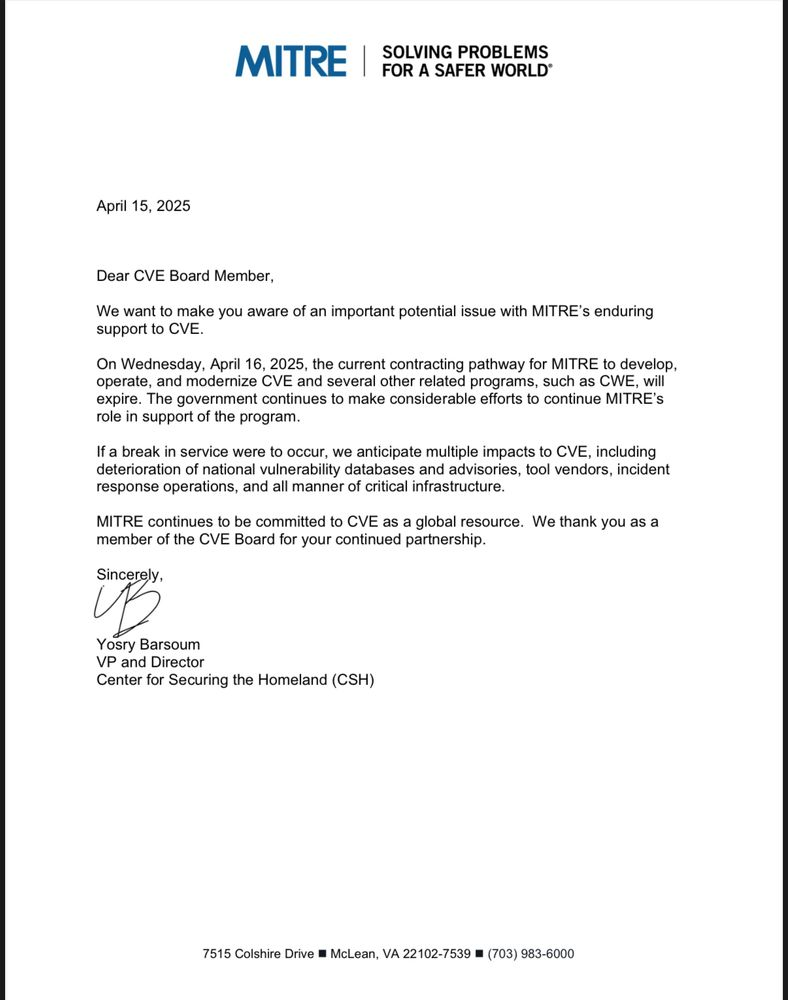


![Global security vulnerability database gets 11 more months of funding [u]](https://photos5.appleinsider.com/gallery/63338-131616-62453-129471-61060-125967-51013-100774-49862-97722-Malware-Image-xl-xl-xl-(1)-xl-xl.jpg)


![Apple Releases tvOS 18.4.1 for Apple TV [Download]](https://www.iclarified.com/images/news/97047/97047/97047-640.jpg)
![Apple Releases macOS Sequoia 15.4.1 [Download]](https://www.iclarified.com/images/news/97049/97049/97049-640.jpg)
![Apple Releases iOS 18.4.1 and iPadOS 18.4.1 [Download]](https://www.iclarified.com/images/news/97043/97043/97043-640.jpg)