Scalable React Component Patterns: From Atomic Design to Compound Components
Scalable React Component Patterns: From Atomic Design to Compound Components As your React app grows, the way you organize and build components becomes critical. Instead of just “breaking things into components,” advanced design patterns help you: Promote reusability Reduce prop drilling Create highly customizable UIs Avoid tech debt In this article, we’ll explore key React component patterns that help build modular, maintainable, and scalable frontends. Atomic Design: Structuring Components by Granularity Atomic Design (coined by Brad Frost) is a methodology that breaks the UI into five stages: Atoms – Basic building blocks (e.g., Button, Input) Molecules – Groups of atoms (e.g., Input + Label) Organisms – Full sections (e.g., Header, Card) Templates – Page-level layouts Pages – Complete pages with data Benefits: Enforces consistency Enables design system reuse Scales well with teams and folders Compound Components: Components That Work Together Compound components are a pattern where multiple components share implicit state using React context. Tab 1 Tab 2 Panel 1 Panel 2 Why it works: Components are declarative and readable State is managed internally in Tabs, shared through context This is used by libraries like Radix UI and Headless UI. Controlled vs Uncontrolled Components Controlled: setValue(e.target.value)} /> State is owned by the parent Easier to control programmatically Uncontrolled: DOM manages the state Ideal for quick forms or integrating with non-React libs Use controlled when you need validation, centralized state, or interactivity. Render Props: Component Logic Sharing Render props is a technique to share logic by passing a function as a child. {({ x, y }) => Mouse position: {x}, {y}} Under the hood: function MouseTracker({ children }) { const [pos, setPos] = useState({ x: 0, y: 0 }); // track mouse... return children(pos); } Before hooks, this was one of the main ways to reuse logic. Still useful for fine-grained control. Headless Components: Logic Without Markup Headless components (like useCombobox() from Downshift) expose logic but let you define the UI. const { isOpen, getItemProps, getMenuProps } = useCombobox({...}); Why it scales: Keeps logic and markup separate Highly composable Works with any design system Great for building framework-agnostic, accessible libraries. Presentational + Container Components This classic pattern separates logic from UI: Container: function UserContainer() { const user = useUser(); return ; } Presentational: function UserProfile({ user }) { return {user.name}; } This is great when using tools like Storybook, where presentational components can be tested in isolation. Contextual Components and Portals Use React’s context to avoid prop-drilling and manage shared state across compound UIs. Portals let you render children outside the parent DOM node — ideal for modals, dropdowns, tooltips: ReactDOM.createPortal(, document.body); Combined with context, this enables decoupled, accessible UI patterns. Custom Hooks + Refs + Imperative Handles Custom hooks let you extract and reuse logic cleanly. function useToggle(initial = false) { const [on, setOn] = useState(initial); const toggle = () => setOn(o => !o); return { on, toggle }; } useImperativeHandle lets you expose internal component methods to parent refs — useful for forms, sliders, and interactive components. useImperativeHandle(ref, () => ({ focus: () => inputRef.current?.focus() })); When and Where to Use Each Pattern Pattern Best For Atomic Design Design systems, scalable folder structure Compound Components Tabs, modals, dropdowns Render Props Custom logic with full control over rendering Headless Components Logic-heavy reusable components Container/Presentational Separation of concerns Context + Portals Shared state across UI layers Final Thoughts Mastering these patterns enables you to: Build clean, reusable, consistent UI systems Collaborate better with designers and teams Write more maintainable, readable code Modern React is more than JSX — it’s a design system toolkit. Pick the right pattern for the job, and your components will scale like pros.
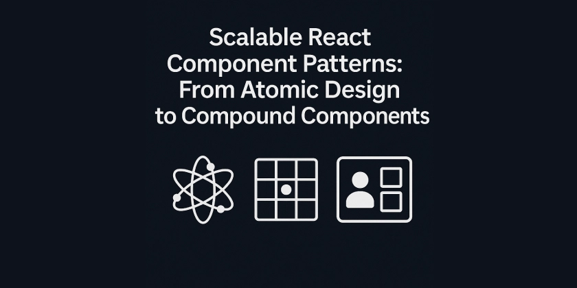
Scalable React Component Patterns: From Atomic Design to Compound Components
As your React app grows, the way you organize and build components becomes critical. Instead of just “breaking things into components,” advanced design patterns help you:
- Promote reusability
- Reduce prop drilling
- Create highly customizable UIs
- Avoid tech debt
In this article, we’ll explore key React component patterns that help build modular, maintainable, and scalable frontends.
Atomic Design: Structuring Components by Granularity
Atomic Design (coined by Brad Frost) is a methodology that breaks the UI into five stages:
- Atoms – Basic building blocks (e.g., Button, Input)
- Molecules – Groups of atoms (e.g., Input + Label)
- Organisms – Full sections (e.g., Header, Card)
- Templates – Page-level layouts
- Pages – Complete pages with data
Benefits:
- Enforces consistency
- Enables design system reuse
- Scales well with teams and folders
Compound Components: Components That Work Together
Compound components are a pattern where multiple components share implicit state using React context.
<Tabs>
  <Tabs.List>
    <Tabs.Trigger value="1">Tab 1Tabs.Trigger>
    <Tabs.Trigger value="2">Tab 2Tabs.Trigger>
  Tabs.List>
  <Tabs.Content value="1">Panel 1Tabs.Content>
  <Tabs.Content value="2">Panel 2Tabs.Content>
Tabs>
Why it works:
- Components are declarative and readable
- State is managed internally in
Tabs, shared through context
This is used by libraries like Radix UI and Headless UI.
Controlled vs Uncontrolled Components
Controlled:
<input value={value} onChange={e => setValue(e.target.value)} />
- State is owned by the parent
- Easier to control programmatically
Uncontrolled:
<input defaultValue="hello" ref={ref} />
- DOM manages the state
- Ideal for quick forms or integrating with non-React libs
Use controlled when you need validation, centralized state, or interactivity.
Render Props: Component Logic Sharing
Render props is a technique to share logic by passing a function as a child.
<MouseTracker>
  {({ x, y }) => <div>Mouse position: {x}, {y}div>}
MouseTracker>
Under the hood:
function MouseTracker({ children }) {
  const [pos, setPos] = useState({ x: 0, y: 0 });
  // track mouse...
  return children(pos);
}
Before hooks, this was one of the main ways to reuse logic. Still useful for fine-grained control.
Headless Components: Logic Without Markup
Headless components (like useCombobox() from Downshift) expose logic but let you define the UI.
const { isOpen, getItemProps, getMenuProps } = useCombobox({...});
Why it scales:
- Keeps logic and markup separate
- Highly composable
- Works with any design system
Great for building framework-agnostic, accessible libraries.
Presentational + Container Components
This classic pattern separates logic from UI:
Container:
function UserContainer() {
  const user = useUser();
  return <UserProfile user={user} />;
}
Presentational:
function UserProfile({ user }) {
  return <div>{user.name}div>;
}
This is great when using tools like Storybook, where presentational components can be tested in isolation.
Contextual Components and Portals
Use React’s context to avoid prop-drilling and manage shared state across compound UIs.
Portals let you render children outside the parent DOM node — ideal for modals, dropdowns, tooltips:
ReactDOM.createPortal(<Modal />, document.body);
Combined with context, this enables decoupled, accessible UI patterns.
Custom Hooks + Refs + Imperative Handles
Custom hooks let you extract and reuse logic cleanly.
function useToggle(initial = false) {
  const [on, setOn] = useState(initial);
  const toggle = () => setOn(o => !o);
  return { on, toggle };
}
useImperativeHandle lets you expose internal component methods to parent refs — useful for forms, sliders, and interactive components.
useImperativeHandle(ref, () => ({ focus: () => inputRef.current?.focus() }));
When and Where to Use Each Pattern
| Pattern | Best For |
|---|---|
| Atomic Design | Design systems, scalable folder structure |
| Compound Components | Tabs, modals, dropdowns |
| Render Props | Custom logic with full control over rendering |
| Headless Components | Logic-heavy reusable components |
| Container/Presentational | Separation of concerns |
| Context + Portals | Shared state across UI layers |
Final Thoughts
Mastering these patterns enables you to:
- Build clean, reusable, consistent UI systems
- Collaborate better with designers and teams
- Write more maintainable, readable code
Modern React is more than JSX — it’s a design system toolkit.
Pick the right pattern for the job, and your components will scale like pros.




![[The AI Show Episode 144]: ChatGPT’s New Memory, Shopify CEO’s Leaked “AI First” Memo, Google Cloud Next Releases, o3 and o4-mini Coming Soon & Llama 4’s Rocky Launch](https://www.marketingaiinstitute.com/hubfs/ep%20144%20cover.png)















.jpg?width=1920&height=1920&fit=bounds&quality=70&format=jpg&auto=webp#)







_Olekcii_Mach_Alamy.jpg?width=1280&auto=webp&quality=80&disable=upscale#)










![Apple Drops New Immersive Adventure Episode for Vision Pro: 'Hill Climb' [Video]](https://www.iclarified.com/images/news/97133/97133/97133-640.jpg)
![Most iPhones Sold in the U.S. Will Be Made in India by 2026 [Report]](https://www.iclarified.com/images/news/97130/97130/97130-640.jpg)
![Apple to Shift Robotics Unit From AI Division to Hardware Engineering [Report]](https://www.iclarified.com/images/news/97128/97128/97128-640.jpg)


