


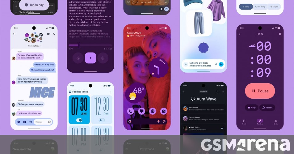
![[The AI Show Episode 147]: OpenAI Abandons For-Profit Plan, AI College Cheating Epidemic, Apple Says AI Will Replace Search Engines & HubSpot’s AI-First Scorecard](https://www.marketingaiinstitute.com/hubfs/ep%20147%20cover.png)


.png?width=1920&height=1920&fit=bounds&quality=70&format=jpg&auto=webp#)


.jpeg?width=1920&height=1920&fit=bounds&quality=70&format=jpg&auto=webp#)


![Apple Working on Brain-Controlled iPhone With Synchron [Report]](https://www.iclarified.com/images/news/97312/97312/97312-640.jpg)


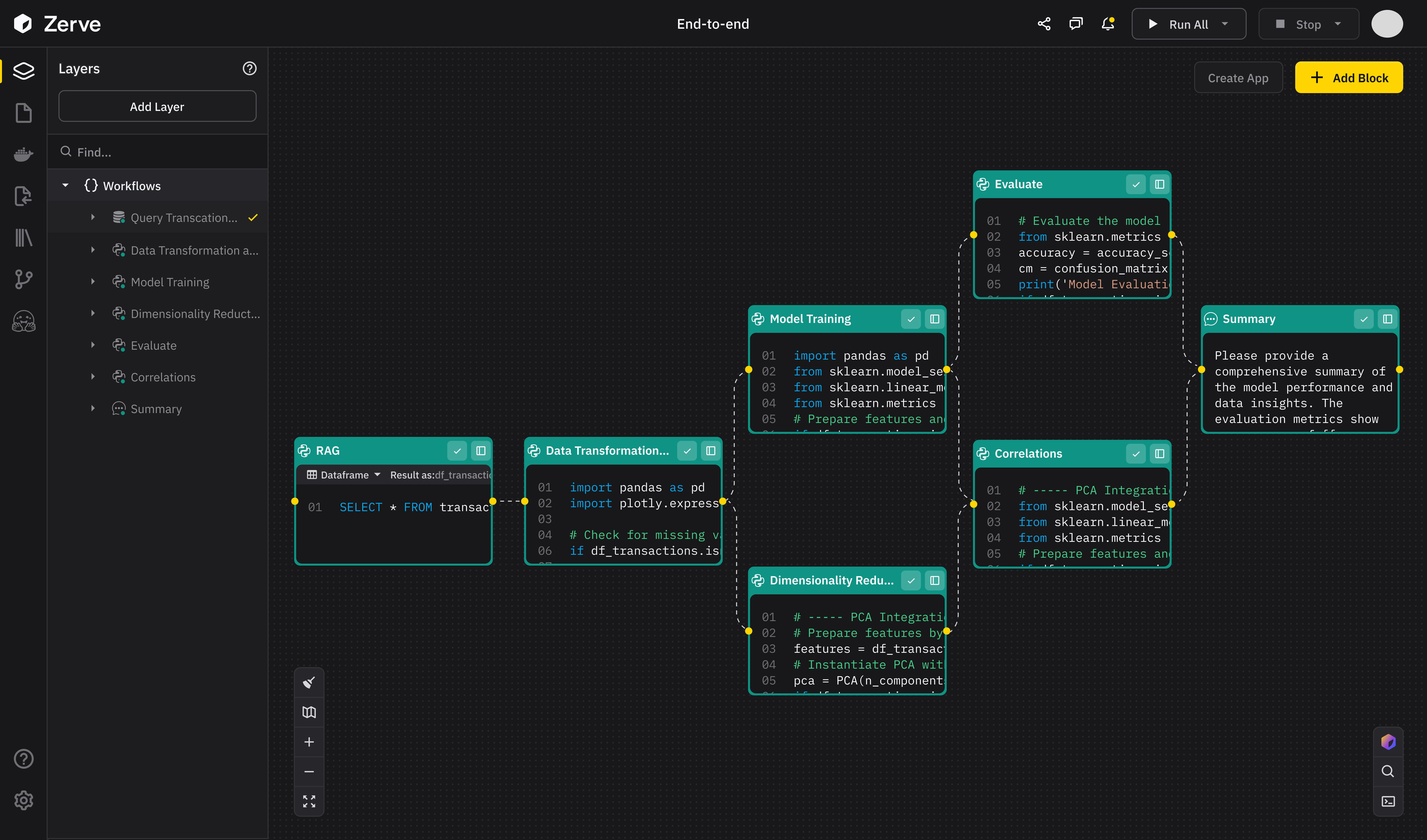
Practical Tutorial on Developing HarmonyOS Shopping Projects with Uniapp: Implementing Home Page Carousel Images
In the past few days' articles, we have talked about how to create cross-platform projects, how to carry out basic layouts, how to implement custom navigation bars, etc. Through this series of article tutorials, we ultimately aim to achieve a shopping app. Today, we are going to work on the carousel section of the shopping app's home page. uniapp provides the corresponding component swiper for carousel images, and it supports HarmonyOS applications, which is very convenient. Let's simply write a carousel with three pages of content. First, define the carousel and the style of each element: .swiper{ width: 100%; height: 140px; } .swiper-item{ width: 100%; height: 100%; display: block; } Now add carousel images on the page: 1 2 3 Take a look at the effect: Now we try to add pictures to each page content. Here, we take a swiper-item as an example: Such a basic carousel image has taken shape. Then we can further enrich its content. Here are some commonly used attributes listed for you: indicator-dots:Whether to display the panel indicator points indicator-color: Indicator point color indicator-active-color: The color of the currently selected indicator point autoplay:Whether to switch automatically interval:Automatically switch the time interval Below are the correct usage methods of the above attributes and the complete code of the carousel: The above is the tutorial sharing about carousel images. Thank you for your reading.

In the past few days' articles, we have talked about how to create cross-platform projects, how to carry out basic layouts, how to implement custom navigation bars, etc. Through this series of article tutorials, we ultimately aim to achieve a shopping app. Today, we are going to work on the carousel section of the shopping app's home page.
uniapp provides the corresponding component swiper for carousel images, and it supports HarmonyOS applications, which is very convenient. Let's simply write a carousel with three pages of content. First, define the carousel and the style of each element:
.swiper{

width: 100%;

height: 140px;

}

.swiper-item{

width: 100%;

height: 100%;

display: block;

}
Now add carousel images on the page:
Take a look at the effect:
Now we try to add pictures to each page content. Here, we take a swiper-item as an example:

Such a basic carousel image has taken shape. Then we can further enrich its content. Here are some commonly used attributes listed for you:
indicator-dots:Whether to display the panel indicator points

indicator-color: Indicator point color

indicator-active-color: The color of the currently selected indicator point

autoplay:Whether to switch automatically

interval:Automatically switch the time interval
Below are the correct usage methods of the above attributes and the complete code of the carousel:
The above is the tutorial sharing about carousel images. Thank you for your reading.